
Typography

Our typographic system is clear and considered, using typefaces that introduce sharp and precise detailing to our layouts.

In this section we will showcase our typefaces, the system and how to use them.

Please visit our Downloads Centre to access all Typography assets.

Overview

Our typefaces

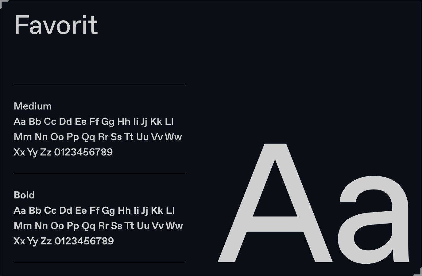
Our brand uses two typefaces: Favorit and Supply Mono. Favorit, our primary font introduces a considered controlled look. Supply Mono, our secondary typeface

is a technical monospace, used for subtitles and typographic detailing. Please visit our Downloads Centre to access all Font assets.

Primary typeface

Favorit, a straightforward, low contrast grotesque, is the foundation of our typographic identity. Through its rigid geometry, it introduces a clear and considered tone to our visual language. We use it in two weights to allow us to add emphasis when required.

For a system font alternate please use Helvetica.

Please visit our Downloads Centre to access all Font assets.
Secondary typeface

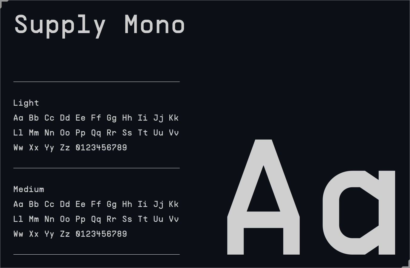
Supply Mono, a contemporary monospaced typeface, brings structure and tactical precision to our layouts. This secondary typeface is used only for subtitles and typographic detailing. We use it in two weights to allow us to add emphasis when required.

For a system font alternate please use JetBrains Mono from Google.

Please visit our Downloads Centre to access all Font assets.

Supporting typeface

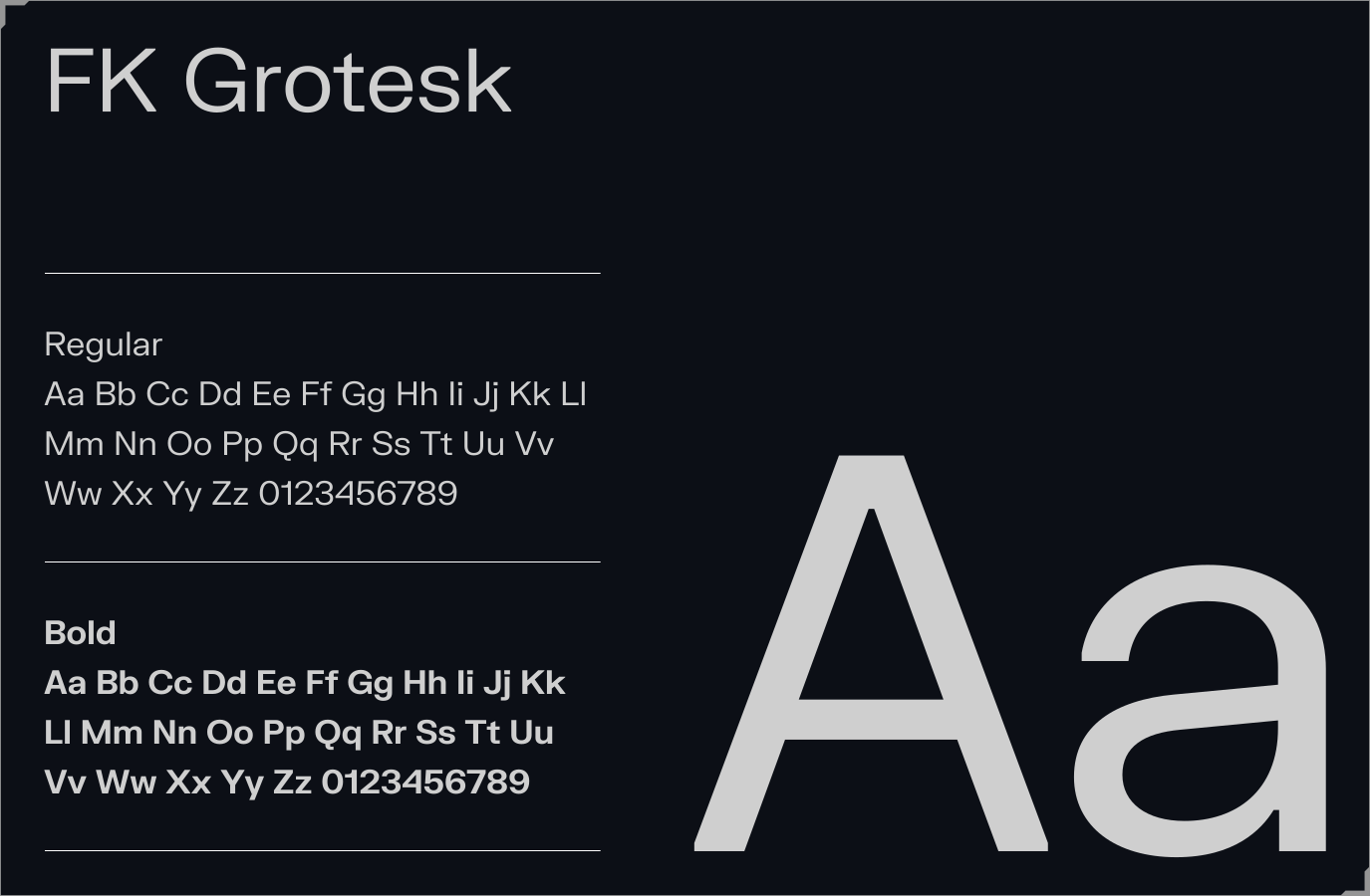
FK Grotesk serves as our supporting typeface within the Franchise brand, playing a pivotal role in maintaining brand consistency. Reserved exclusively for body copy, it ensures a cohesive visual language across all brand communications. We use it in two weights to allow us to add emphasis when required.

For a system font alternate please use Helvetica.

Please visit our Downloads Centre to access all Font assets.
Usage

Type hierarchy

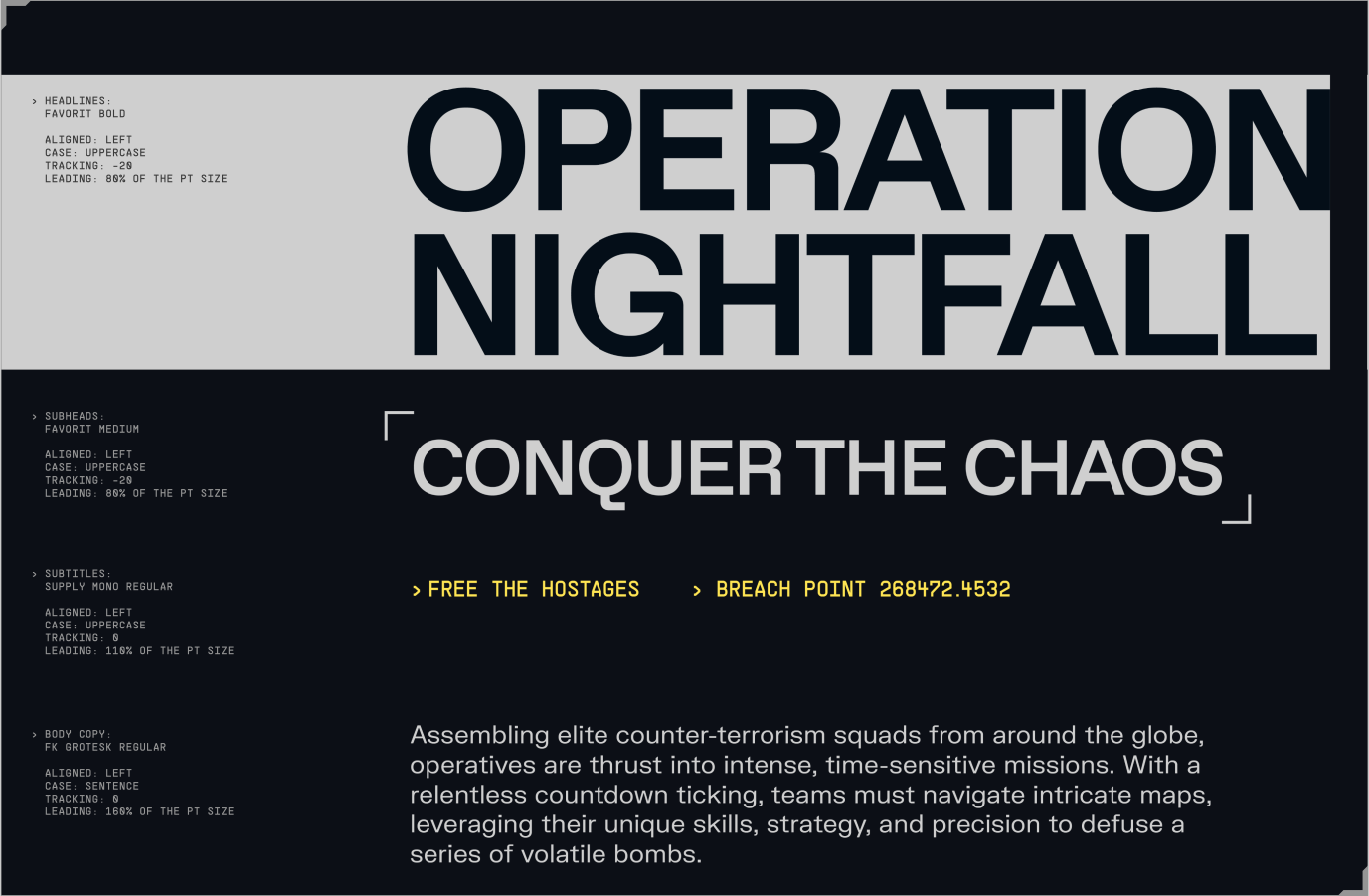
Make sure to follow this guidance for our typographic system which will ensure consistency across all our digital and print applications.

One thing to note, the colour seen here for some elements will differentiate between dark and light mode. To see more information on this please refer to the Colour section.

Please visit our Downloads Centre to access all Font assets.
Headlines

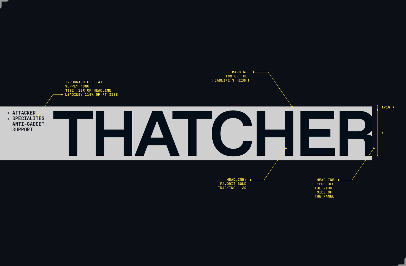
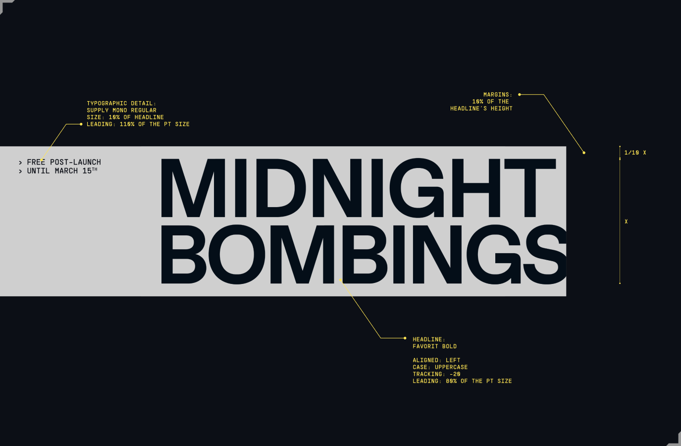
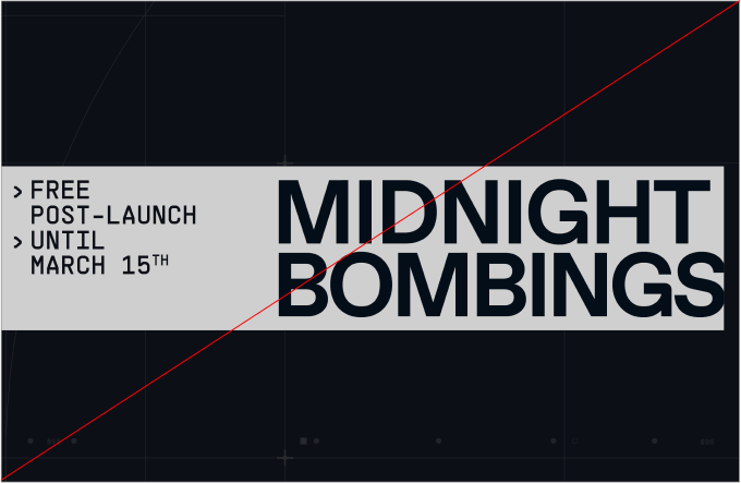
Our headlines use Favorit Bold and feature in a “redacted” block, a nod to our logo and the confidential nature of the operations.

Small annotations can feature on the left side of the “redacted” block. These annotations should not be high level information, as they are used at small scale. They serve to add to the narrative.

Follow this guidance to create consistent short or long form headlines.

One thing to note, the colour seen here for some elements will differentiate between dark and light mode. To see more information on this please refer to the Colour section.

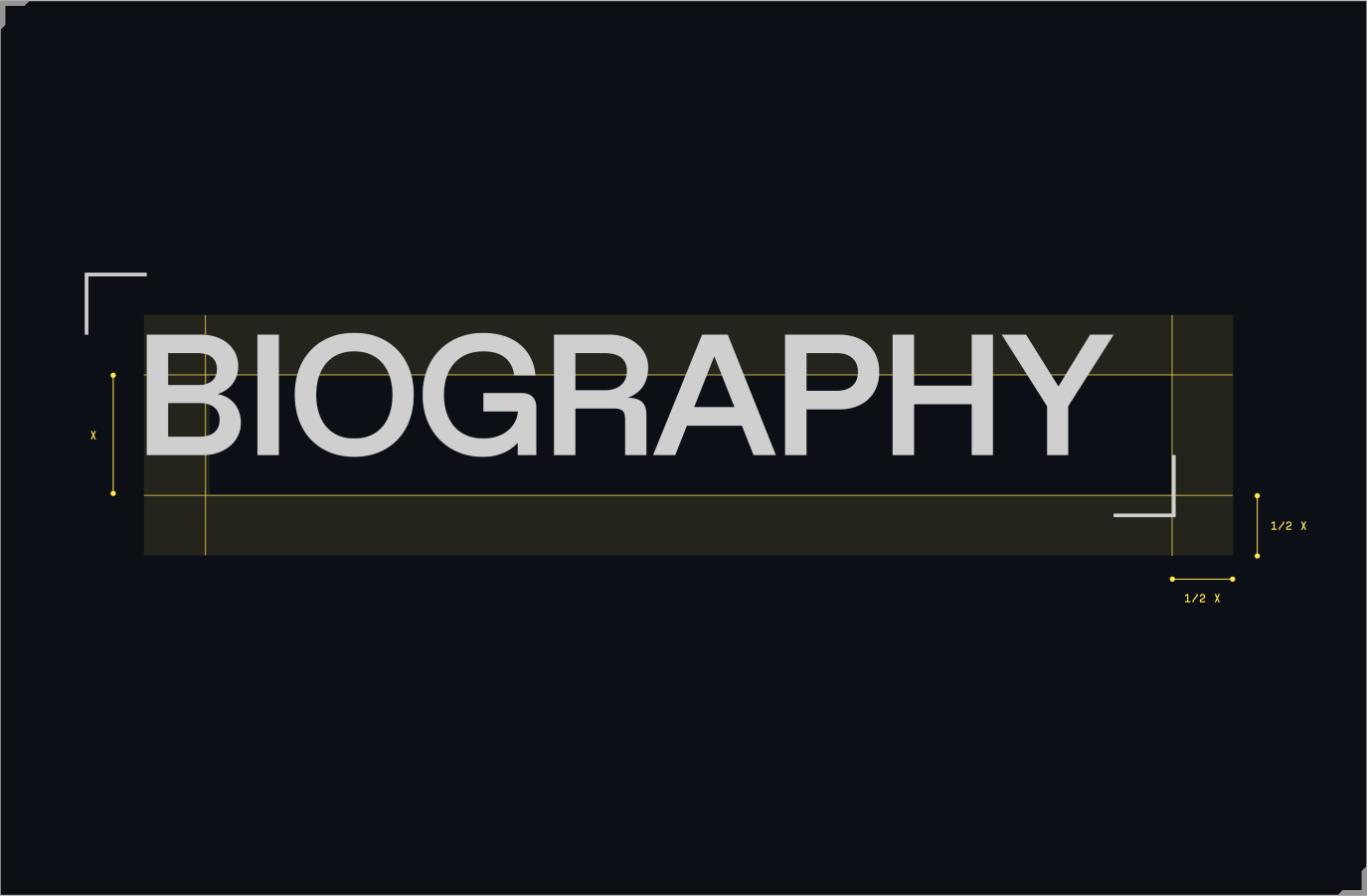
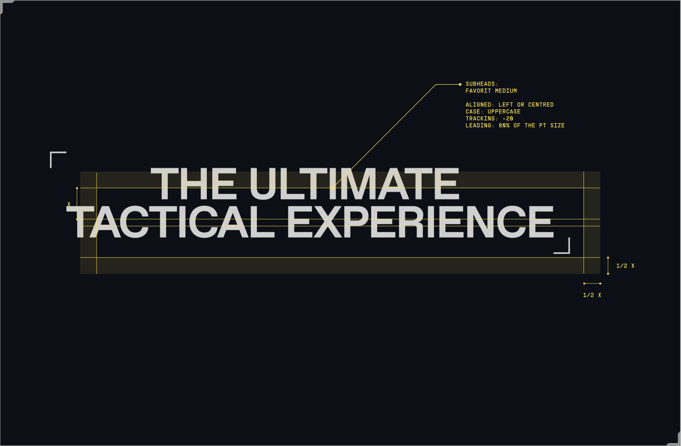
Subheadings

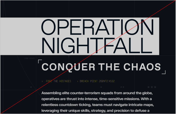
Our subheadings use Favorit Medium and feature small framing devices on either side, as a nod to the details found in our logo.

Follow this guidance to create consistent short or long form subheadings.

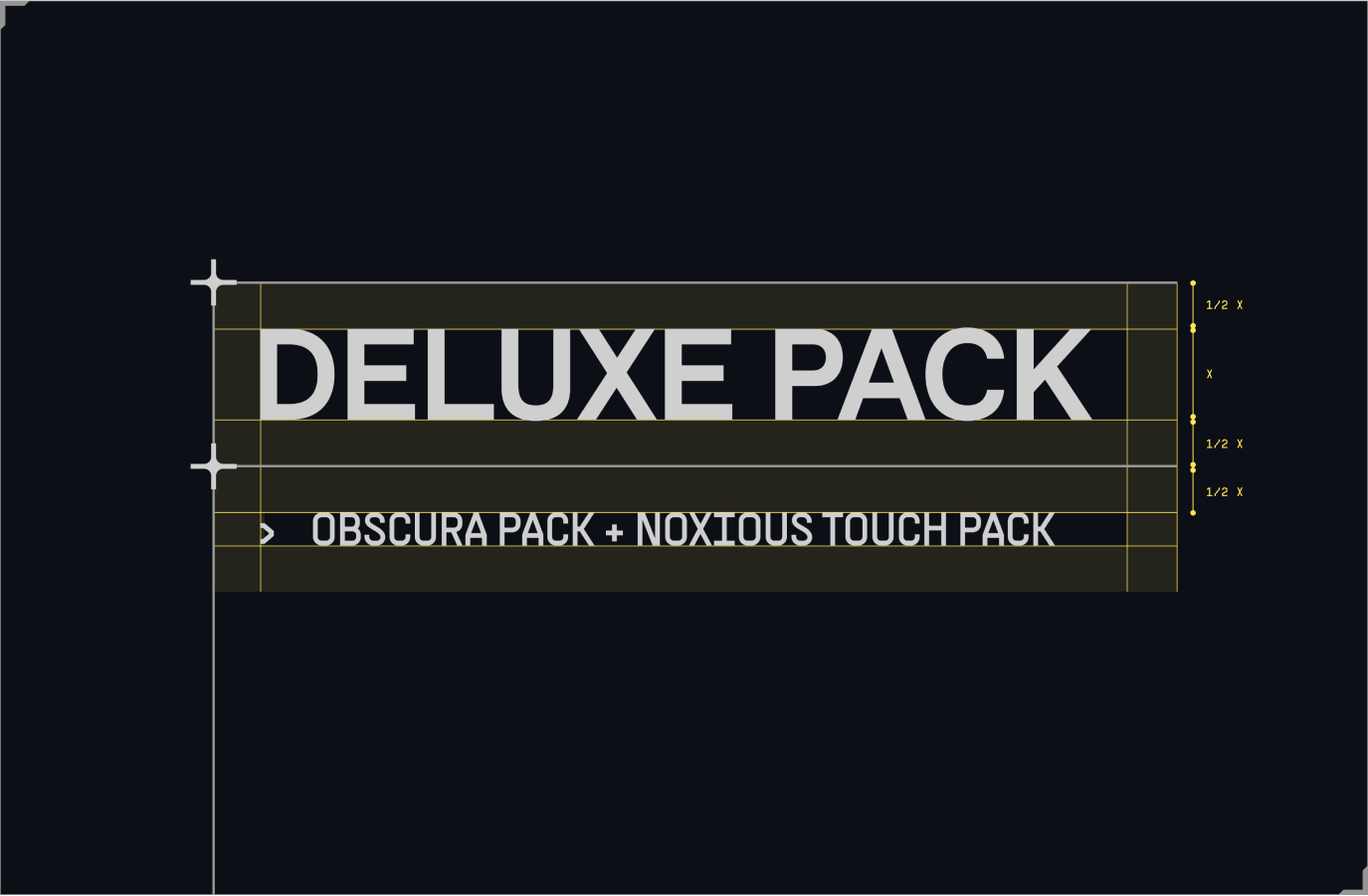
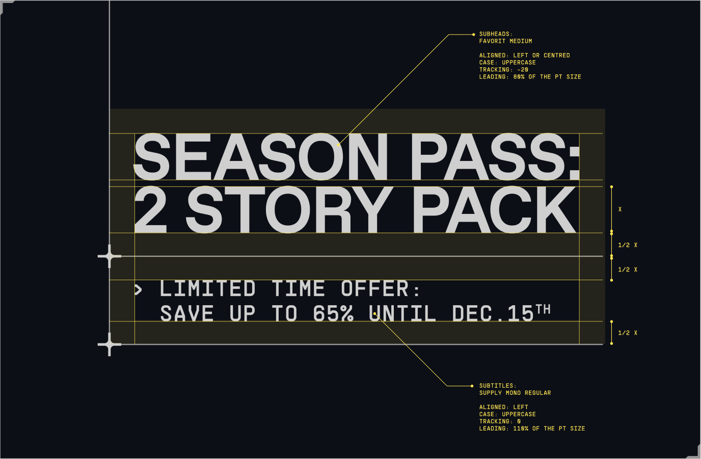
Subheadings & subtitles

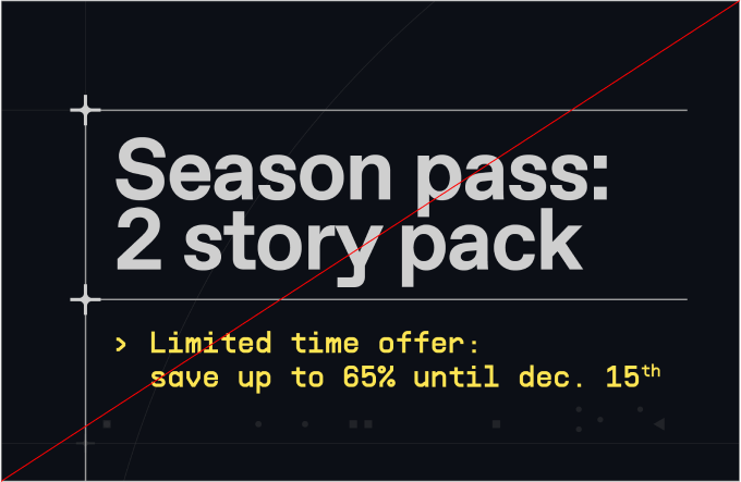
Our subheadings, when paired with typographic details or subtitles, can feature in a graphic device mimicking our grid system. This allows us to create a clear hierarchy.

Follow this guidance to create consistent short or long form subheading and subtitle pairings.

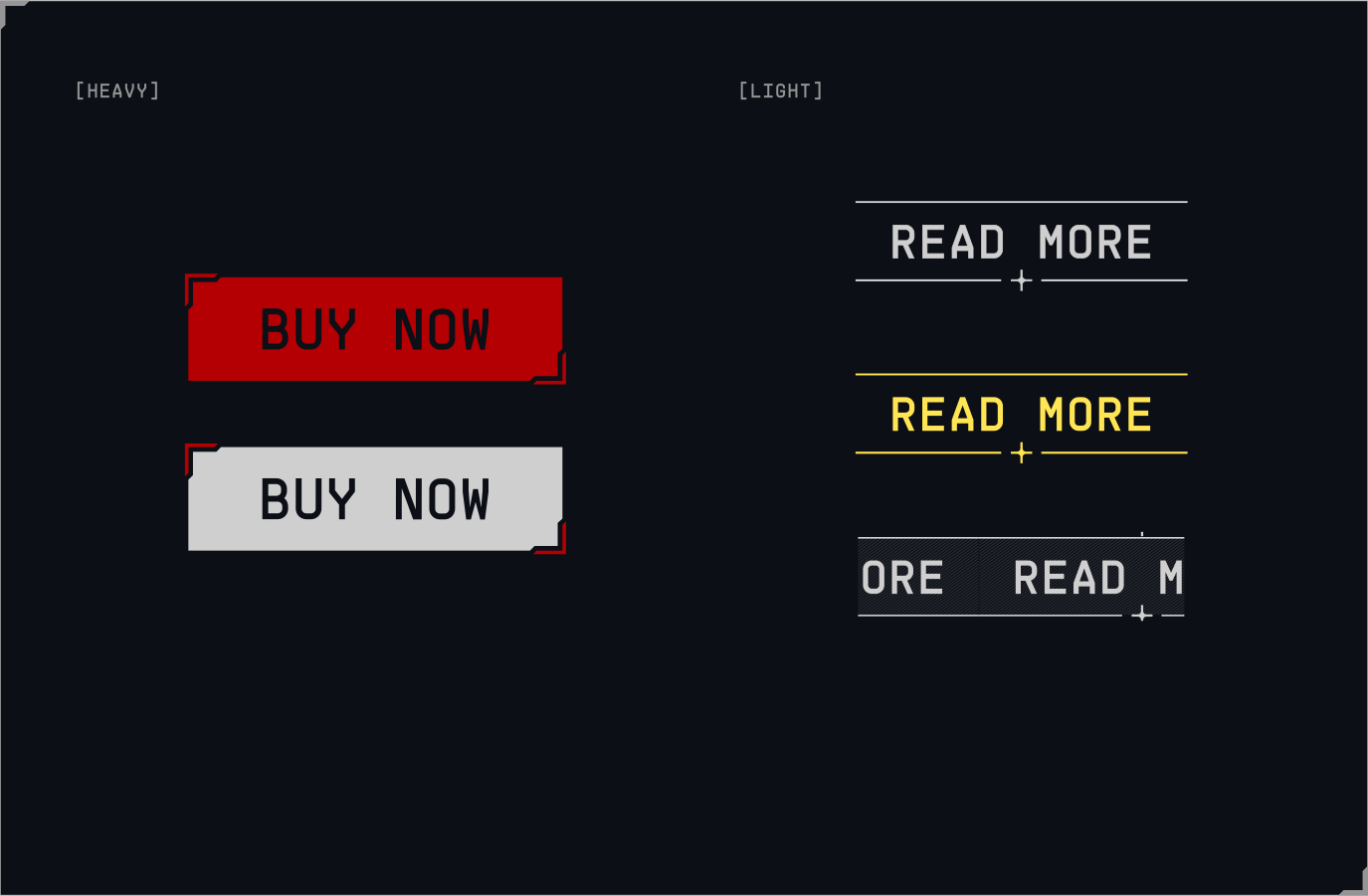
CTAs

Our CTAs use Supply Mono. Heavy CTAs feature a graphic device similar to our logo, a block with two framing devices on either side, while light CTAs nod to our grid system, using the crosshair device to emphasis them.

One thing to note, the colour seen here for some elements will differentiate between dark and light mode. To see more information on this please refer to the Colour section.

Things to avoid

Make sure to follow this guidance to ensure our Typographic system is used correctly in all formats and applications.

do not use sentence case on headlines and typographic details.
Typographic details should be kept small, in comparison to headlines.
do not use the wrong weights and tracking.
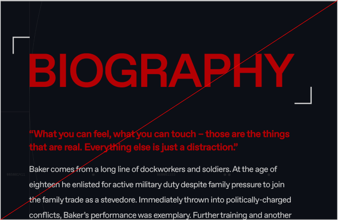
do not use highlight colours on headlines or body copy.