07
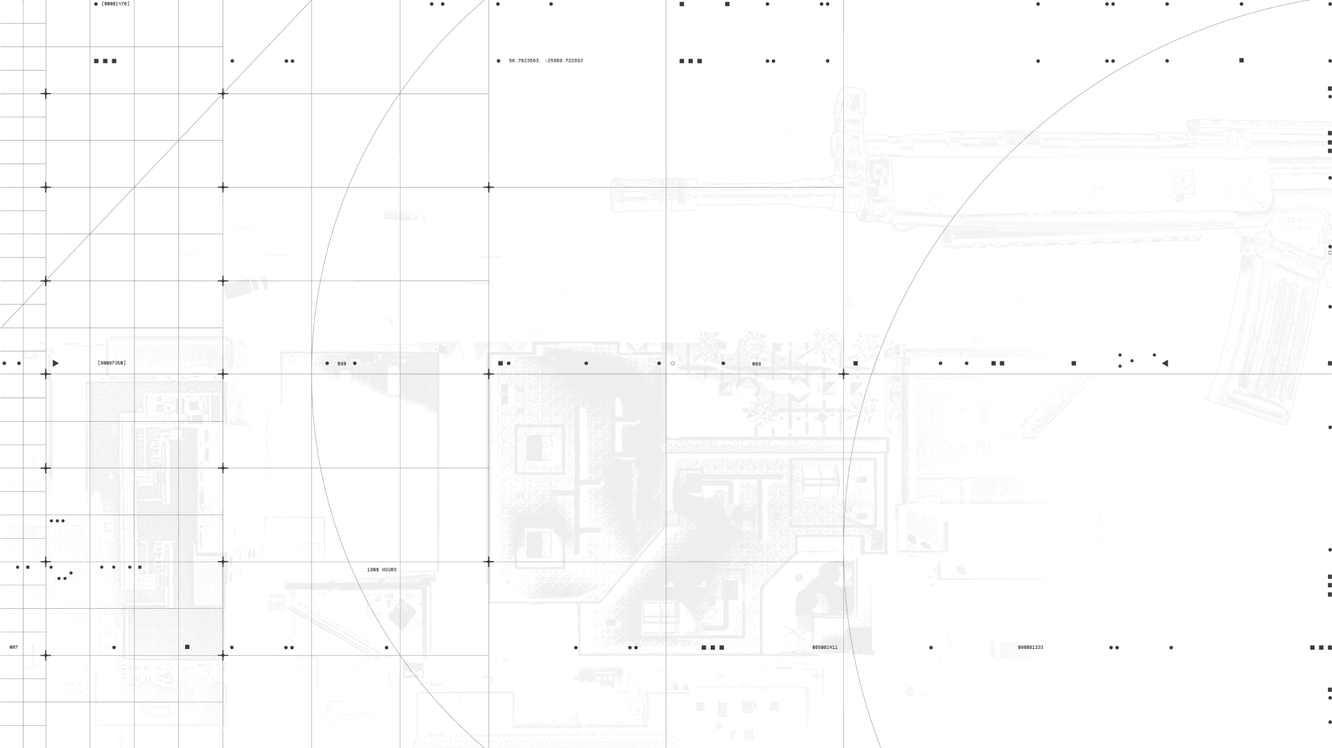
Our Layout system brings everything together. It ensures consistency and clear hierarchies of information across all communication touch-points.
In this section we will see a breakdown of our Layouts and how they bring together our toolkit effectively.
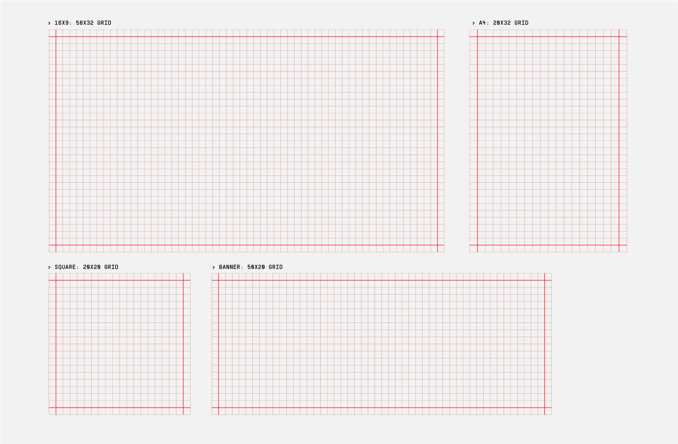
Our Layouts are base on an underlying square grid which follows our digital grid used in our backgrounds. The underlying grid flexes depending on the format.
Graphic elements, such as headlines and framing devices, should snap to the underlying grid, creating considered and precise layouts.
Please follow these requirements when creating different assets to ensure brand consistency.
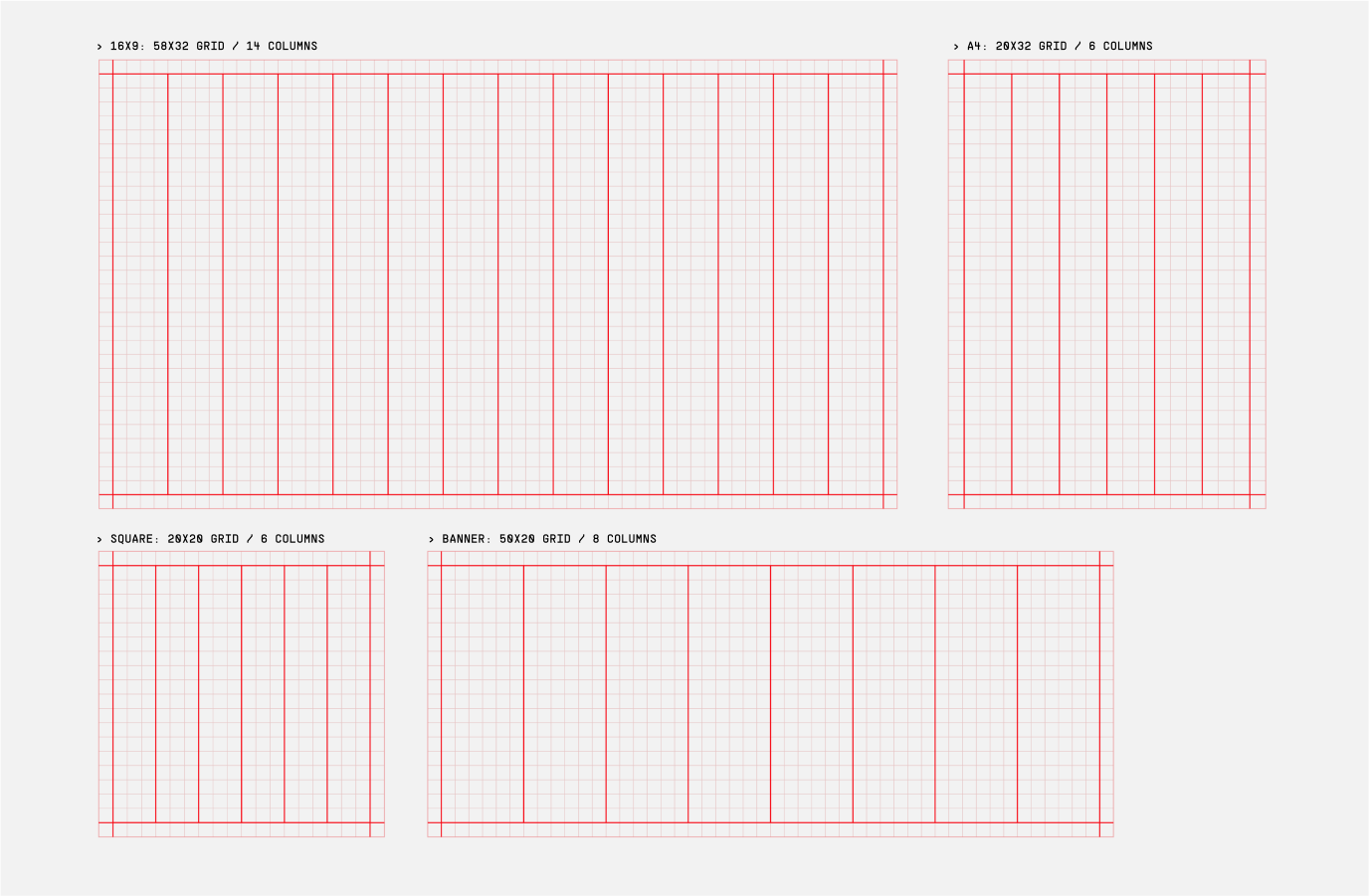
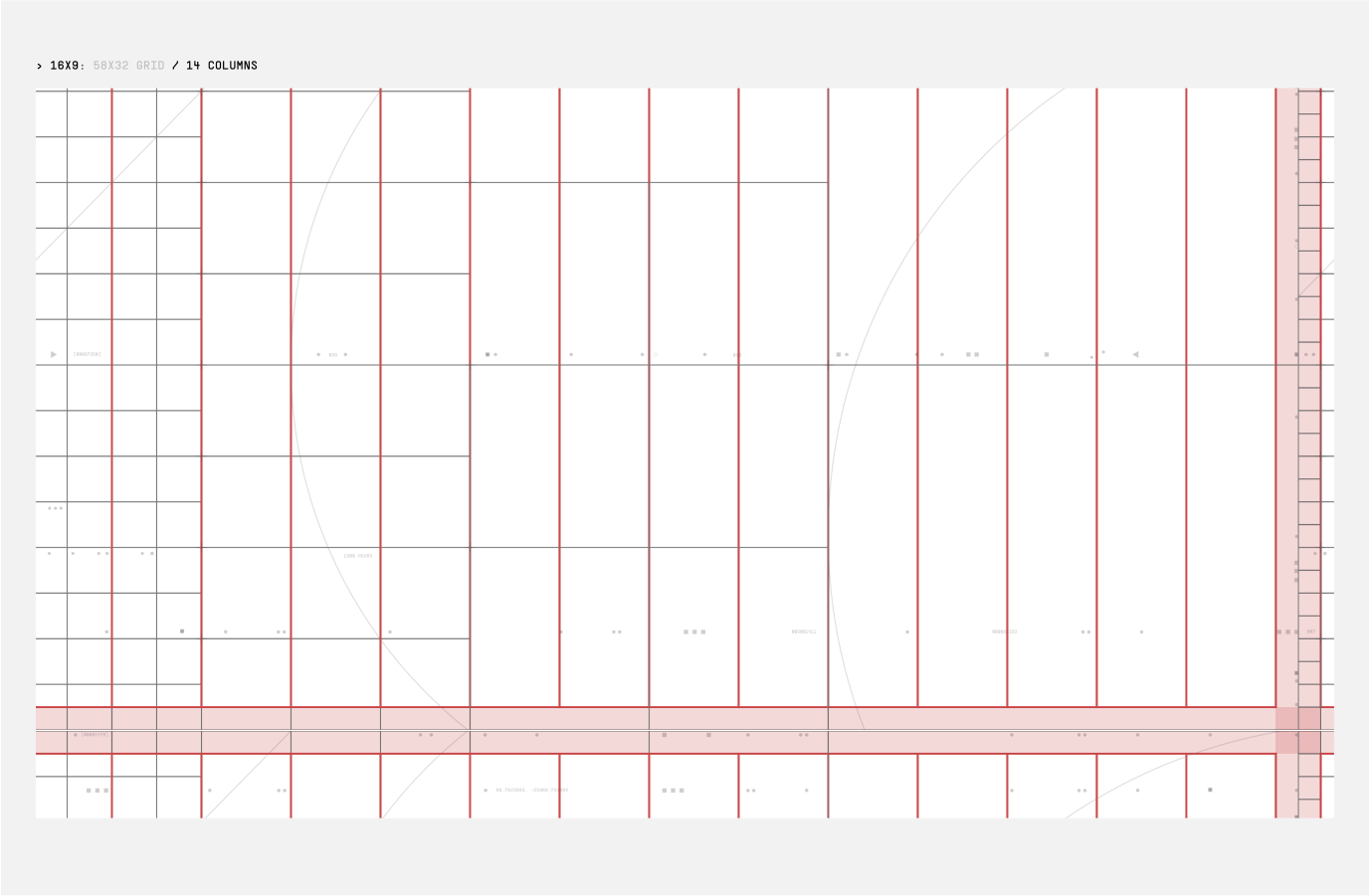
For Layouts that are type heavy, needing clear hierarchy and balance, columns can be used.
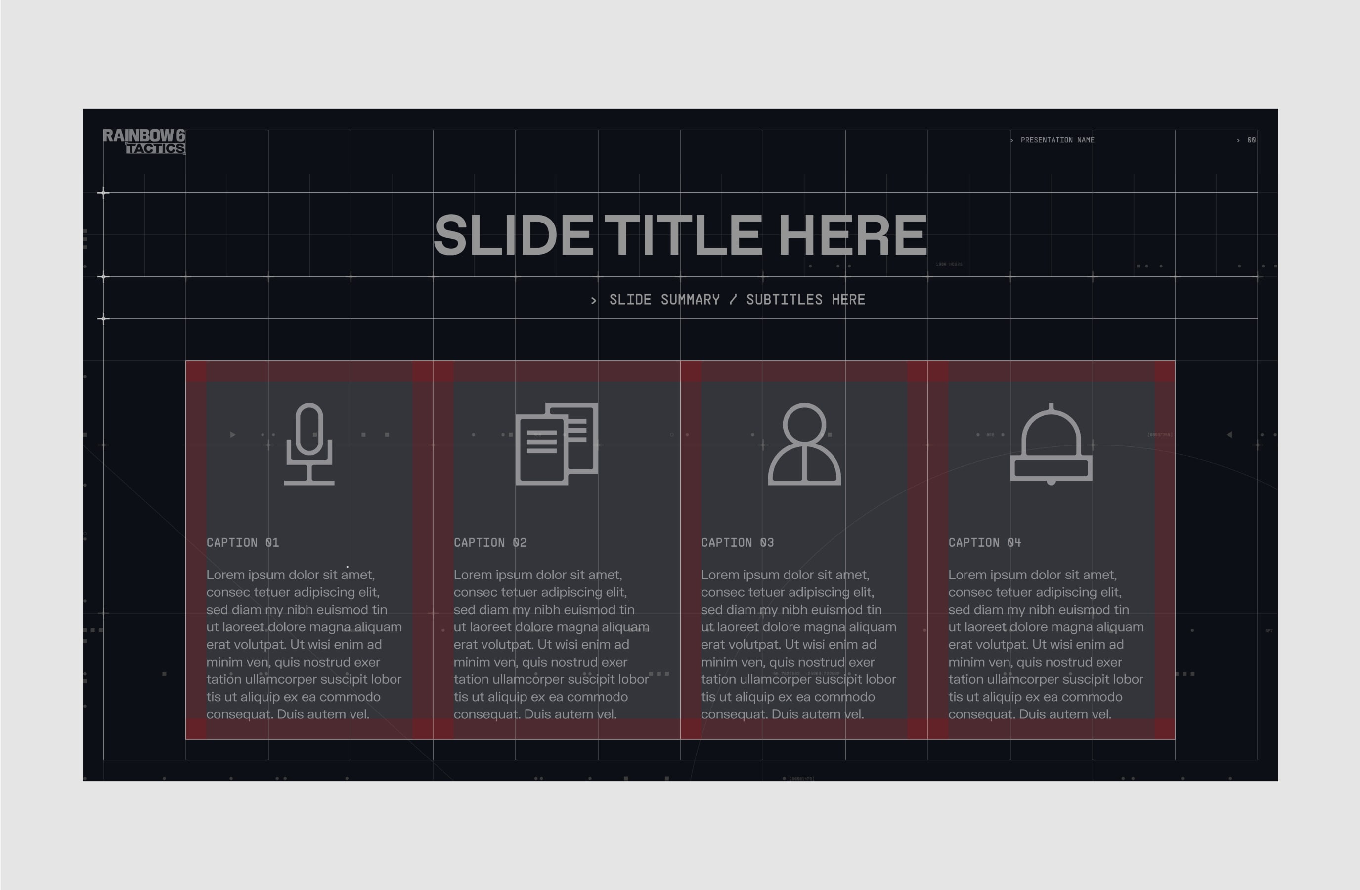
As a rule we use 14 columns for 16:9, 8 columns for banners, and 6 columns for smaller formats such as portrait A4 and 1:1. Depending on the size of your artwork you may need to increase or decrease the number of columns. The number of columns should always be a multiple of 2.
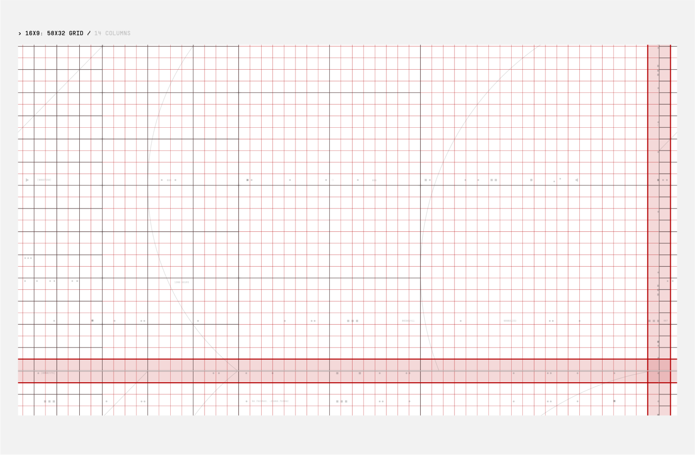
Here are examples of how the underlying grid and columns match the digital grid, while highlighting the margins in red.
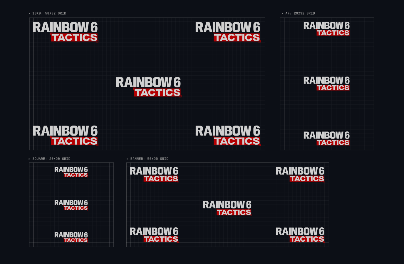
Refer to the guidance here to ensure correct placement of our logo suite. For images and minimal layouts, centrally placing the logo is recommended.
For applications which have more details we should place the lockups at the top or bottom of the format, either left or right aligned.
For instances of smaller formats use the logo centrally aligned for maximum legibility.
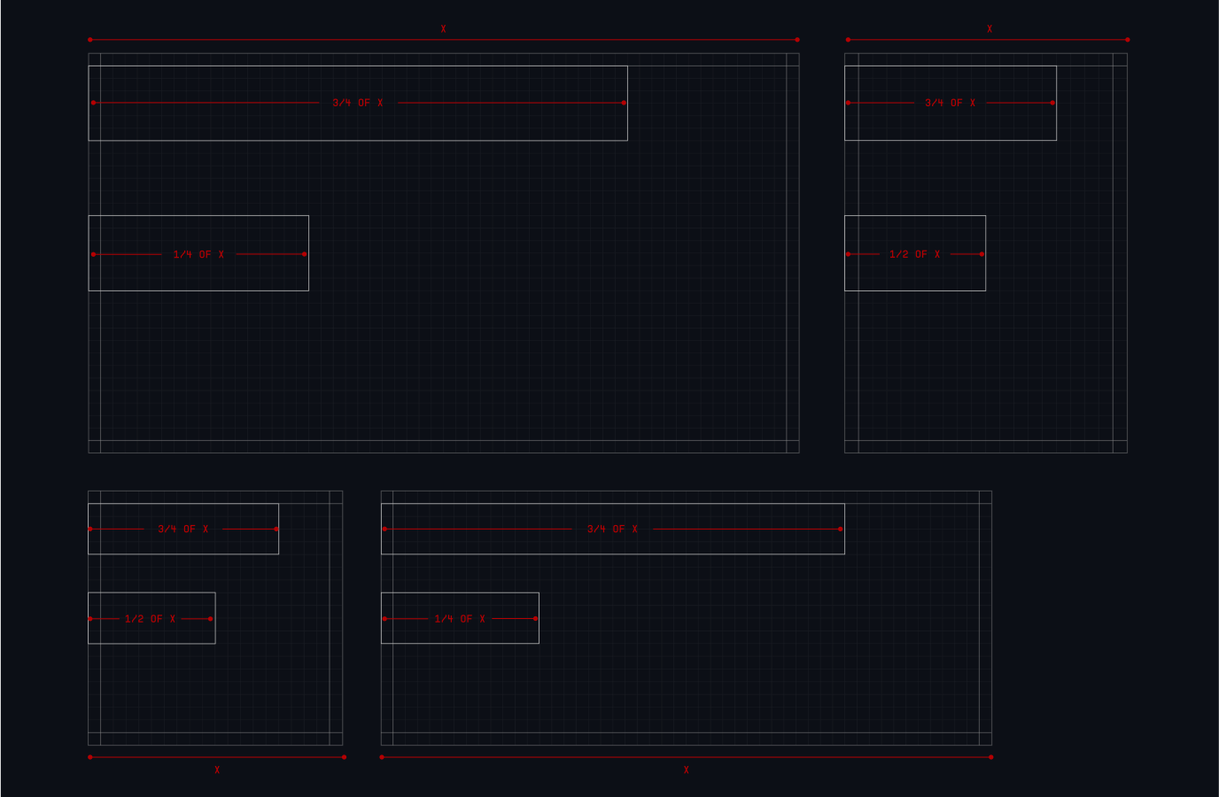
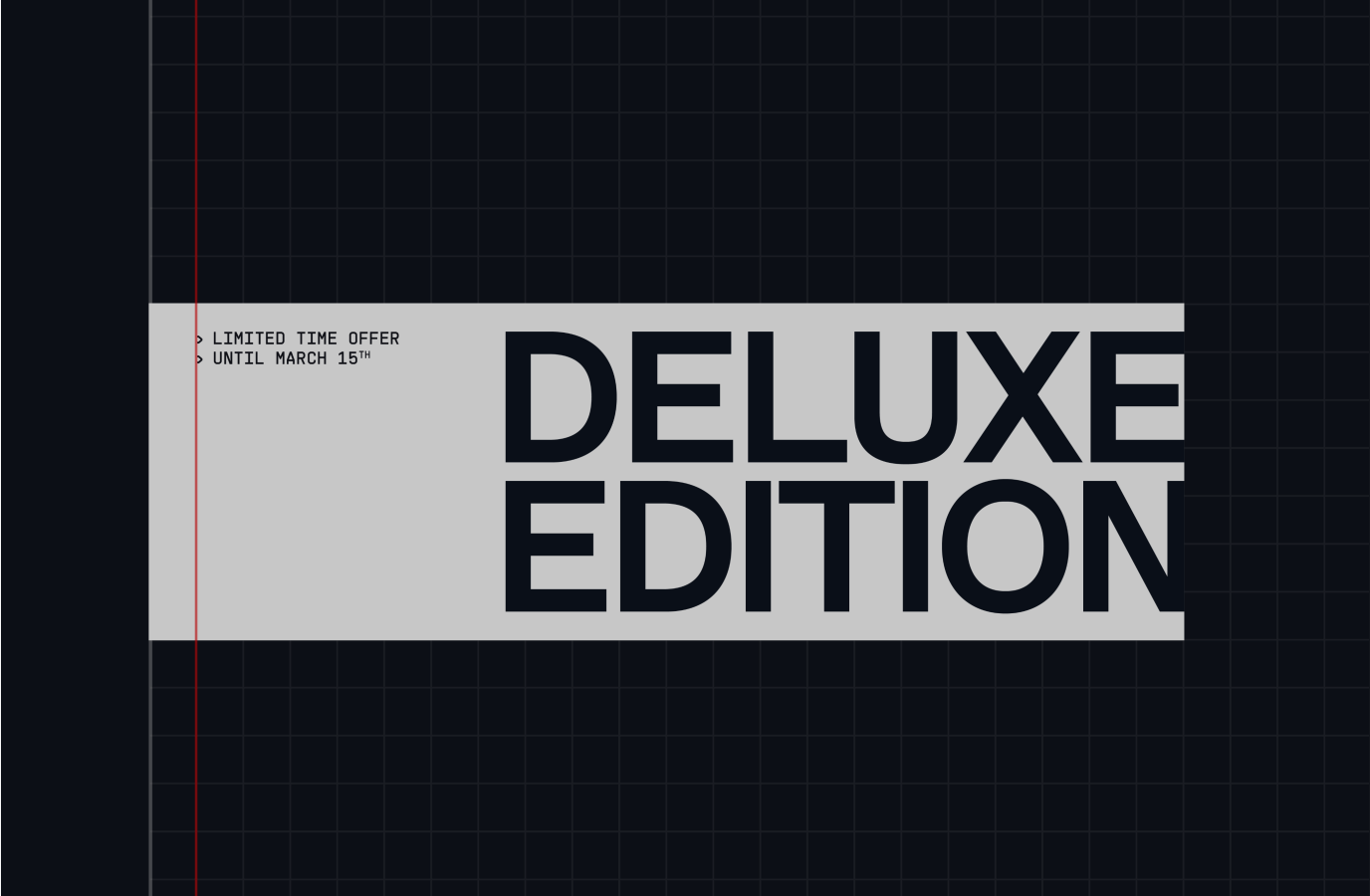
Headline blocks are always left aligned, generally centred on the format or aligned to the top.
Block length:
Minimum 25% and maximum 75% of the width of the format, following the grid.
PERSPECTIVE
Our Layouts present a collection of information and intel, spread throughout the control board, as images and text. This results in layered layouts. Images overlapping each other, at different scales and elements bleeding out of the frame; our layouts feel like a piece of a larger picture.
COMMANDING
Our Layouts express the idea planning and commanding. They feel sharp and precise, through the use of our visible grid and its details. There’s a strong sense of hierarchy, with colour and annotations clearly highlighting key information.
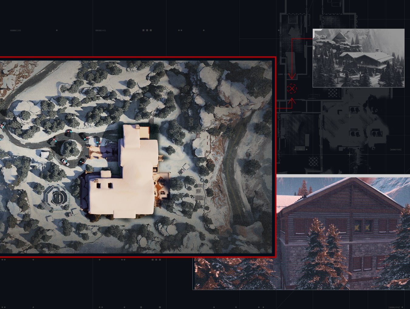
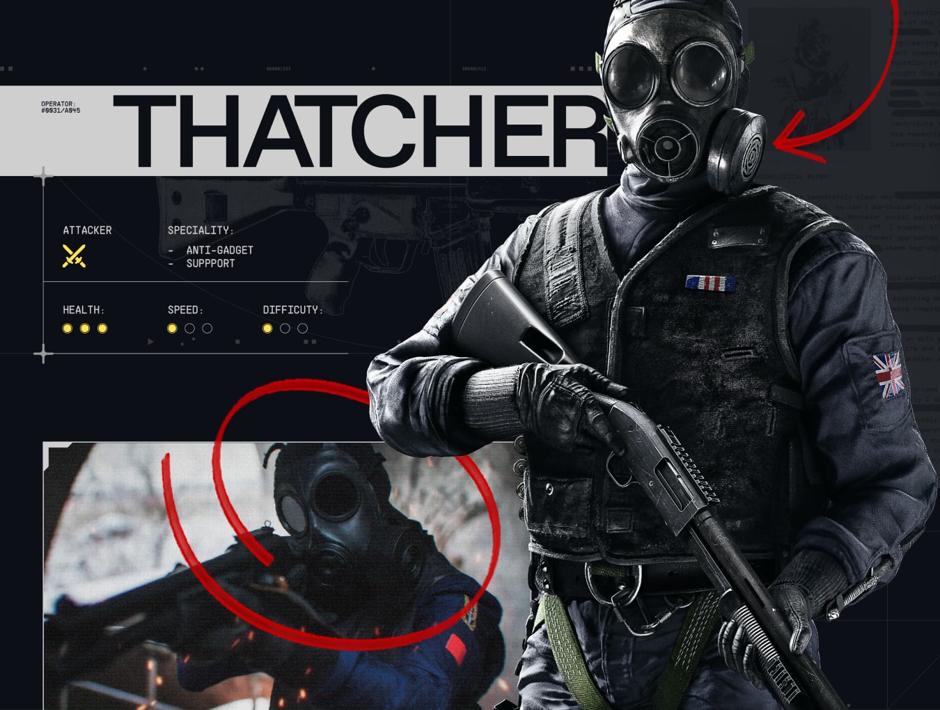
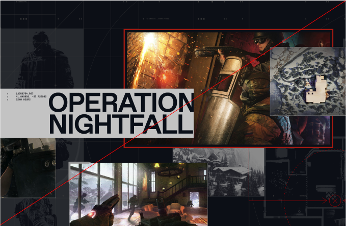
Our Layouts use a multitude of elements - headlines, art direction, typographic details, annotations, textures. To clearly communicate key information, we must create a clear hierarchy in our layouts.
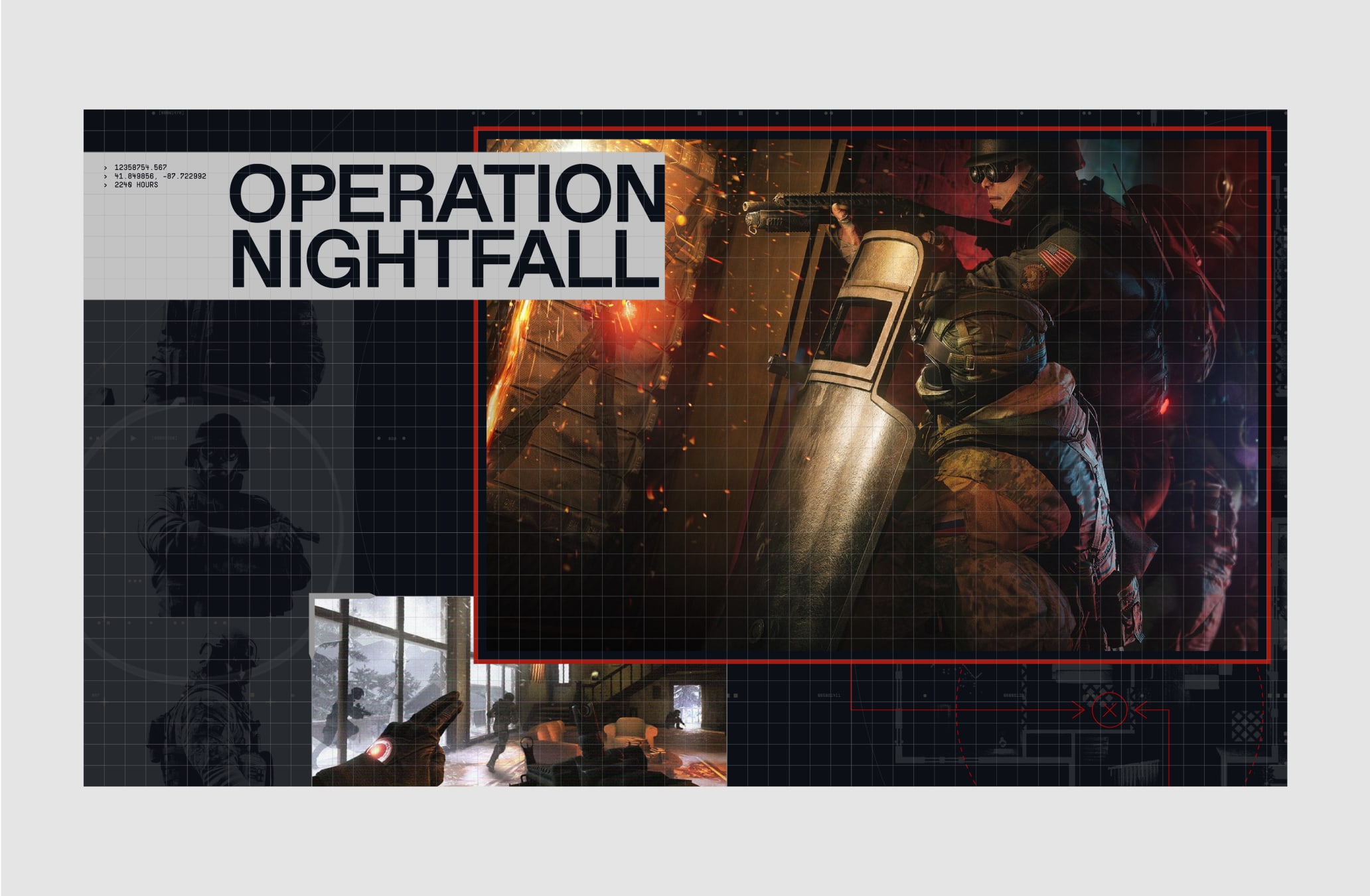
In this example, the key information is the headline and the main image, which uses a primary frame, in our red highlight.
The secondary image, which adds to the narrative of the layout, is used at a smaller scale (50% or less), with the primary image slightly layered on top of it, creating a sense of depth.
To further emphasis the narrative of the layout, we can include annotation, smaller supporting images and textures in the background.
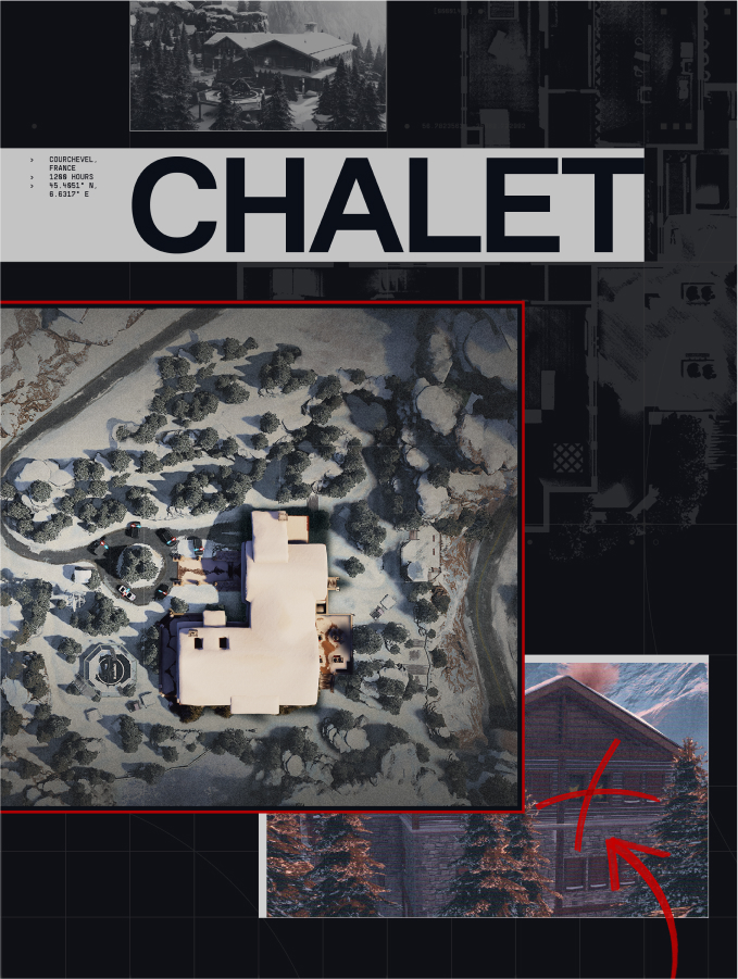
The key information are clearly highlighted through the use of the headline style and highlight colour on the framing device.
Secondary imagery uses secondary framing and colour style. It can also use on of the two image treatment.
Annotations serve to add an extra layer of storytelling.
Supporting imagery and textures feature in the background at smaller scale for art direction and low opacity for textures.
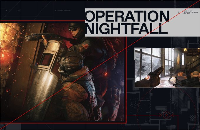
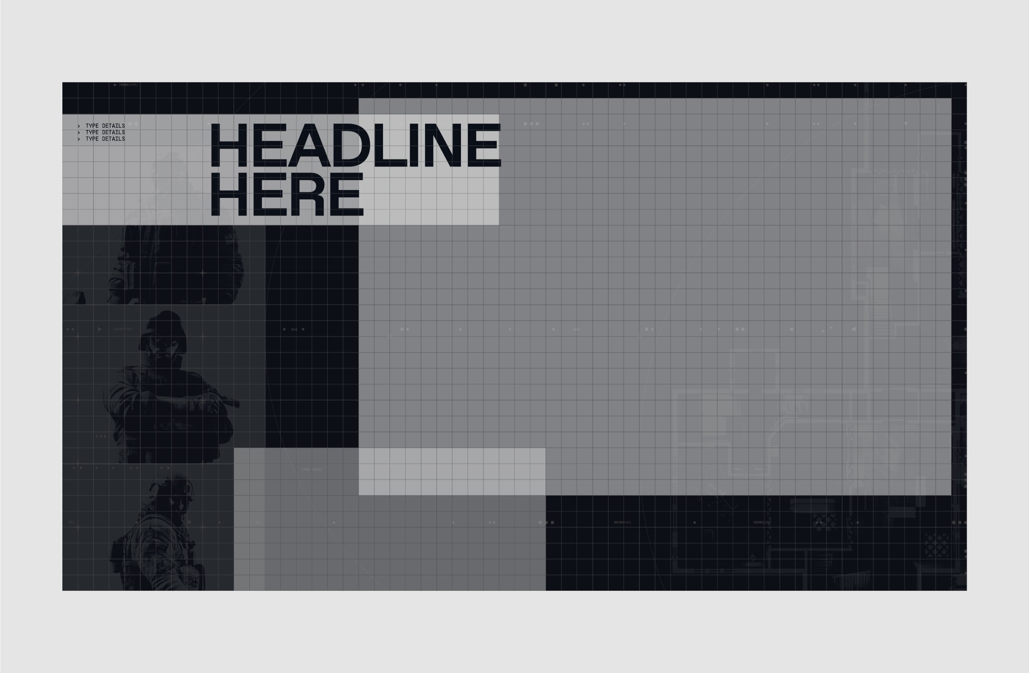
Here we breakdown this layout showing how to use the grid when we have a key image paired with a headline, each asset at the same level of hierarchy.
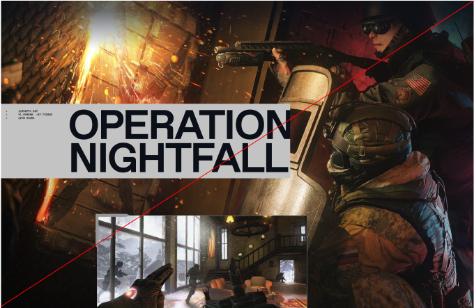
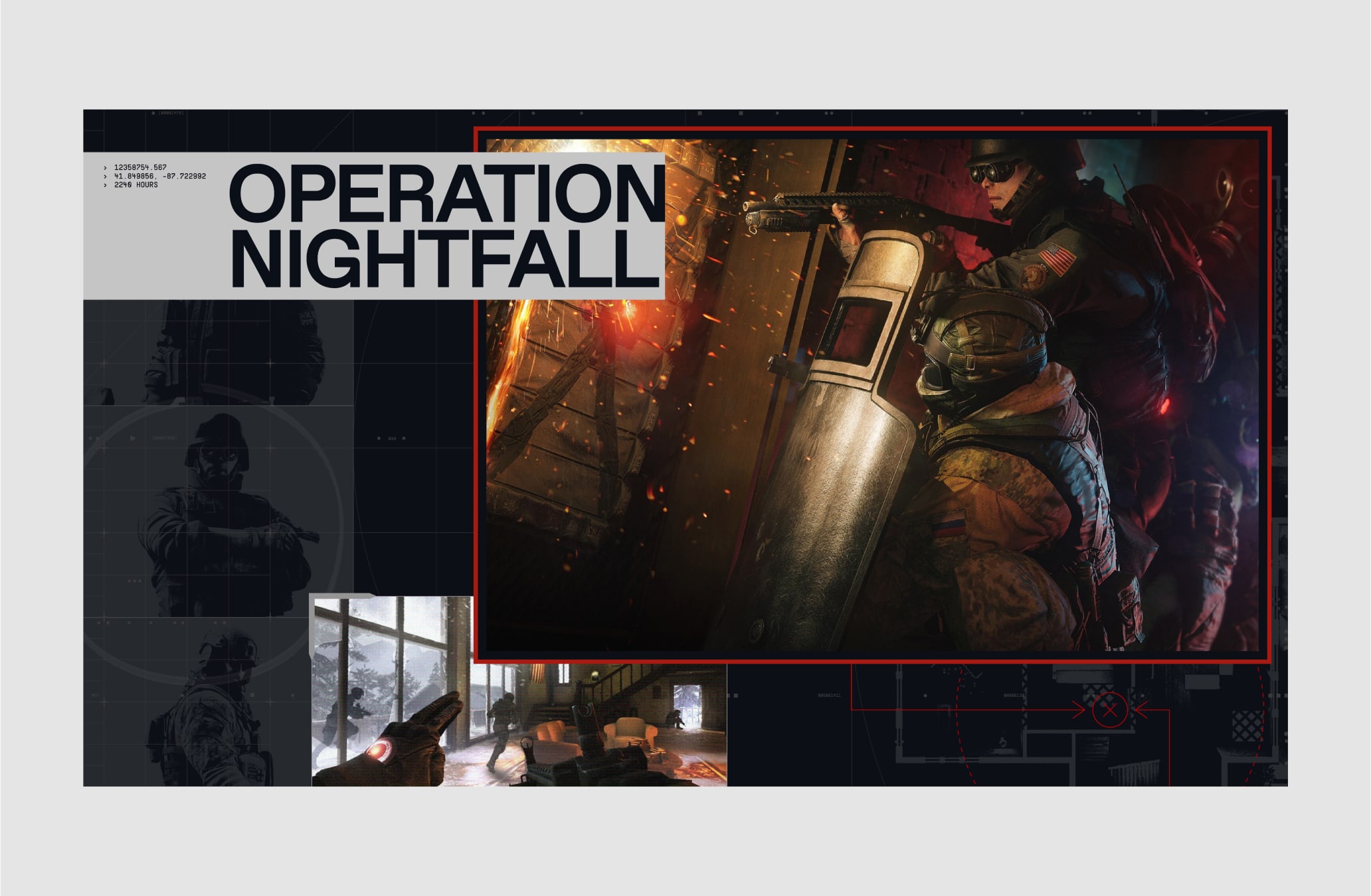
In these cases where layouts have a minimal amount of information to communicate, we can overlap elements at different sizes without overly obstructing the content.
Here for example, our key image is given the most amount of space formatted to draw your eye to this first with the headline and then the secondary image. There are three instances of elements overlapping, with the headline and the key and secondary image, to create a slight sense of depth.
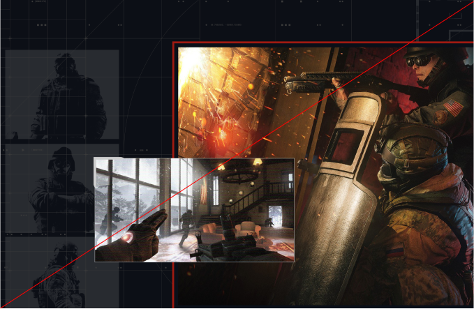
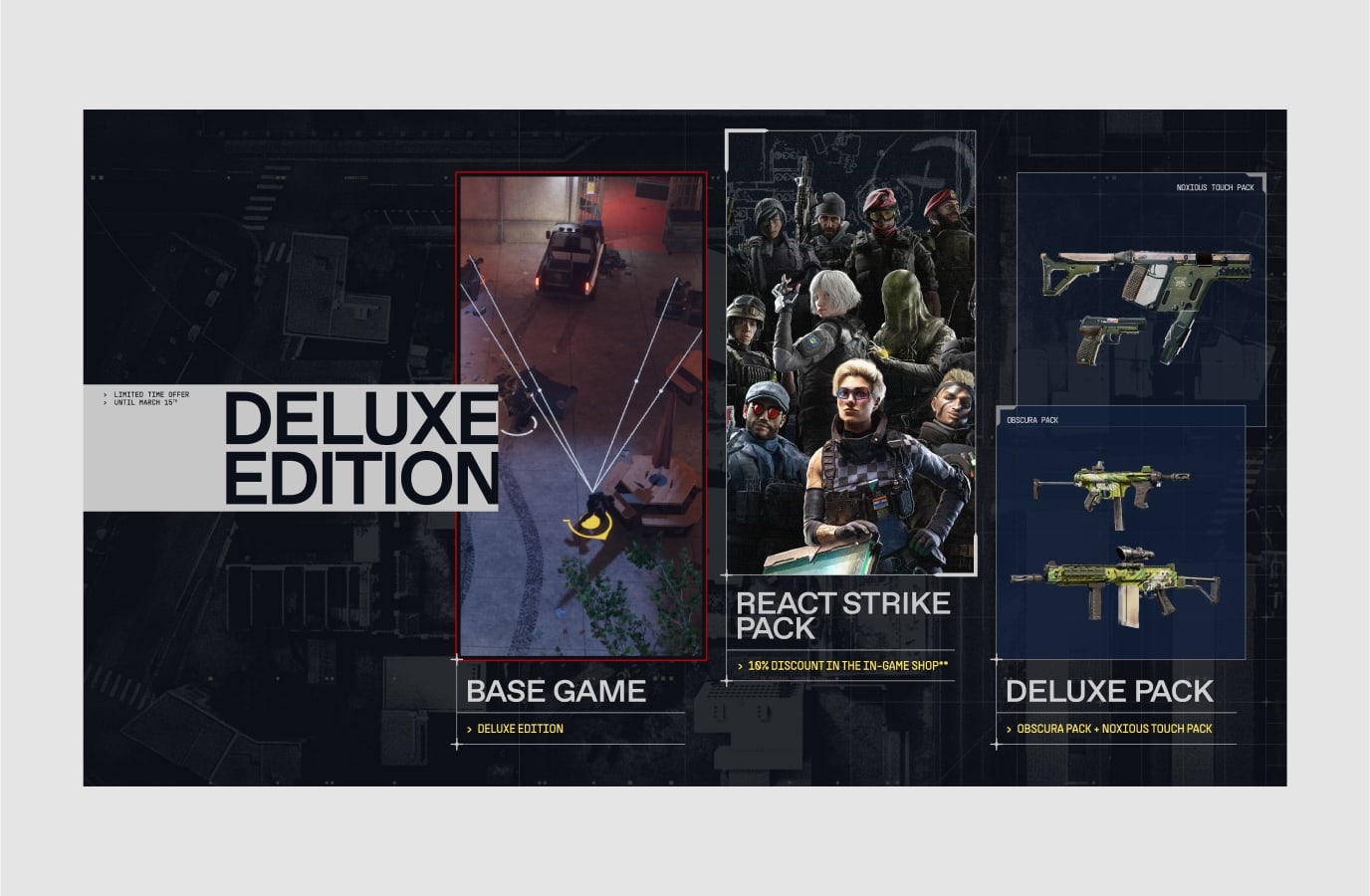
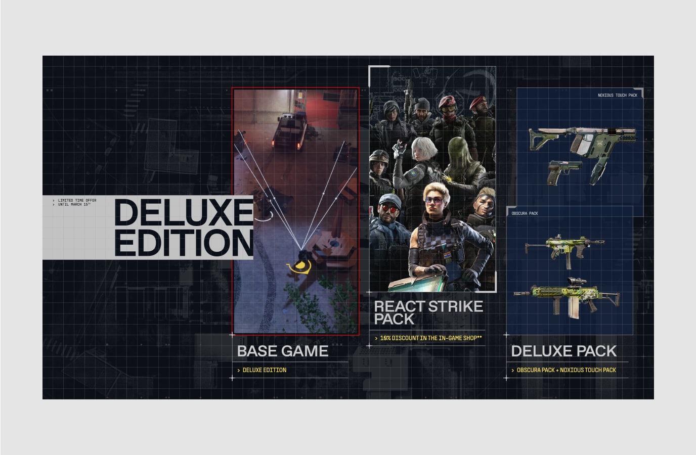
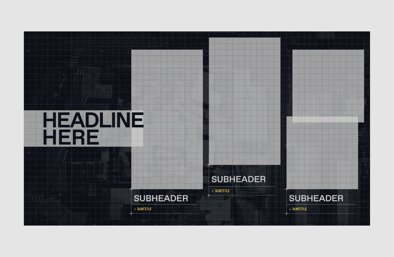
Here we breakdown this layout showing how to use the grid when we have multiple images paired with typography, each asset at the same level of hierarchy.
In these cases where layouts have a large amount of information to communicate, we avoid too many elements overlapping or at different sizes.
Here for example, each image uses the same amount of space and is formatted in the same style. There is only one instance of elements overlapping, with the headline and the first image, to create a slight sense of depth.
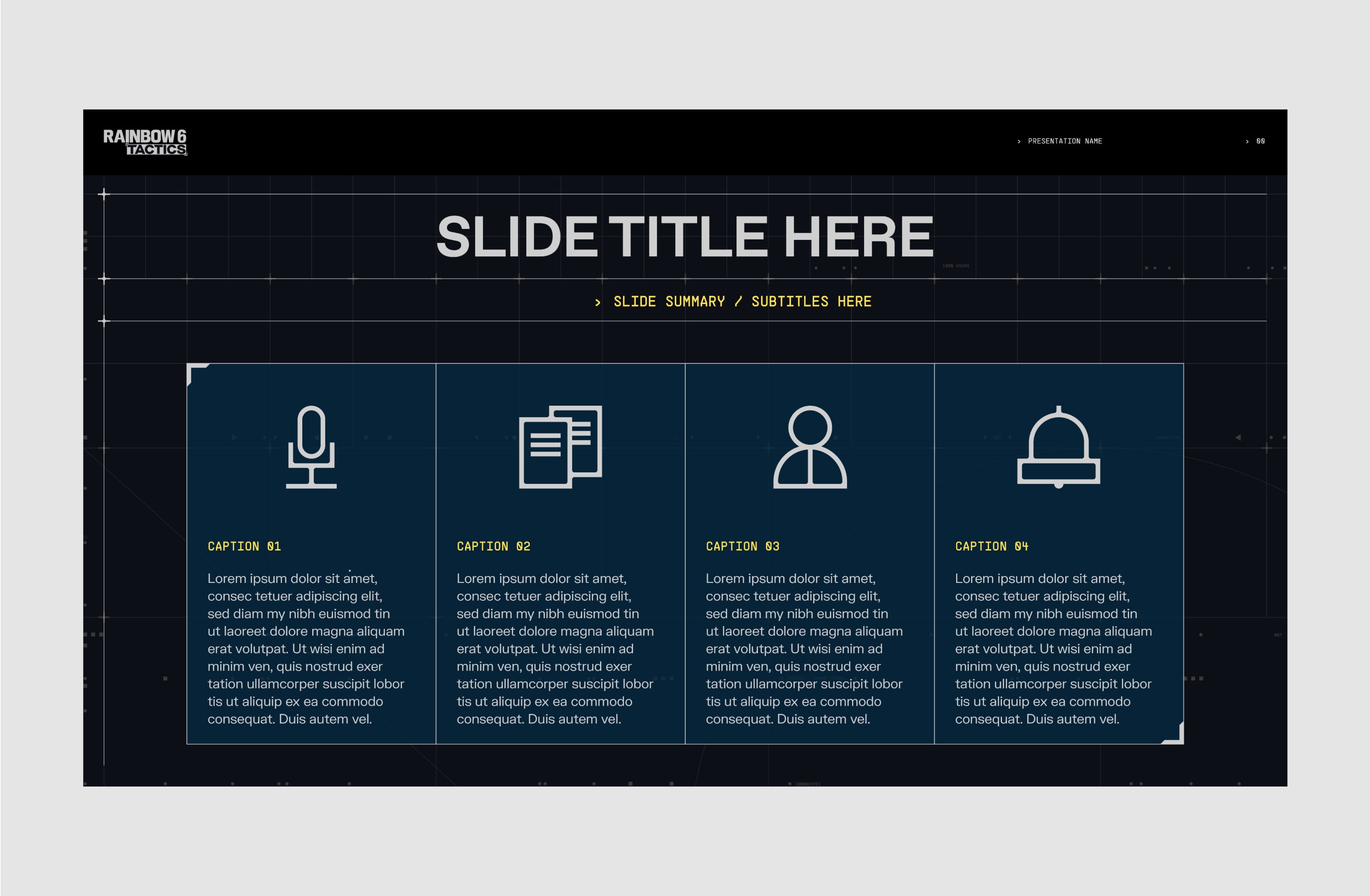
Here we breakdown this layout showing how to use the grid and columns in a simple typographic layout. Using the headline graphic device, typographic hierarchy is clearly establish. To learn more about this please refer to the Typography section.
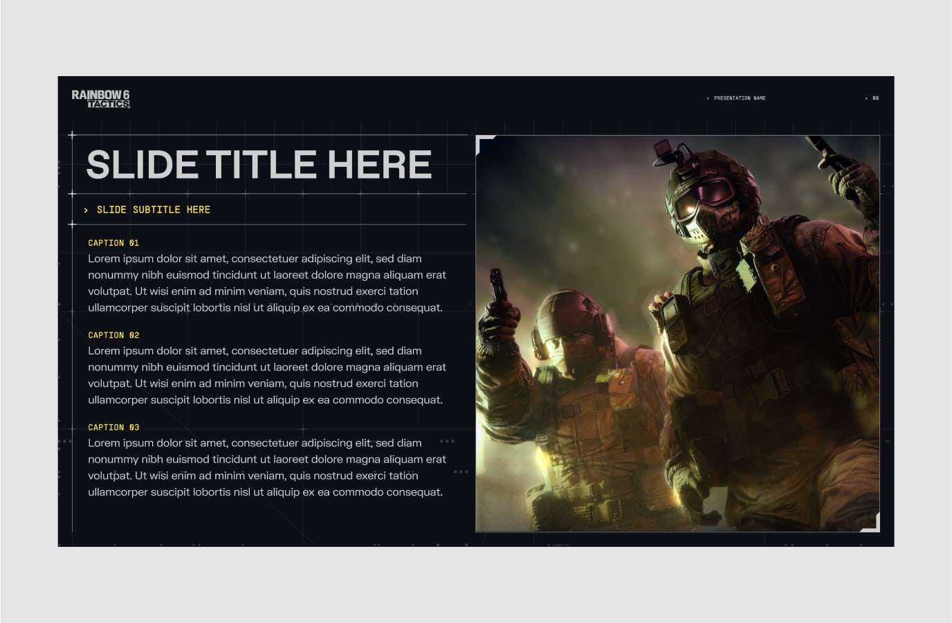
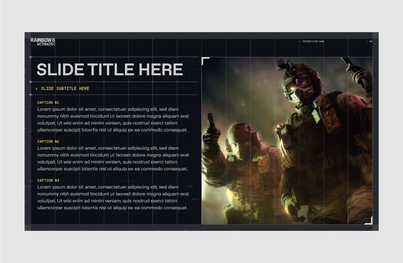
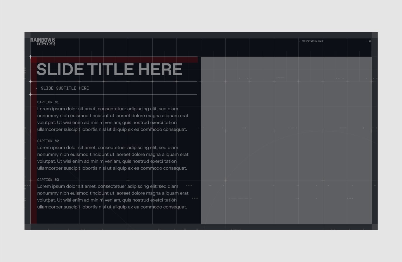
This layout demonstrates how to use the grid and columns in a complex typographic layout. Using the columns help create a balanced and consistent layout. Type can feature in modules to clearly separate and highlight information. The padding within these modules equal the margins of the layout.
To learn more about our Typography hierarchy and modules please refer to our Typography and Graphic Devices sections.
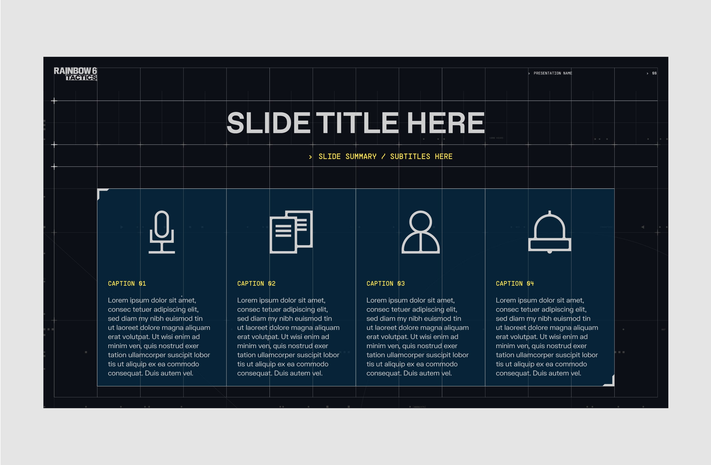
In specific use cases our digital grid can be dialled up to create a more expressive background. This would only ever be for use on simple layouts with minimal assets (e.g. logo key visuals)
In Dark Mode:
The grid lines, the crosshairs and the digital code go from using Tactics Grey (#3A3A3A) to using Tactics Silver (#959595). This allows them stand out more on the Navy background.
In Light Mode:
The grid lines, the crosshairs and the digital code go from using Tactics Grey (#3A3A3A) to using Tactics Silver (#959595). This allows them stand out more on the Navy background.
Digital code can be duplicated and added to the grid for more details.
Please visit our Downloads Centre to access all background assets for print and digital formats.
Make sure to follow this guidance to ensure our Layout system is used correctly in all formats and applications.