05
Our graphic devices emphasise the narrative created by our backgrounds of 6's control board, collecting files and information, planning and making decisions.
In this section we will see the different elements with out toolkit and how to use them together effectively.
Please refer to our Downloads Centre to access our Framing Devices and Handwritten Annotation assets.
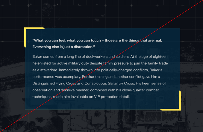
Our Framing Devices, inspired by digital files, are used to highlight our Art Direction and Type modules.
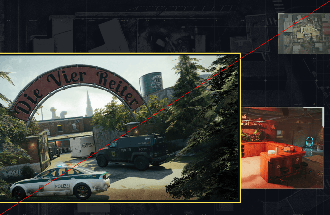
We have the option of two primary frames to highlight key images, two secondary frames for secondary imagery and two tertiary frames for supporting images. These can be used in different colours for Hierarchy. Please refer to the Colour Usage section for more information.
Please refer to our Downloads Centre to access our Framing Devices.
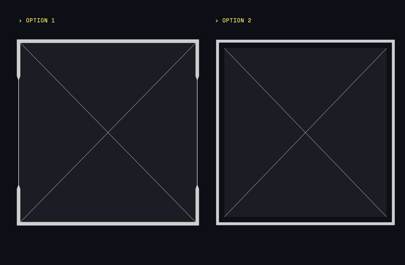
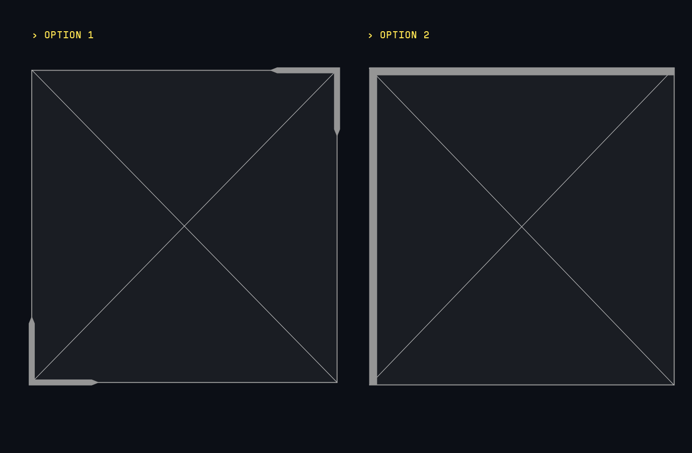
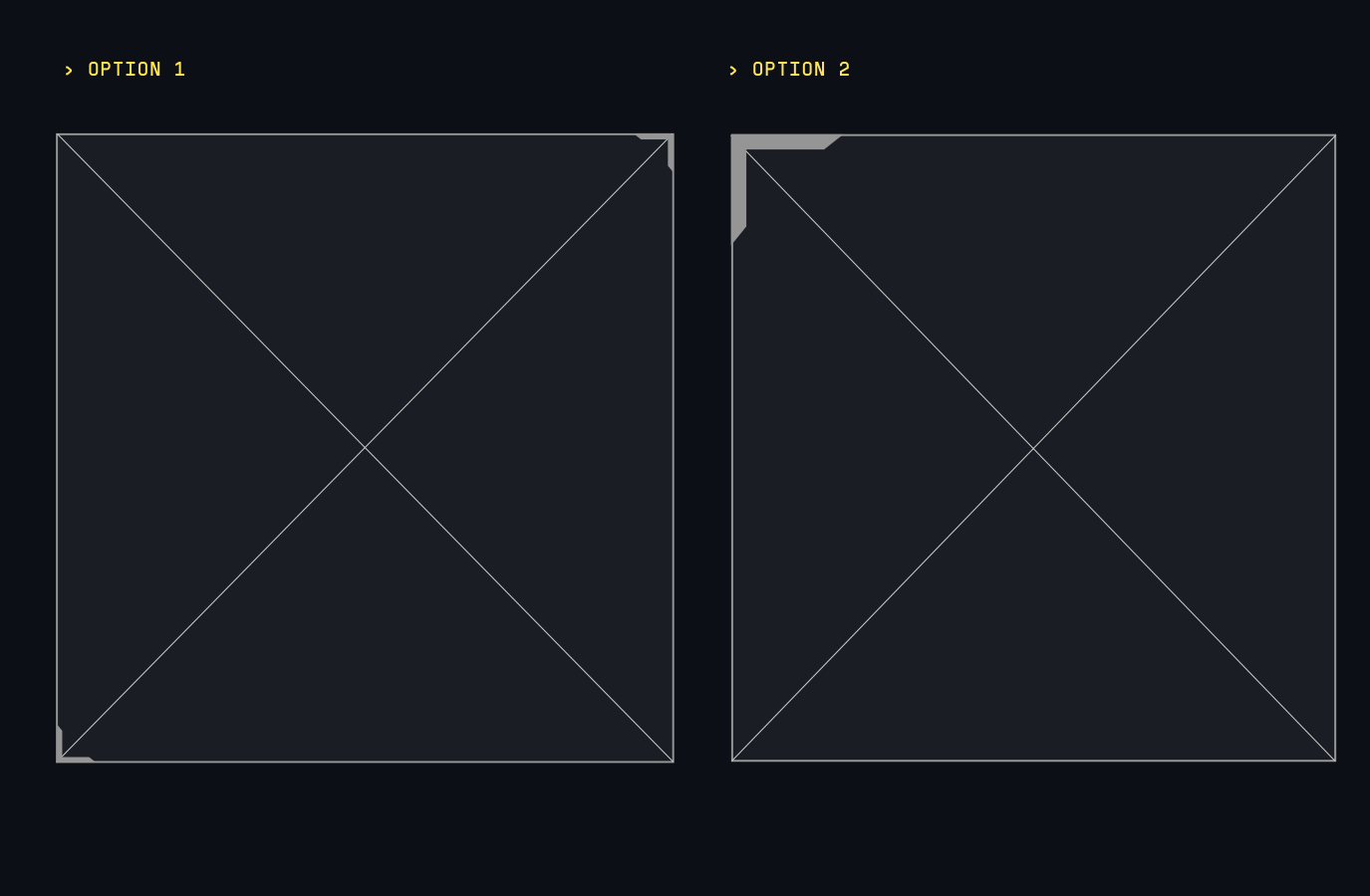
Our Framing Devices are used to frame our Art Direction or Type modules, adding a layer of technical detail to our layouts.
They help establish a hierarchy between multiple images, bring depths and contrast to our layouts, as well as helping typography stand out on our backgrounds.
Refer to the Layout section for more detail on how the frames are used with the grid.
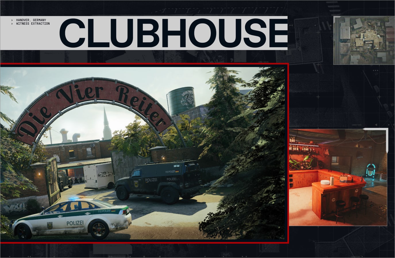
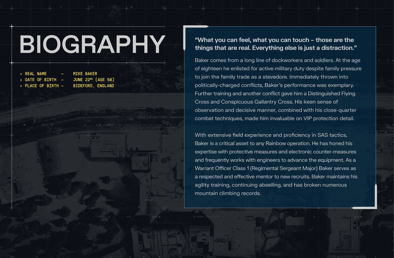
In addition to the framing hierarchy established previously, sizing and colour can be used to clearly communicate primary assets.
Primary images use Tactics Red frames to stand out, while secondary and supporting images use Tactics Silver or Off-White in Dark Mode, and Blue, Navy, Grey or Silver in Light Mode.
For more information on Colour, please refer to the Colour section.
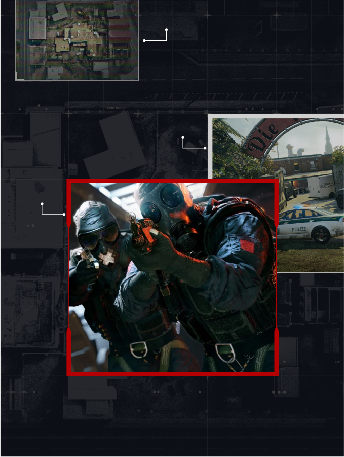
Primary imagery uses one of the two primary frames, in our Red highlight
Secondary imagery uses one of the two secondary frames, in Silver or Off-white.
Supporting imagery uses one of the two tertiary frames, in Silver or Off-white.
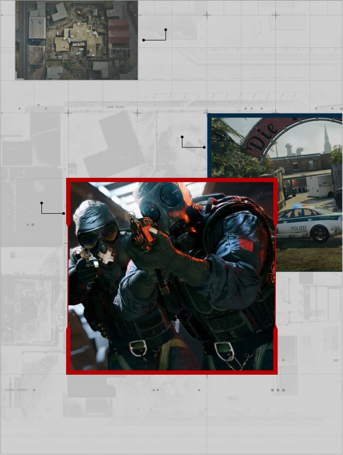
Primary imagery uses one of the two primary frames, in our Red highlight.
Secondary imagery uses one of the two secondary frames, in Blue, Navy or Silver.
Supporting imagery uses one of the two tertiary frames, in Silver or Grey.
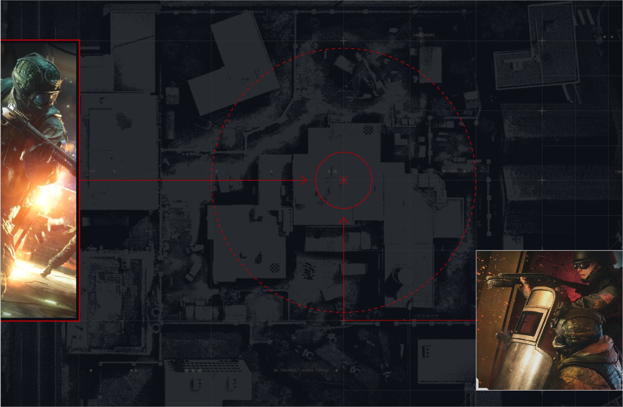
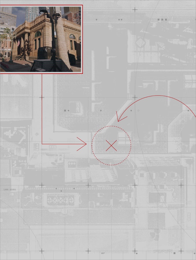
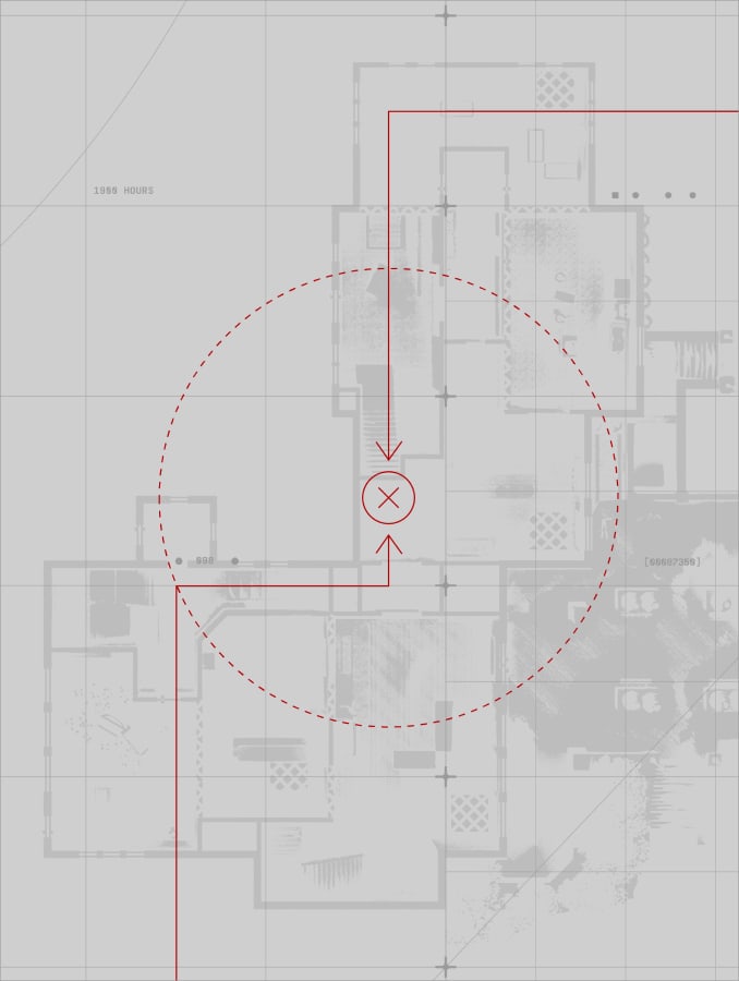
Vector annotations add a nice level of secondary detail and storytelling to our layouts, illustrating the precise planning and decision making behind the operations. We use them to connect images to other images or our blue print textures.
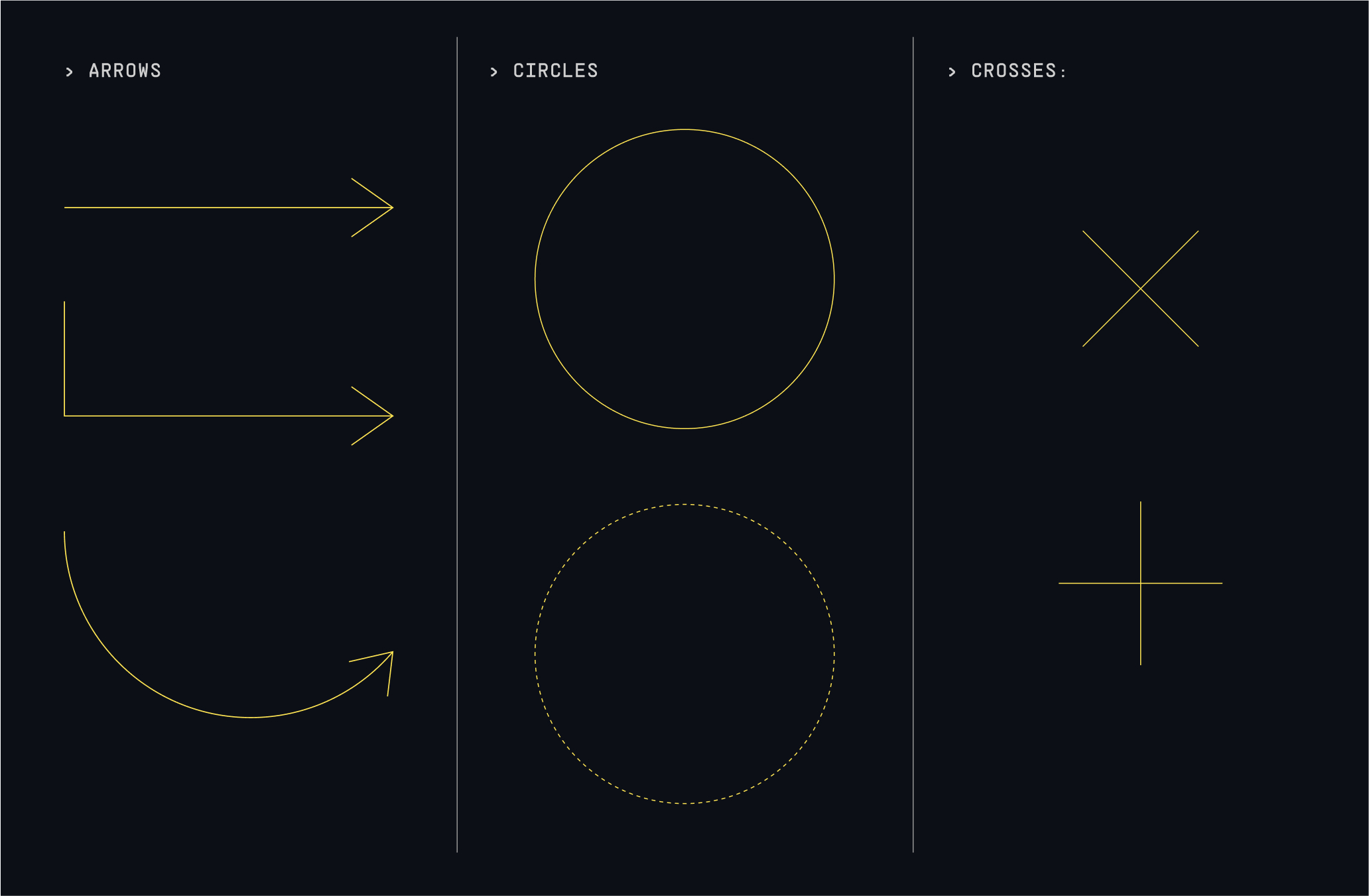
The toolkit of the Vector annotations is made up of simple and graphic vector arrows, circles and crosses which can be drawn using all Adobe software. The line weight is 1.25pt and can be dashed occasionally when differentiation is needed.
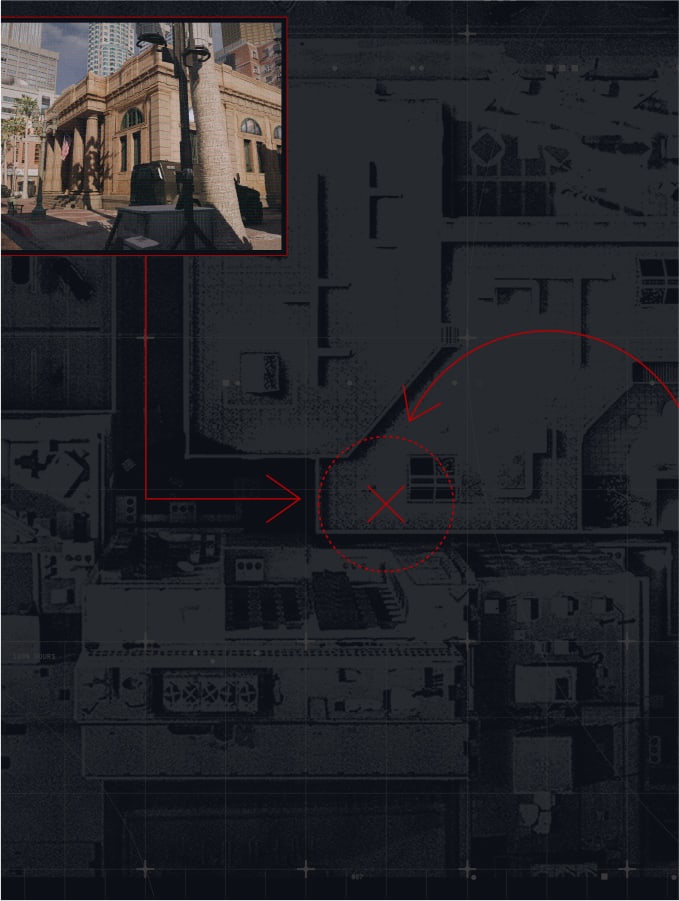
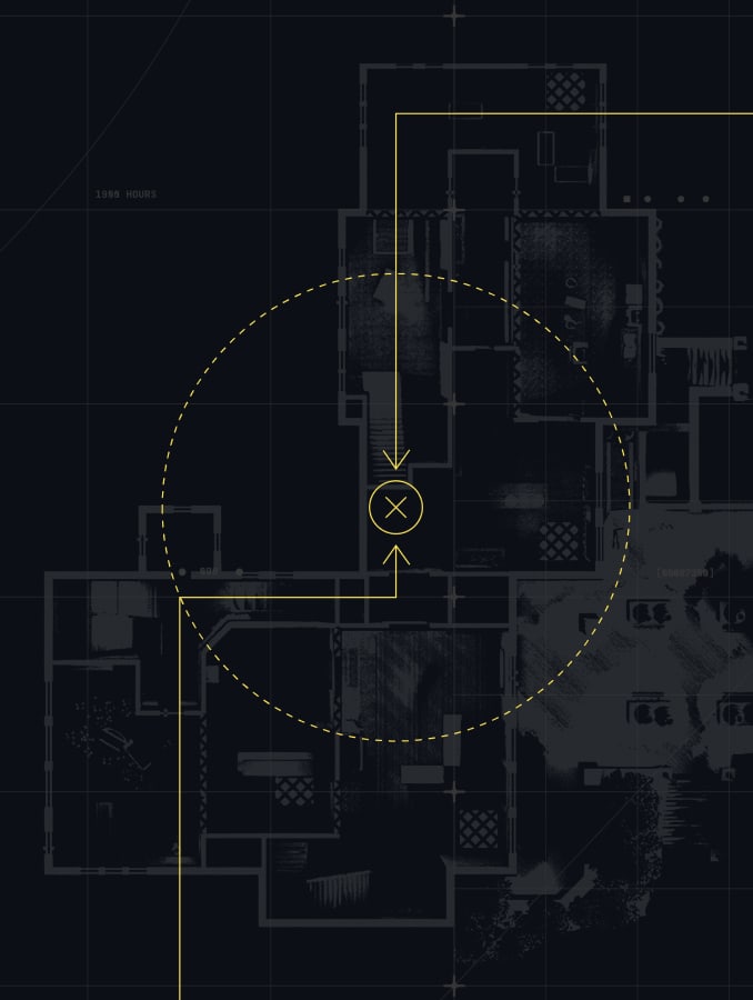
Our Vector annotations are used on top of the grid, as overlays for blueprints of maps. They can illustrate directions given, mapping out instructions, a point of interest in the map, etc. They can also connect to frames, creating a link and a narrative between the textures and the art direction.
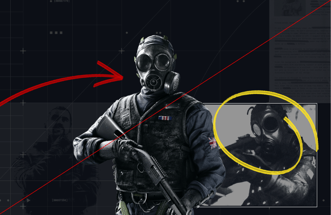
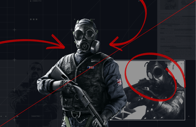
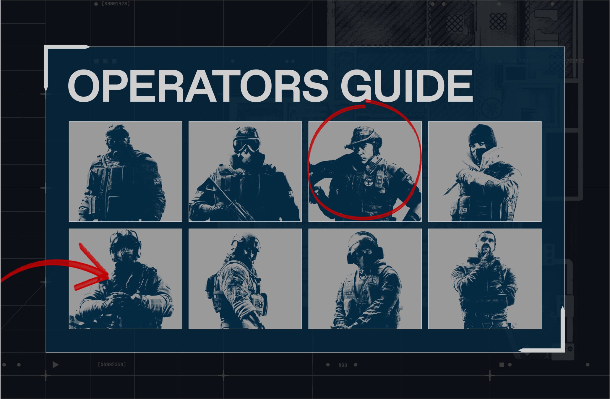
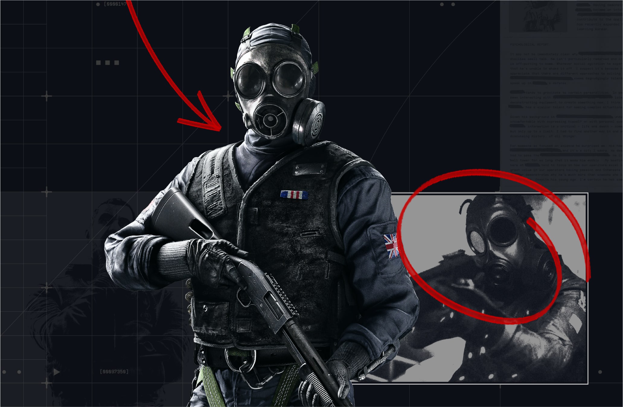
Handwritten annotations add an extra level of detail and storytelling to our layouts. They illustrate someone working through all of the information collected and making decisions. The handwritten style feels energetic and quick, hinting at the tension and pressure behind the operations.
Please refer to our Downloads Centre to access our Handwritten annotations and Brush.
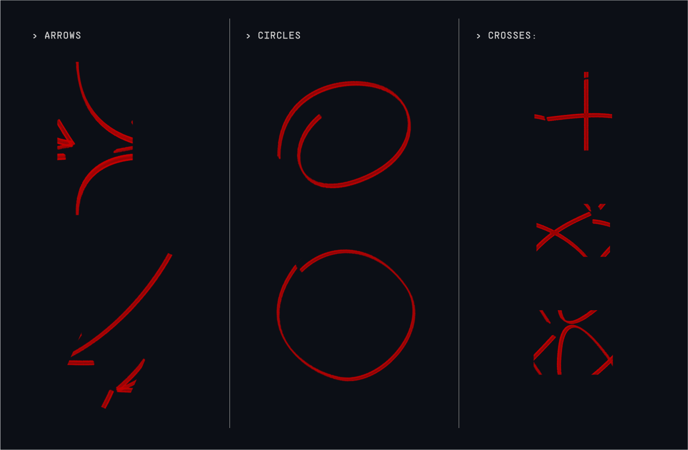
The toolkit of the Handwritten annotations consists of energetic arrows, circles and crosses.
Here is the detailed breakdown to create additional assets:
Brush:
R6_Tactics_Brush.abr
Size: 18
Brush settings:
Shape Dynamics - Size Jitter: 100%
Control: Fade (25)
Minimum Diameter: 100%
Angle Jitter : 5%
Control: Initial Direction (25)
Please refer to our Downloads Centre to access our Handwritten annotations and Brush.
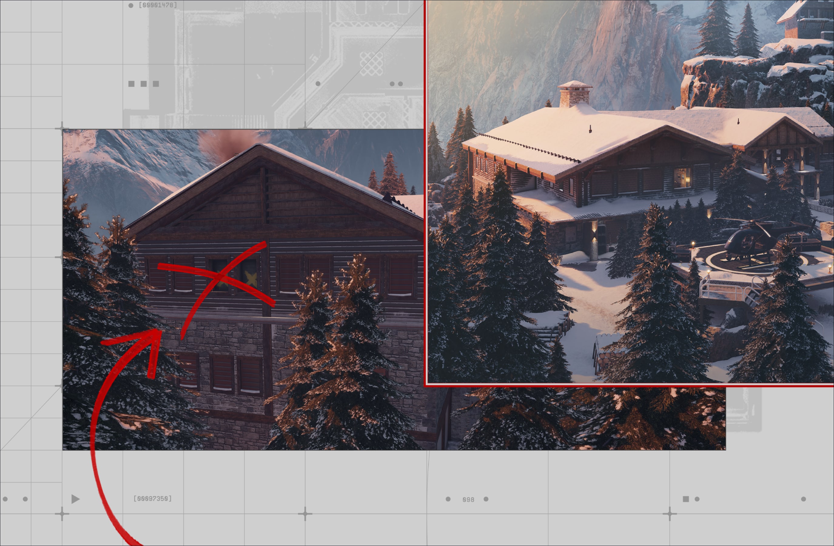
Our Handwritten annotations are used on top of our art direction, to add an extra level of detail and storytelling to our layouts. They highlight details within an image or illustrate a decision being made.
We use a maximum of two handwritten annotations per layout. Any more than this becomes crowded and unclear in how to use them.
Make sure to follow this guidance to ensure our Graphic Devices are used correctly in all formats and applications.