01
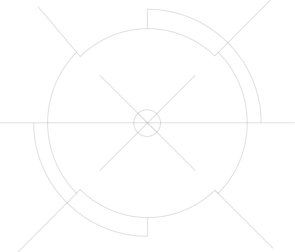
Our logo system not only embodies our brand heritage but also commands attention with its impactful design. The 6 Emblem uniquely incorporates a bullet into its form, while our Wordmark represents an evolution from our previous marque.
In this section we will showcase our different logos and how to use them.
Please visit our Downloads Centre to access all logo assets.
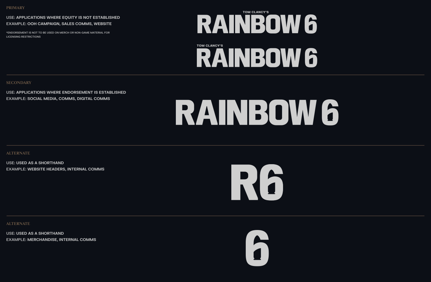
Our logo suite comprises of the Wordmark with and without Endorsement, the R6 and the emblem, offering versatility throughout our brand ecosystem.
Please visit our Downloads Centre to access all logo assets.
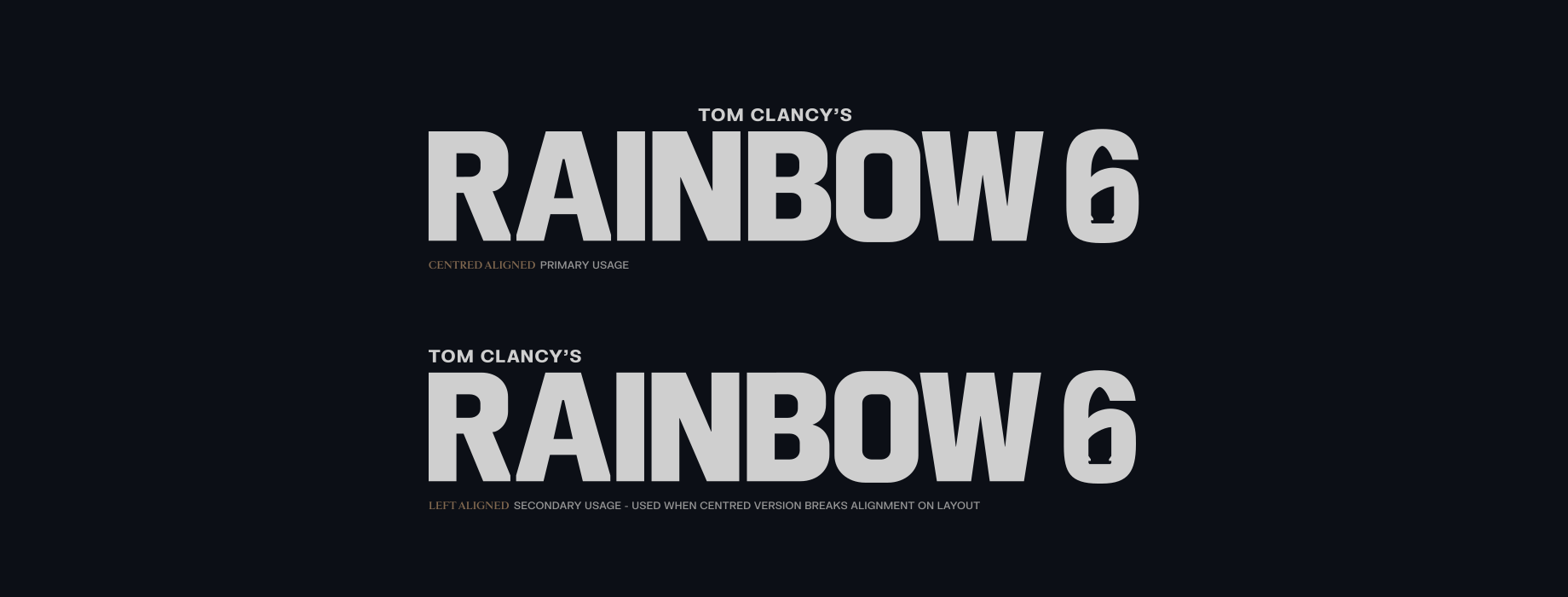

Make sure to follow this Hierarchy guidance so that the correct lockup is being used in applications. This will make sure our brand identity is cohesive and consistent.
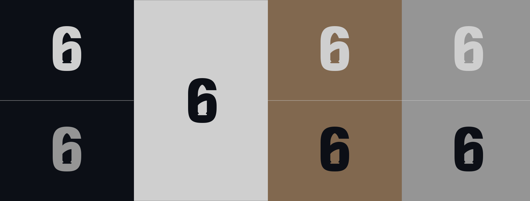
For the majority of applications we should use R6 Navy or Off-White for our logo usage. For secondary usage and digital application we use R6 Silver. When colour is not available, we should use a Black or White.
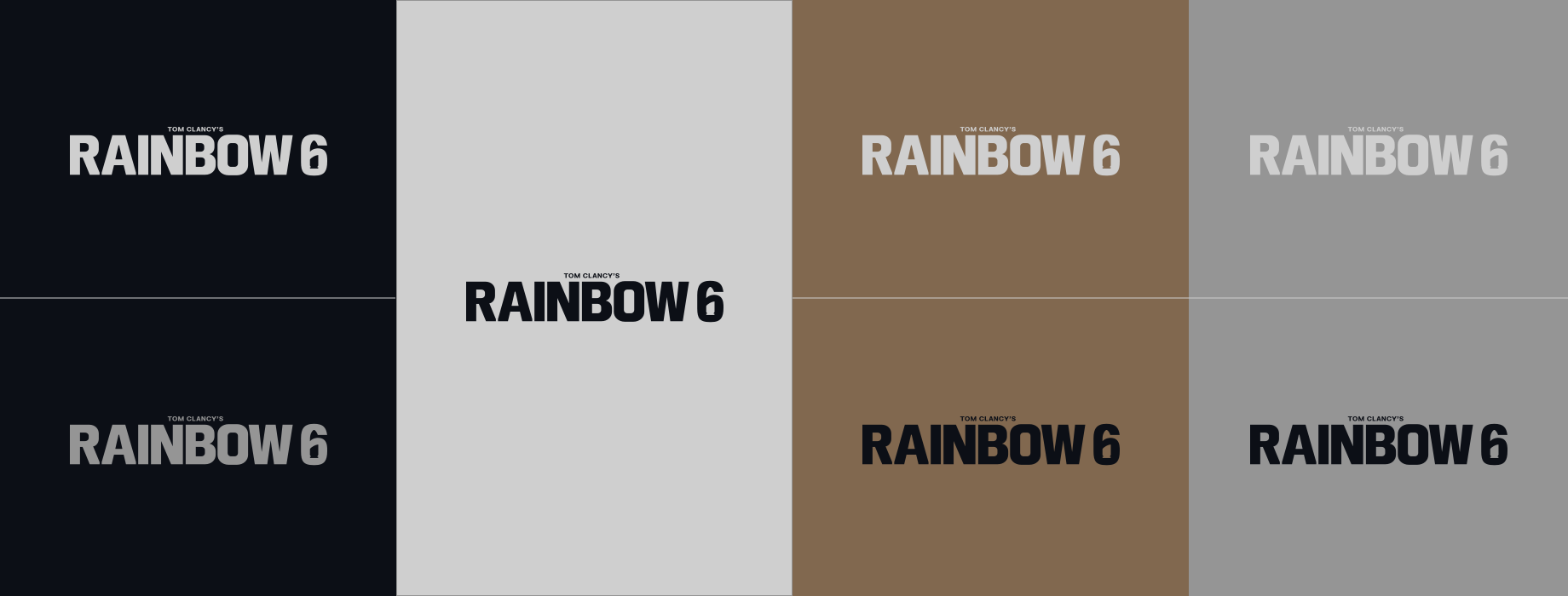
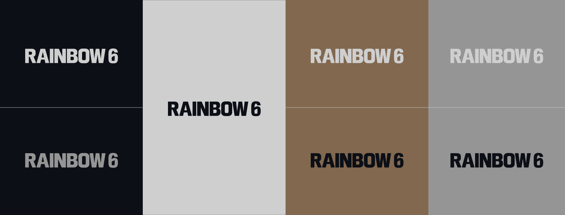
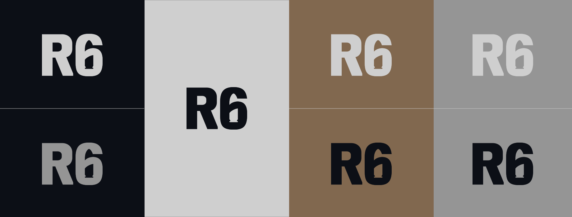
Please maintain a minimum clear space around our lockups. This ensures the logo remains visually distinct and unobstructed, enhancing its legibility and impact in all applications.
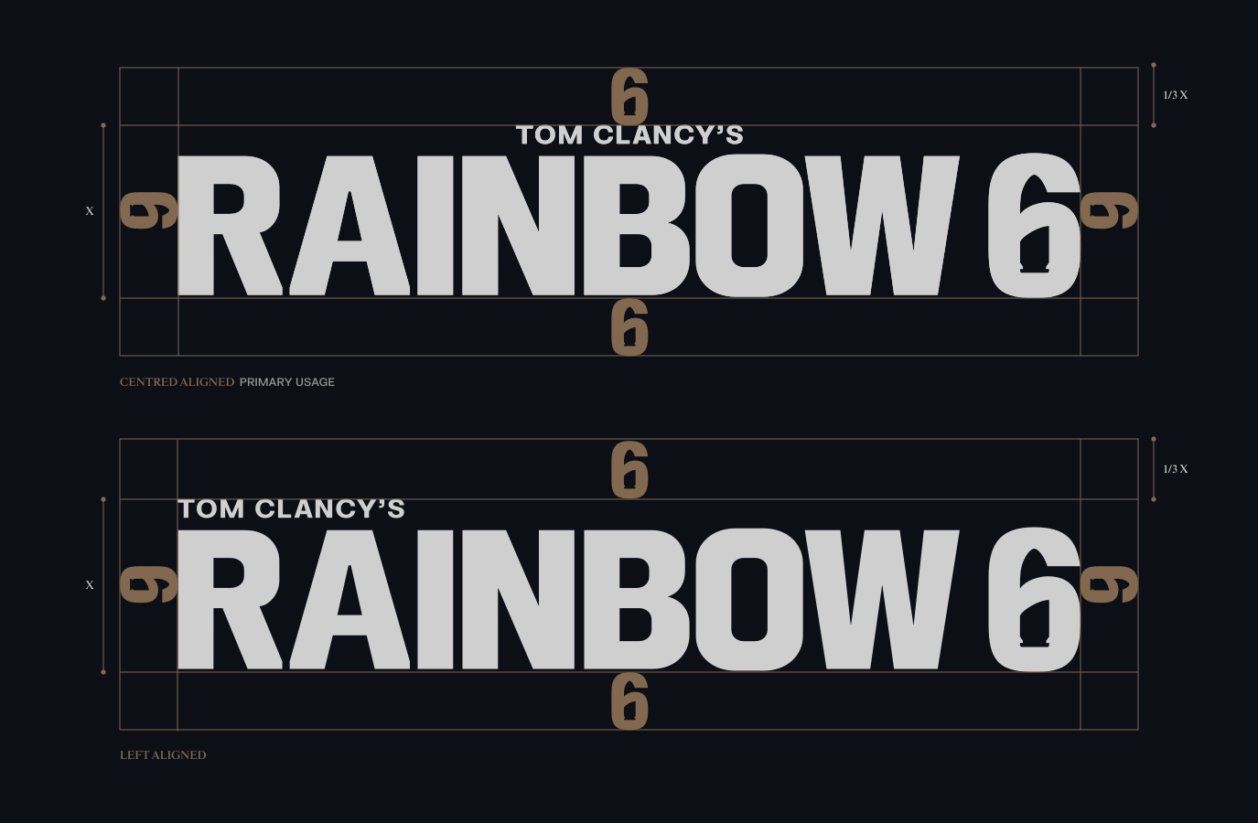
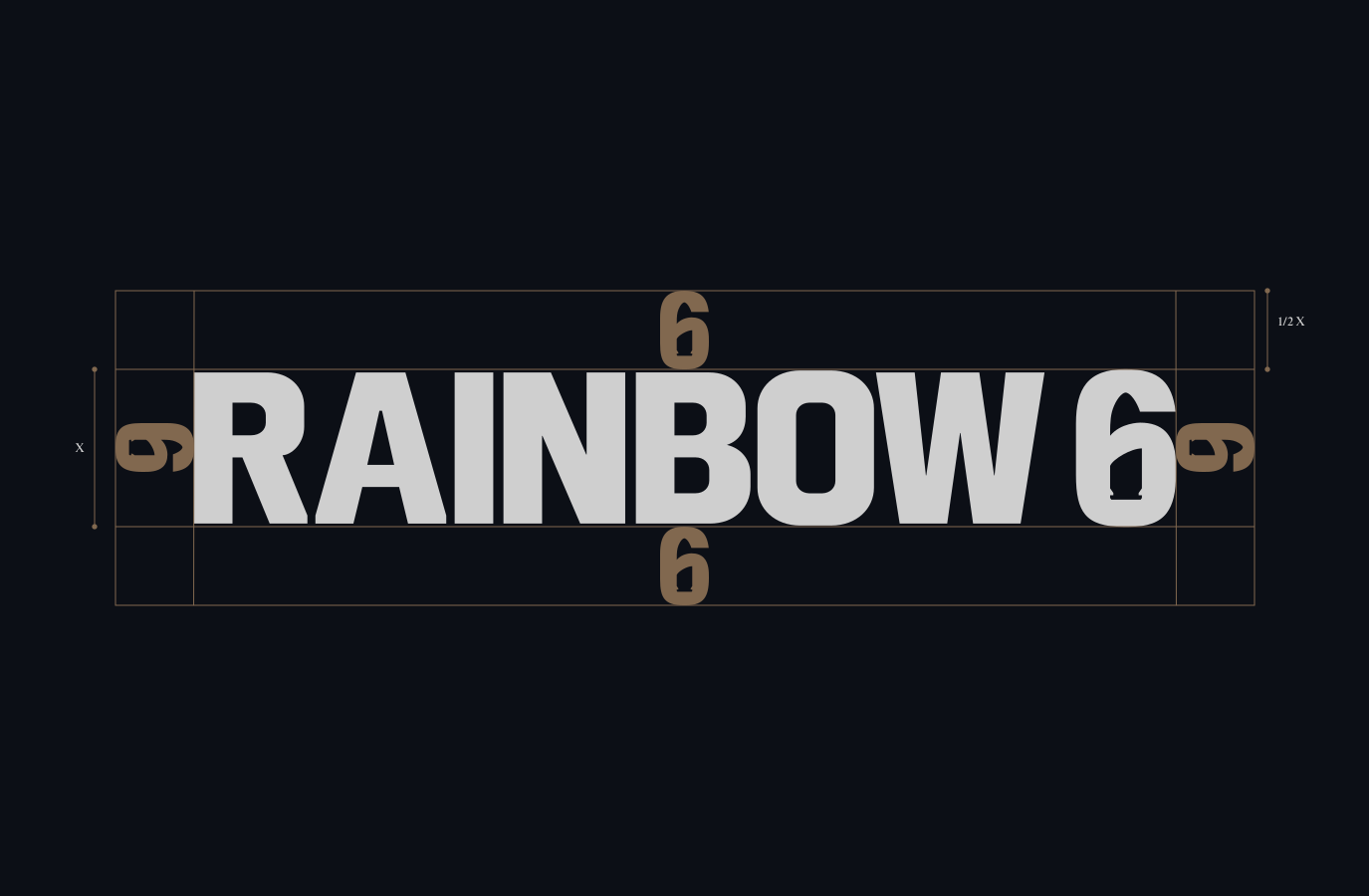
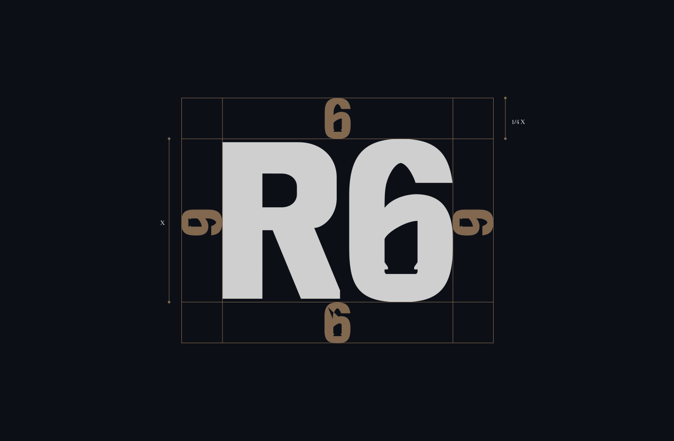
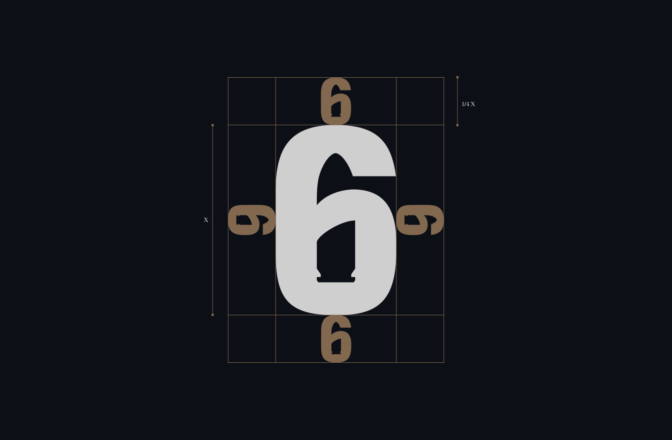
Please maintain a minimum clear space around our lockups. This ensures the logo remains visually distinct and unobstructed, enhancing its legibility and impact in all applications.
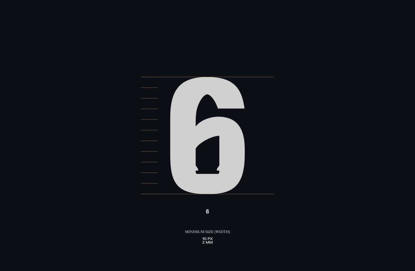
This minimum size requirement maintains legibility and preserves the integrity of the lockup’s design.
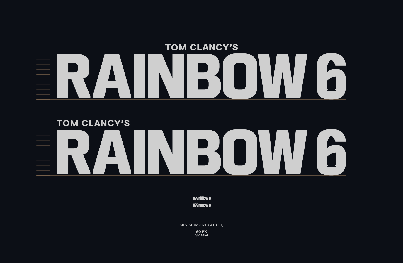
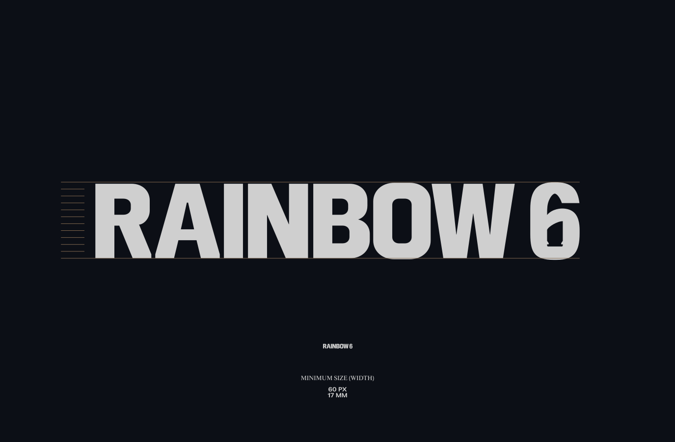
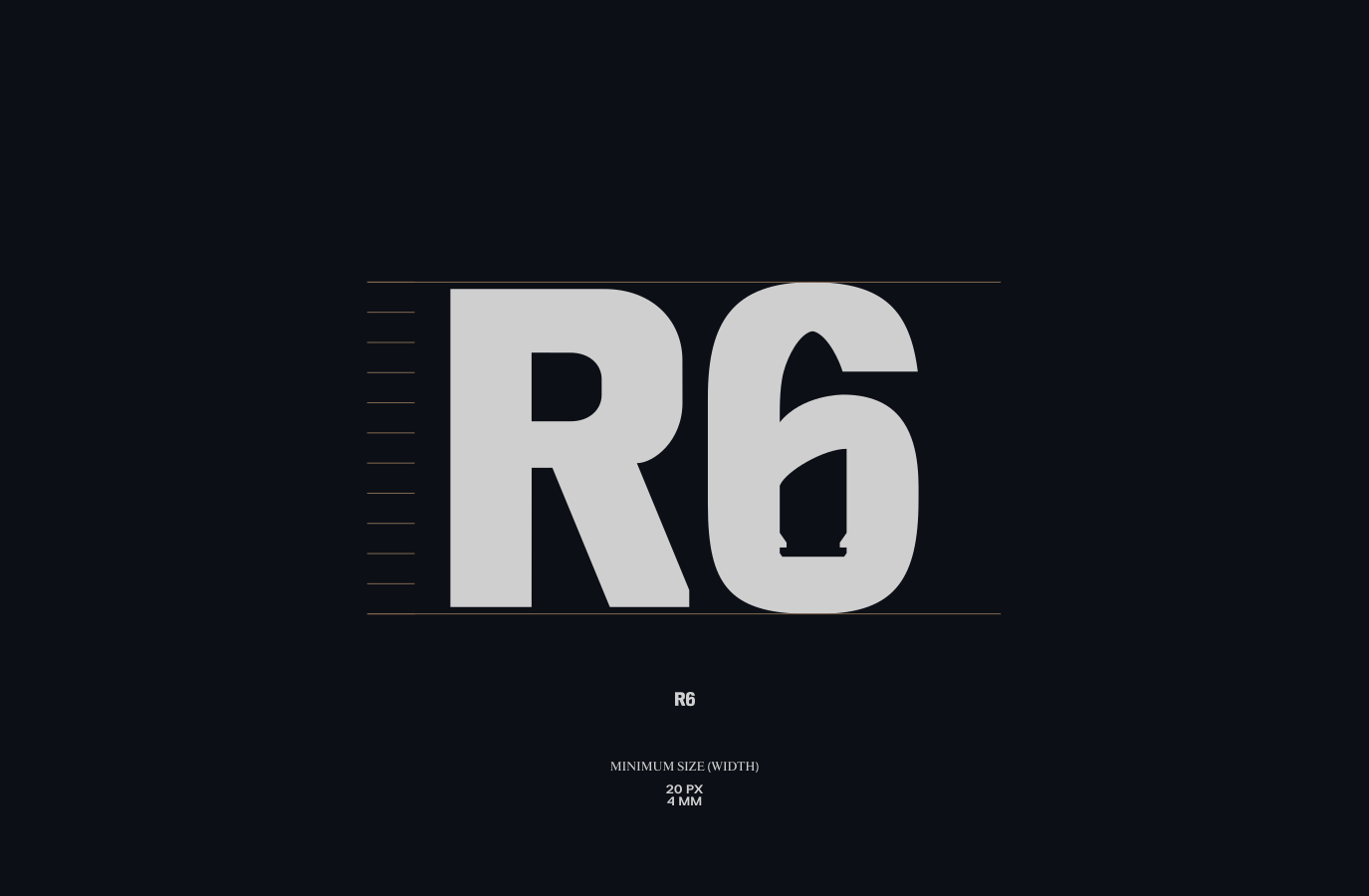
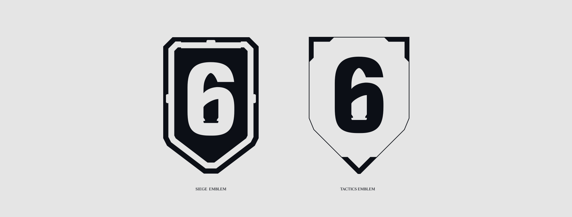
We also have game versions of our 6 Emblem. These holding devices are inspired by the visual identity of the game. When creating new emblems make sure they feature appropriate design details.
Please maintain a minimum clear space around our lockups. This ensures the logo remains visually distinct and unobstructed, enhancing its legibility and impact in all applications.
This minimum size requirement maintains legibility and preserves the integrity of the lockup’s design.
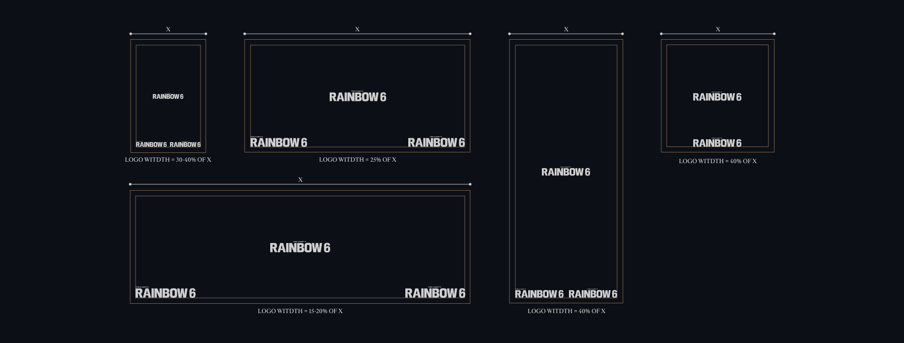
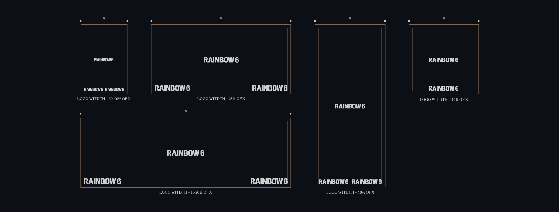
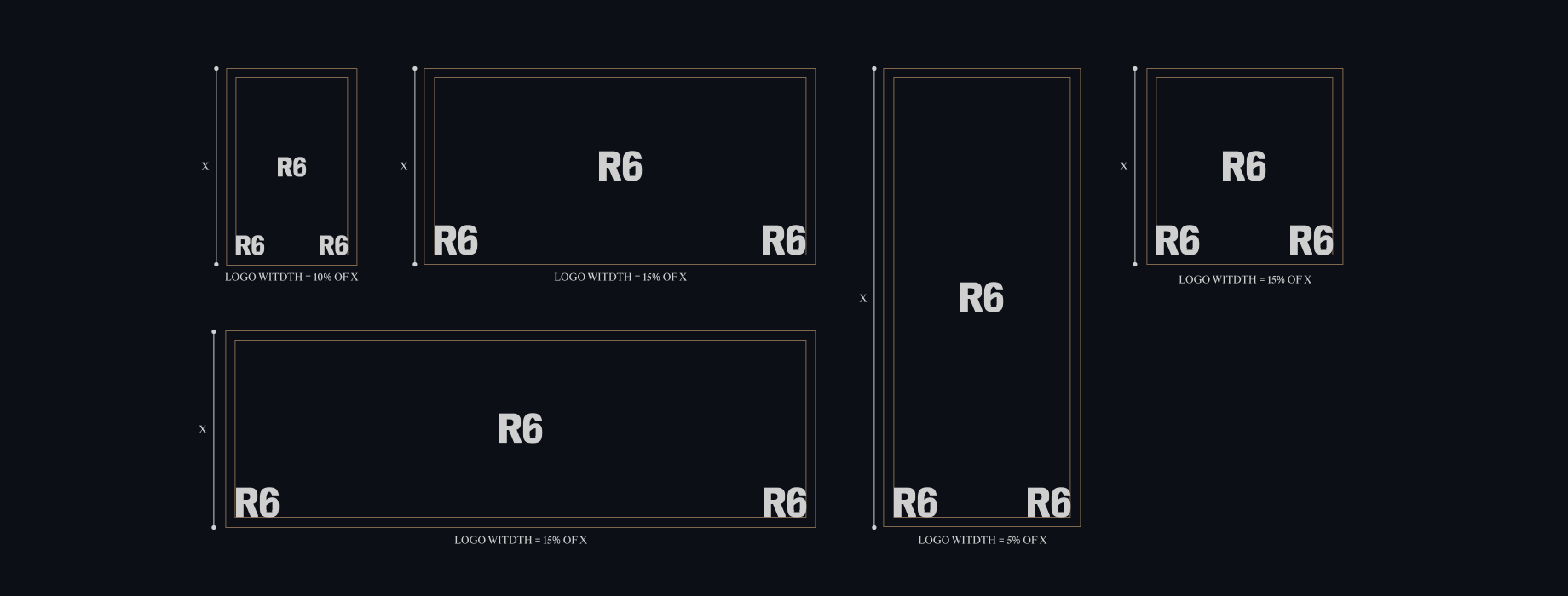
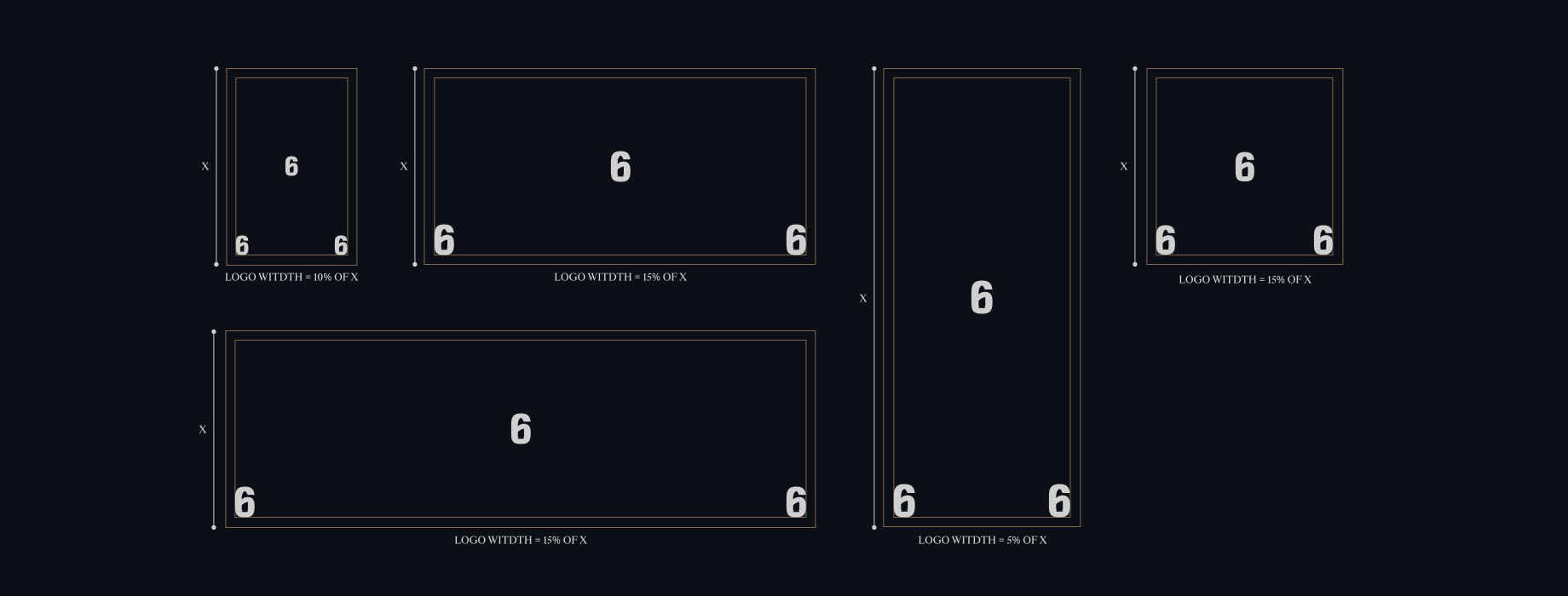
Refer to this guidance for creating Game Lockups.
When prioritising the title over the Franchise, Rainbow Six should occupy 25-30% of the title width.
Conversely, when emphasising the Franchise over the game title, the title should span 70% of the width of Rainbow Six.
We will always use the colour palette of the game to inform the colour of the Rainbow Six wordmark and endorsements.
For Siege, we use Siege Grey for Rainbow Six. Siege Orange is used for the game title.
Within Tactics we use R6 Off White for Rainbow Six, while keeping the title in it’s core colour.
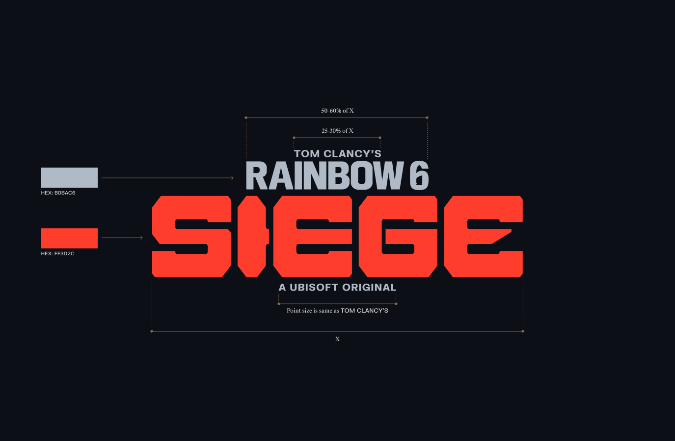
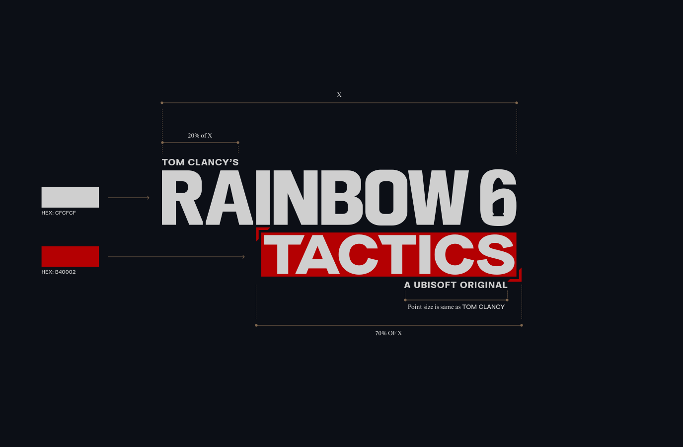
Refer to this guidance for creating Game Lockups.
When prioritising the title over the Franchise, Rainbow Six should occupy 25-30% of the title width.
Conversely, when emphasising the Franchise over the game title, the title should span 70% of the width of Rainbow Six.
We will always use the colour palette of the game to inform the colour of the Rainbow Six wordmark and endorsements.
For Siege, we use Siege Grey for Rainbow Six. Siege Orange is used for the game title.
Within Tactics we use R6 Off White for Rainbow Six, while keeping the title in it’s core colour.
Please visit our Downloads Centre to access all logo assets.
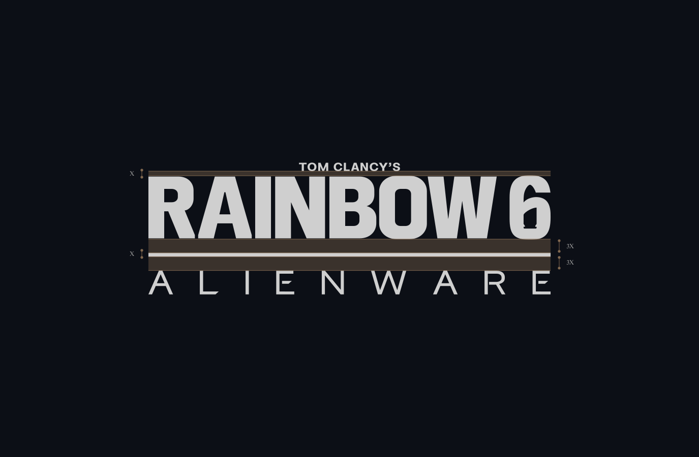
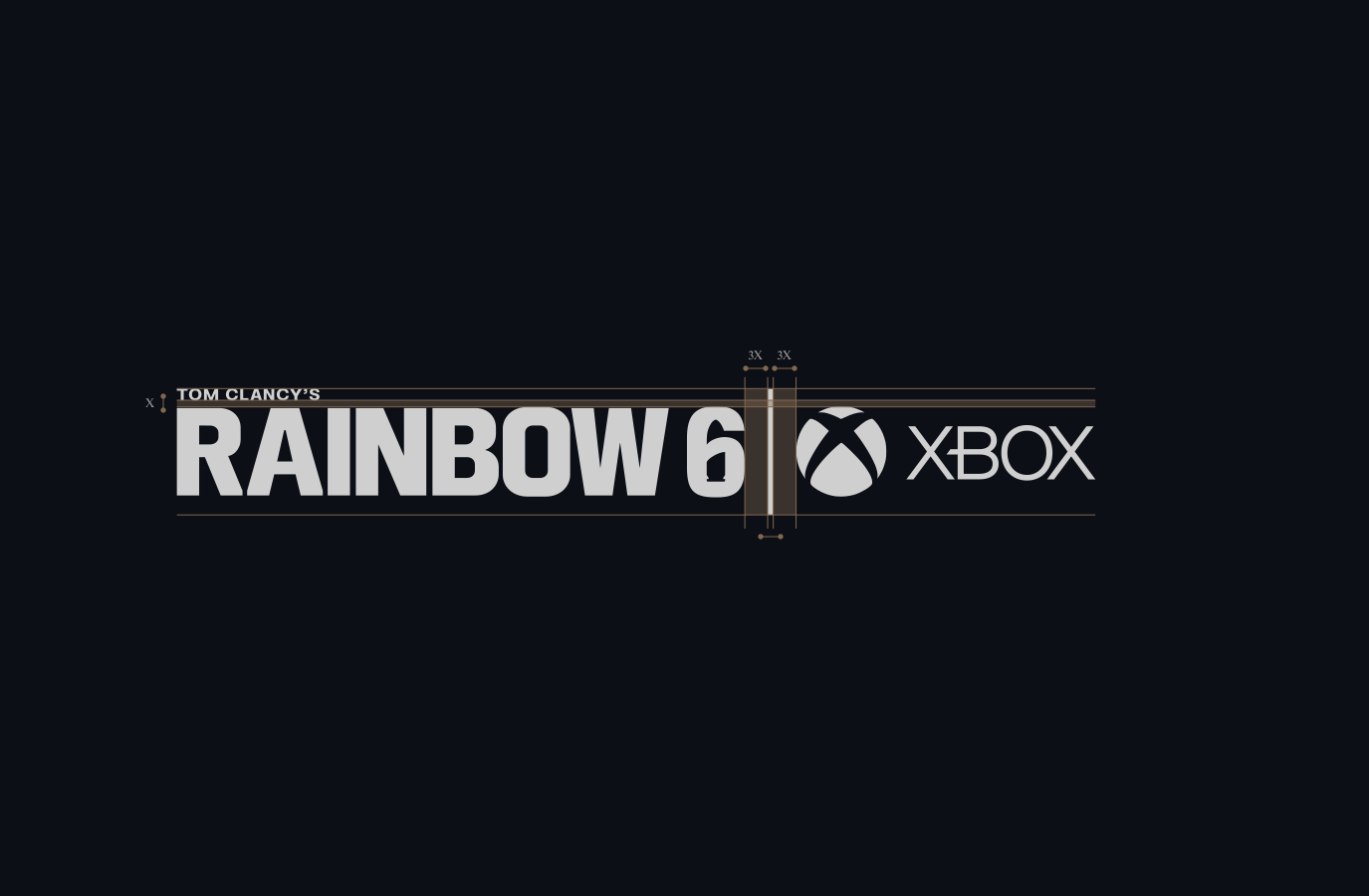

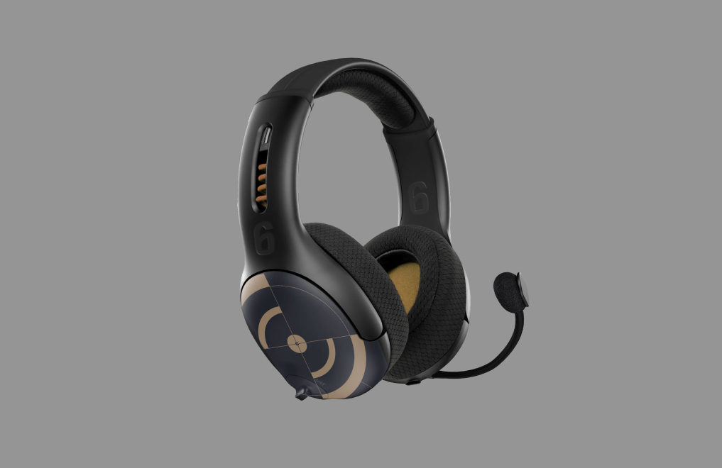
Headphones
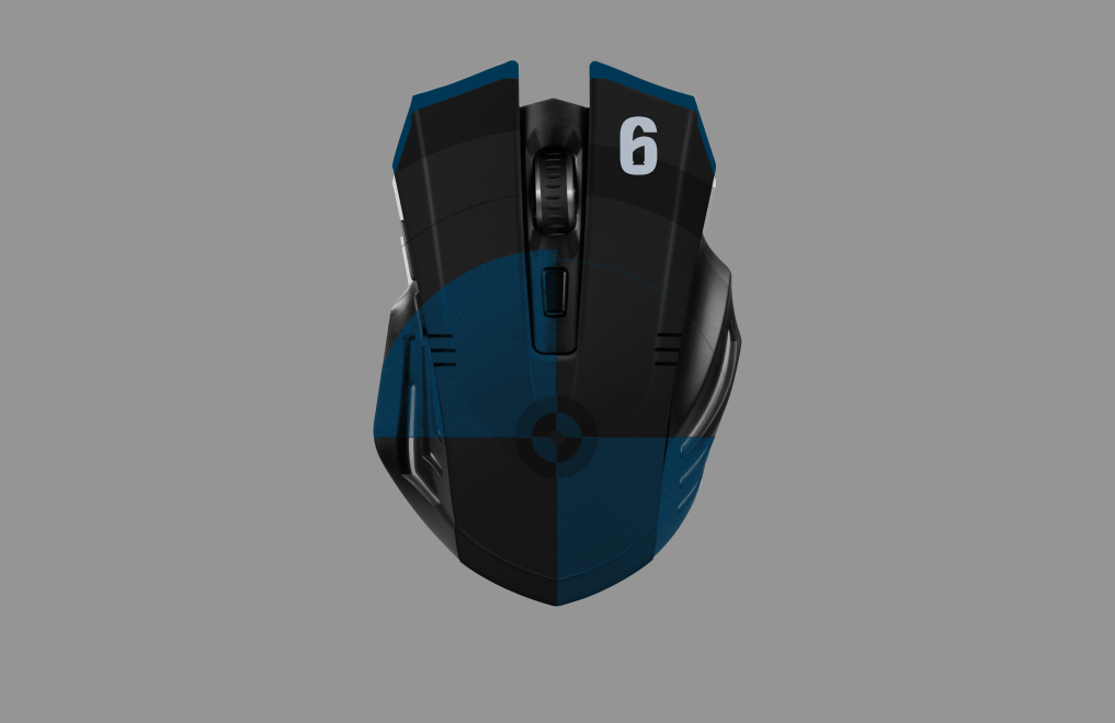
Mouse
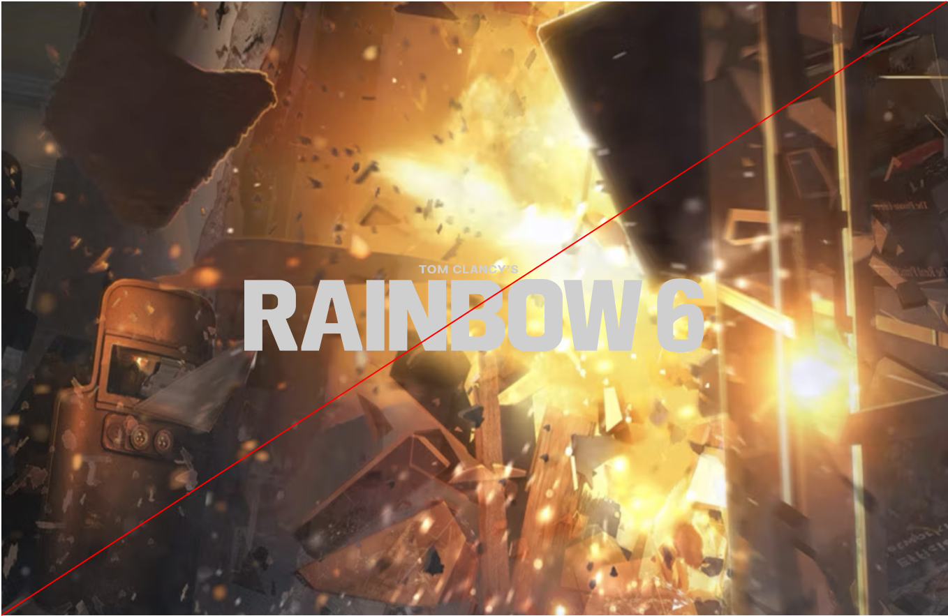
Make sure to follow this guidance to ensure our Logo system is used correctly in all formats and applications.

Social media
Refer to this guidance for creating Game Lockups.
When prioritising the title over the Franchise, Rainbow Six should occupy 25-30% of the title width.
Conversely, when emphasising the Franchise over the game title, the title should span 70% of the width of Rainbow Six.
We will always use the colour palette of the game to inform the colour of the Rainbow Six wordmark and endorsements.
For Siege, we use Siege Grey for Rainbow Six. Siege Orange is used for the game title.
Within Tactics we use R6 Off White for Rainbow Six, while keeping the title in it’s core colour.
Please visit our Downloads Centre to access all logo assets.