02

Our colour scheme is inspired by the honour and prestige of international counter terrorism units. It is a metallic palette that creates vivid contrast across physical and digital applications.
Please visit our Downloads Centre to access all colour assets.
R6 Navy
RGB : 12, 15, 22
HEX : 0C0F16
CMYK : 78, 65, 46, 81
PANTONE : 296C
R6 off white
RGB : 207, 207, 207
HEX : CFCFCF
CMYK : 0, 0, 0, 22
PANTONE : N/A
R6 Gold
RGB : 129, 104, 79
HEX : 81684F
CMYK : 36, 48, 62, 36
PANTONE : 10365C
R6 Silver
RGB : 149, 149, 149
HEX : 959595
CMYK : 0, 0, 0, 51
PANTONE : N/A
Our colour scheme is inspired by the honour and prestige of international counter terrorism units. It is a metallic palette that creates vivid contrast across physical and digital applications.
Please visit our Downloads Centre to access all colour assets.
R6 Navy
RGB : 12, 15, 22
HEX : 0C0F16
60%
RGB : 110, 111, 116
HEX : 6E6F74
20%
RGB : 207, 207, 209
HEX : CFCFD1
R6 Gold
RGB : 129, 104, 79
HEX : 81684F
CMYK : 36, 48, 62, 36
PANTONE : 10365C
60%
RGB : 179, 164, 149
HEX : B3A495
20%
RGB : 230, 225, 220
HEX : E6E1DC
R6 Silver
RGB : 149, 149, 149
HEX : 959595
CMYK : 0, 0, 0, 51
PANTONE : N/A
60%
RGB : 191, 191, 191
HEX : BFBFBF
20%
RGB : 234, 234, 234
HEX : EAEAEA
Our colour scheme is inspired by the honour and prestige of international counter terrorism units. It is a metallic palette that creates vivid contrast across physical and digital applications.
Please visit our Downloads Centre to access all colour assets.
R6 Navy
RGB : 12, 15, 22
HEX : 0C0F16
CMYK : 78, 65, 46, 81
PANTONE : 296C
R6 off white
RGB : 207, 207, 207
HEX : CFCFCF
CMYK : 0, 0, 0, 22
PANTONE : N/A
R6 Gold
RGB : 129, 104, 79
HEX : 81684F
CMYK : 36, 48, 62, 36
PANTONE : 10365C
Siege Orange
RGB : 255, 61, 44
HEX : FF3D2C
CMYK : 0, 90, 79, 0
PANTONE : 3556C
R6 Silver
RGB : 149, 149, 149
HEX : 959595
CMYK : 0, 0, 0, 51
PANTONE : N/A
R6 Navy
RGB : 12, 15, 22
HEX : 0C0F16
CMYK : 78, 65, 46, 81
PANTONE : 296C
R6 off white
RGB : 207, 207, 207
HEX : CFCFCF
CMYK : 0, 0, 0, 22
PANTONE : N/A
R6 Gold
RGB : 129, 104, 79
HEX : 81684F
CMYK : 36, 48, 62, 36
PANTONE : 10365C
Tactics Blue
RGB : 4, 44, 62
HEX : 042A42
CMYK : 98, 76, 39, 48
PANTONE : 295C
R6 Silver
RGB : 149, 149, 149
HEX : 959595
CMYK : 0, 0, 0, 51
PANTONE : N/A
Tactics Red
RGB : 255, 229, 83
HEX : FFE553
CMYK : 0, 100, 89, 0
PANTONE : 3546C
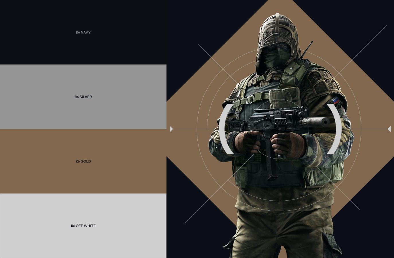
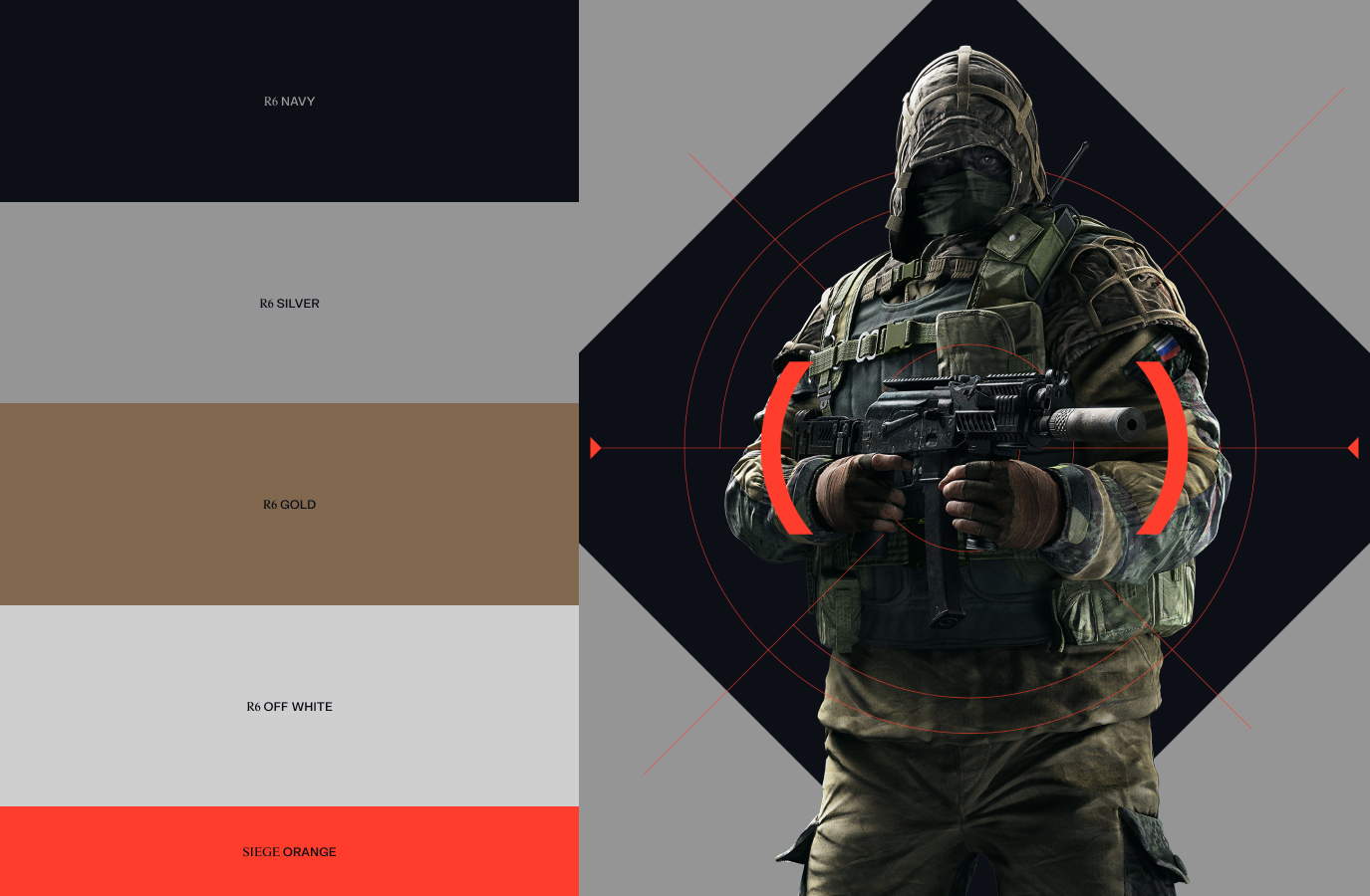
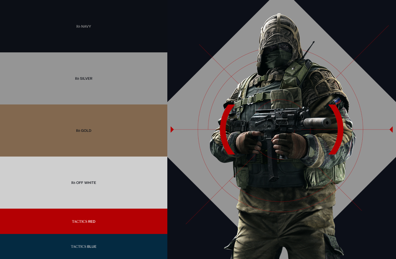
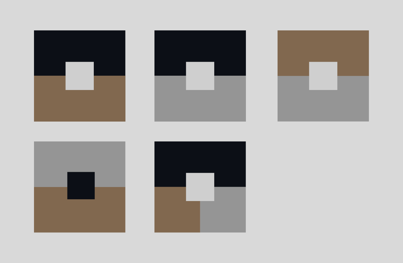
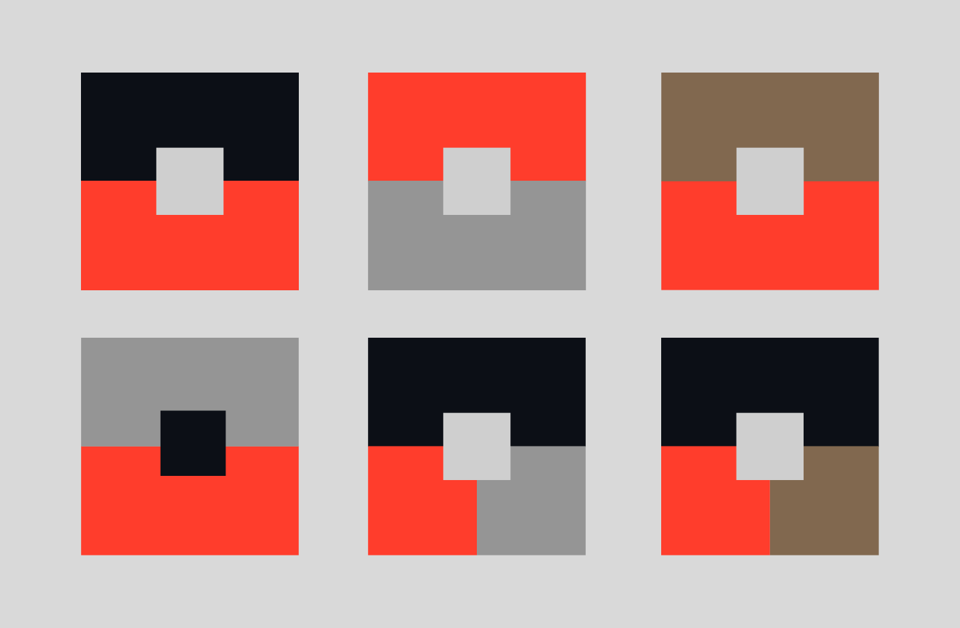
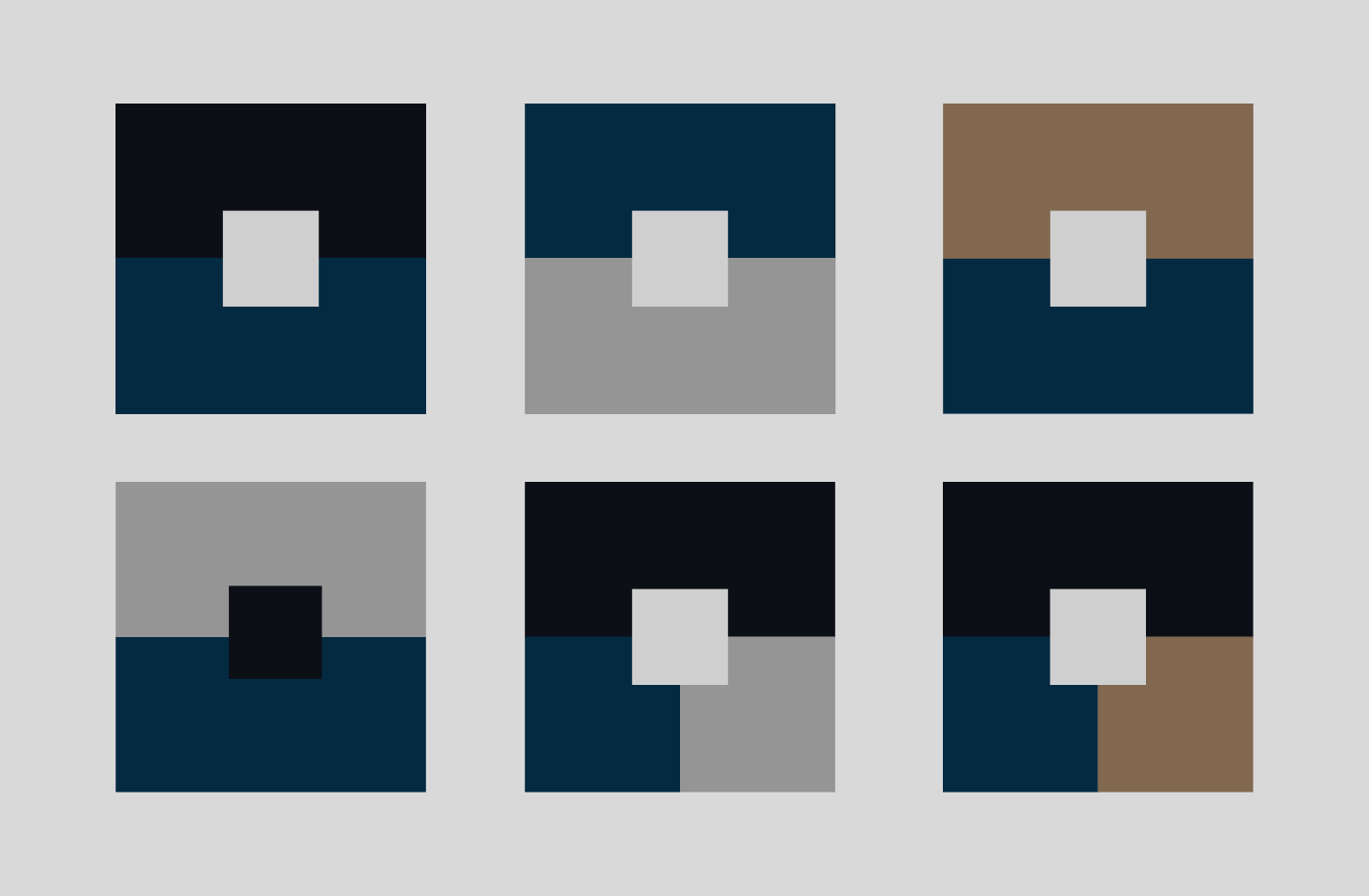

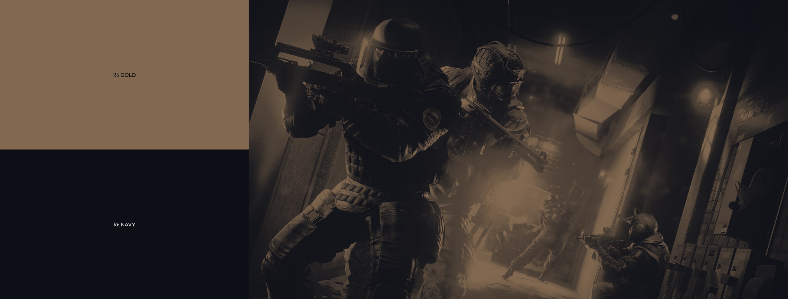
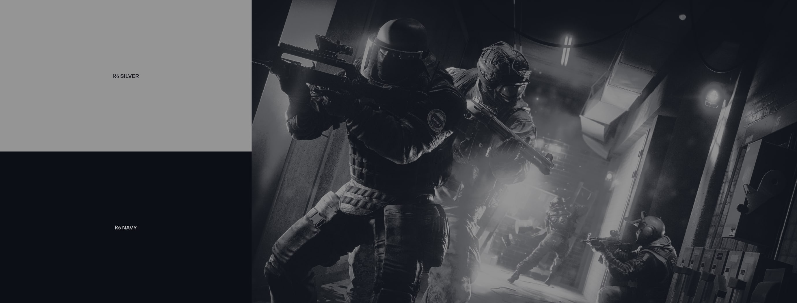
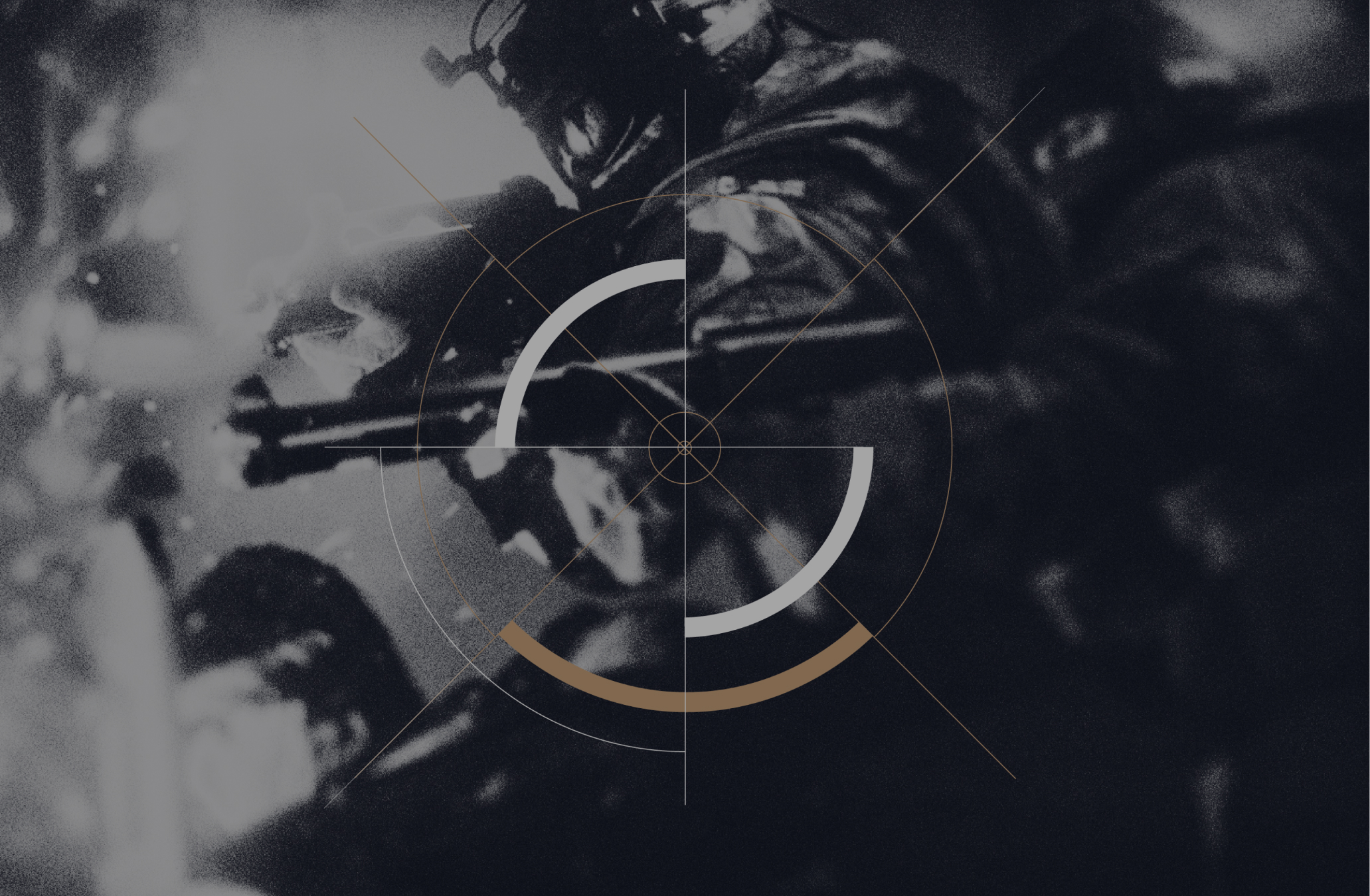
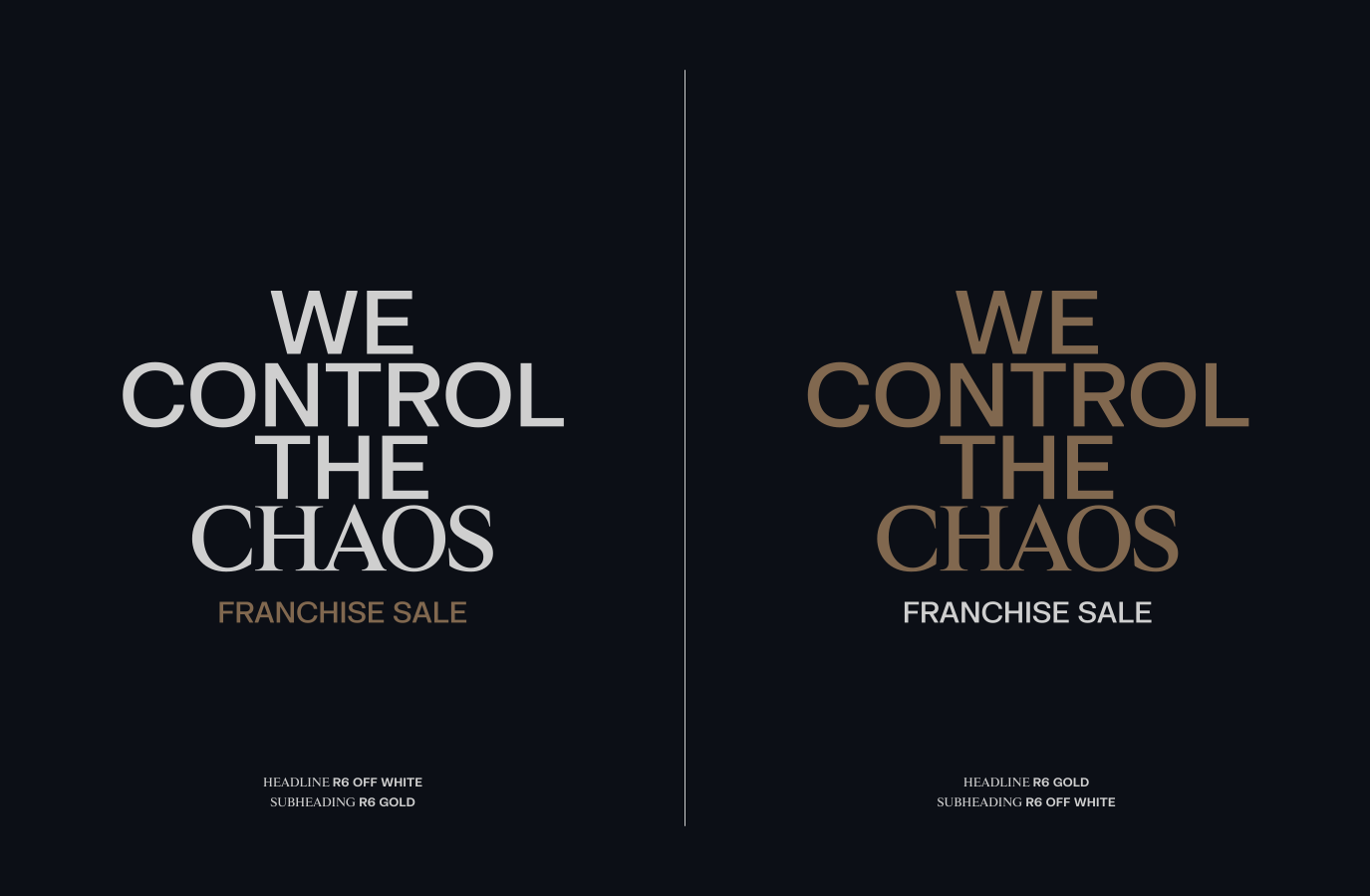
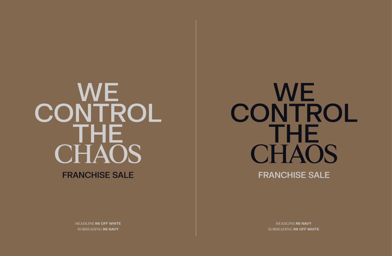
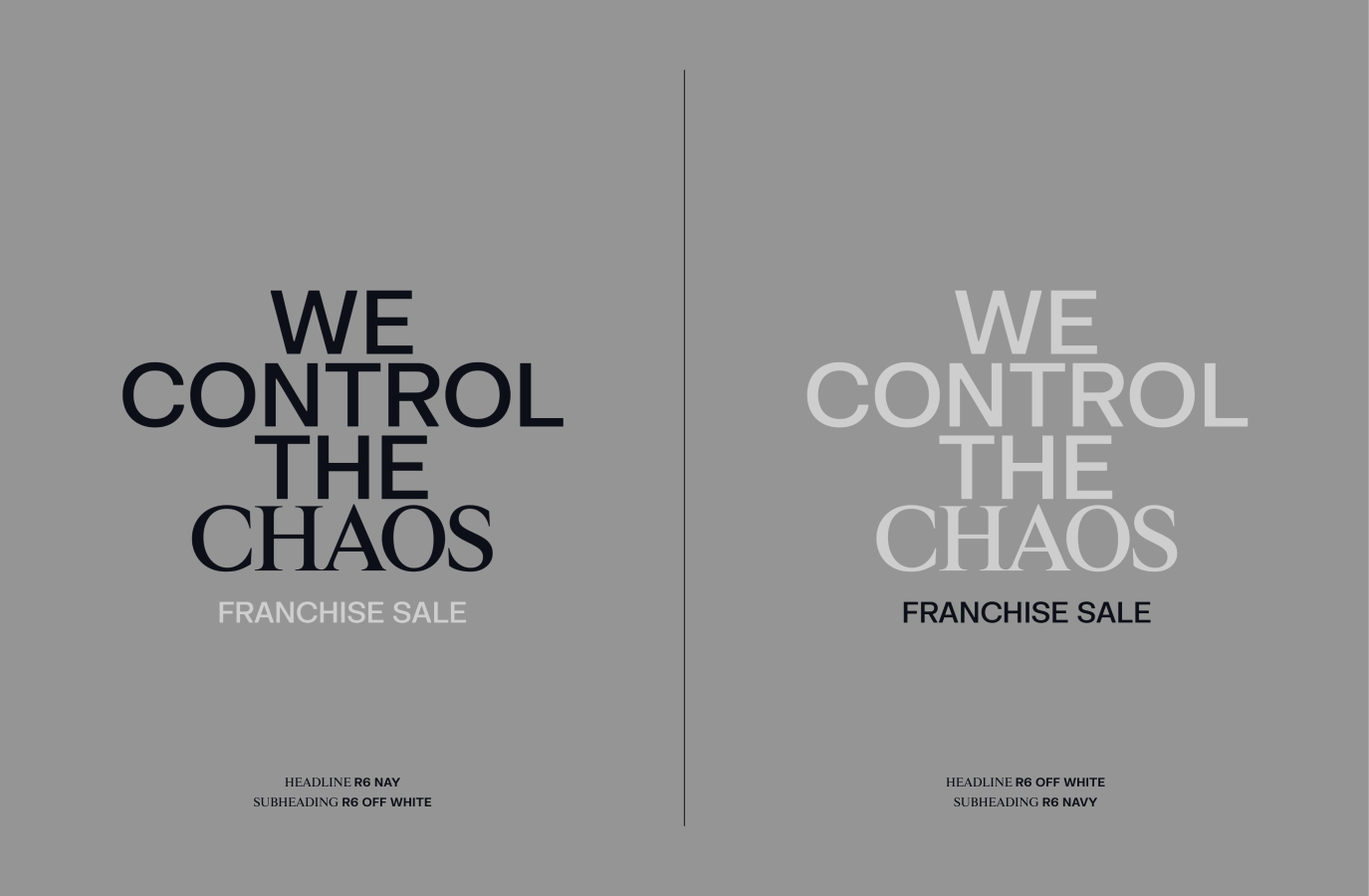
These are the designated colour combinations to employ when implementing our Art Direction treatment. To learn more about how to create this treatment, please refer to the Art Direction section.
Adhering to these specific colours ensures consistency across our Franchise brand.
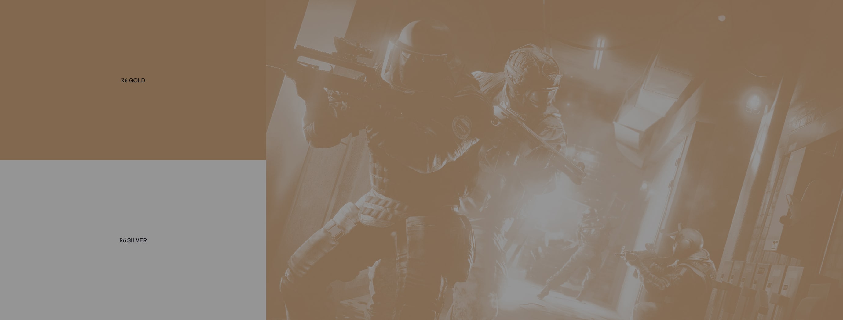
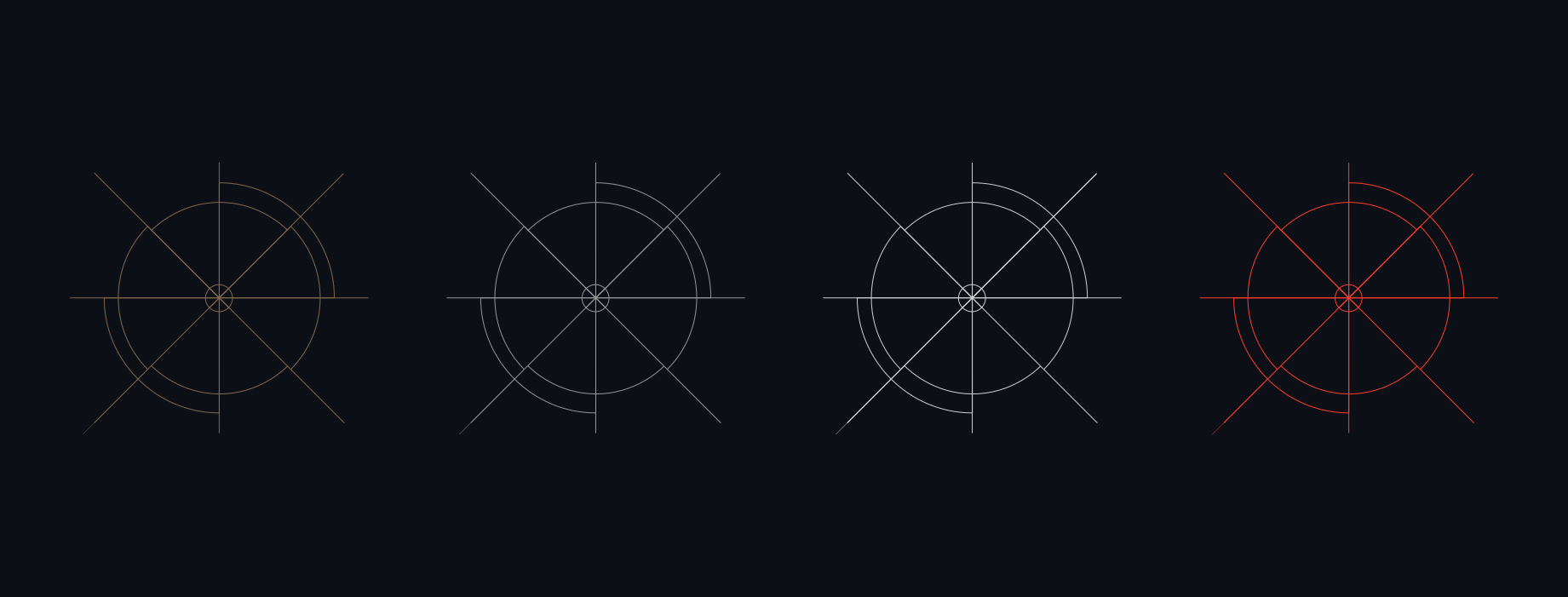
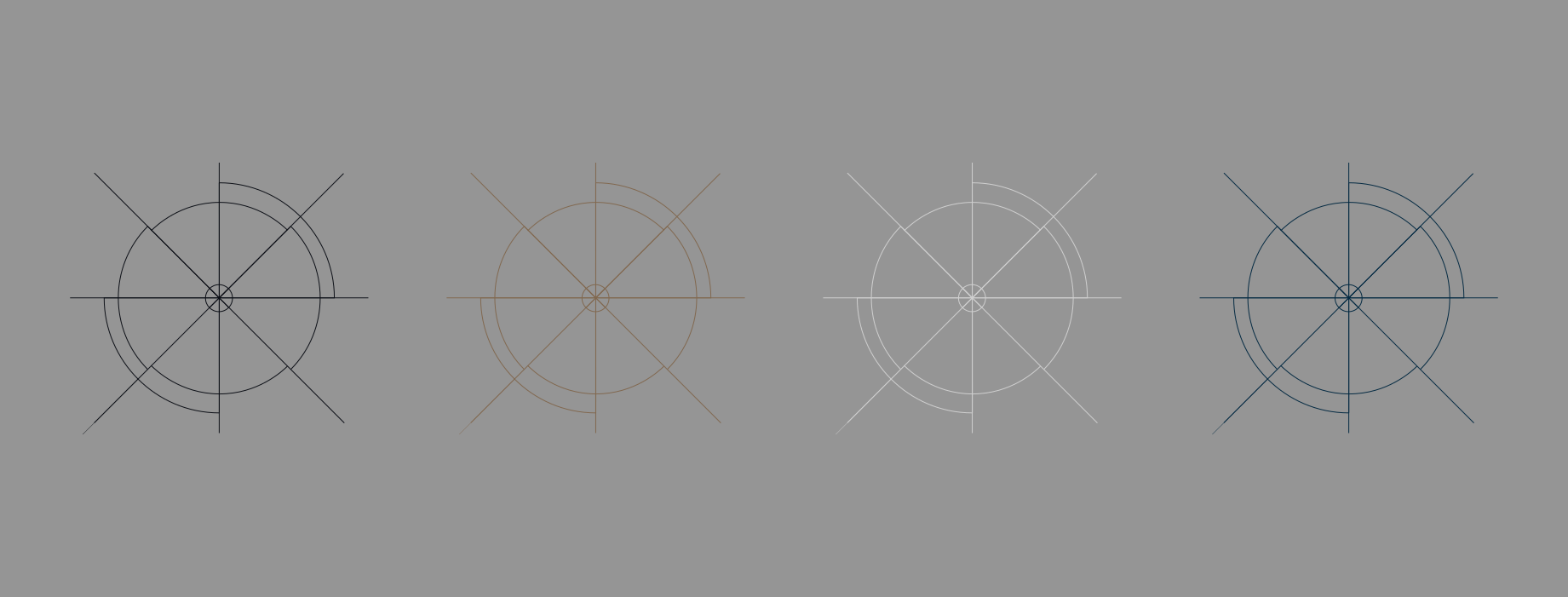
Below, you'll find examples and recommendations for colour usage with our Scope device. To learn more about this please refer to our Scope section. Adhering to these specific colours and contrast
ensures adequate legibility and consistency across our Franchise brand. Please visit our Downloads Centre to access all scope assets.

We have the option to utilise two colours in our Scopes. To learn more about this please refer to our Scope section. It's important to maintain a balanced split of 50/50 between the colours to prevent one from overpowering the other.
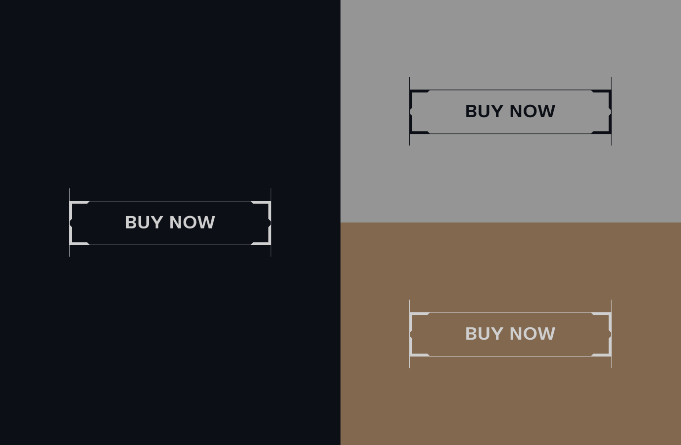
When crafting CTAs, refer to the guidance provided here to ensure they are treated with the appropriate colour scheme. It's paramount that CTAs maintain high legibility and contrast of text colour to the button fill colour. Clarity and high legibility is the focus - not being attention grabbing.
Make sure to follow this guidance to ensure our Colour system is used correctly in all formats and applications.