06
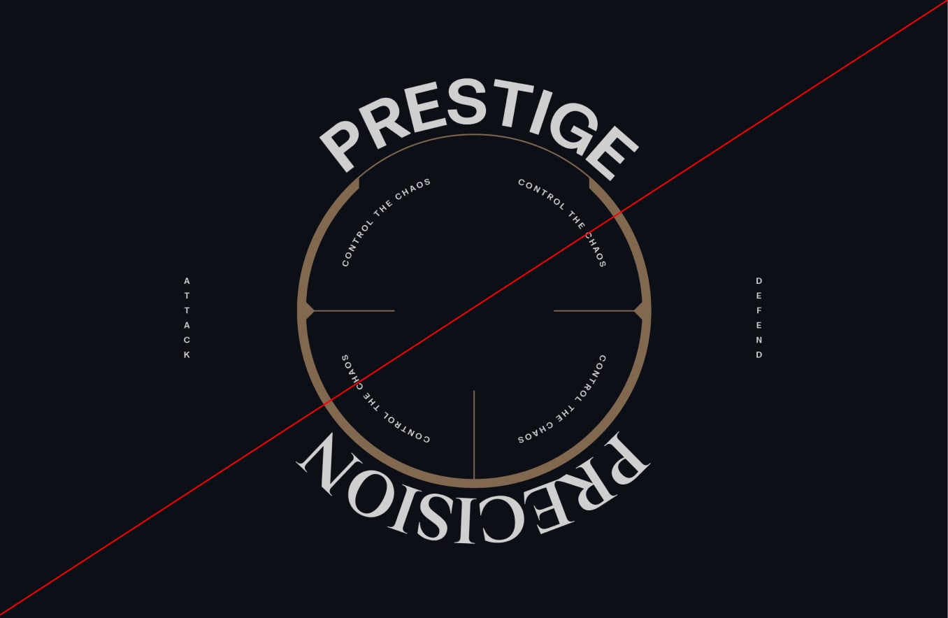
Our layout system serves as the cohesive backbone, bringing together all elements and expressing the brand consistently and impactfully.
In this section we will showcase a breakdown of our Layouts and how they bring our toolkit together effectively.
To determine the size of margins, we use the shortest edge of the format. Follow these rule sets to make sure our margins are set correctly.
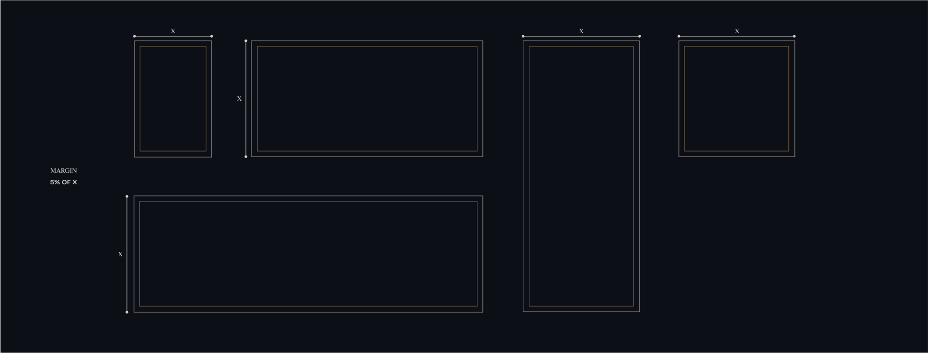
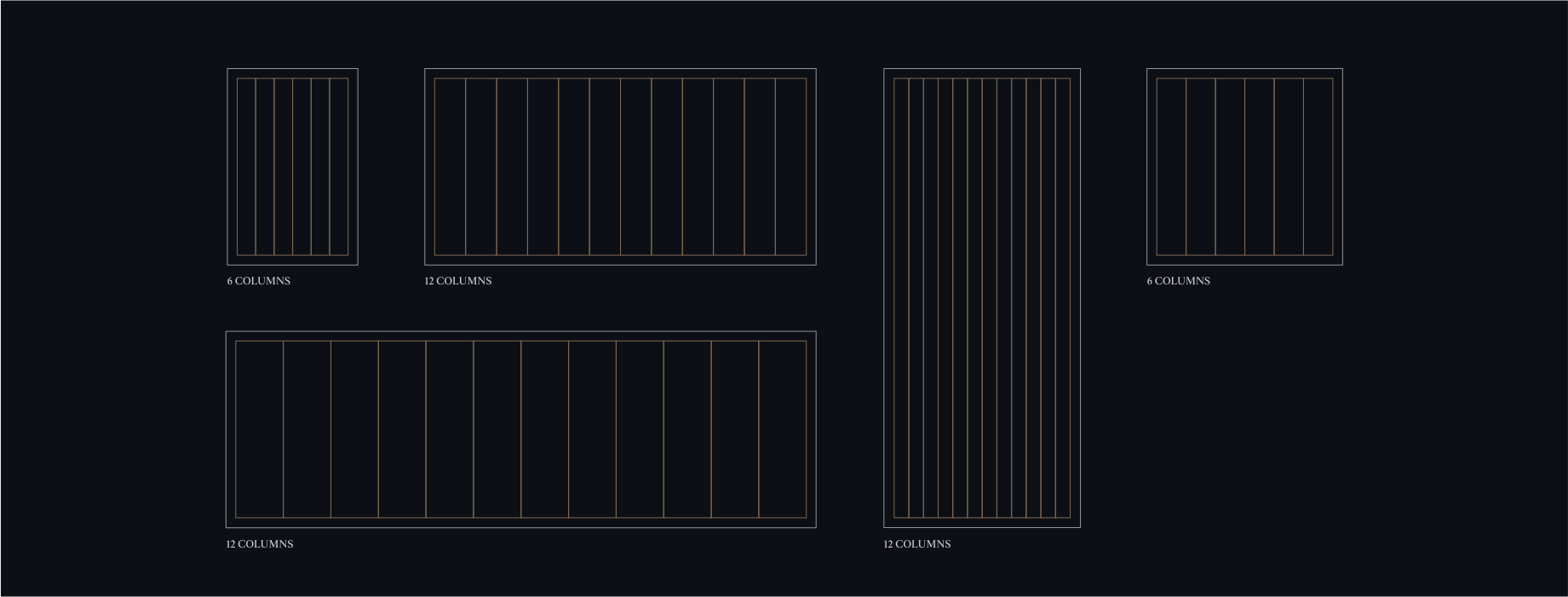
Once we establish our margins, we proceed to define our columns. These columns serve as the framework for positioning and arranging content, including headlines and our logo.
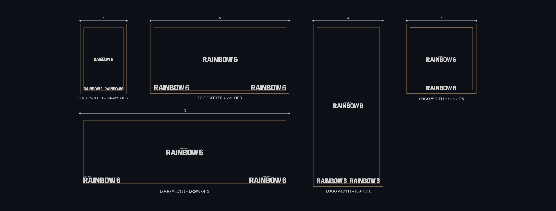
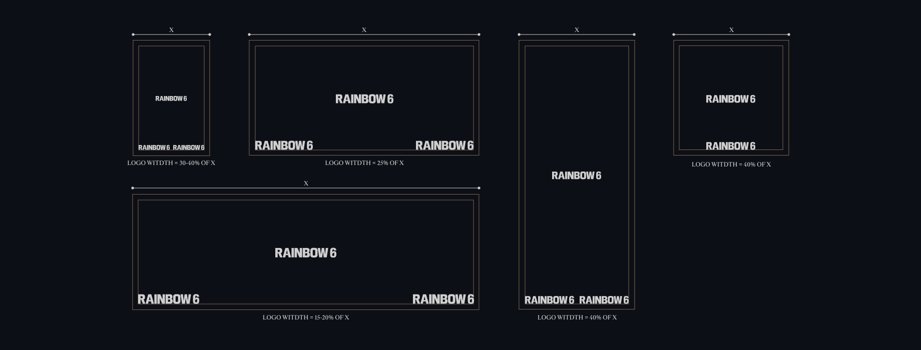
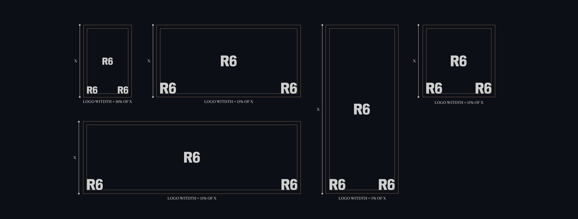
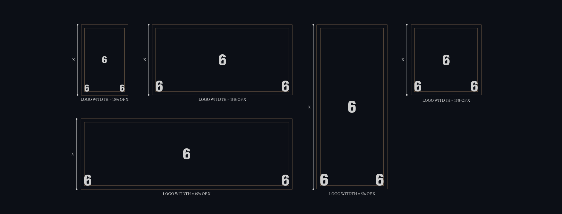
Refer to the guidelines below to ensure correct placement of our logo suite. For images and minimal layouts, centrally placing lockups is recommended. For applications which have more details we should
place the lockups at the bottom of the format, either left or right aligned. For any layouts where we want to place our endorsement logo bottom left we should always use our left aligned lock up.
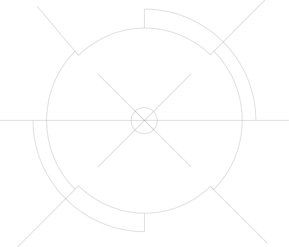
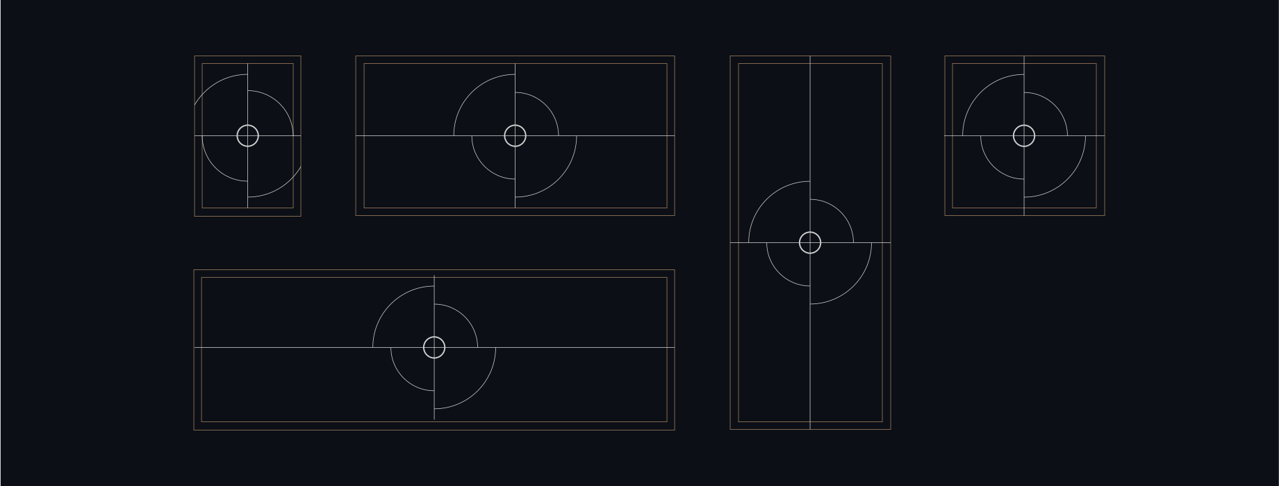
Our Scopes should be centre aligned to all our formats. They should occupy as much space within the scene as possible, and are able to overflow from the frame to create more impact when required.
To learn more about our Scopes please refer to our Scopes section.
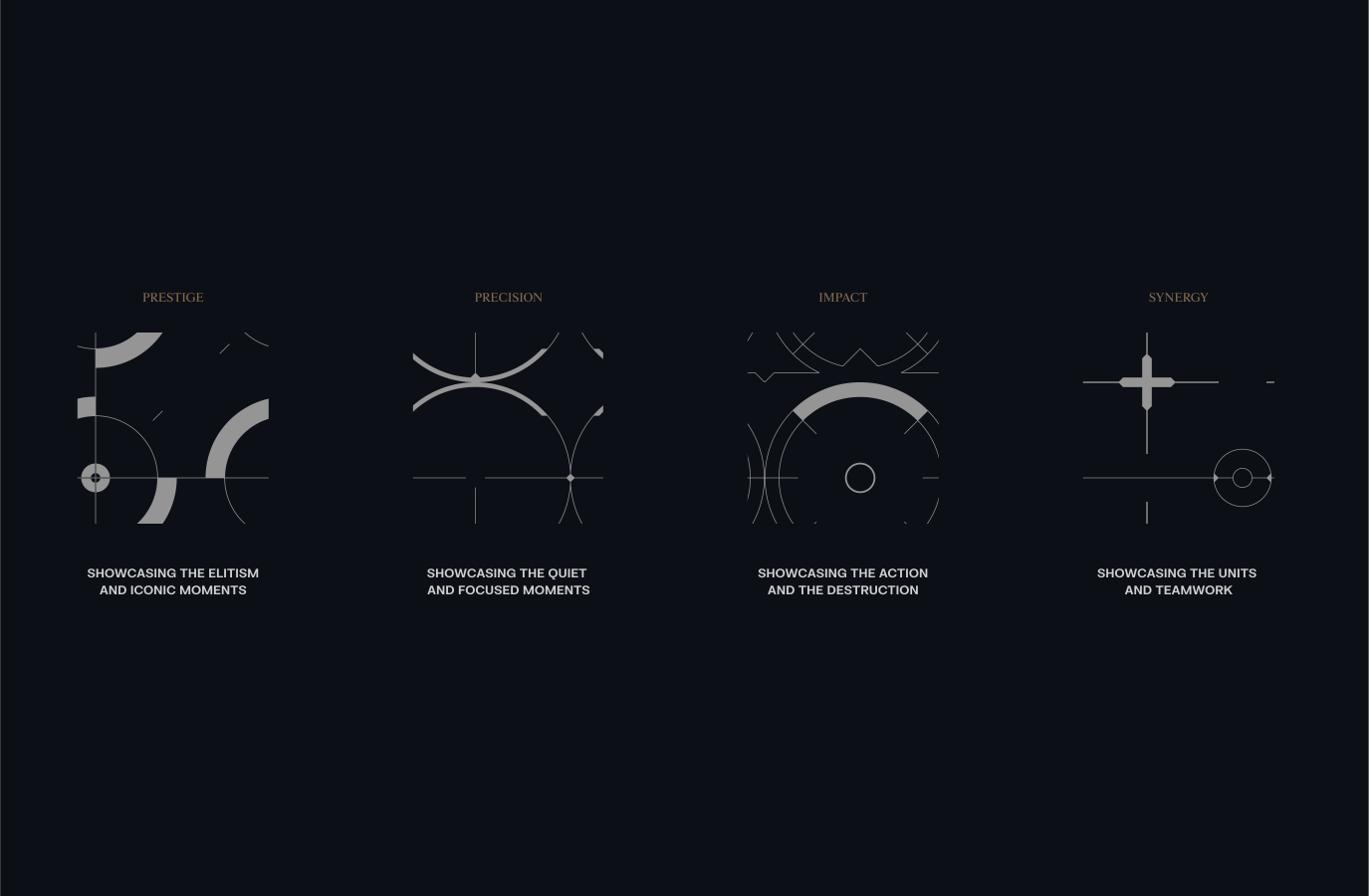
Each category has flexibility in its style, allowing us to create a myriad of scopes around the same theme. By maintaining the same base, adding or removing details, increasing sizes, and filling shapes, we can create a large variety of scopes.
This enables us to work with a large array of scopes, keeping our layouts distinct and varied.
To learn more about our Scopes please refer to our Scopes section.
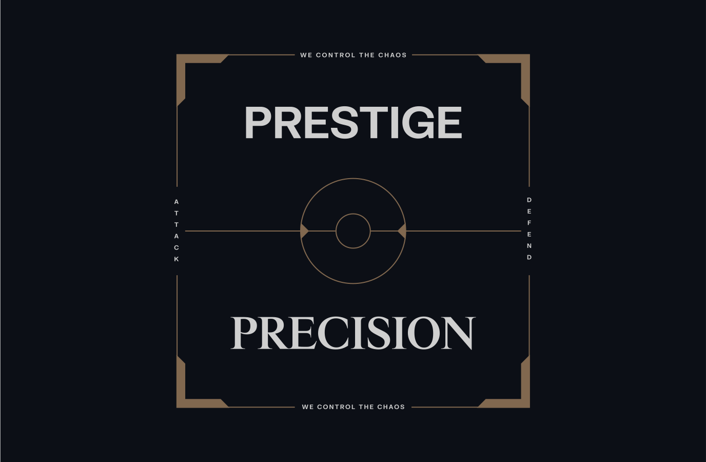
Here are different examples of how we can create intricate and various layouts with our flexible Scope system. Typography should follow and align to the components of each Scope.
To learn more about our Scopes and Typography please refer to our Scopes and Typography sections.



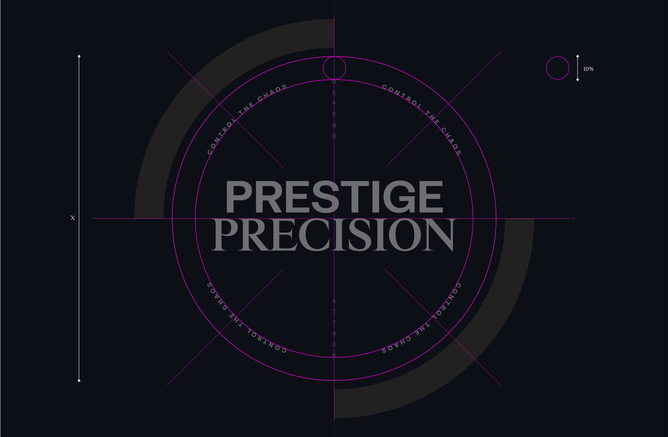
When laying out text, it's crucial to ensure there's adequate space between the type and surrounding elements, like the Scope area. A useful rule is to set the margin to approximately 10% of the size of the outer keyline. This ensures proper legibility and aesthetic balance in your design.
To learn more about our Typography please refer to our Typography section.
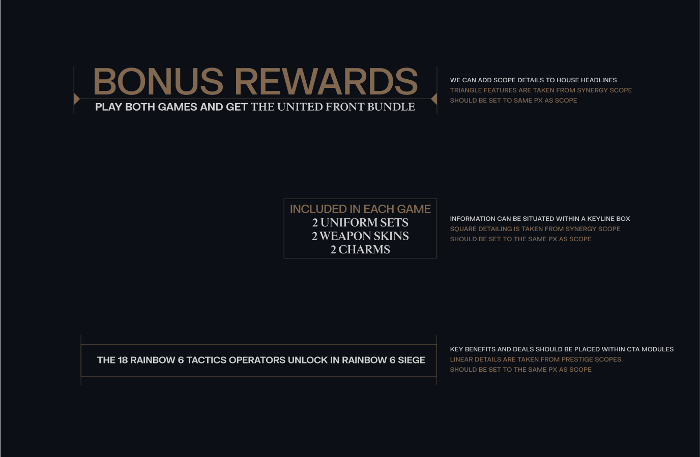
We can leverage elements from our Scopes to structure content and typography effectively. For instance, a headline with key messaging can be constructed using components from the Synergy scope.
Adhering to this guidance ensures that the utilisation of Scope furniture remains consistent and makes a lasting impact.
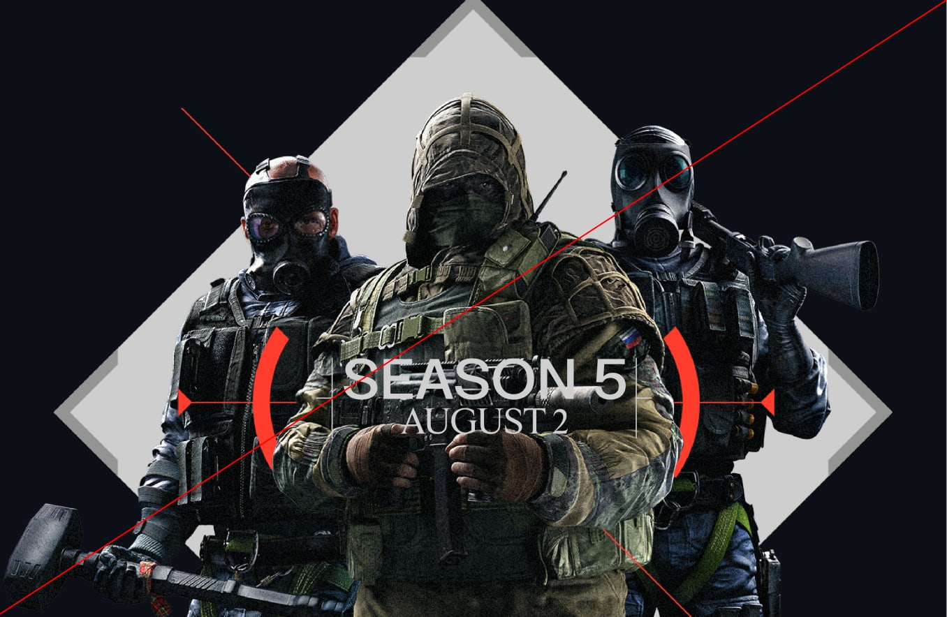
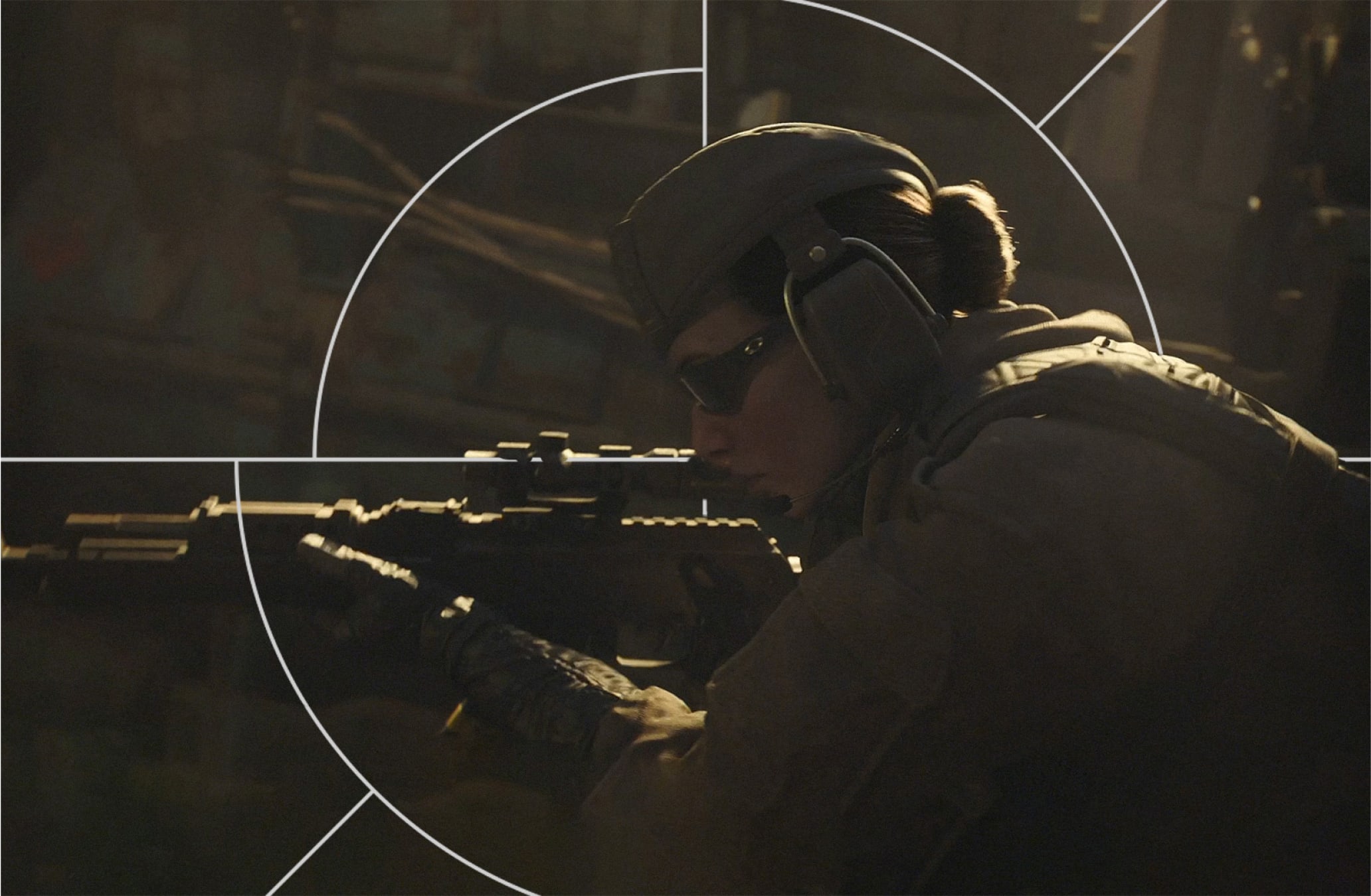
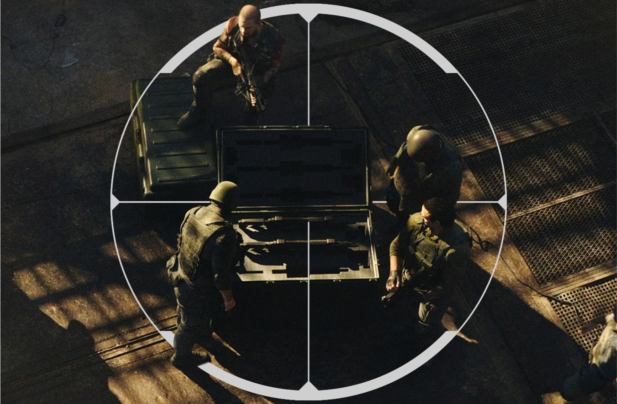
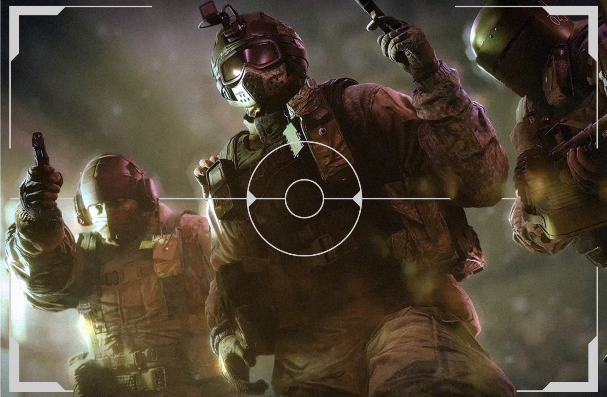
These examples demonstrate how to use Art Direction with our different categories of scopes, ensuring imagery is integrated with the Scopes where possible, either through overlays or framing devices.
It's best practice to avoid placing solid crosslines over operators to prevent them from resembling targets. This helps maintain clarity in the design and avoids any unintended connotations, ensuring the operator remains distinct and easily identifiable.
To learn more about our Scopes please refer to our Scopes section.

Here is an example of how we can use our margins and columns and how it can inform the placement of our Scope and furniture.
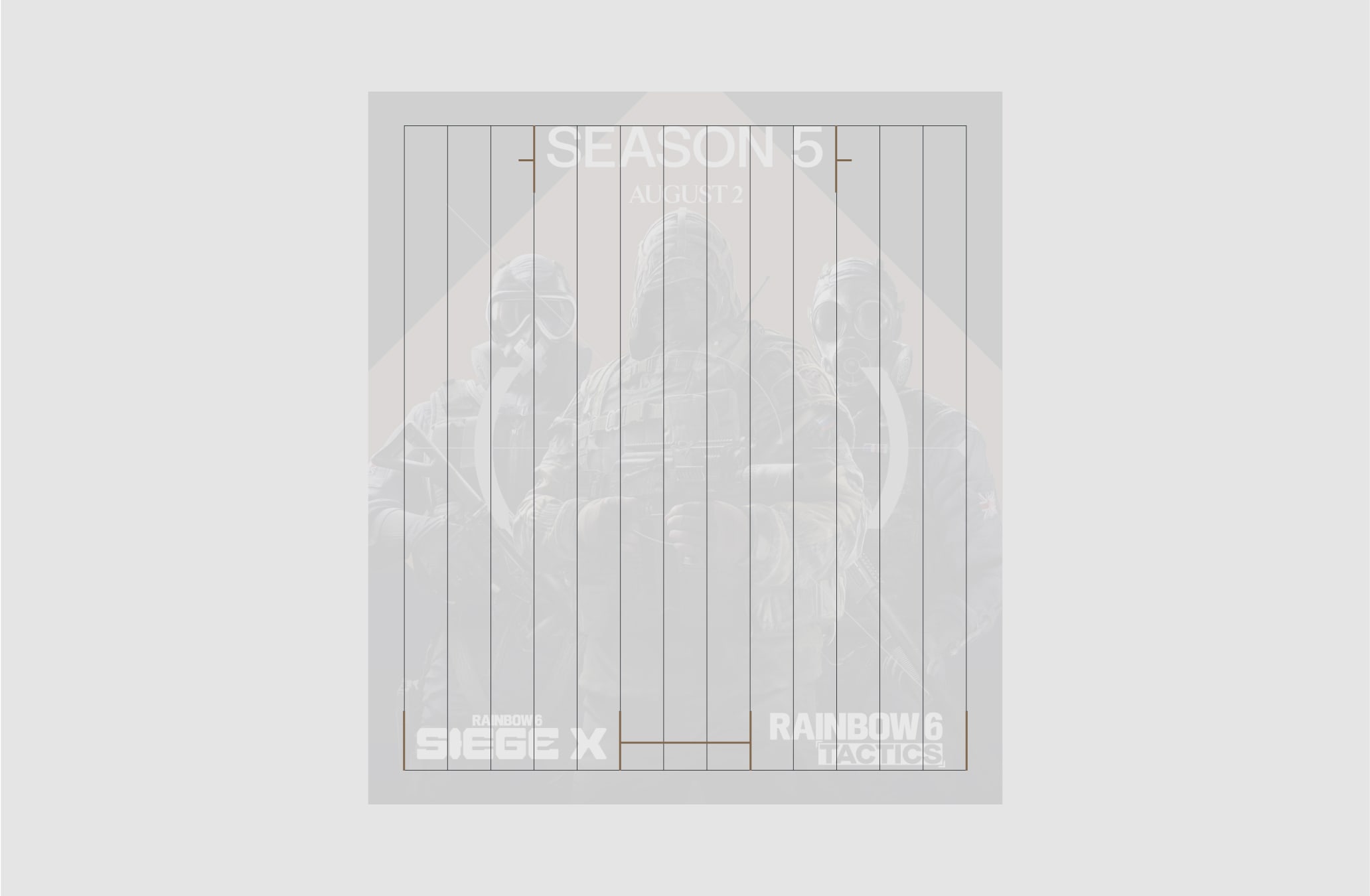
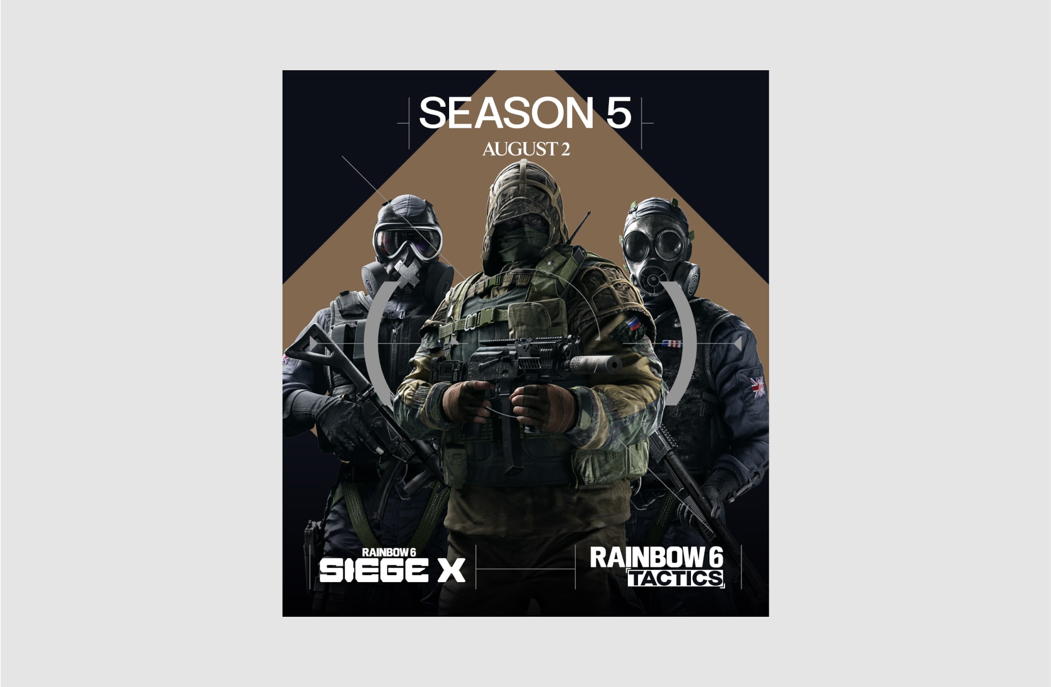
Here is an example of how we can use our margins and columns and how it can inform the placement of our Scope and furniture.
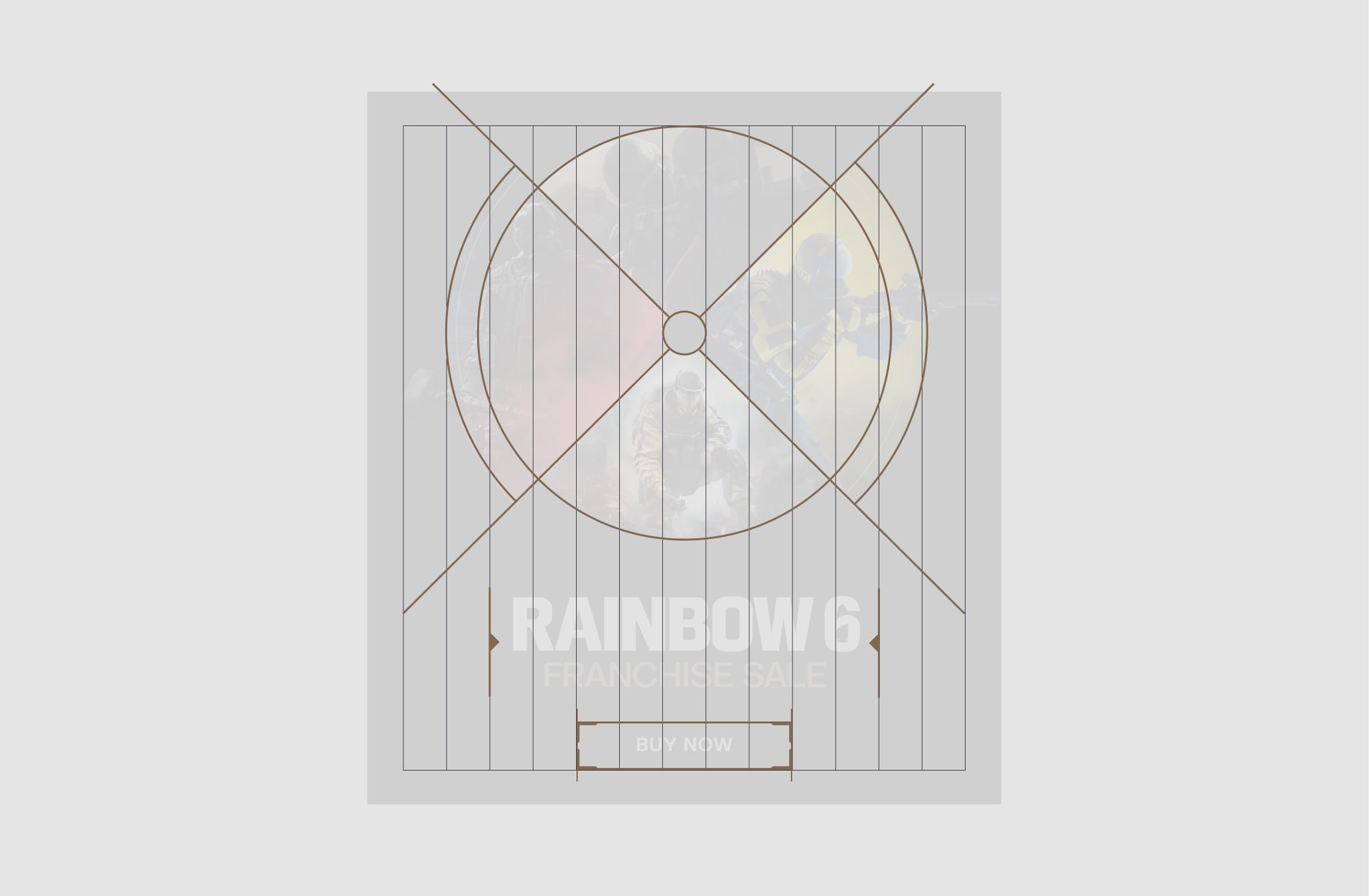

Make sure to follow this guidance to ensure our Layout system is used correctly in all formats and applications.