07

Our Icon styles are uniquely crafted and distinctive, embodying the visual language of our Scope system. They serve as a consistent representation of our brand, even in the smallest and most functional aspects of the user experience.
In this section we will showcase a breakdown of our Icons and how to use them.
Our functional Icon set, designed with the same aesthetic principles as our Scopes. These Icons are optimised for small-scale usage, making them ideal for digital presentations and UI design elements.
To learn more about our Scopes please refer to our Scope section.
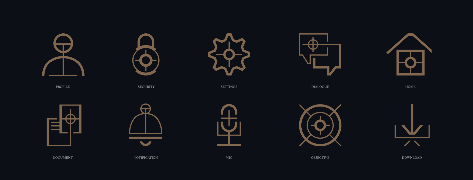
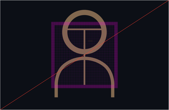
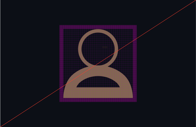
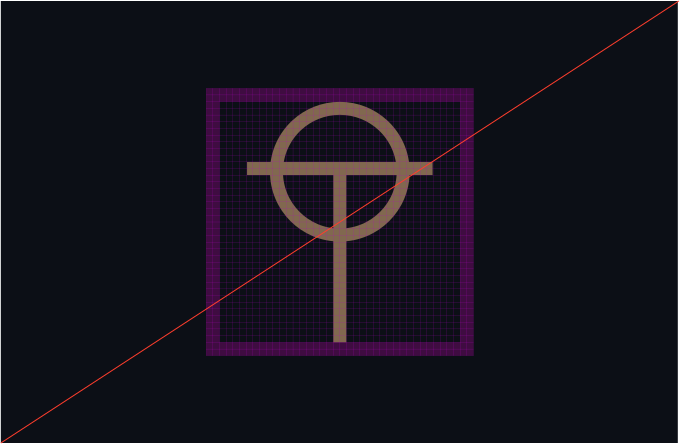
Our Functional Icons to a 40x40 grid, allowing for a 2px clear space. Each icon maintains solidity, with components separated by a 2px space for clarity.
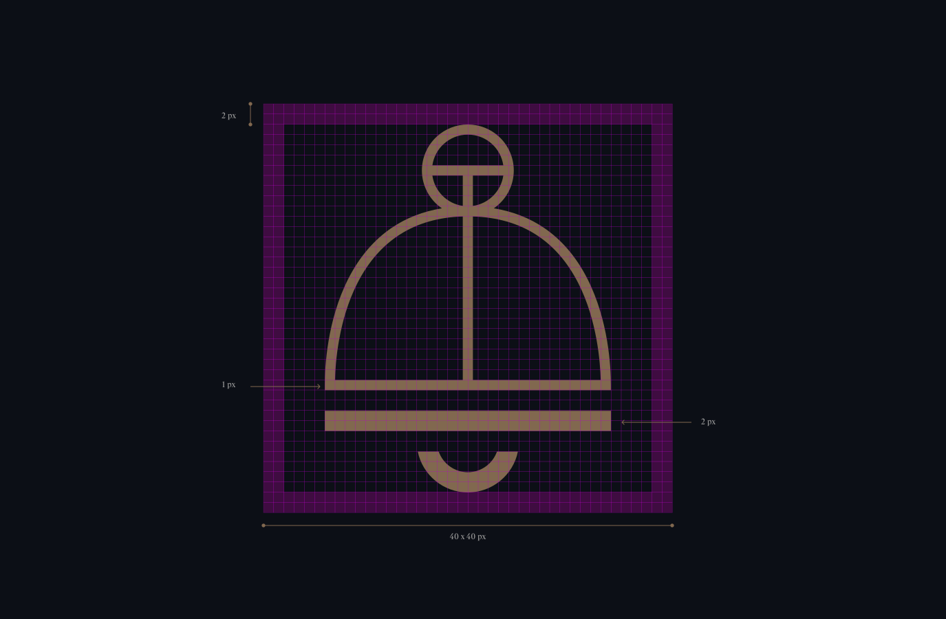

Ensure consistency and legibility in our Icon set by adhering to this guidance during creation.

Our icons should have intricate gaps between some of the forms.
The icons must allude to our scopes.
There are two line widths within our icons to add a level of detail and intricacy.
Make sure the icon’s function is apparent and is not too illustrative.
Explore this example showcasing our Icon style, ideal for both UI elements and illustrative purposes within presentations.
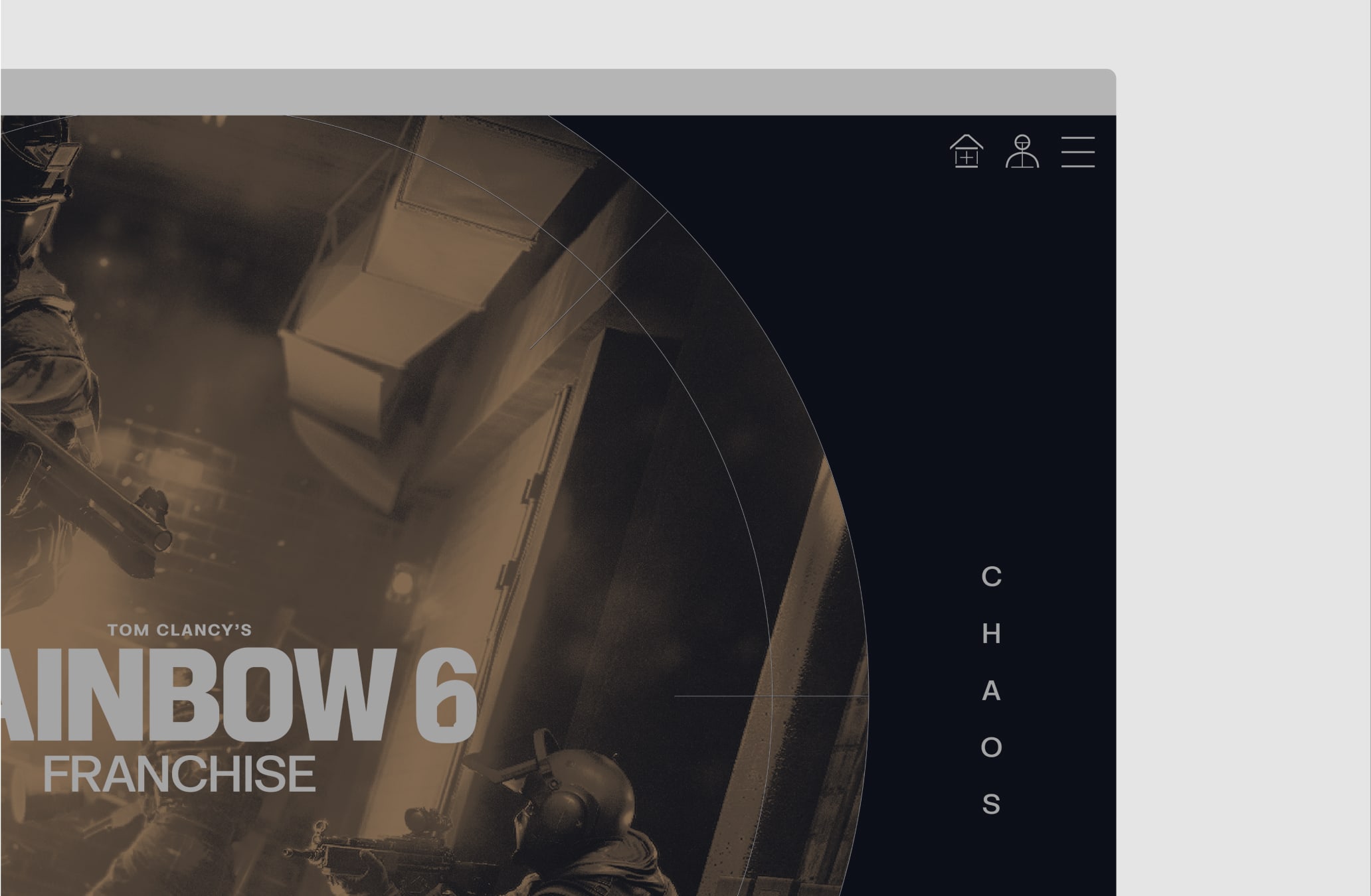
Make sure to follow this guidance to ensure our Iconography is used correctly in all formats and applications.