Typography

Our typographic system draws inspiration from prestige of the past while embodying a modern tone, through the combination of two typefaces. This combination effectively injects authority and prestige into all of our applications.

In this section we will showcase our typefaces, the system and how to use them.

Please visit our Downloads Centre to access all Typography assets.

Overview

Our typefaces

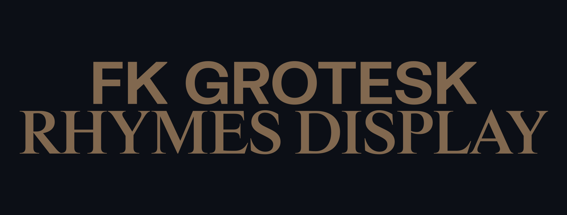
Our typographic system pairs two typefaces. FK Grotesk is used in our headlines and body copy, bringing structure and a modern tone to our applications. We pair FK Grotesk with Rhymes Display in our headlines, which introduces

a sense of heritage and prestige to our system.

Please visit our Downloads Centre to access all Typography assets.

Primary typeface

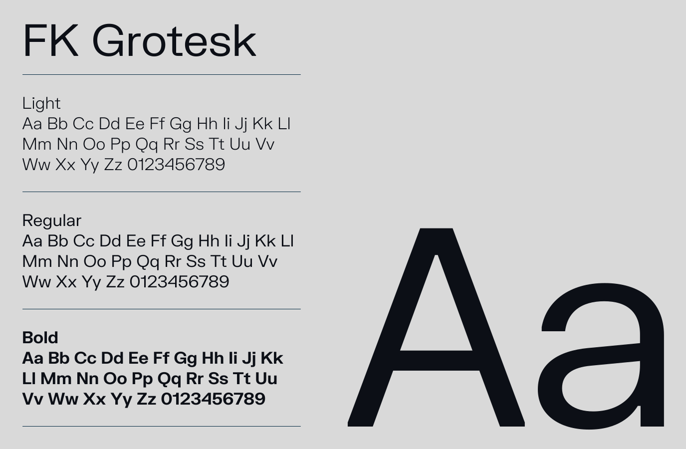
FK Grotesk is the foundation of our typographic identity. It is a robust typeface with a mechanical appearance, suitable for both small text and large headlines. We use it in three weights to give us flexibility with legibility and emphasis when needed.

For a system font alternate please use Helvetica.

Please visit our Downloads Centre to access all font assets.
Secondary typeface

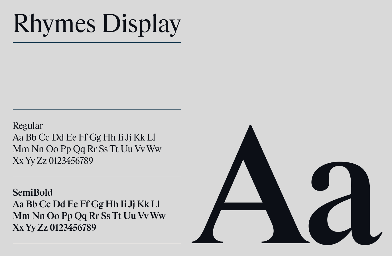
Rhymes Display, a contemporary serif, brings a touch of authority and prestige to our design language. Its finer details help create an impactful contrast when paired with FK Grotesk. We use it in two weights to give us flexibility with legibility and emphasis when needed.

For a system font alternate please use Times New Roman.

Please visit our Downloads Centre to access all font assets.
Usage

Hierarchy

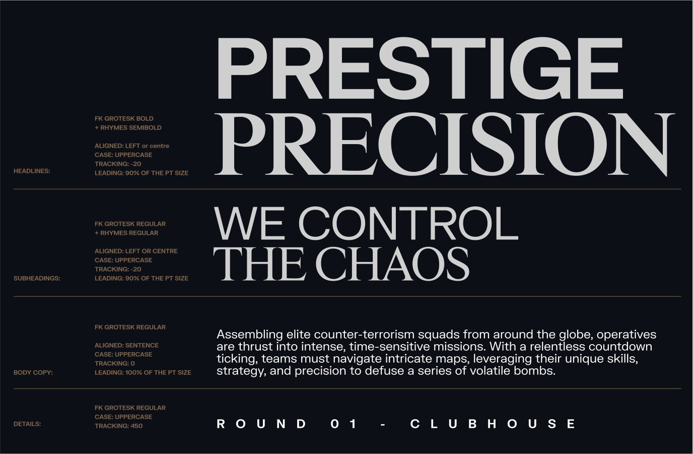
Make sure to follow this guidance for our typographic system which will ensure consistency across all our digital and print applications.

Please visit our Downloads Centre to access all font assets.
Type pairings

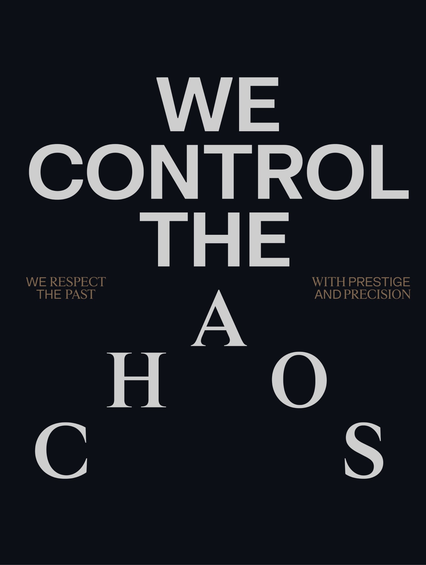
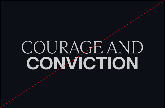
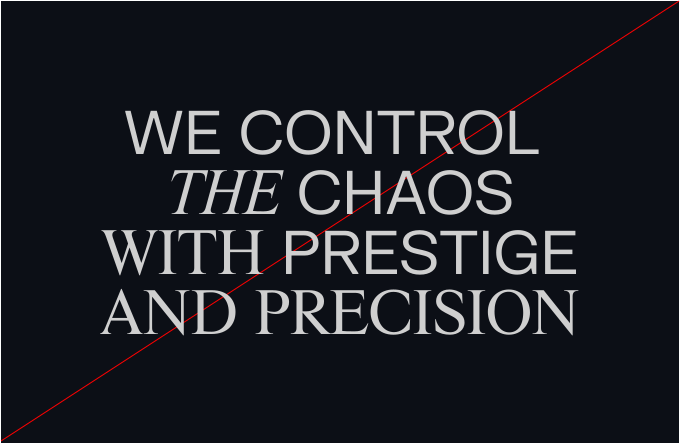
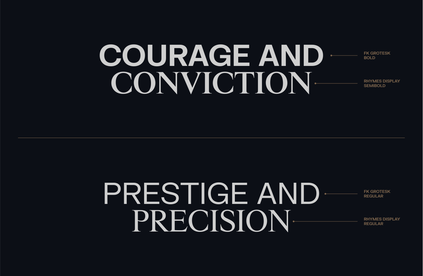
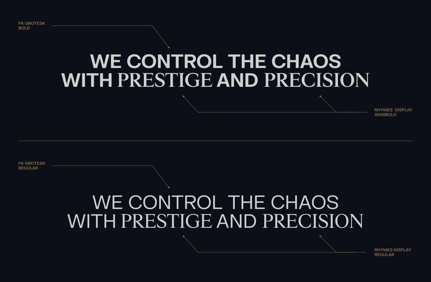
Our headlines and subheadings pair FK Grotesk and Rhymes Display together. Rhymes Display is used to create contrast and put emphasis on specific words. We primarily lead with FK Grotesk when pairing to endure legibility. However, in contexts where we may want to lead with Rhymes for context or legibility reasons this is allowed.

Follow this guidance to create consistent type pairings across all our digital and print applications.

Please visit our Downloads Centre to access all font assets.
Expressive

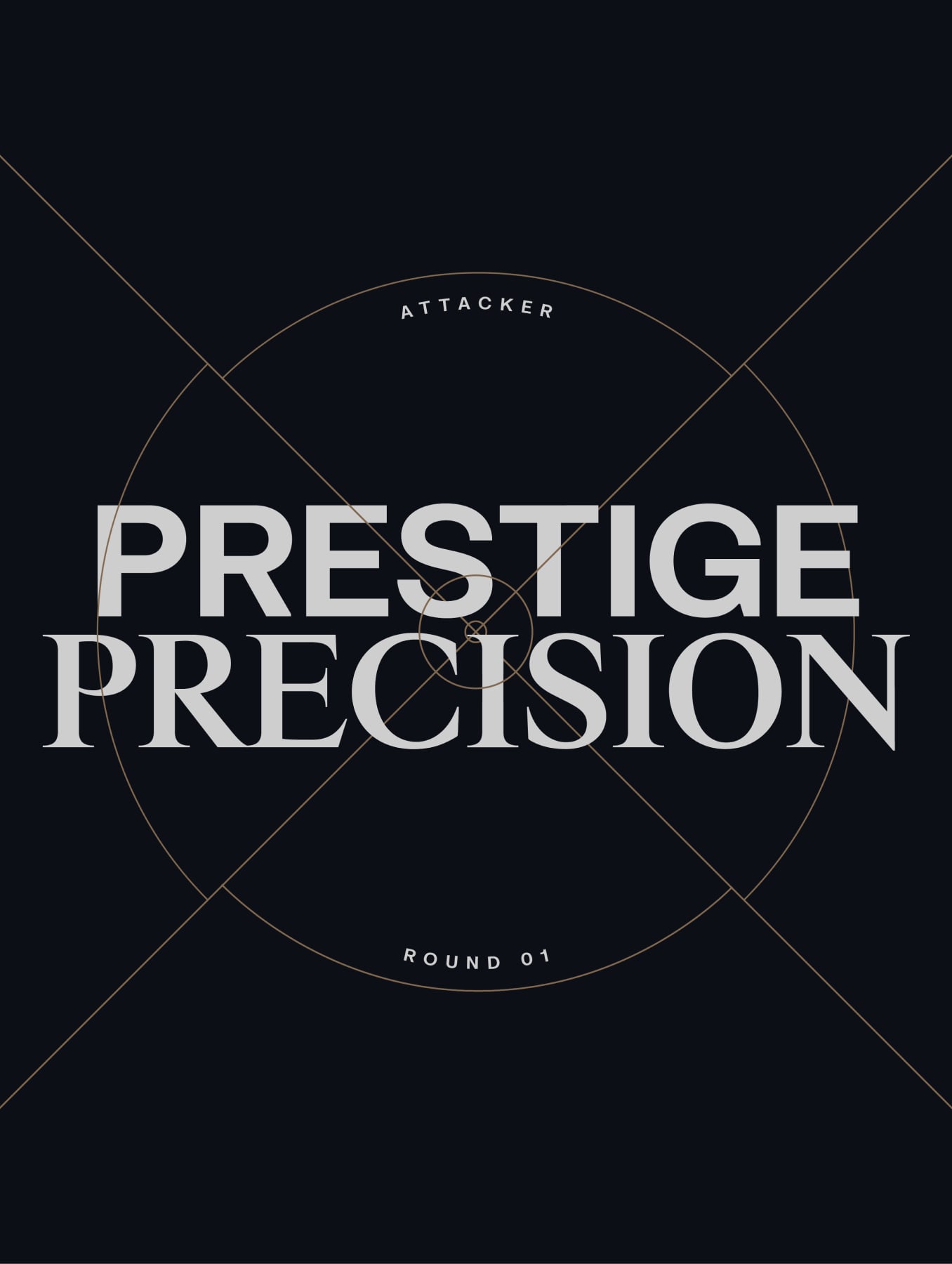
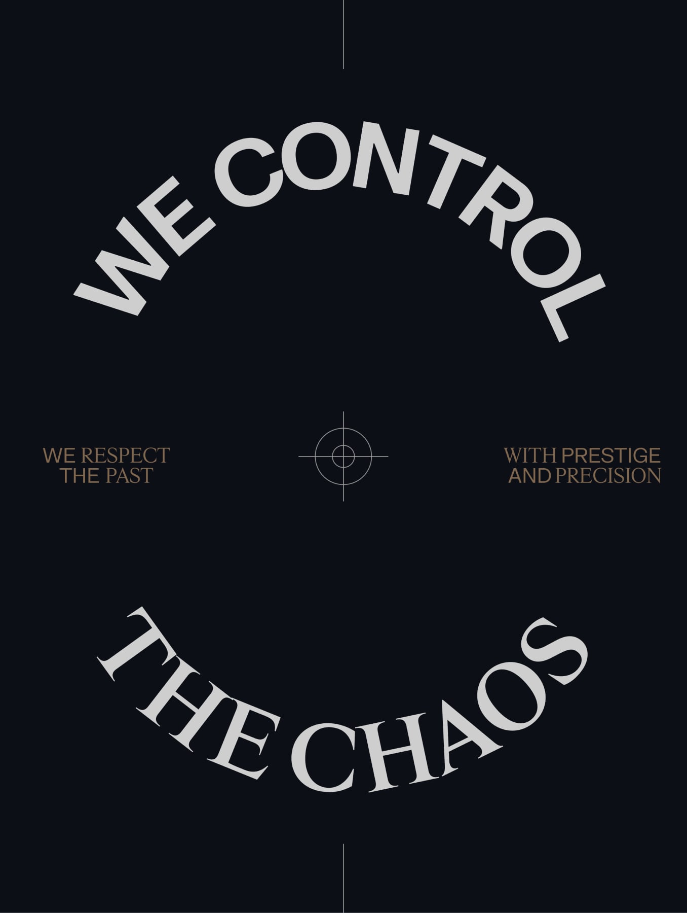
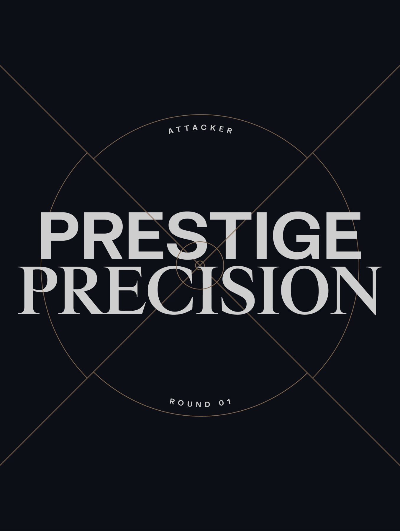
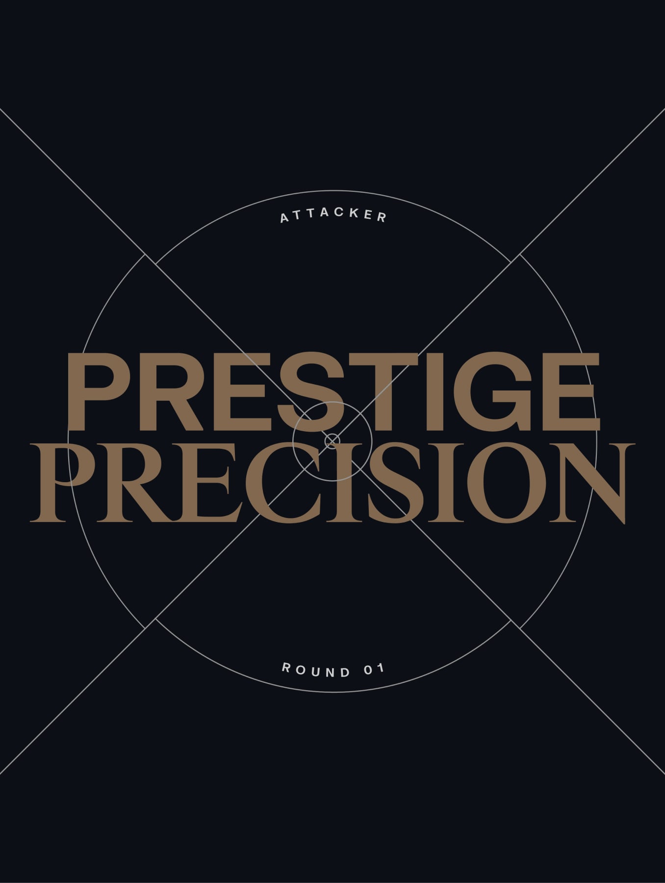
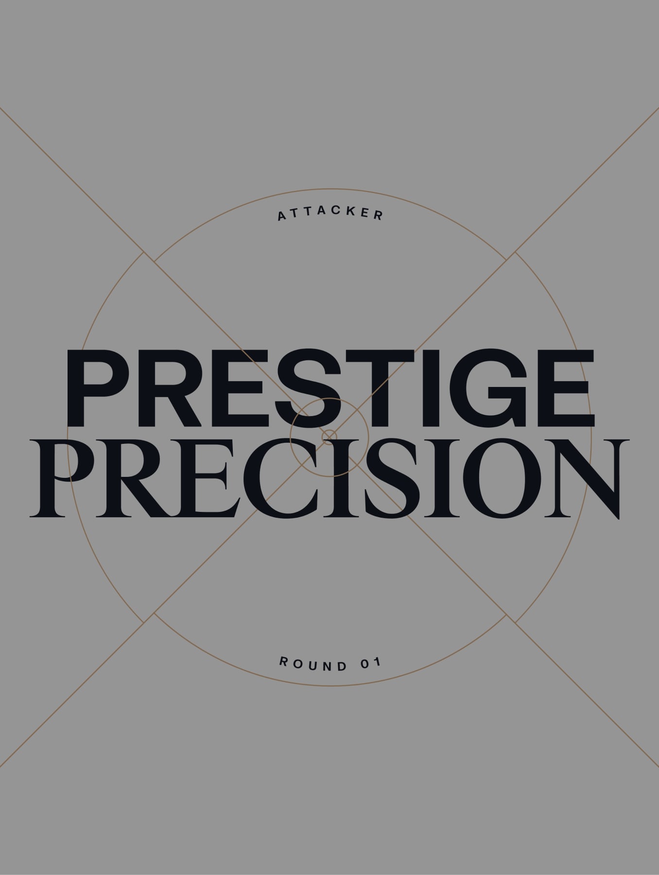
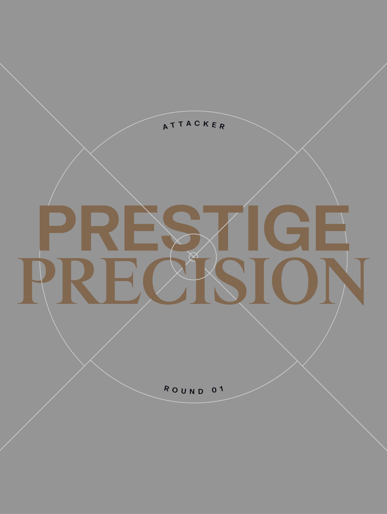
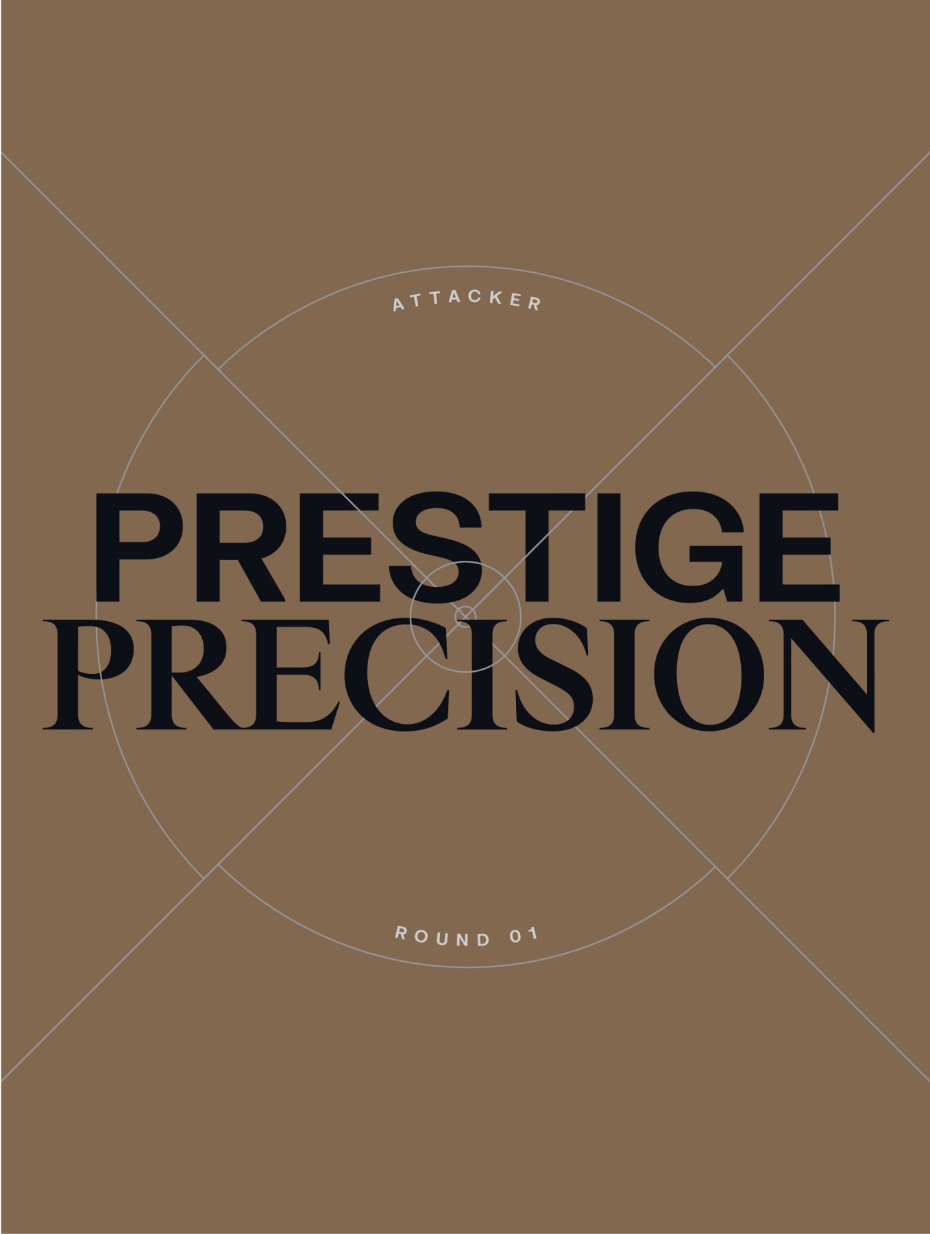
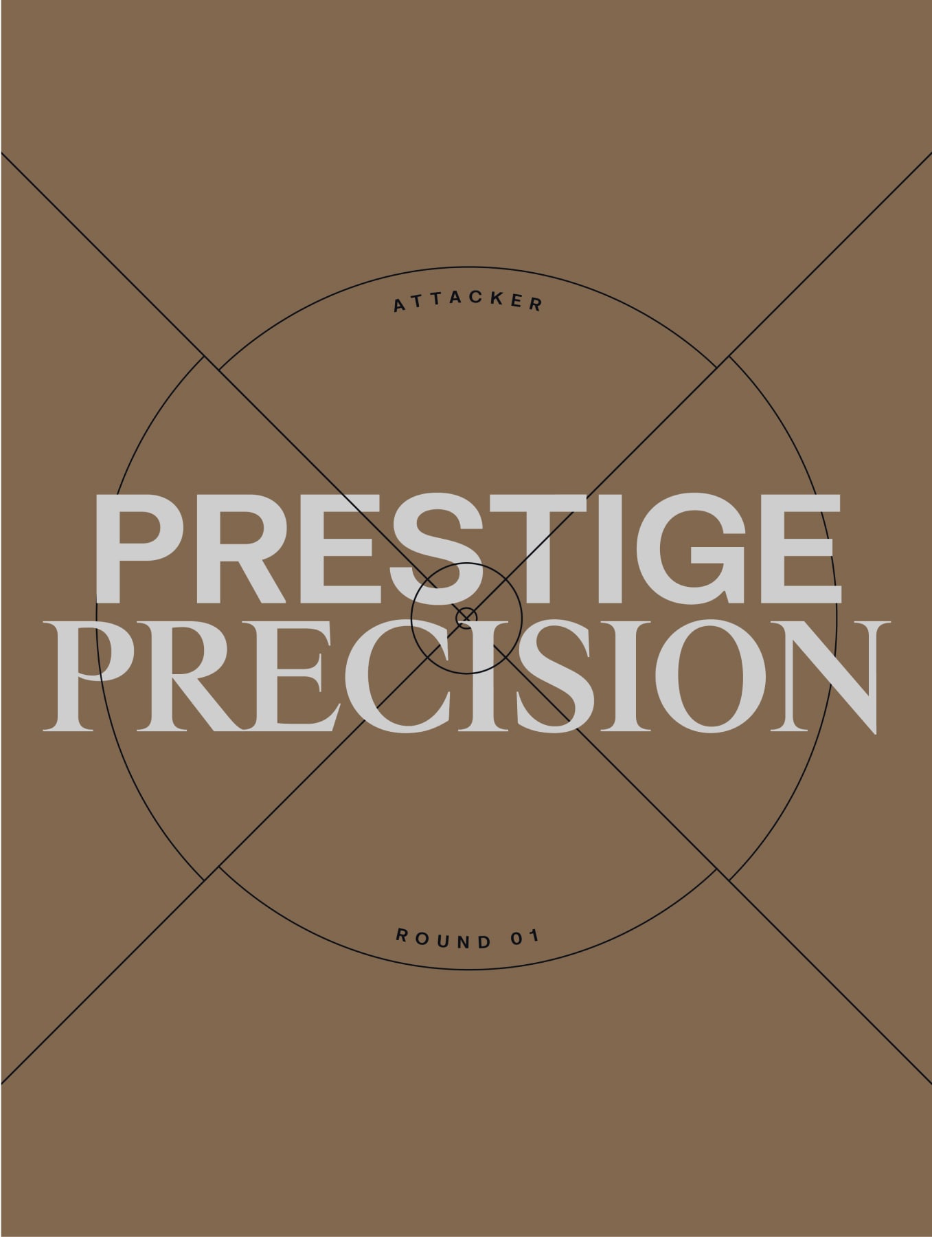
Headlines can be presented using expressive type, inspired by our Scope language. To learn more about these please refer to our Scope section.

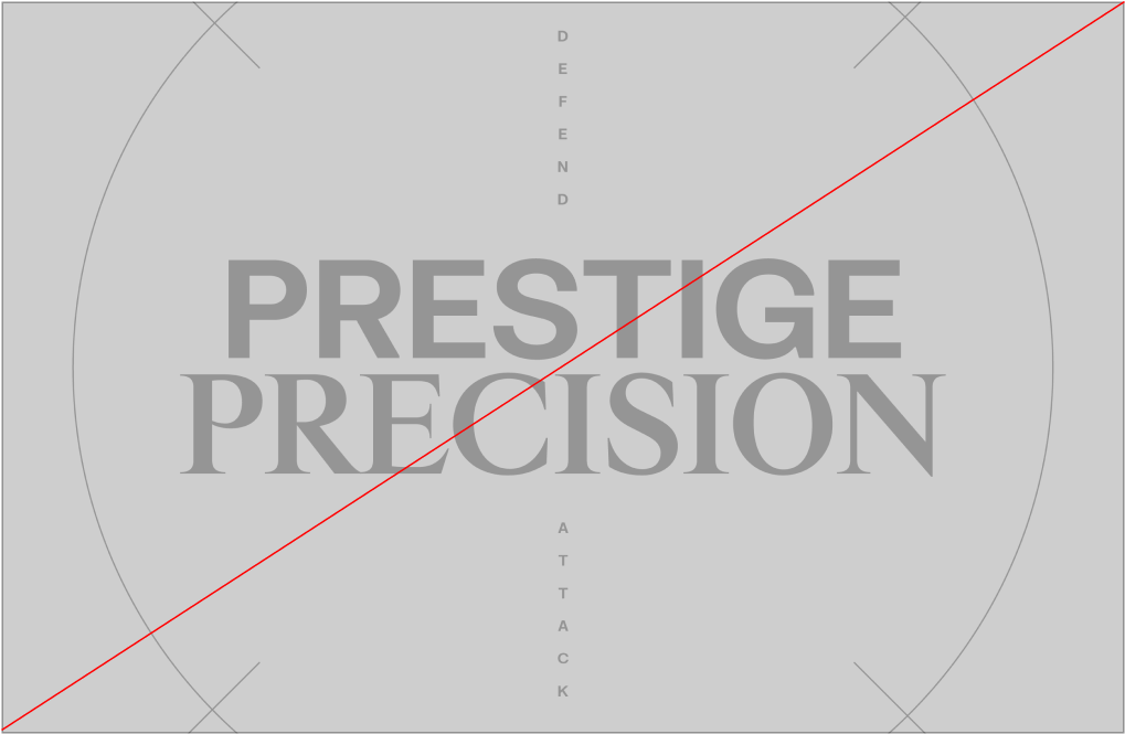
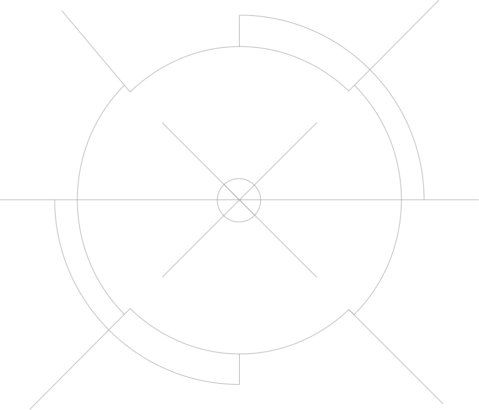
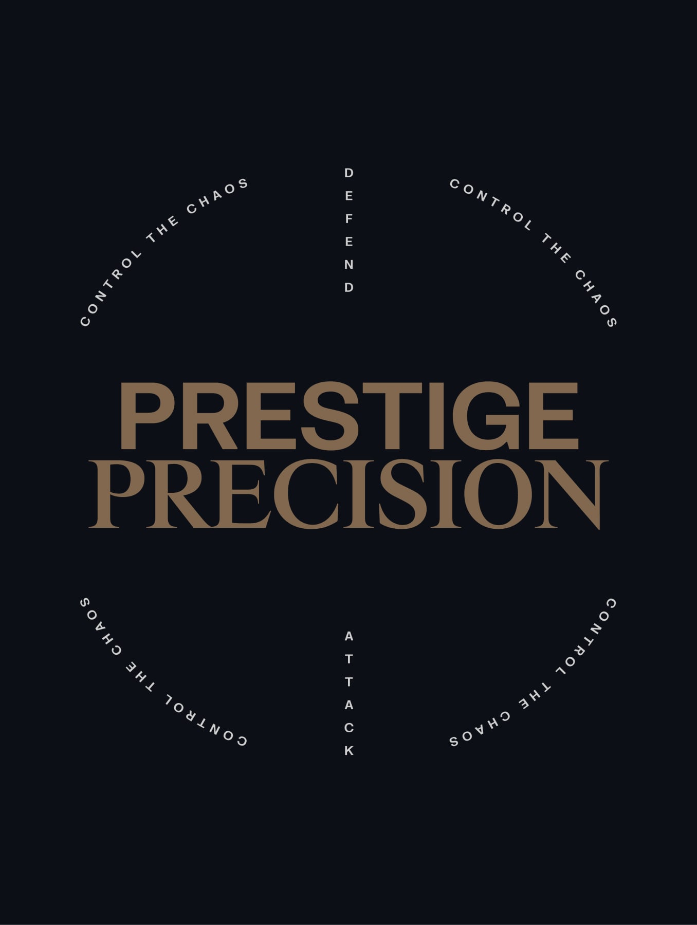
Headlines are placed around a focus point, using our type pairings. Small typographic details in FK Grotesk Bold can be used to illustrate the shape of a scope. Scope outlines can be added for further emphasis and detail where necessary.

Please visit our Downloads Centre to access all font assets.
Ctas

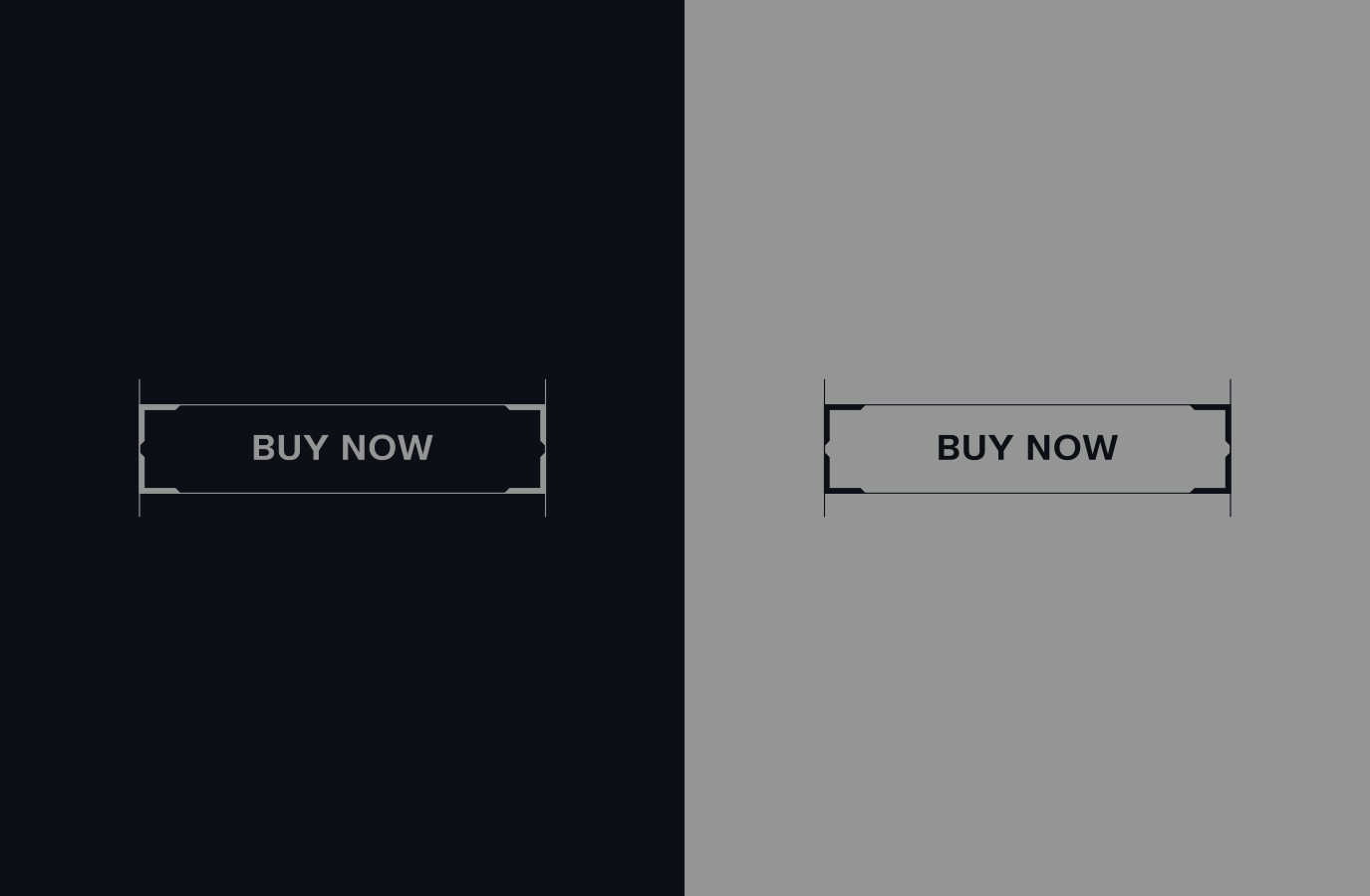
When creating CTAS, we use FK Grotesk in Bold to bring attention to certain details and offers. Surrounding this we bring in a Scope inspired button style to highlight the messaging on offer.

To learn more about Scopes and CTA Colours please refer to our Scope and Colour sections.

Please visit our Downloads Centre to access all font assets.
Colour

Our typography can either sit on a R6 Navy, R6 Silver or R6 Gold background. When using R6 Navy as the background, our headlines and typographic details should be in either R6 Off-White or R6 Gold.

When using R6 Silver as the background, our headline should be in either R6 Navy or R6 Gold, and the small typographic details in R6 Navy.

When using R6 Gold as the background, our headlines and typographic details should be in either R6 Off-White or R6 Navy.

For more information on colour please refer to the Colour section.

Things to avoid

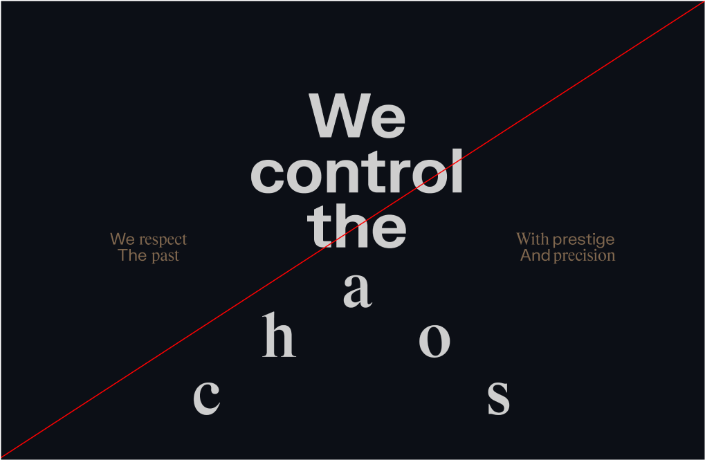
Make sure to follow this guidance to ensure our Typographic system is used correctly in all formats and applications. 

do not mix the wrong weights.
do not use sentence case on headlines and typographic details.
do not create emphasis when not necessary
do not use Silver for type.