02
Our colour scheme is inspired by the conflicting of opposing forces - attack and defence. Through intentional contrasts, we not only amplify legibility but also amplify our assets with a sense of dynamism and depth.
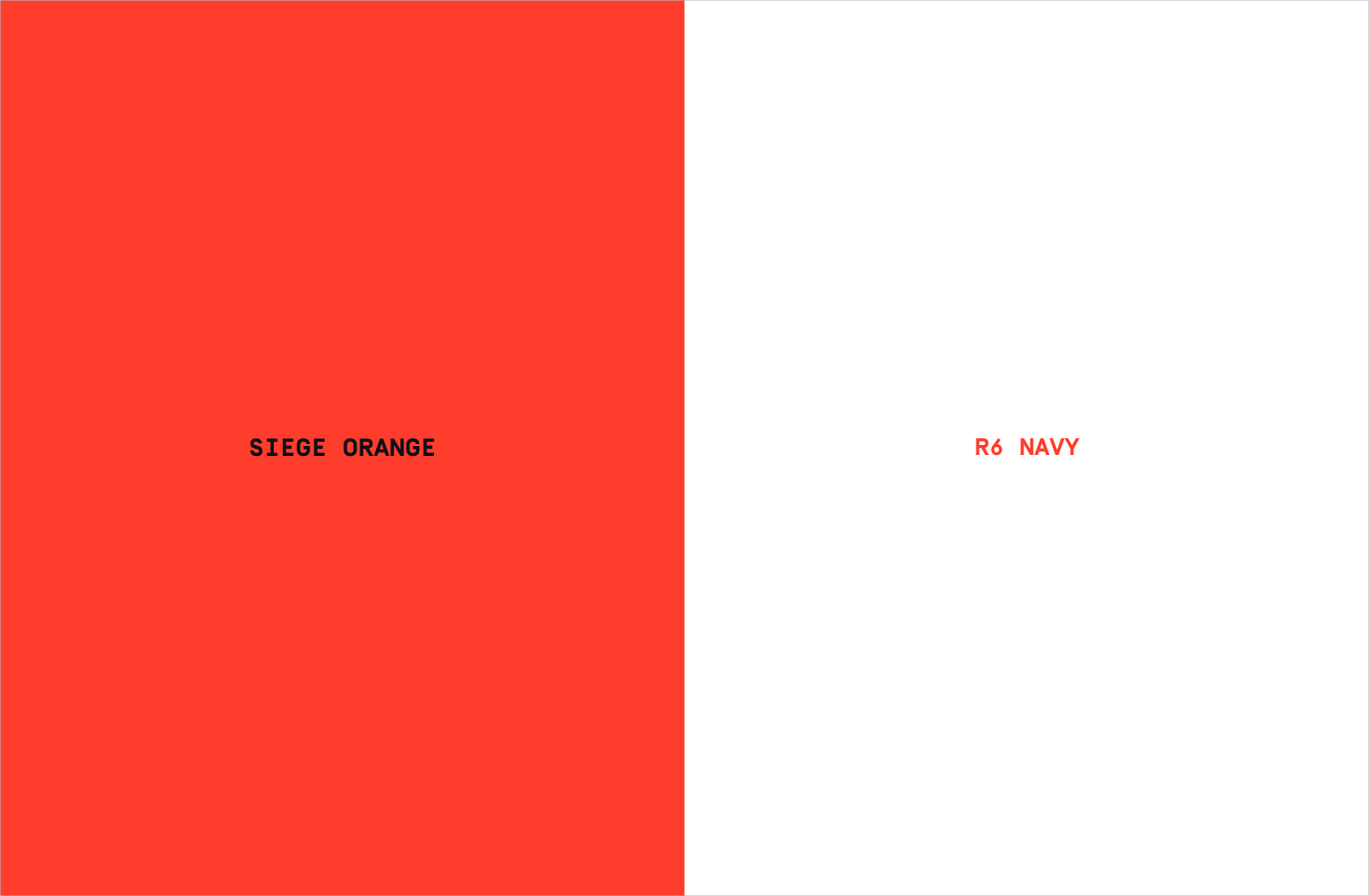
Our Colour Palette creates contrast whilst also adding tone and depth to our destruction visual language. We should avoid using colours outside of this palette to retain consistency.
Please visit our Downloads Centre to access all colour assets.
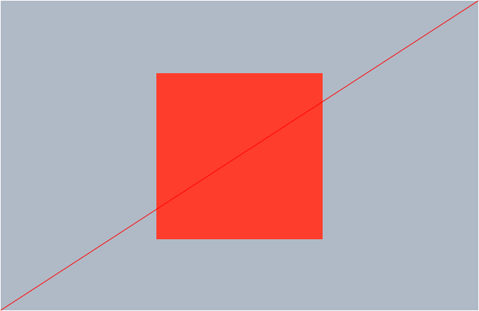
Siege Orange
RGB: 255, 61, 44
HEX: FF3D2C
CMYK: 0, 90, 79, 0
PANTONE: 3556C
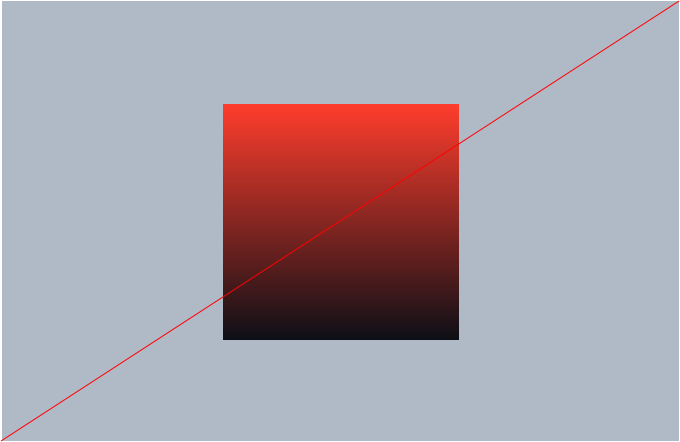
Siege Navy
RGB: 12, 15, 22
HEX: 0C0F16
CMYK: 78, 65, 46, 81
PANTONE: 296C
Siege Dark Blue
RGB: 10, 53, 60
HEX: 0A3550
CMYK: 93, 69, 40, 38
PANTONE: 2955C
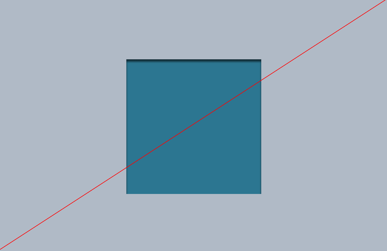
Siege Light Blue
RGB: 44, 118, 145
HEX: 2C7691
CMYK: 72, 35, 27, 11
PANTONE: 7454C
Siege Grey
RGB: 176, 186, 198
HEX: B0BAC6
CMYK: 29, 20, 15, 0
PANTONE: 537C
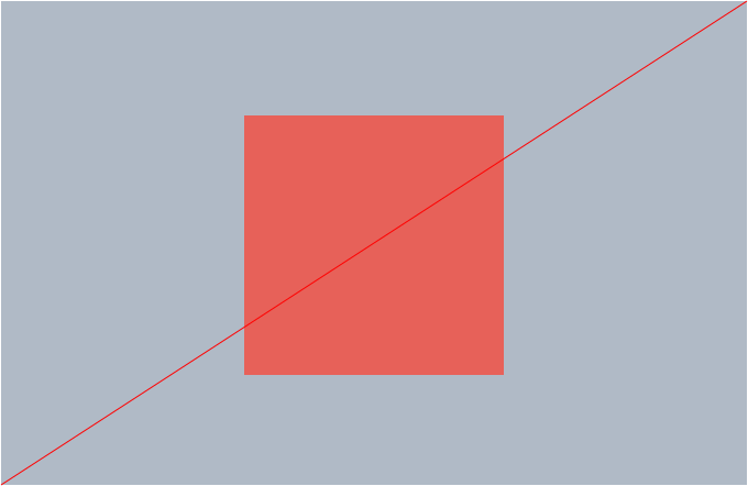
Our Extended UI Palette introduces two additional lighter tones of our palette at 60% and 40%. These tones are exclusively reserved for digital applications to ensure a consistent visual experience.
Siege Orange
60%
RGB: 255, 139, 128
HEX: FF8B80
20%
RGB: 255, 216, 213
HEX: FFD8D5
Siege Navy
60%
RGB: 110, 111, 116
HEX: 6E6F74
20%
RGB: 207, 207, 209
HEX: CFCFD1
Siege Light Blue
60%
RGB: 128, 173, 189
HEX: 80ADBD
20%
RGB: 213, 228, 233
HEX: D5E4E9
Siege Grey
60%
RGB: 208, 204, 221
HEX: D0D6DD
20%
RGB: 239, 241, 244
HEX: EFF1F4
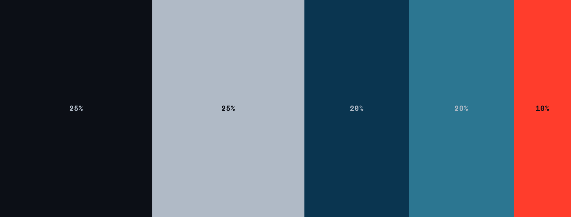
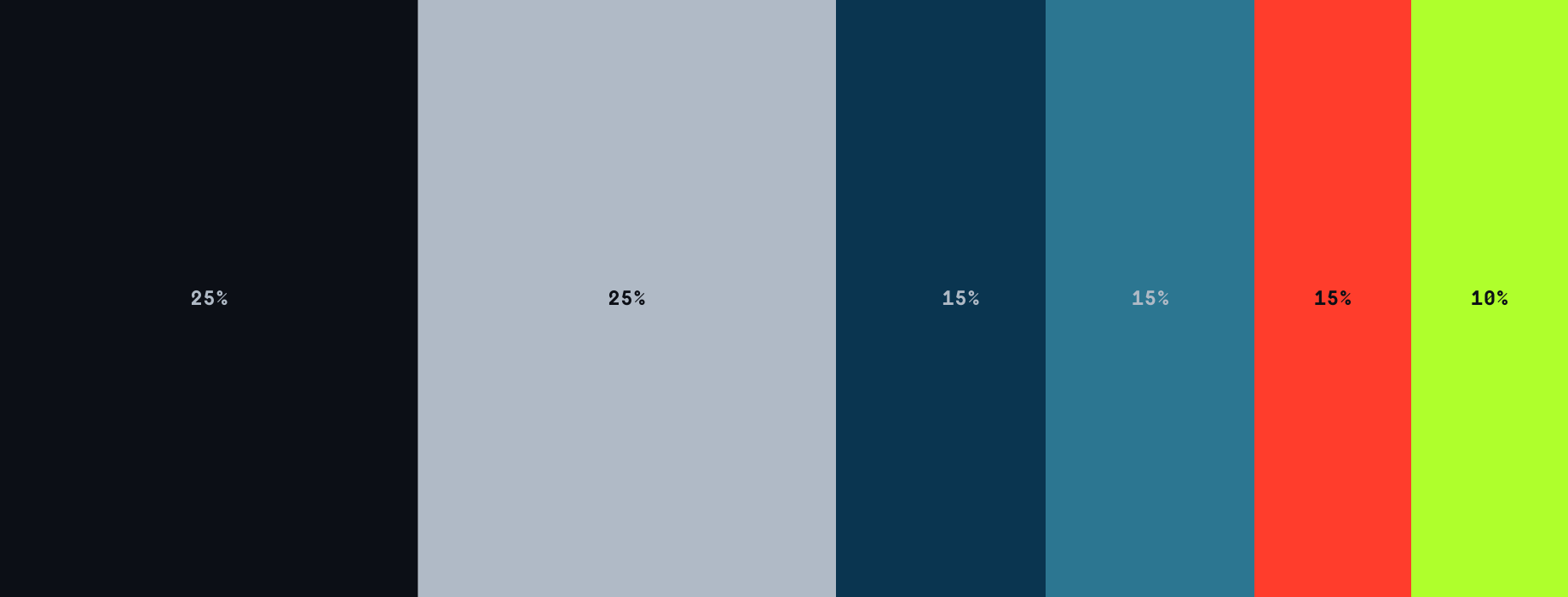
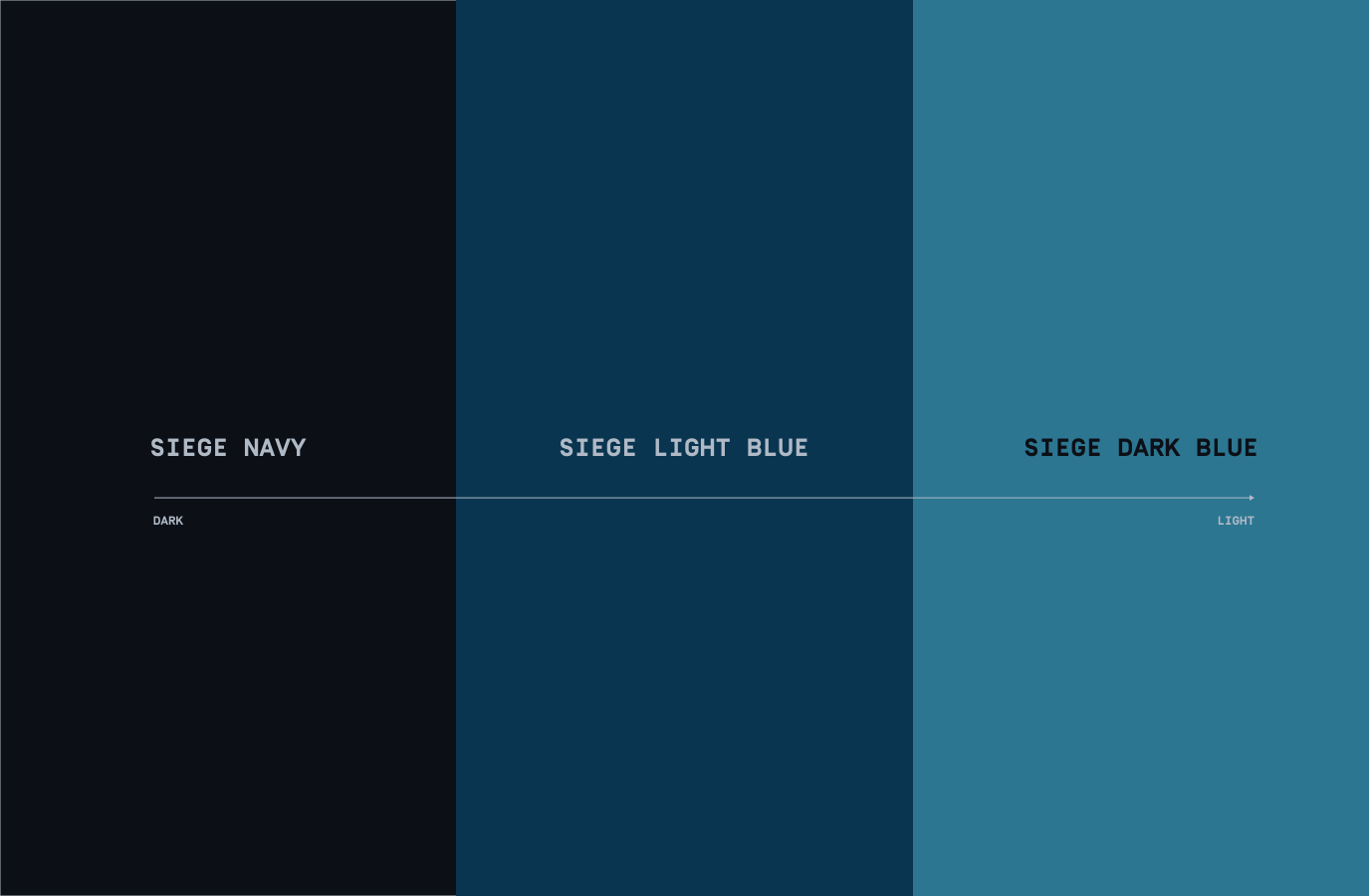
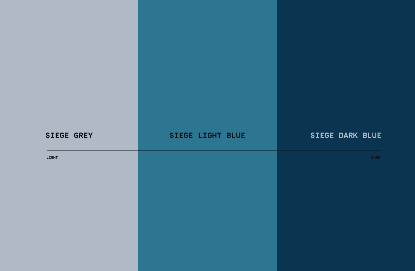
When producing assets and applications make sure to follow this hierarchy. Siege Dark Blue and Light Blue should only be used for Destruction assets, please refer to this section for more detail.
When creating Seasonal assets, that colour should be used at 15% alongside our other colours. We have included a notional Season colour into the hierarchy to show this in use.
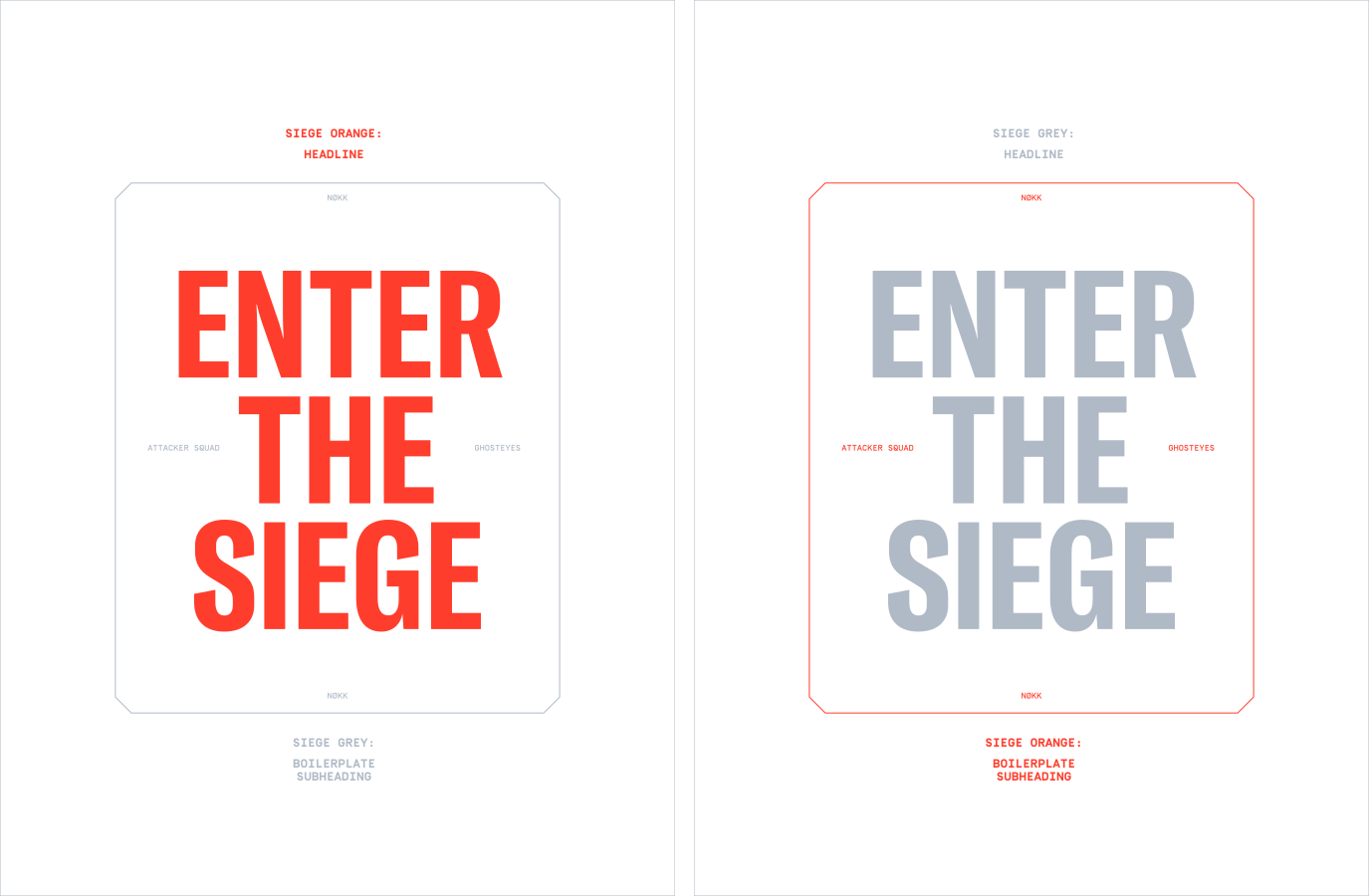
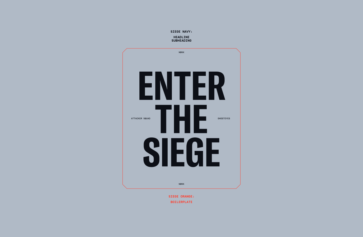
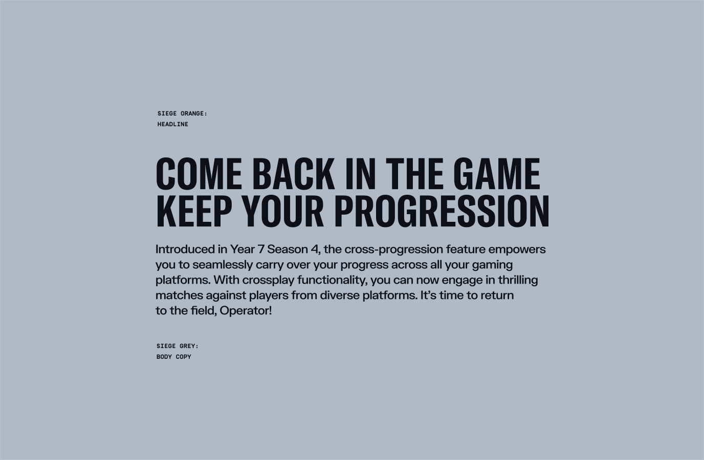
When our body copy sits on Siege Navy, the headline can be in either Siege Orange or Siege Grey.When our copy is on a Grey background, both the headline and body copy must be in Navy for legibility purposes.
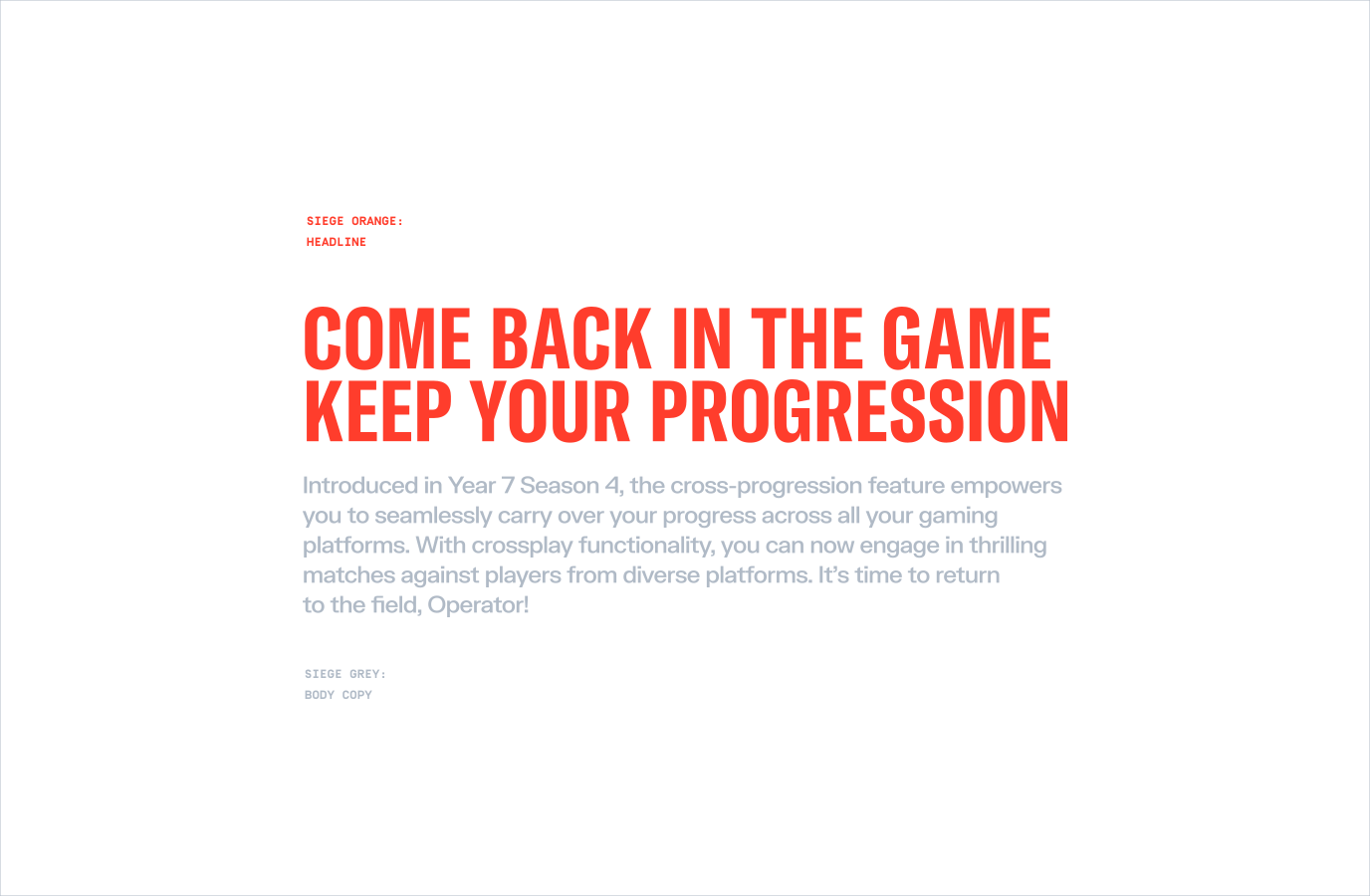
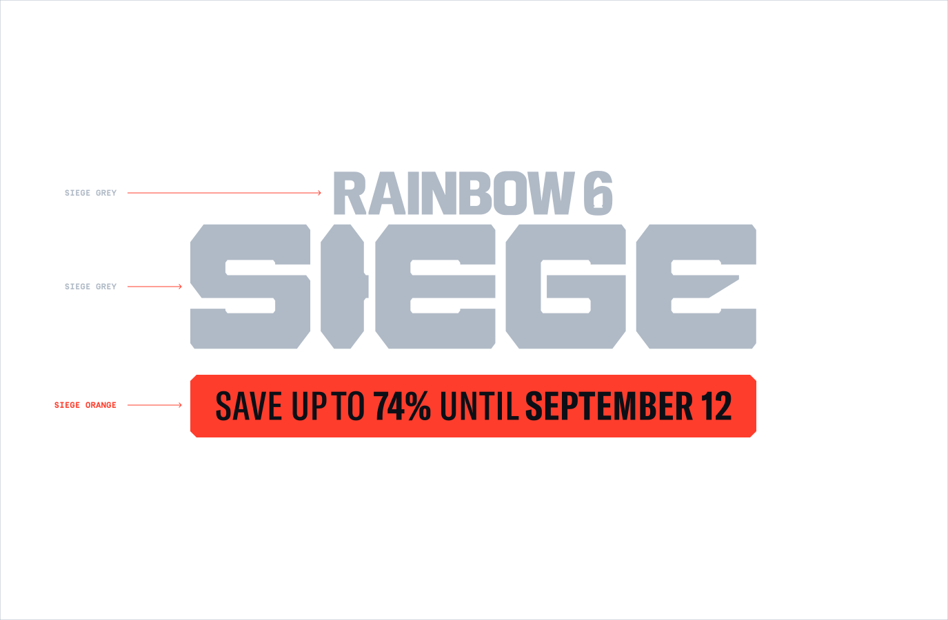
All CTAs and buttons must be in Siege Orange. If a lockup is positioned near the CTA, the lockup must be in Siege Grey. This ensures that information within the CTA gains the necessary attention.
Make sure to follow this guidance to ensure our Colour system is used correctly in all formats and applications.