01

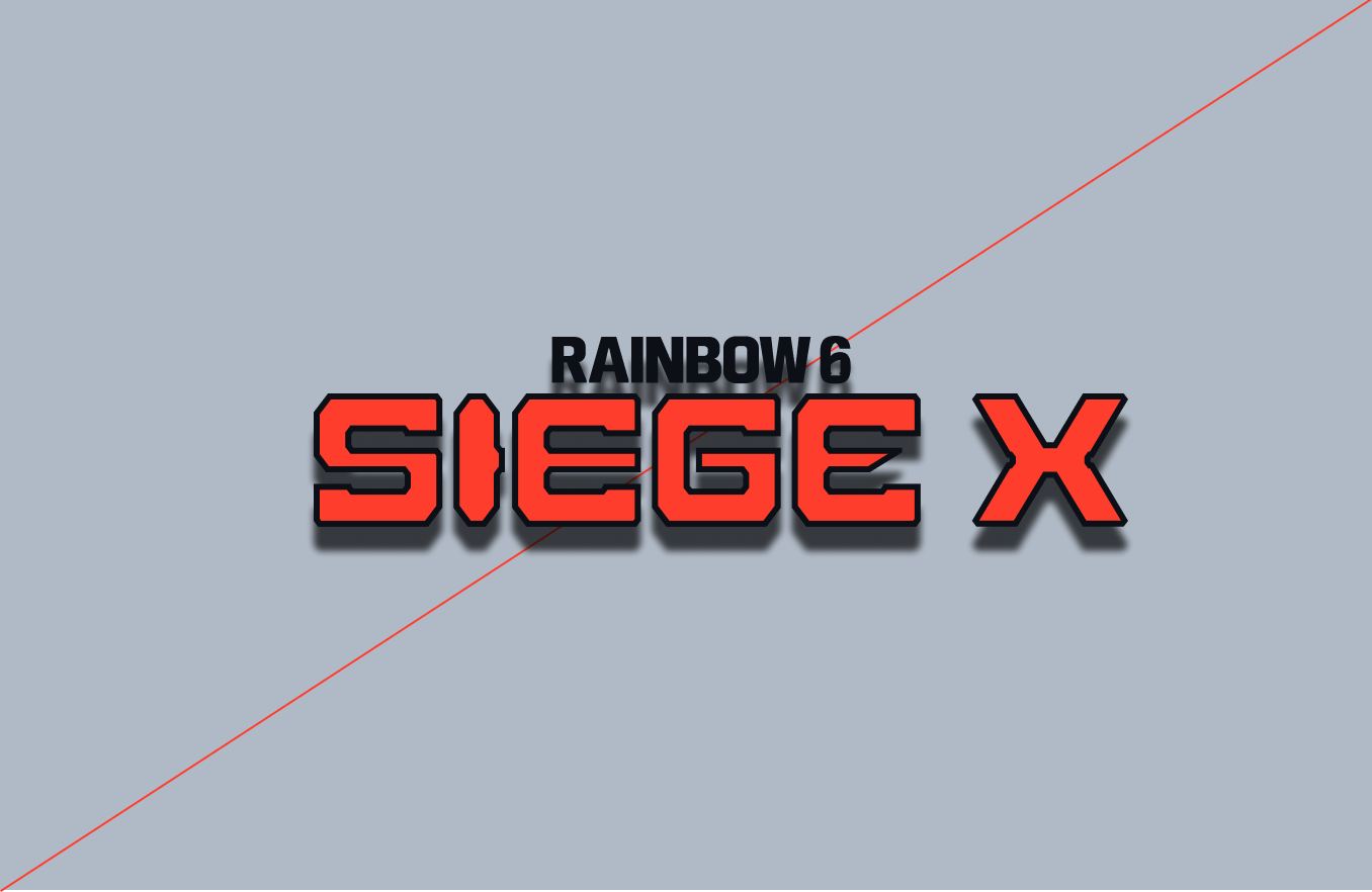
Our logo stands as an unbreakable mark, firmly entrenched within the realm of Siege. Its bold and graphic forms exude a sense of indestructibility, reflecting the resilience inherent to the game's spirit.
Within the letterforms lies The Caber, a tribute to heritage and captivating experience that Siege offers. Alongside this, to celebrate the Siege 10 year anniversary we have introduced a custom X.
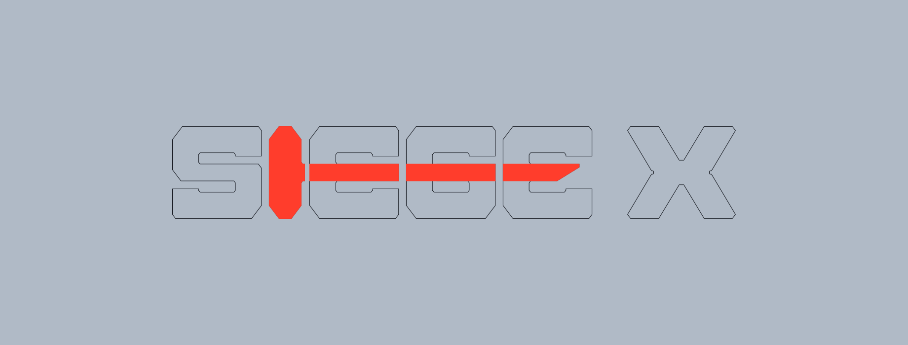
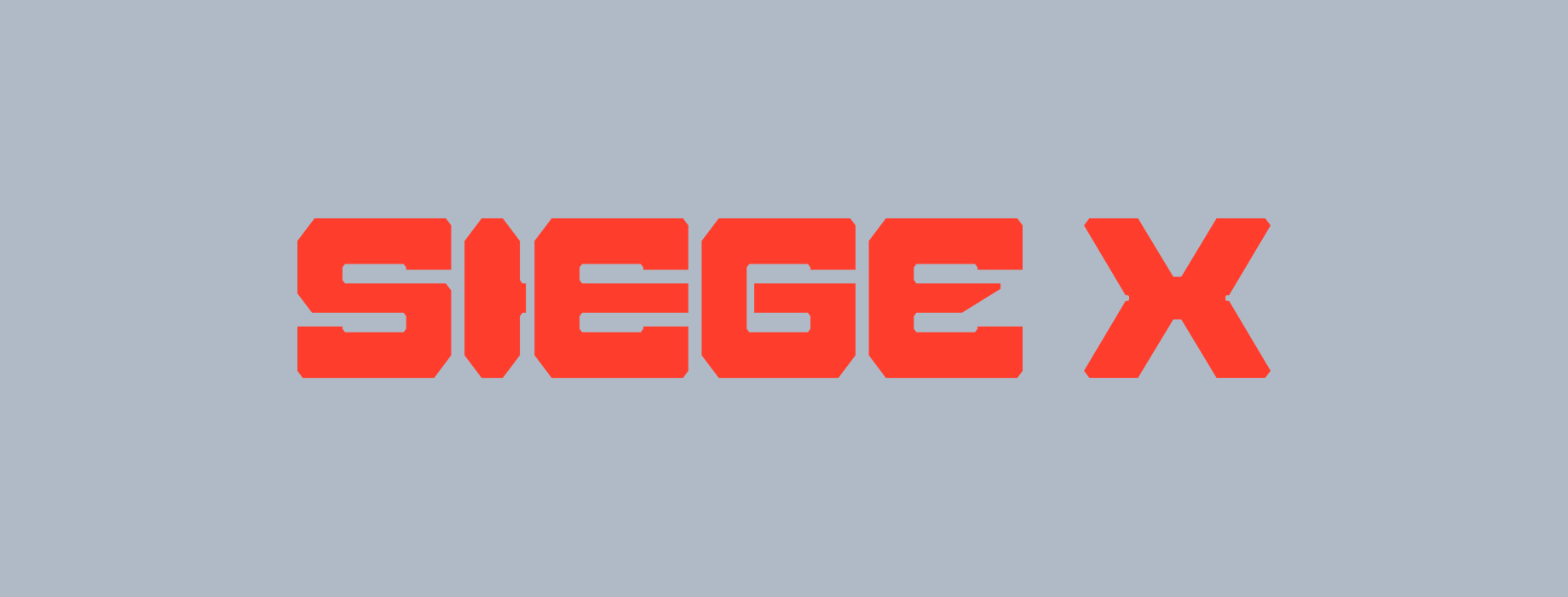
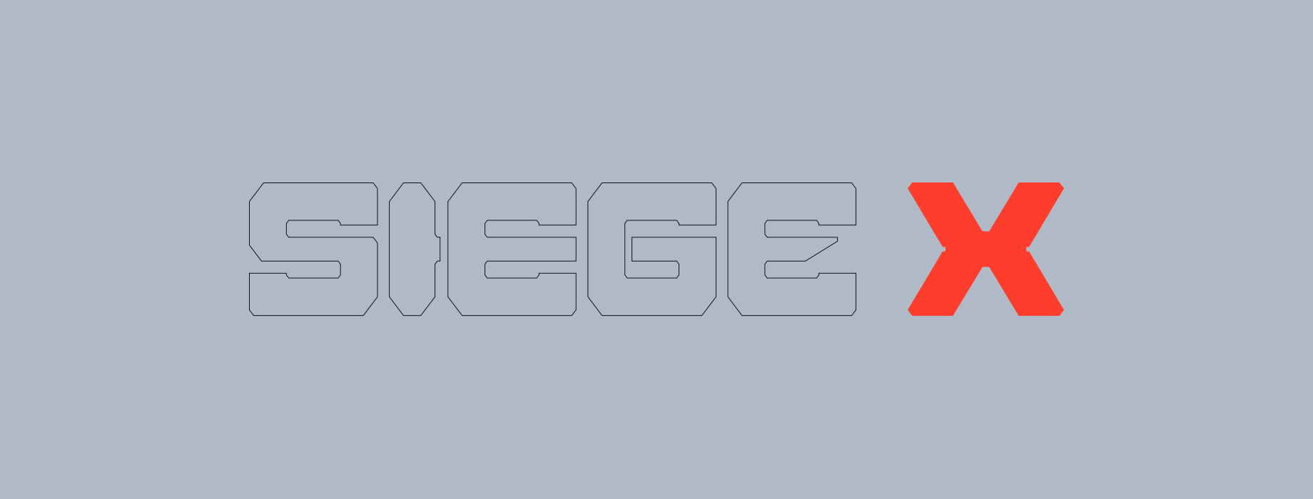
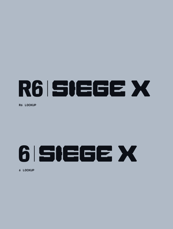
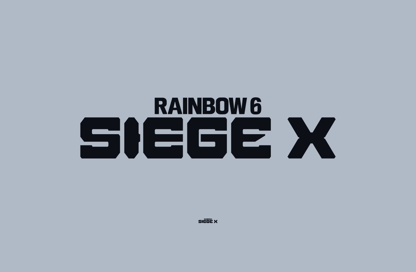
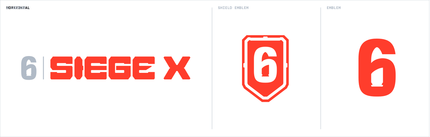
We have three variations of our lockup. Our logo should be associated with our Endorsement lockup for the majority of the time. Please refer to the Hierarchy section for more details.
Please visit our Downloads Centre to access all logo assets.
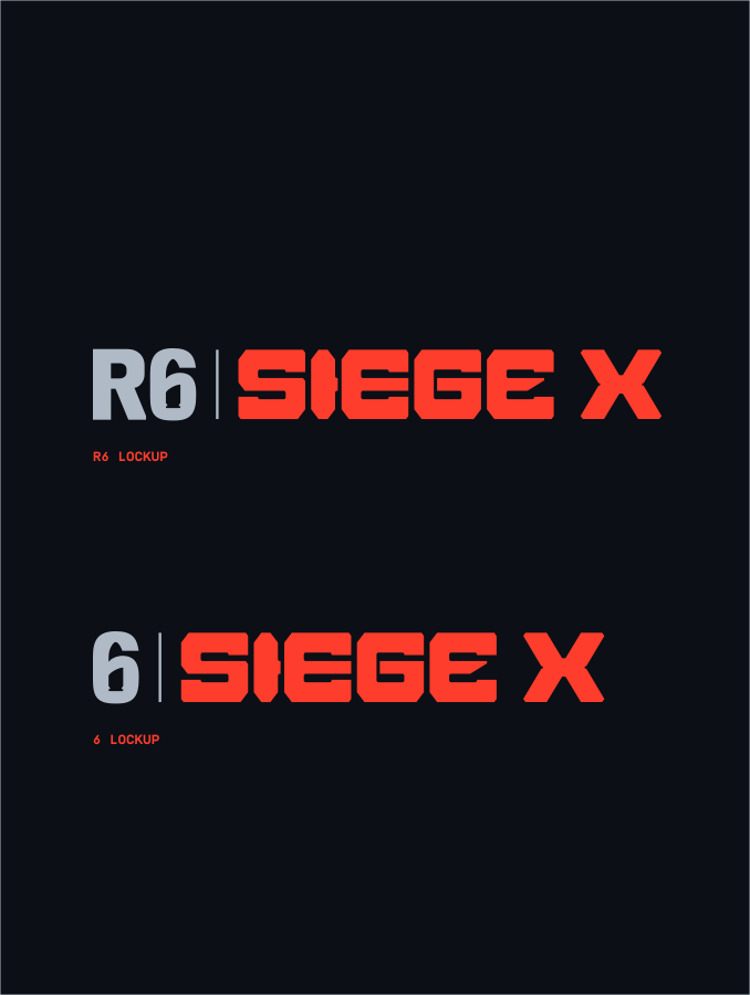
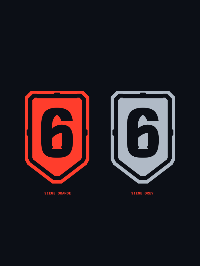
For Primary colour usage we should always use our logos in Siege Orange and Franchise and Endorsements in Siege Grey.
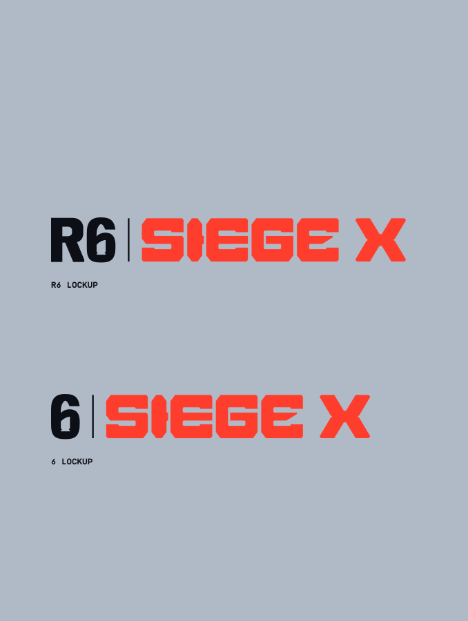
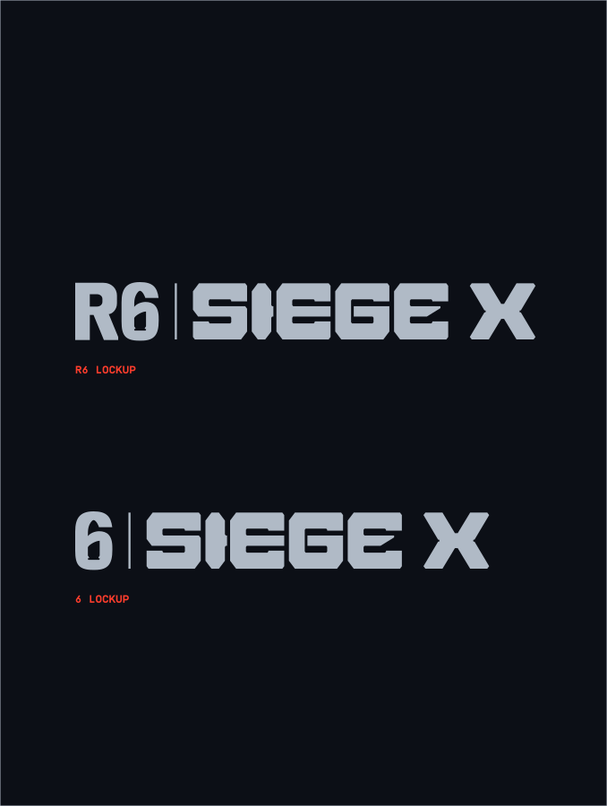
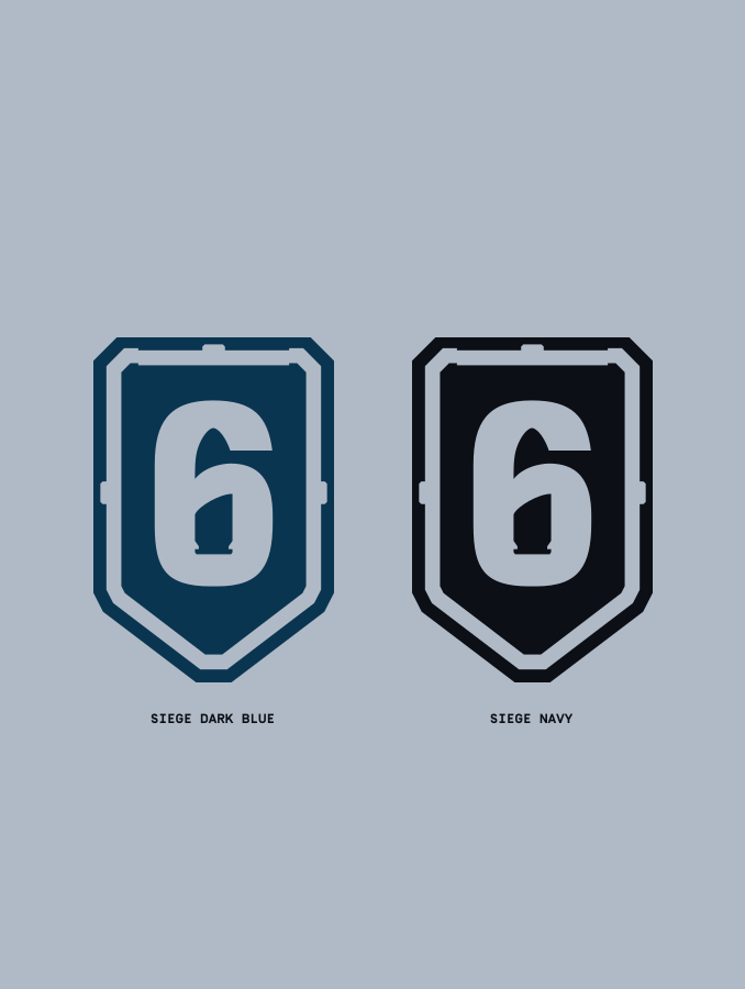
For when colour is limited or not available, we should use our Secondary usage colours in our Siege Grey, Navy, Black or White.
You will also see here the background colours our logos work on best for legibility.
Please visit our Downloads Centre to access all logo assets.
Please visit our Downloads Centre to access all logo assets.
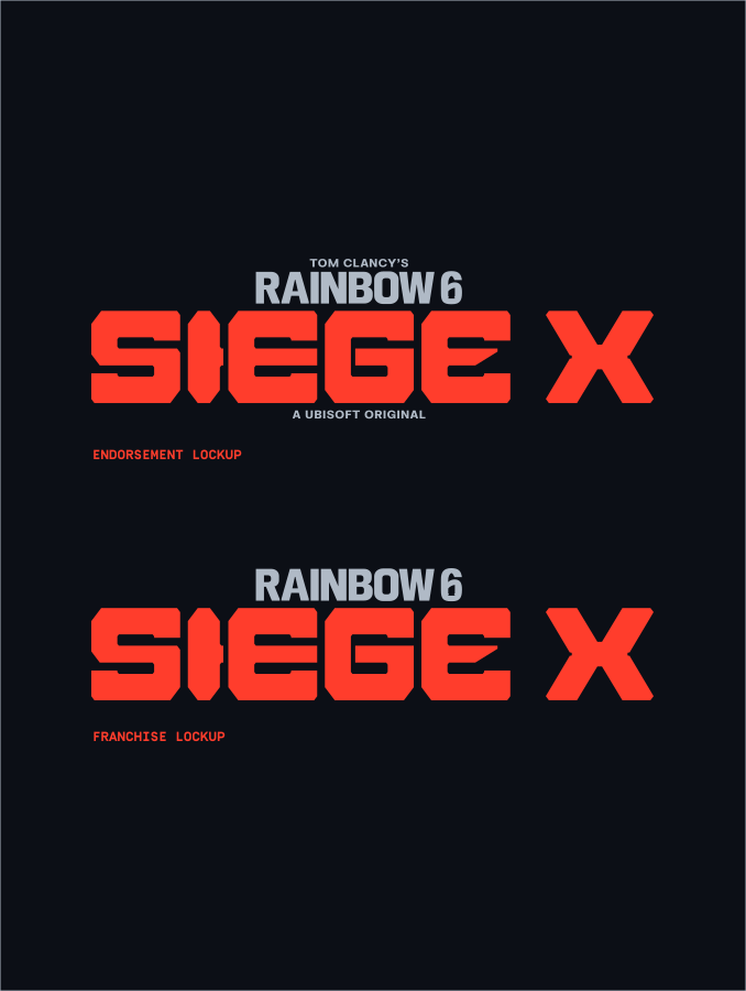
Our primary colour usage is using Siege Grey for the Franchise shorthand and Siege Orange for our Siege wordmark.
For when colour is limited or not available, we should use our Secondary usage colours in our Siege Grey, Navy, Black or White.
Please visit our Downloads Centre to access all logo assets.
PRIMARY
USED FOR: APPLICATIONS WHERE EQUITY IS NOT ESTABLISHED
EXAMPLE: OOH CAMPAIGN, SALES COMMS, WEBSITE
Secondary
USED FOR: APPLICATIONS WHERE endorsement IS ESTABLISHED
EXAMPLE: SOCIAL MEDIA, COMMS, DIGITAL COMMS

Alternate
USED FOR: used As a shorthand
EXAMPLE: Website headers, internal comms

Alternate
USED FOR: when endorsement is established
EXAMPLE: PHYSICAL AND DIGITAL MERCH

Siege Emblem
USED FOR: when endorsement is established
EXAMPLE: PHYSICAL AND DIGITAL MERCH, social media profile

Always maintain a minimum clear space around our logo lockups using 1/2 the size of the Siege ‘S’. This ensures the logo remains visually distinct and unobstructed, enhancing its legibility and impact in all applications.
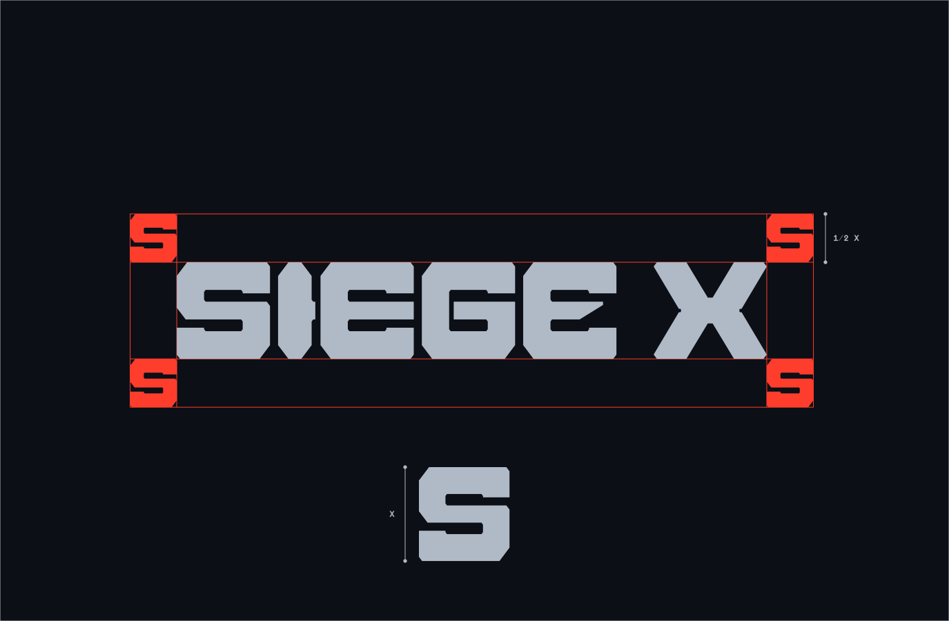
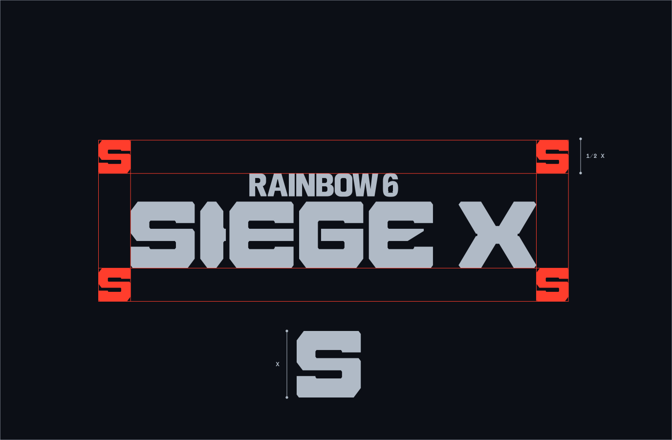
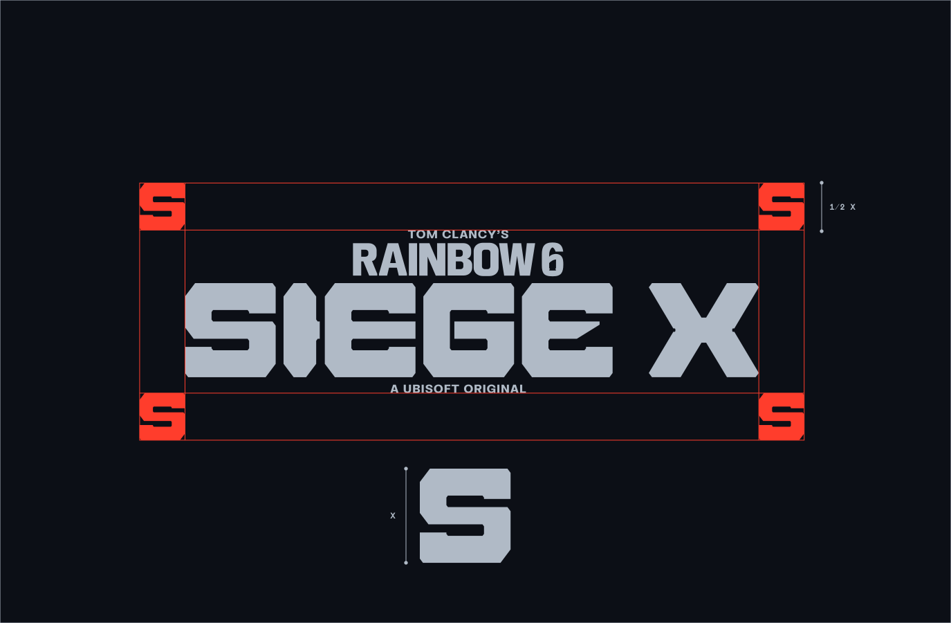
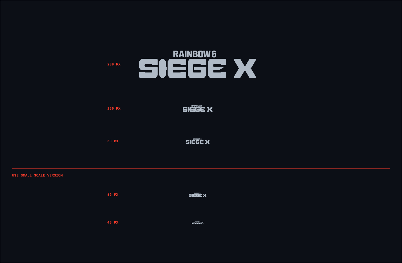
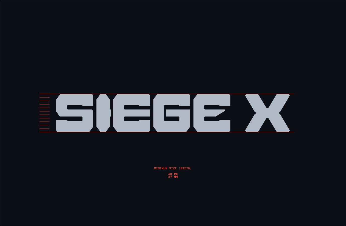
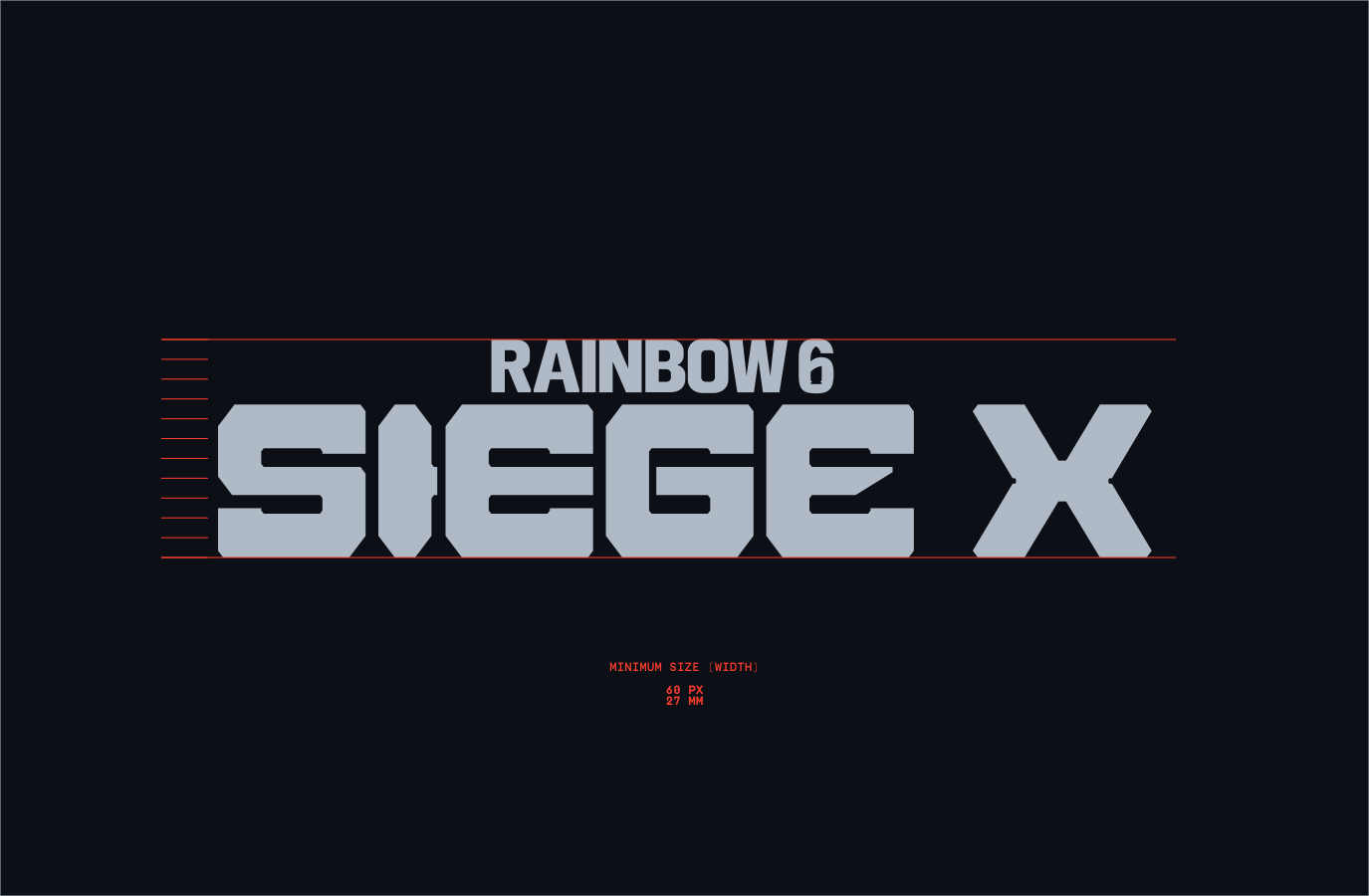
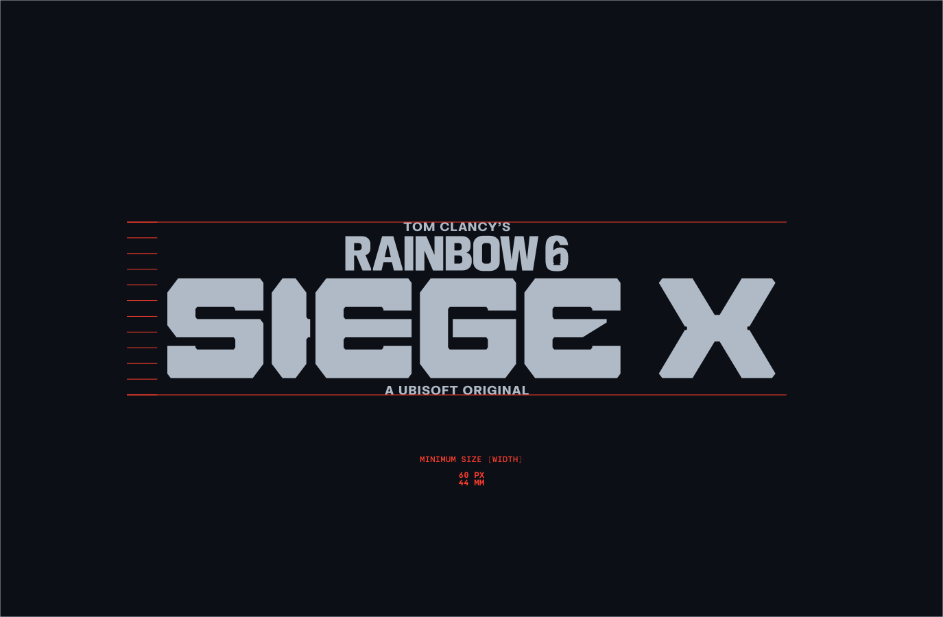
Follow the guidance below to make sure the lock up placement is correct. This placement is a guide for when we are not using our Boilerplates in layouts please refer to this section for more information.
The placement below should be applied to the rest of the lockups within our system. For more information regarding Lockup placement please refer to the Layout section.
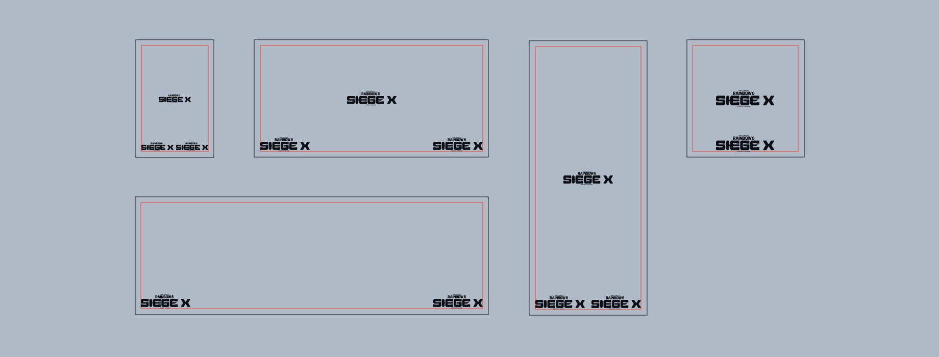
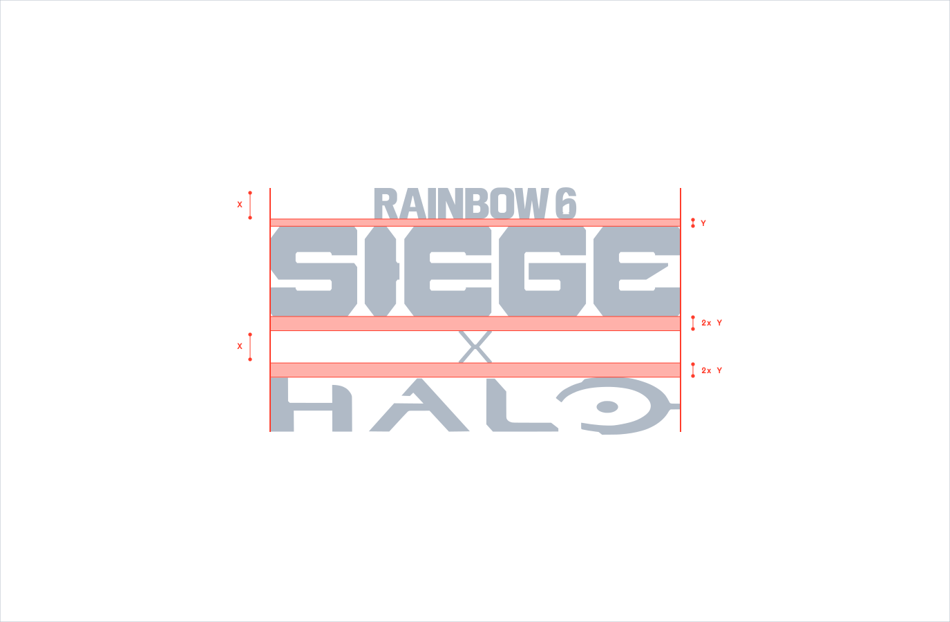
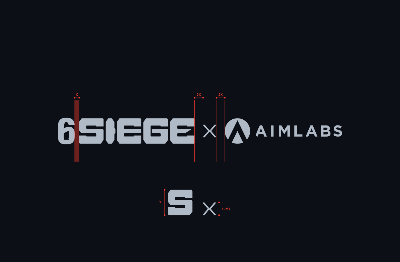
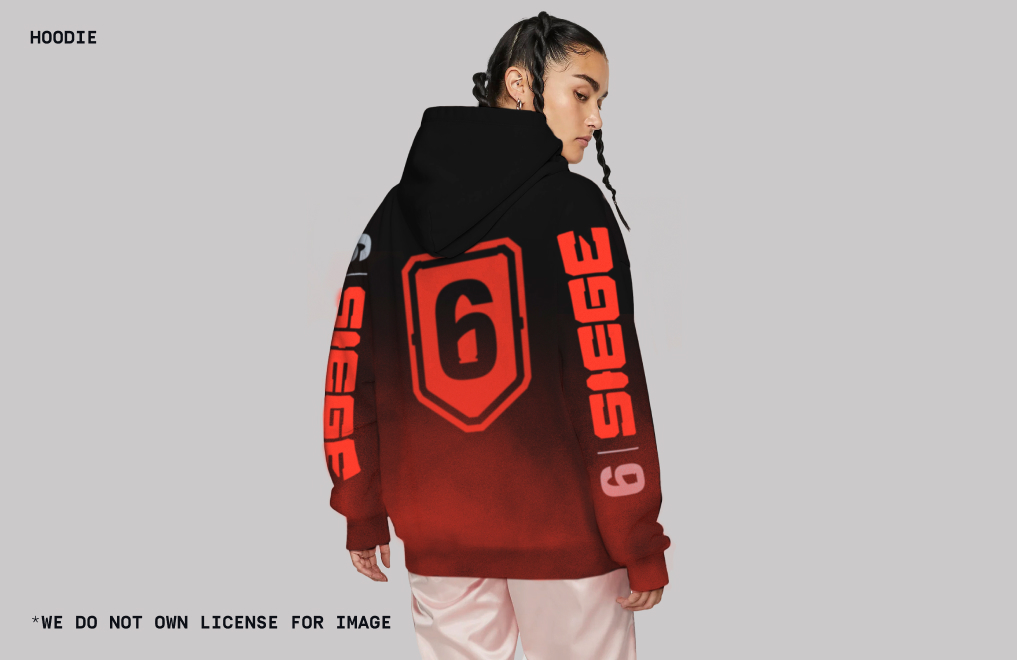
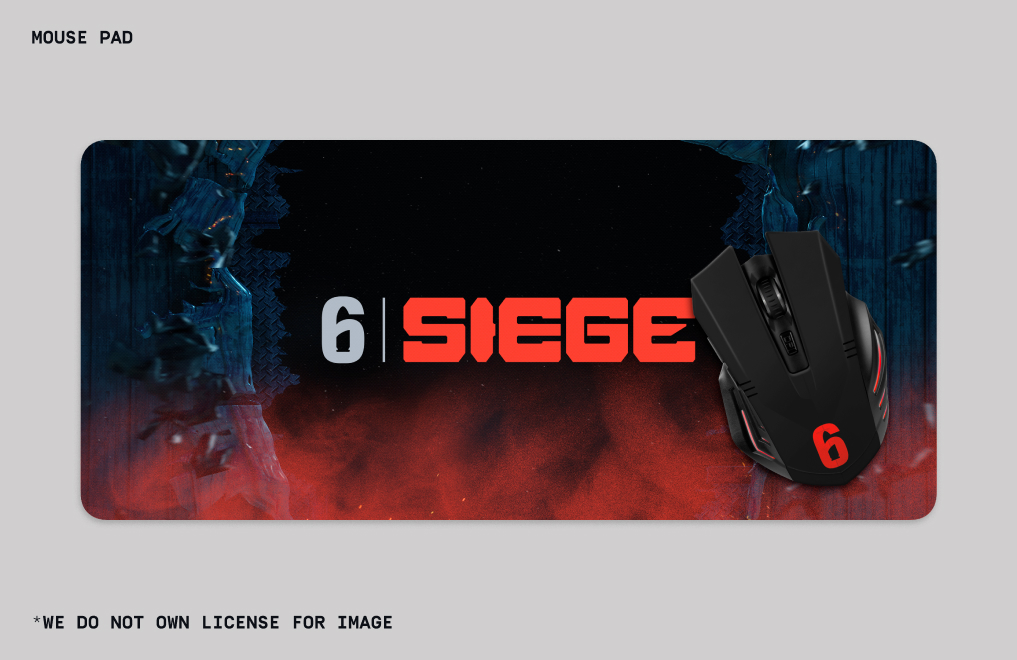
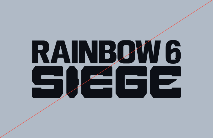
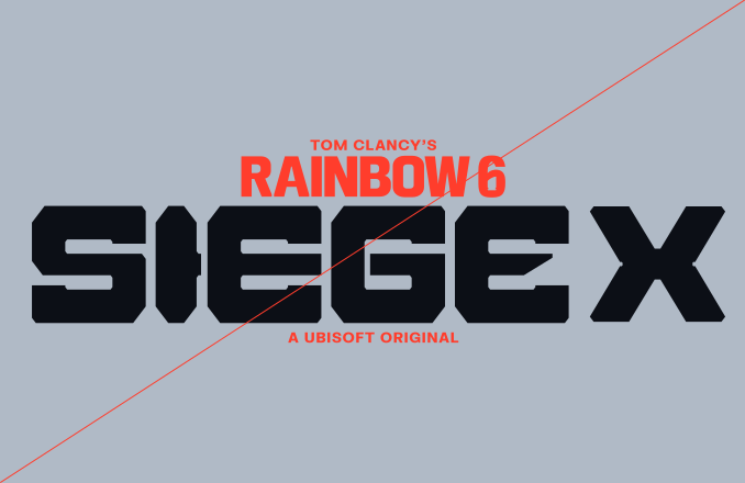
Make sure to follow this guidance to ensure our Logo system is used correctly in all formats and applications.
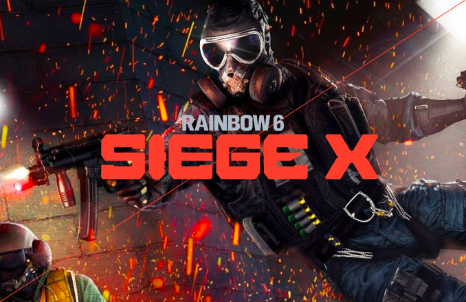

Social media