06

Our Layout system brings everything together. Expressing the brand in a consistent and impactful way.
In this section we will showcase a breakdown of our Layouts and how they bring our toolkit together effectively.
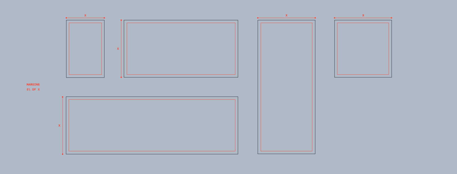
To determine the size of margins, we use the shortest edge of the format. Follow these rulesets to make sure our margins are set correctly.
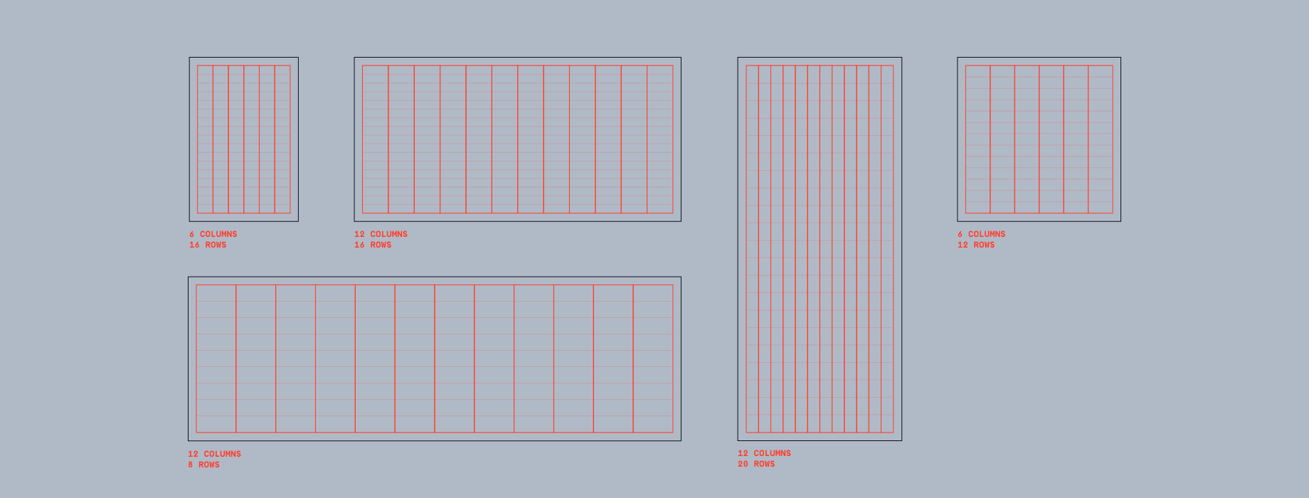
After determining the margins, we can set the columns & rows. These aid in placing content and Boilerplates. To learn more about Boilerplates please refer to the Boilerplates section.
The base of a Boilerplate should not move, however it can extend to fit more content. Boilerplates should never take up more than 40% of an application’s longest side.
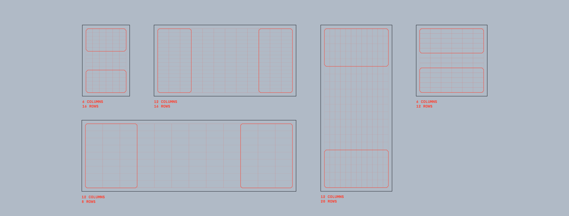
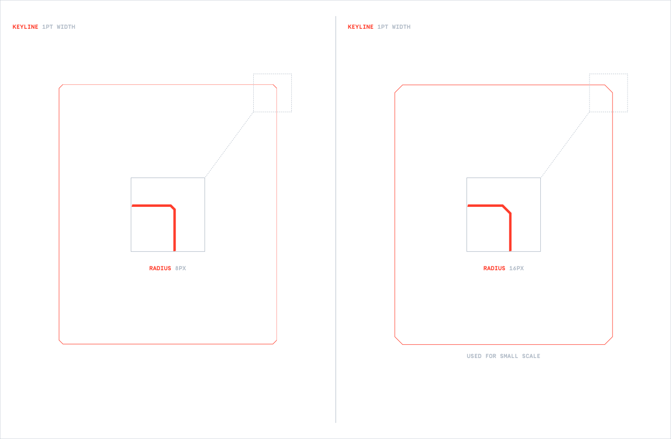
The width of our Boilerplate keyline should be set to 1pt. For small formats we can increase this for legibility reasons.
We have two radius options for our Boilerplates set at either 8 or 16 pixels.
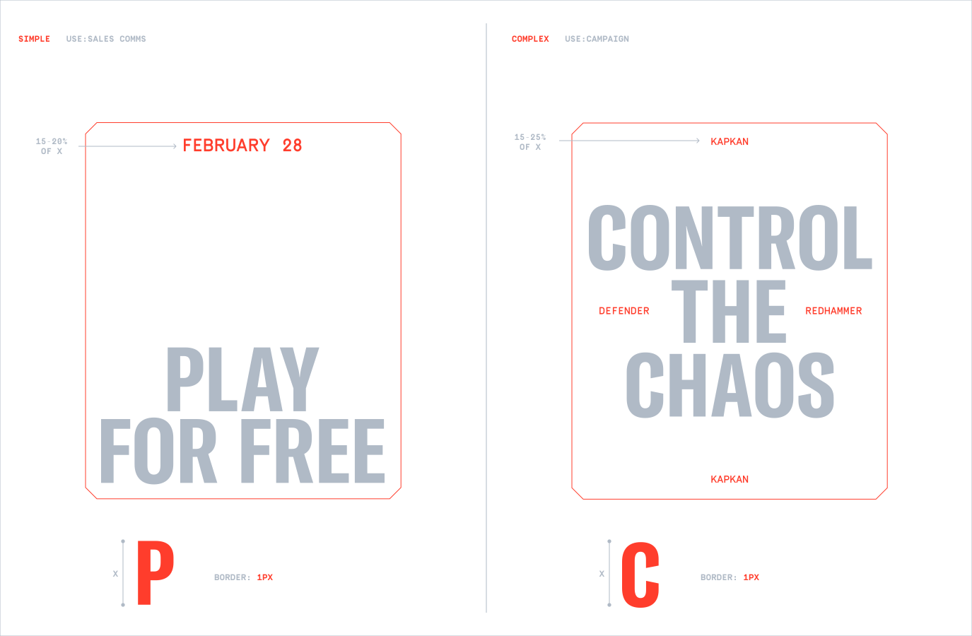
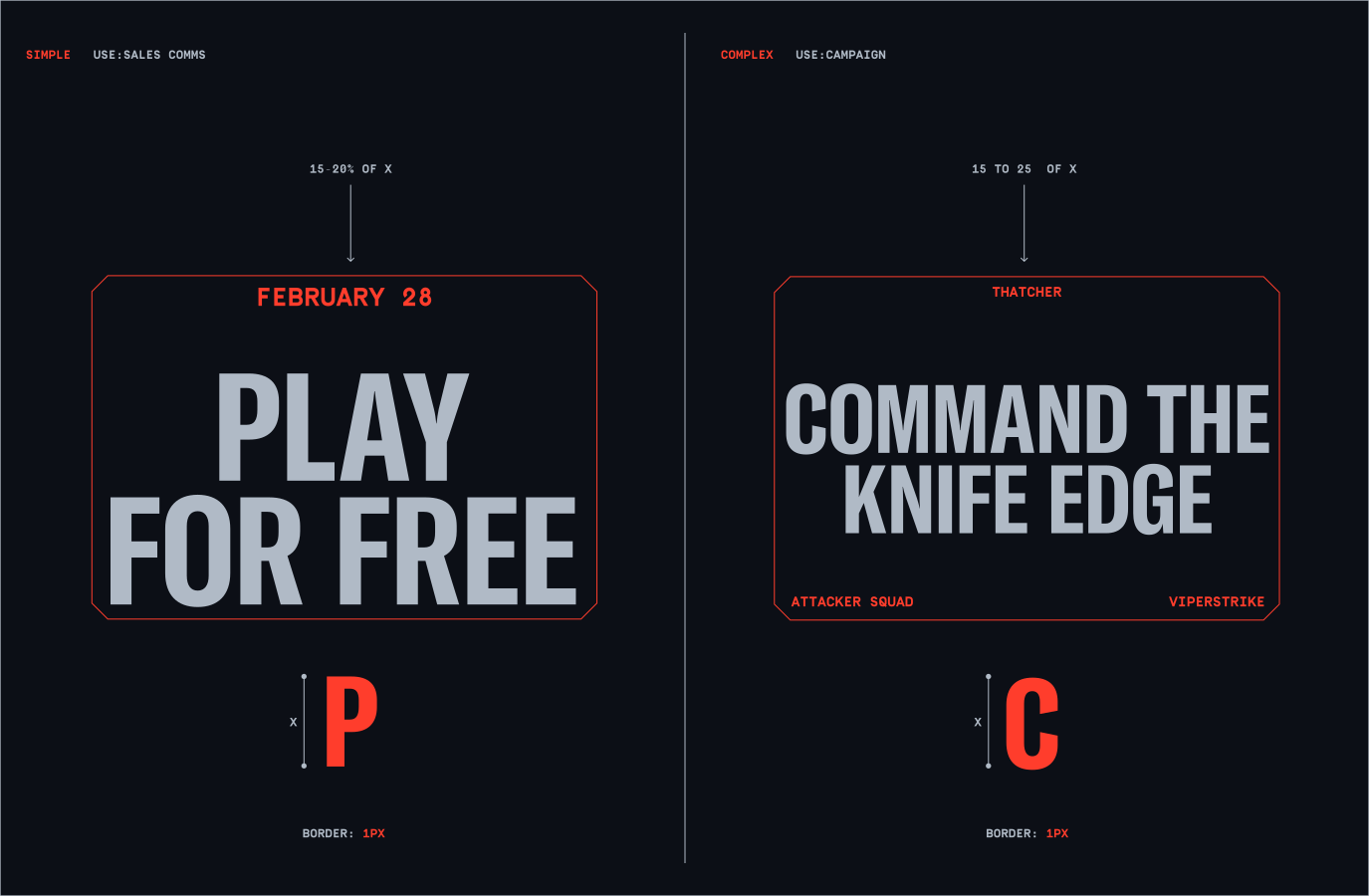
Follow this guidance to make sure the typography that sits within the Boilerplate is consistent and always impactful.
Type can be either centred or left aligned.
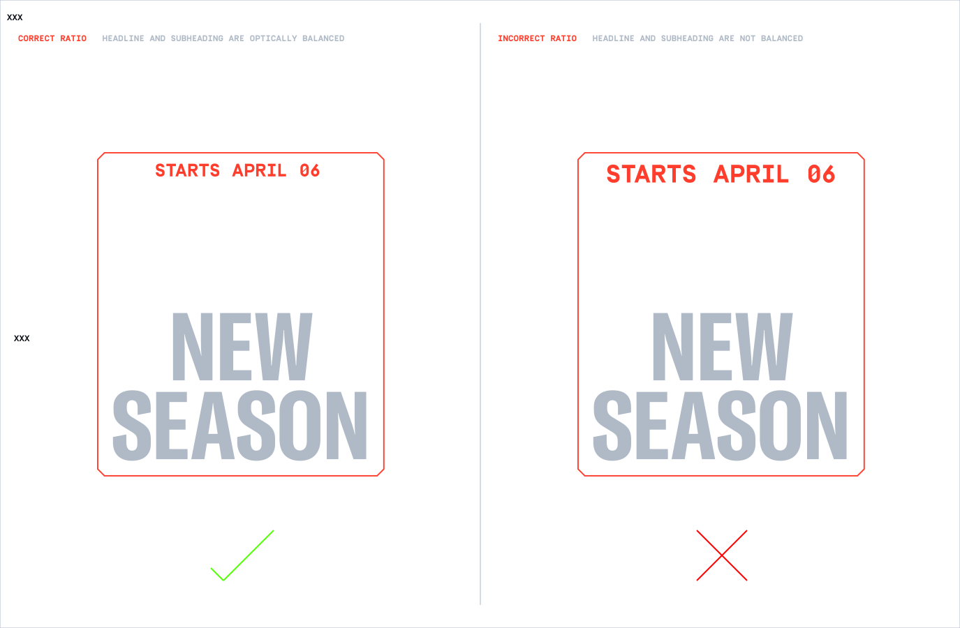
This is an approximation; the ratio should be conducted optically. Make sure the headline has greater importance than the subheadings and details. For more detail on this please see the Type Ratio Example.
For more information on Type please refer to the Typography section.
Here is an example of how we can set the Type Ration optically. The headline should always be the focus within the Boilerplate.
For more information on Type please refer to the Typography section.
To set the margins within our Boilerplate, we use a height of 25% of our headline. The subheading should also be set to this margin.
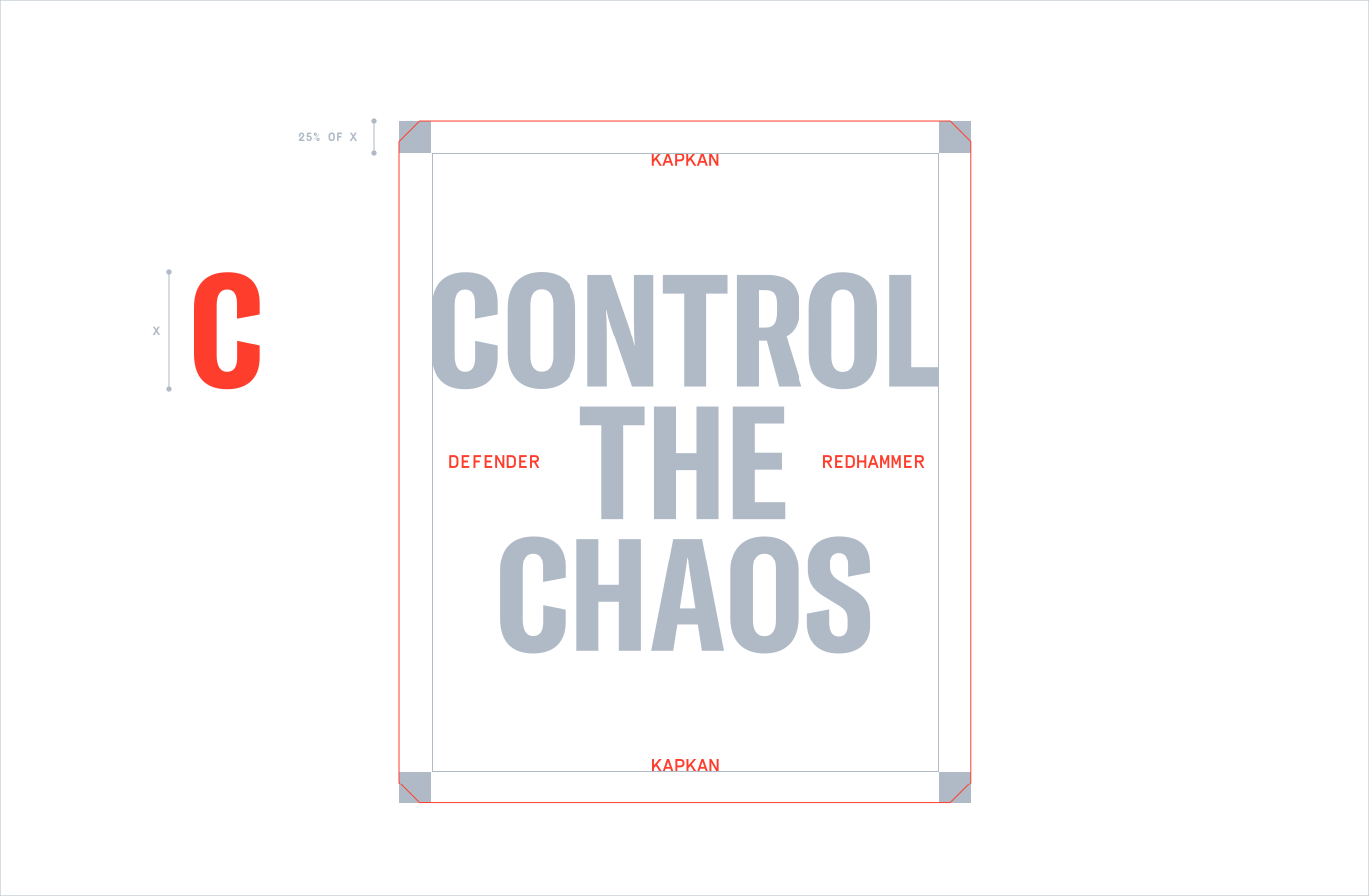
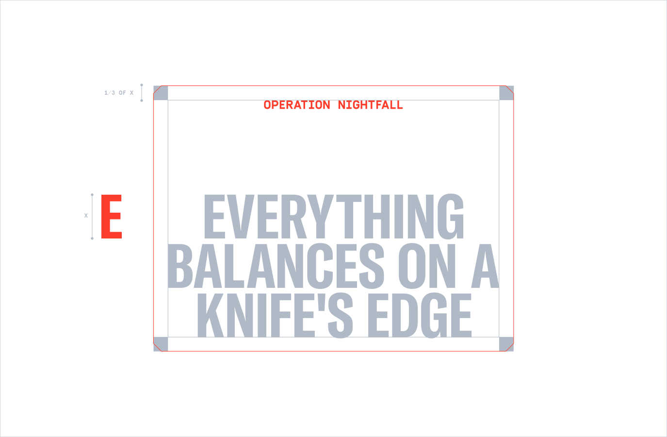
When a headline exceeds 10 characters, enlarge the margins accordingly. Set the margin to one-third of the headline's x height, applying the same adjustment to the subheading.
This version maintains clarity while streamlining the language for better readability.
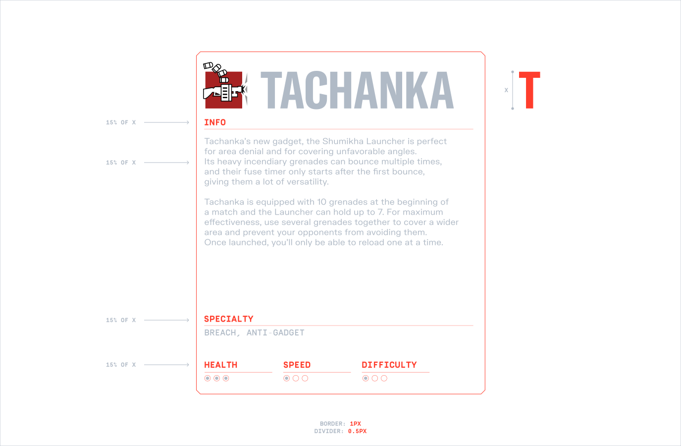
When we have extensive content, we can divide typography within the boilerplate. We can also add divider keylines to separate the content - these should be set to half the width of the Boilerplate.
For more information on Type please refer to the Typography section.
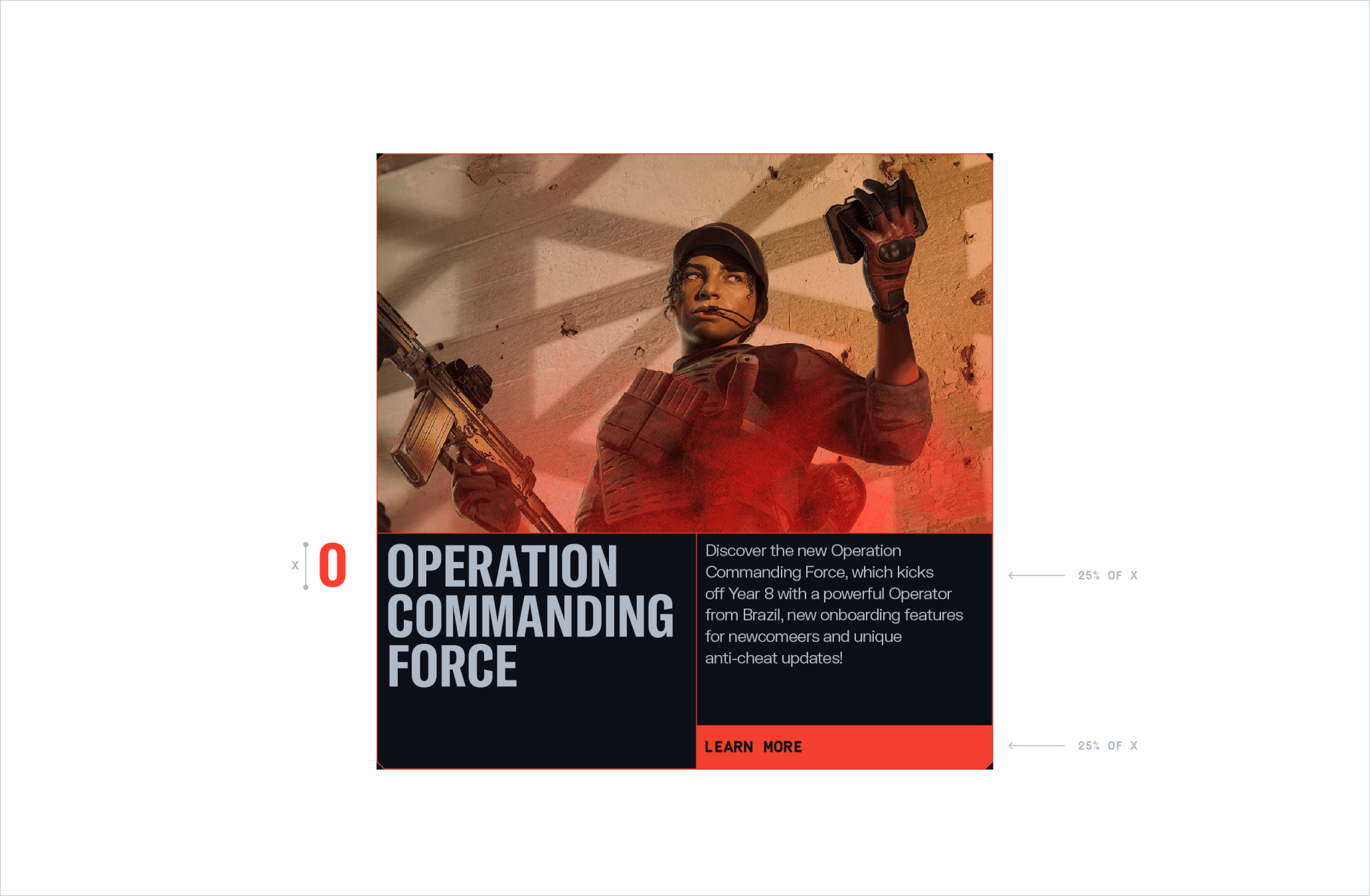
Similar to Content Plates, we can use Modules to hold typography and imagery. Follow the guidance to make sure our typefaces are set to the right size.
Areas of the Module can also be filled in, this can bring attention to CTAs and buttons.
For more information on Type please refer to the Typography section.
While Destruction and Debris can overlap with our Boilerplate and typography. It's crucial that these elements do not overly obscure the type, ensuring optimal legibility whilst still showcasing depth and dynamism in the layout
For more information on Destruction please refer to the Destruction section.
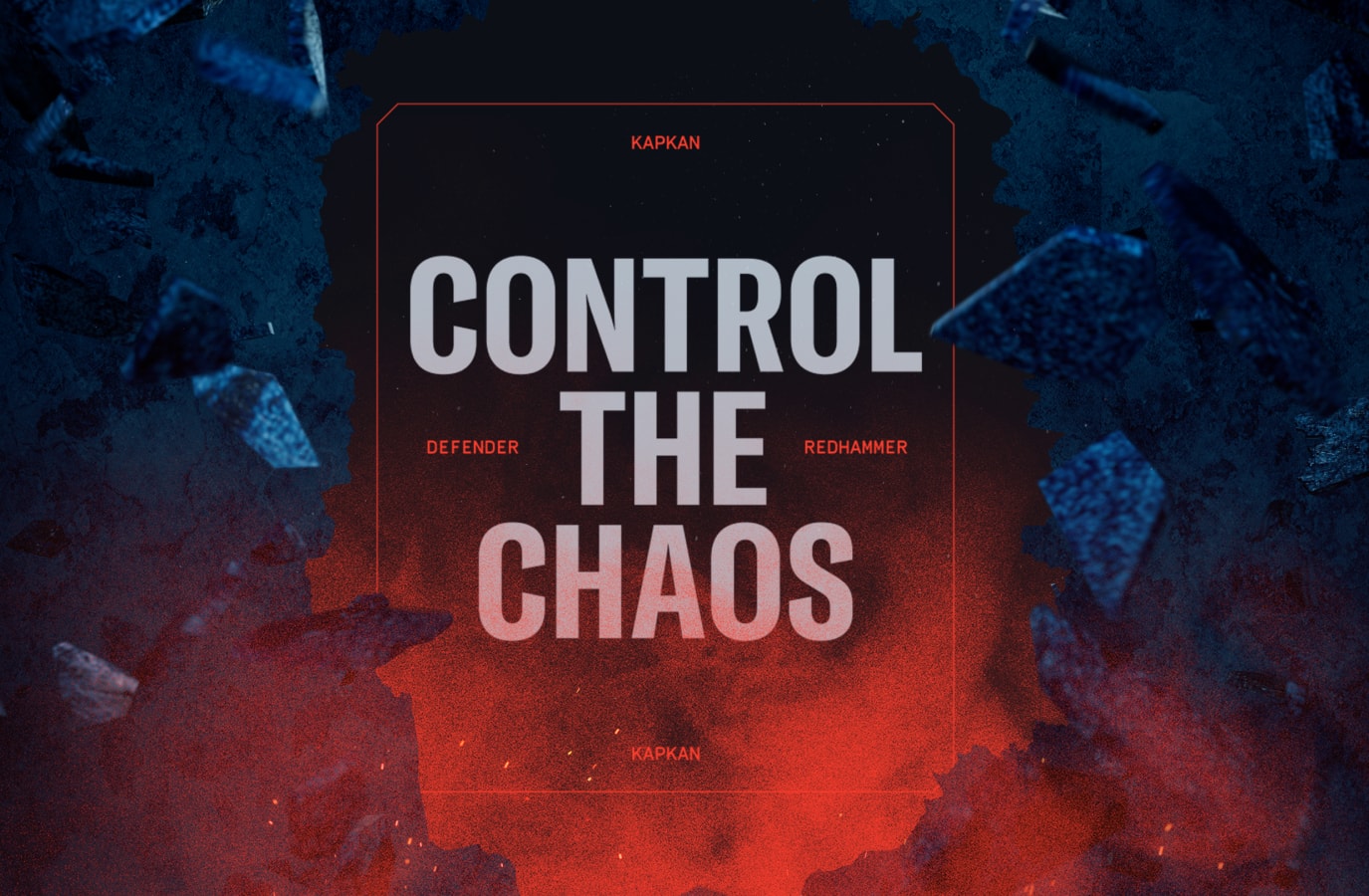

This demonstration highlights the adaptability and consistency of our visual language, ensuring impactful communication across different formats.
To see more examples of layouts in different formats and contexts please refer to our Application section.
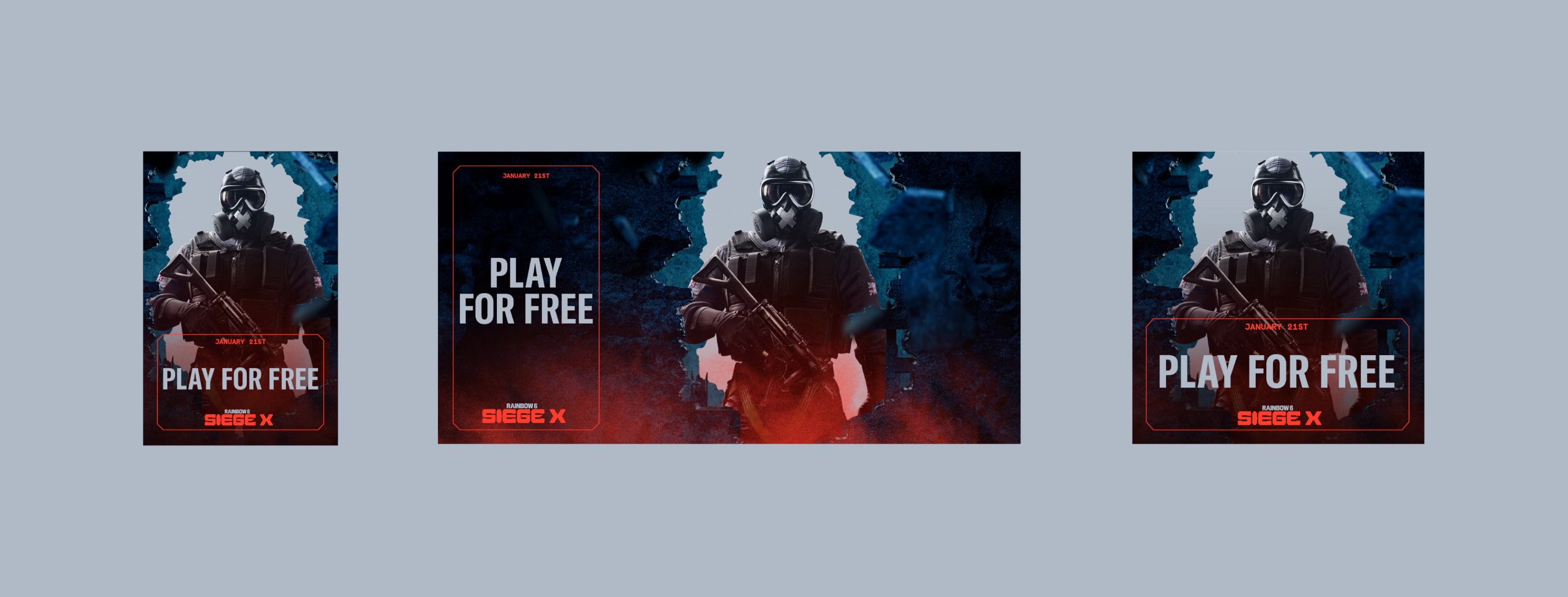
Make sure to follow this guidance to ensure our layouts are used correctly in all formats and applications.