05
Our Art direction embodies the empowering essence of our operators, consistently evoking a commanding presence. It operates as a versatile system, seamlessly integrating with our destruction language and seasonal key art, ensuring a cohesive visual narrative.
In this section we will showcase the different styles of Art Direction within our toolkit, how to create them and how to use them.
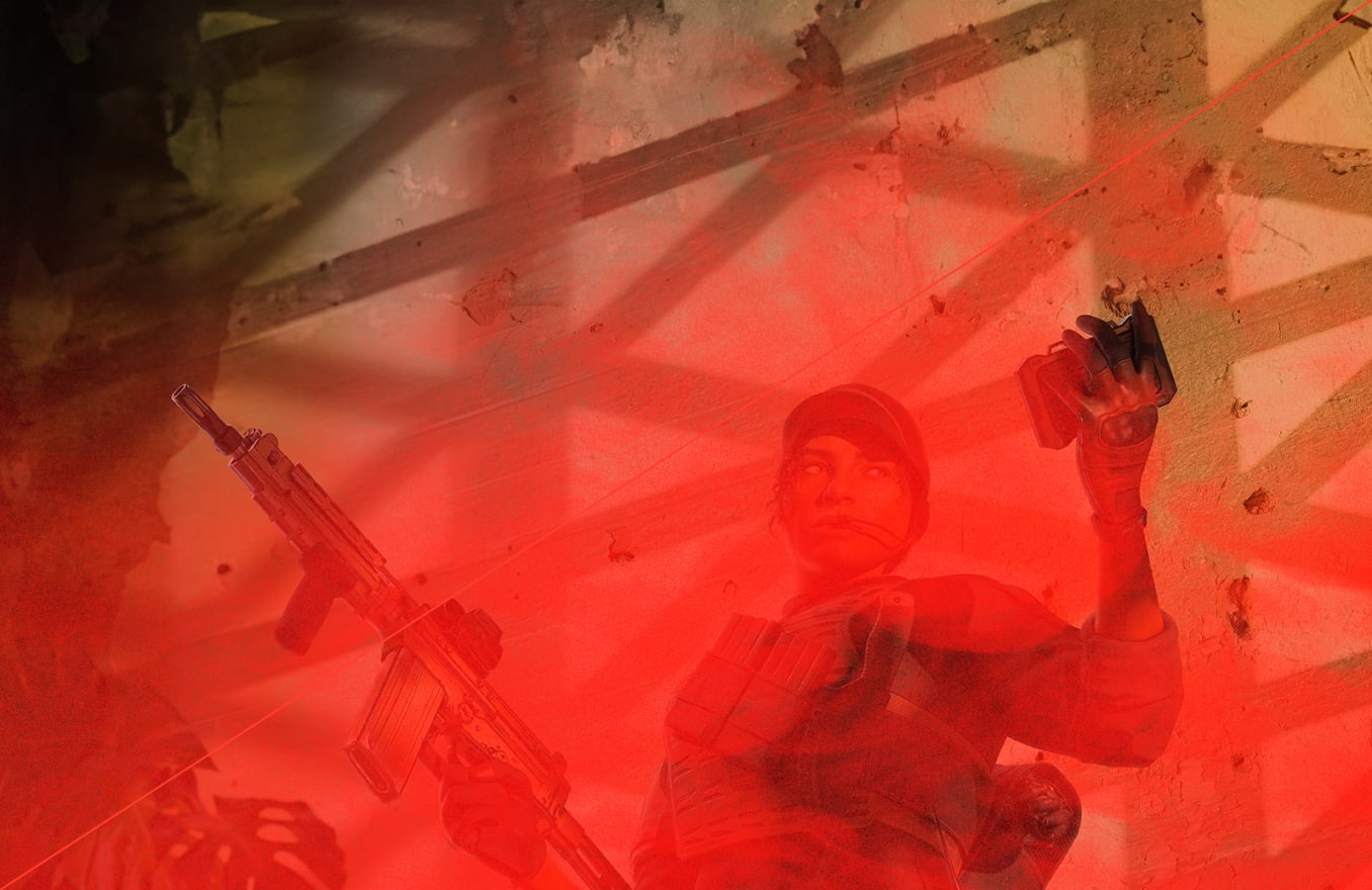
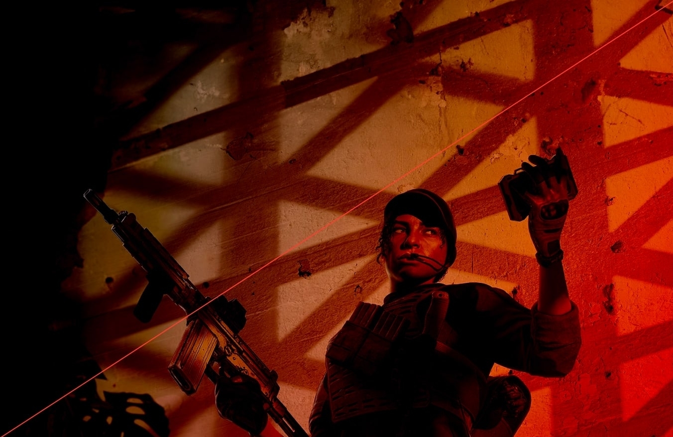
Our operators demand a presentation that is bold and empowering, capturing their essence with a commanding presence. Their posture should convey a sense of poised anticipation, embodying a momentary pause amidst the action, evoking both strength and readiness.
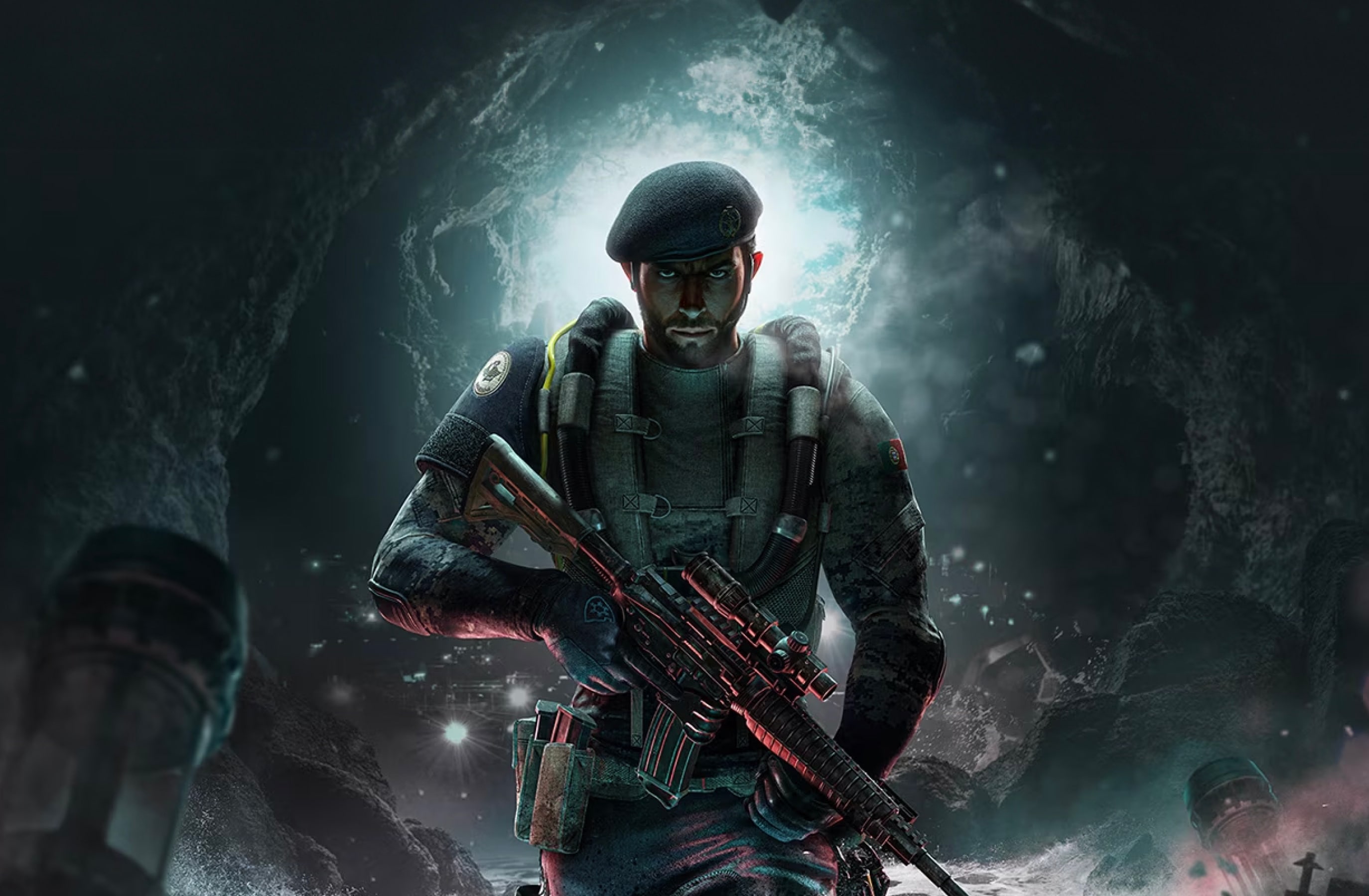
Follow this guidance to make sure shots of our operators are always consistent and impactful.
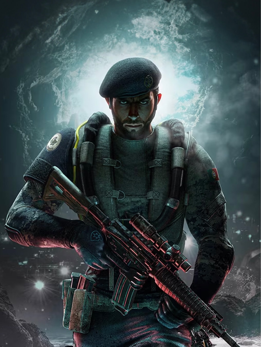
For season key art, there needs to be appropriate context in the background.
The operators pose should be one of confidence and command, a moment of pause within battle.
Shots of operators should be 3/4 length, focussing on the operators weapon and expression.
The operators weapon should always be in shot.
Our operators seamlessly integrate within our Destruction scenes, yielding epic and impactful applications.
To learn more about destruction please refer to our Destruction section.
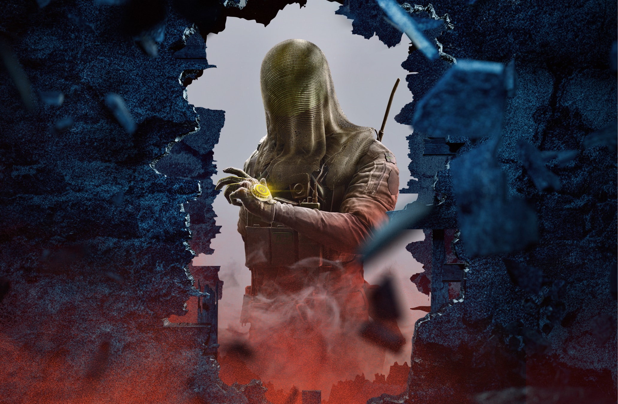
Follow this guidance to make sure shots of our Destruction are always consistent and impactful.
To learn more about destruction please refer to our Destruction section.
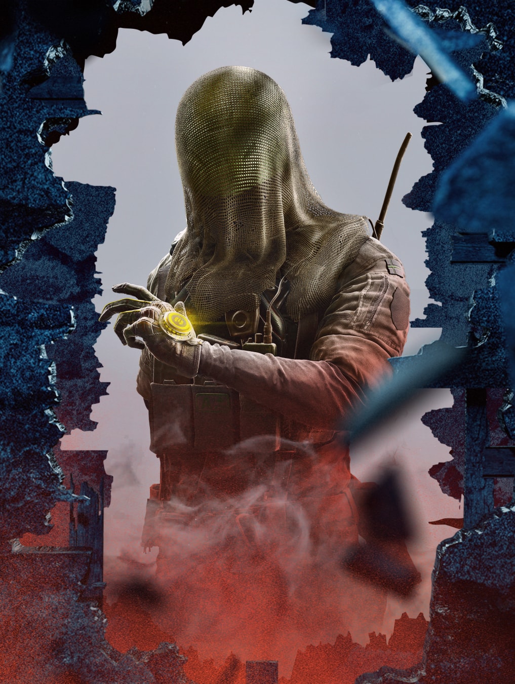
The operator should be lit with the same lighting as the scene, for example with the Grey as highlights and the Orange from the dust as a colour overlay.
The operators pose should be an empowering one. A moment of pausing, between action.
There should be clearspace to give the composition room to breathe.
Dust and embers can cover the operator, embedding them in the scene.
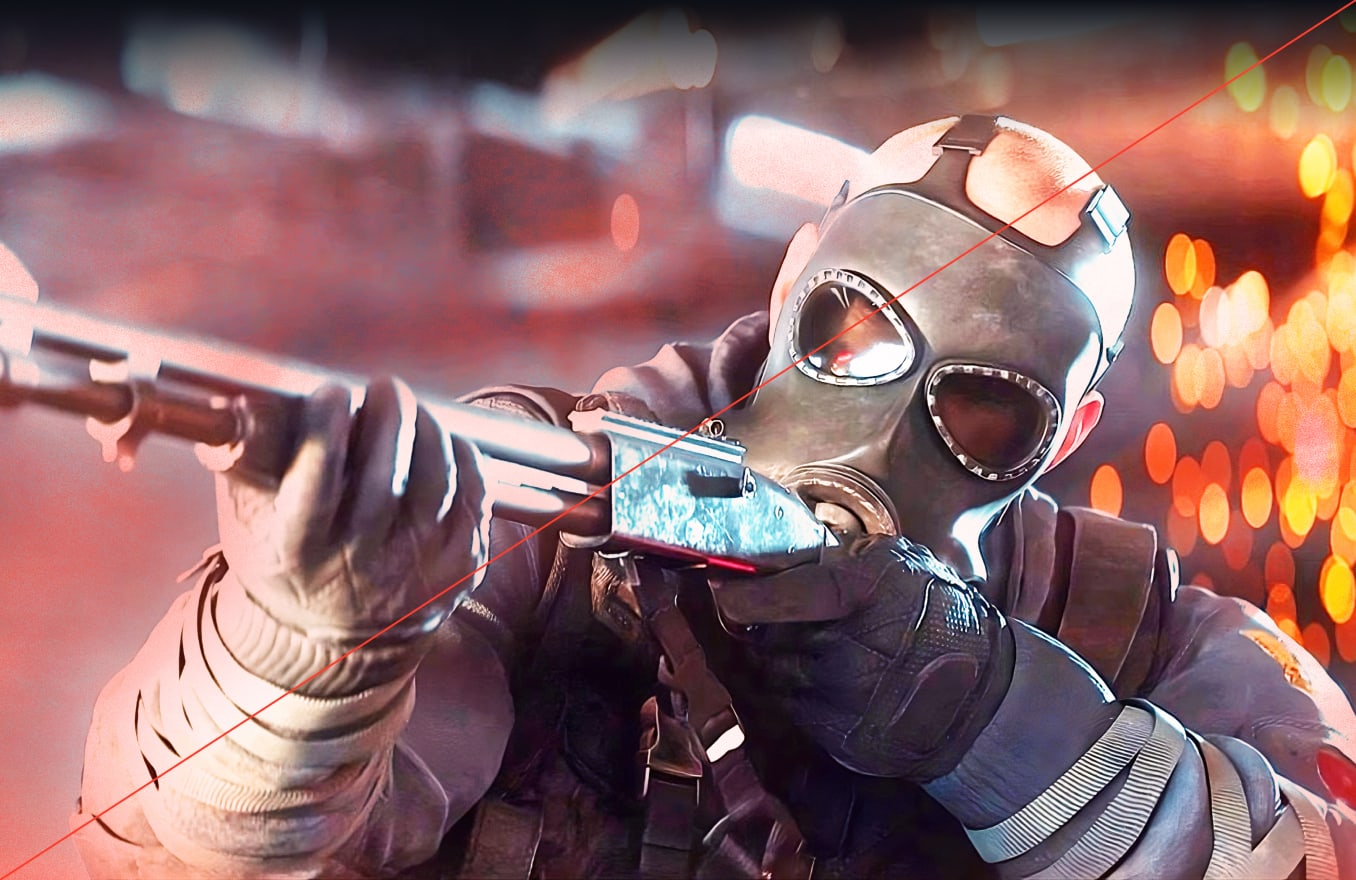
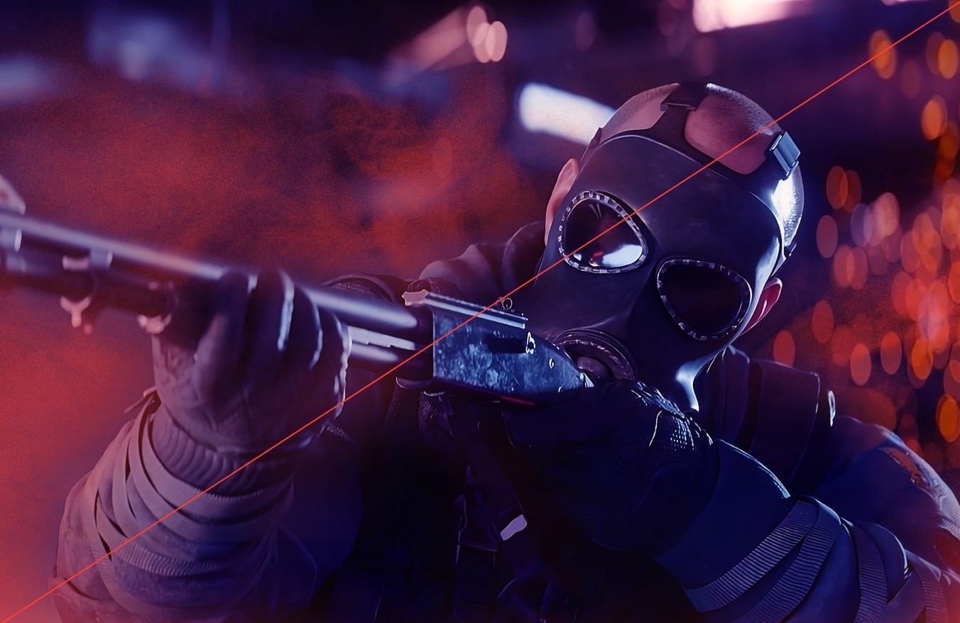
Gameplay art direction is used throughout our applications, with shots designed to encapsulate the intensity and action synonymous with Siege.
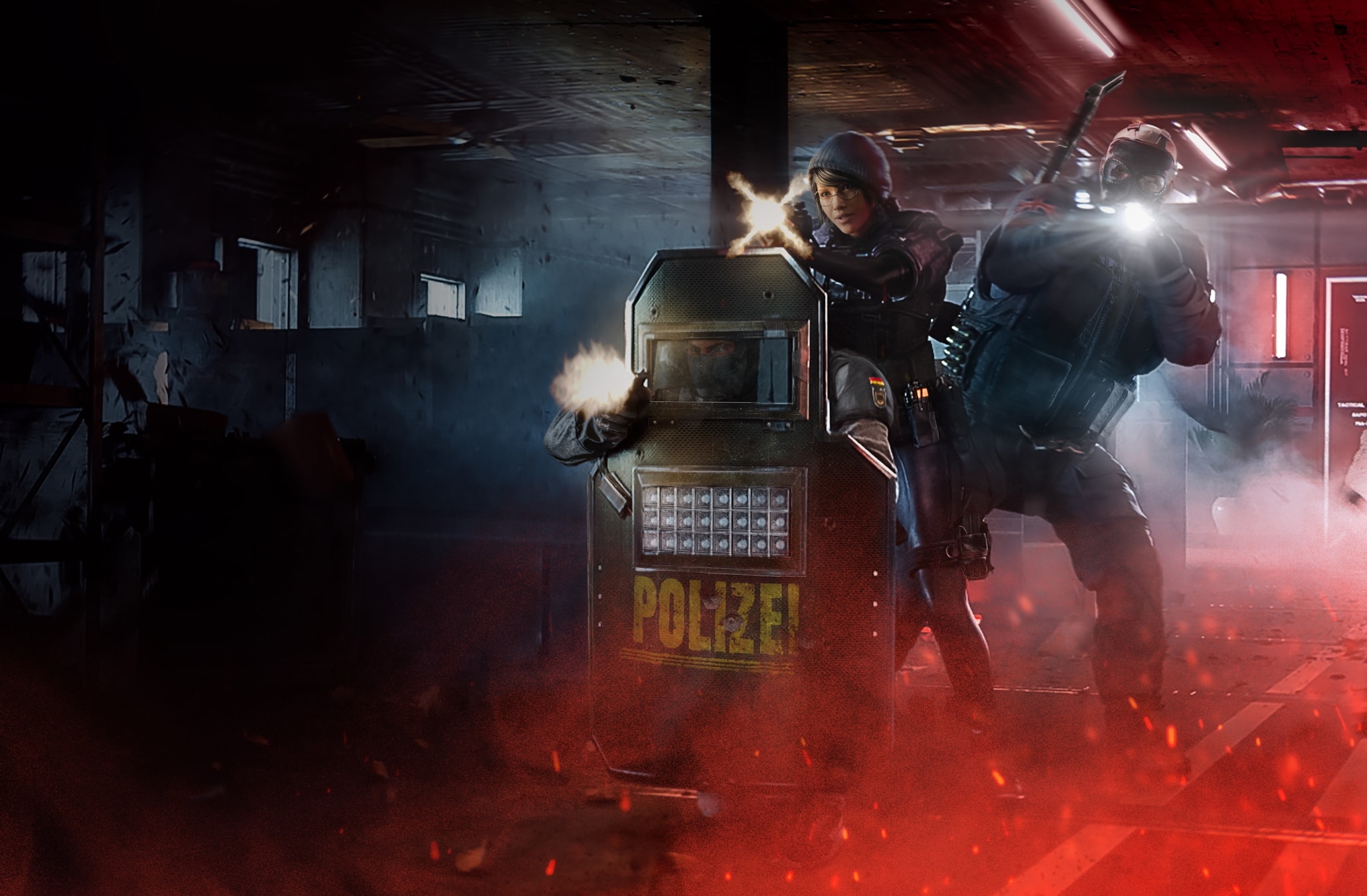
Follow this guidance to make sure shots of our Gameplay art direction is always consistent and impactful.
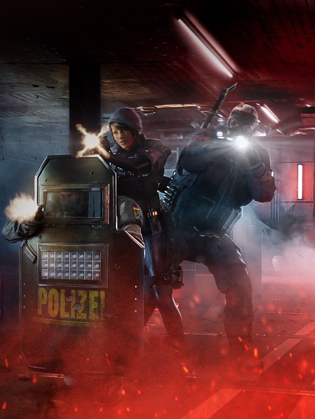
The scene should capture a sense of the environment for context.
The operators should be in a moment of action, reflecting the intensity of Siege.
We have the option of adding a Siege Orange colour overlay to the scene, which helps it feel connected to the rest of the visual identity. We can do this by creating a simple colour gradient in the bottom of the image that links to the placement of the dust.
We also have the option to add dust to the scene, adding a hint of destruction to the scene. We can do this by adding the dust as a layer to the image from our destruction assets.
We have the opportunity to align our Operator art direction to ensure aesthetic consistency with the rest of our visual identity.
Following the same treatment as gameplay above we can add a layer of dust to our operators and a simple gradient overlay.
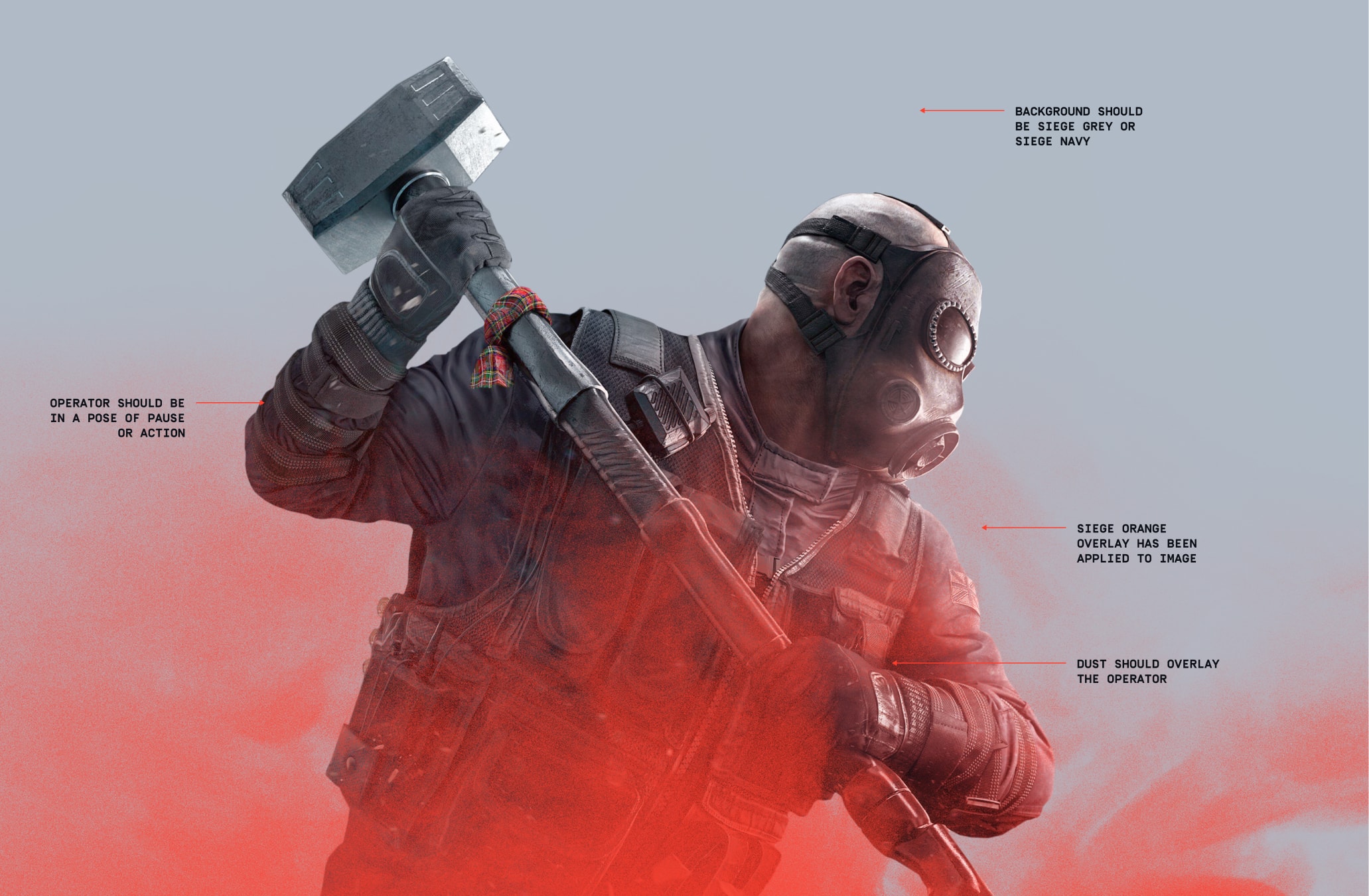
We have the opportunity to align our Gameplay art direction to ensure aesthetic consistency with the rest of our visual identity.
Following the same treatment as above we can add a layer of dust to our operators and a simple gradient overlay.
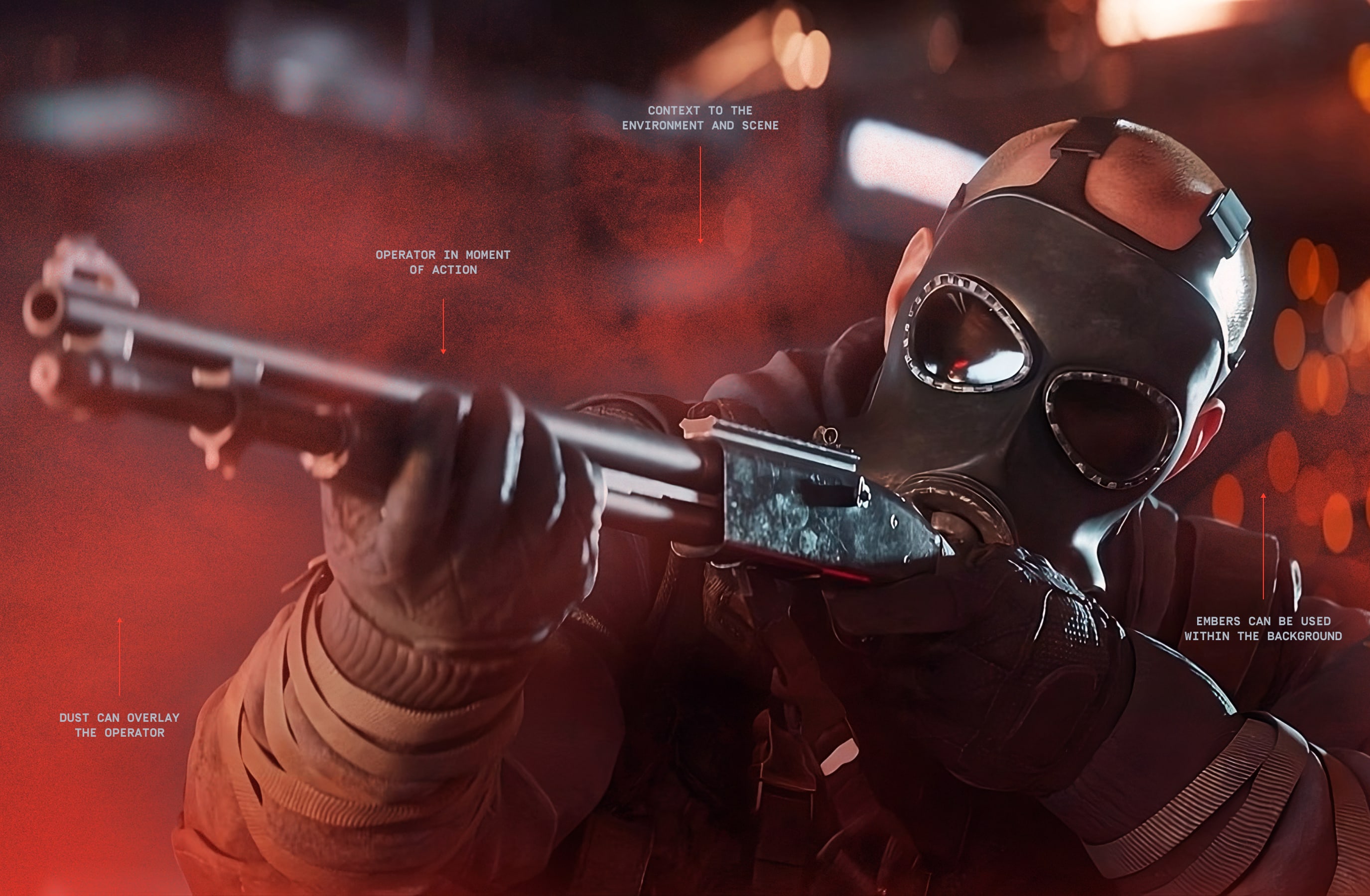
Here are two examples of our Destruction art direction in use.
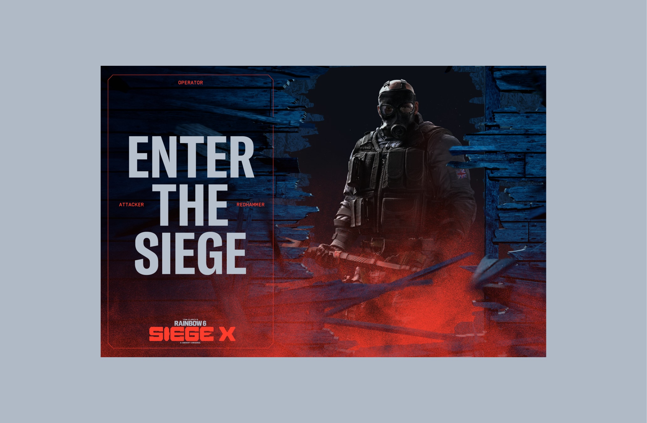
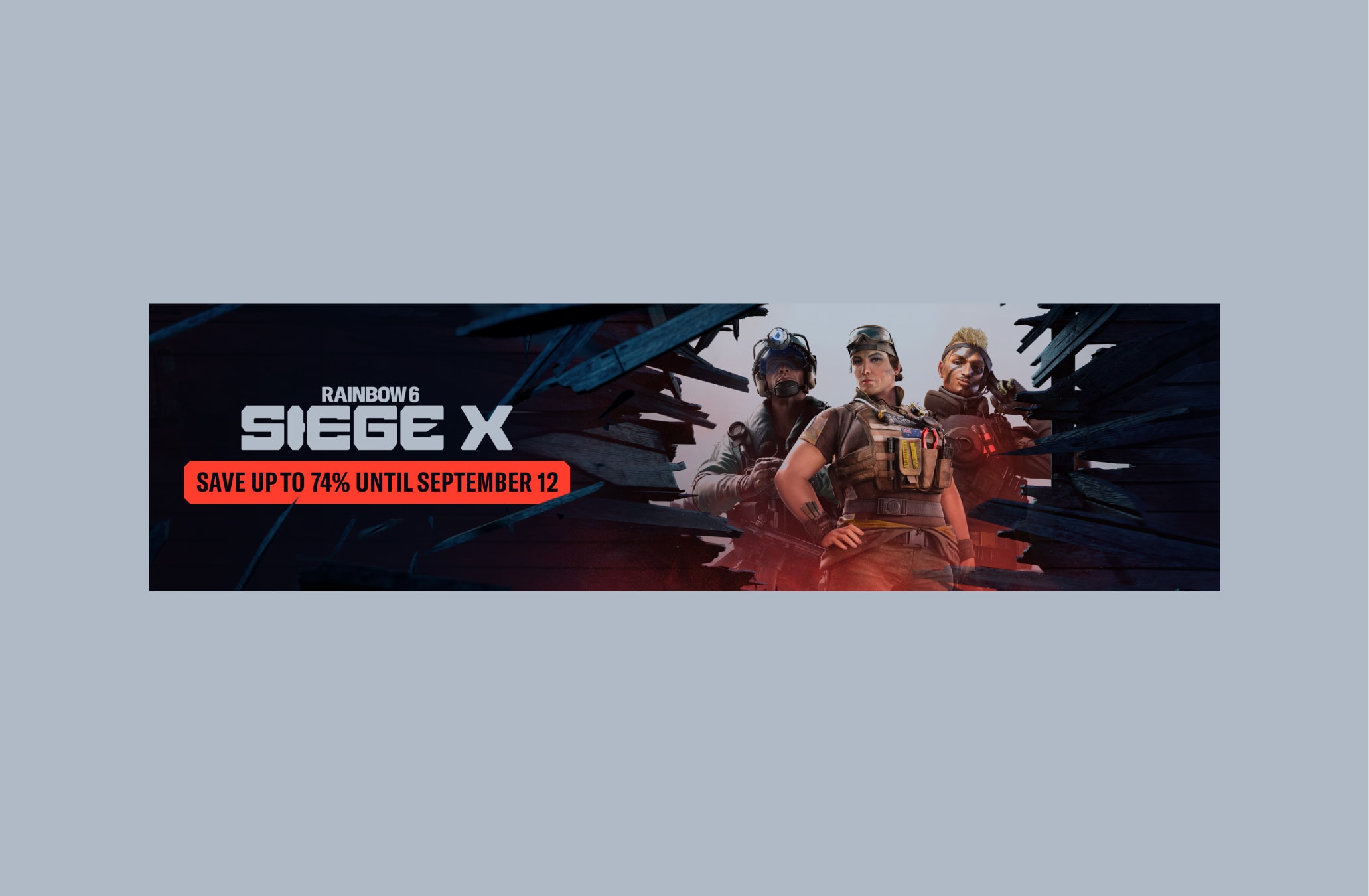
Here are two examples of our Gameplay art direction in use.
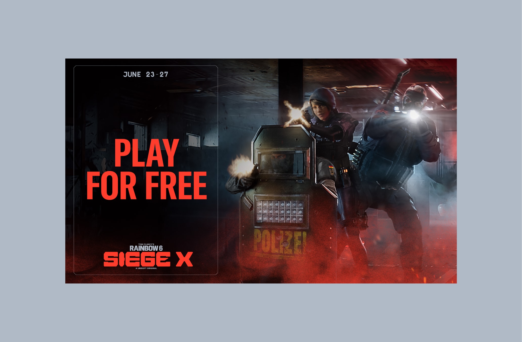
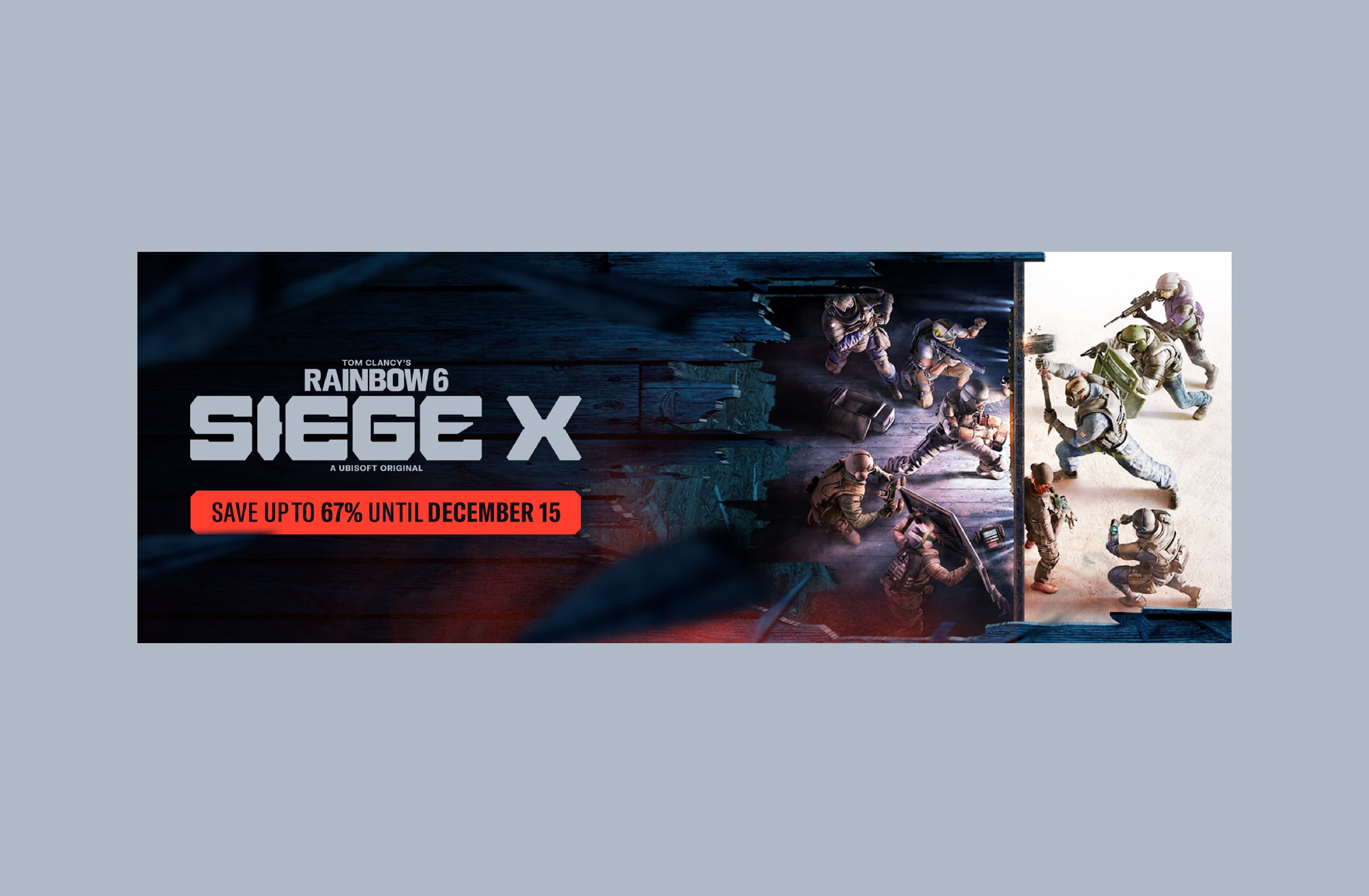
Make sure to follow this guidance to ensure our art direction is used correctly in all formats and applications.