07

Our Icon styles are distinct and ownable, incorporating the visual language Boilerplate system. They ensure that the brand is represented even in the smallest and most functional parts of the experience.
In this section we will showcase a breakdown of our Icons and how to use them.
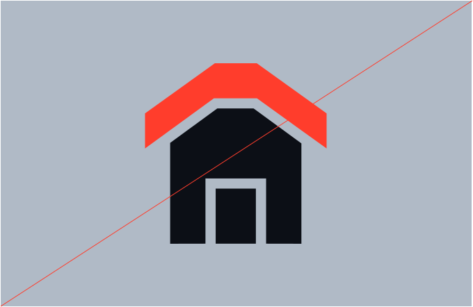
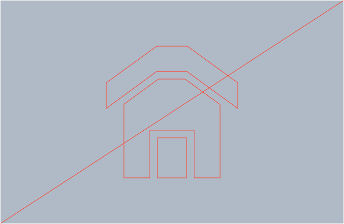
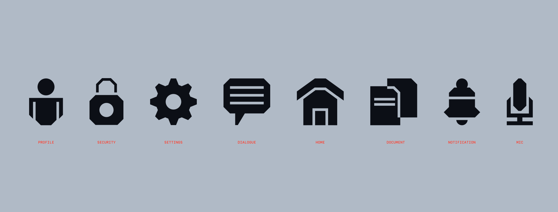
Here are our Functional Icons. These icons adopt the same corner radius as our Boilerplate and Logo, making them versatile for digital presentations and UI design details.
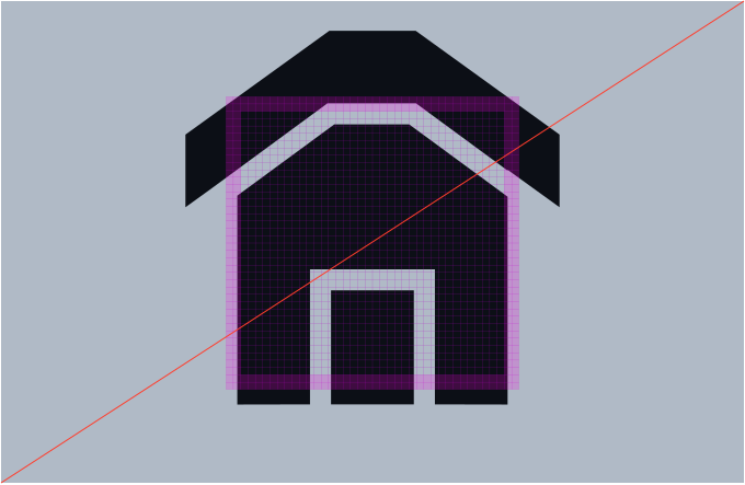
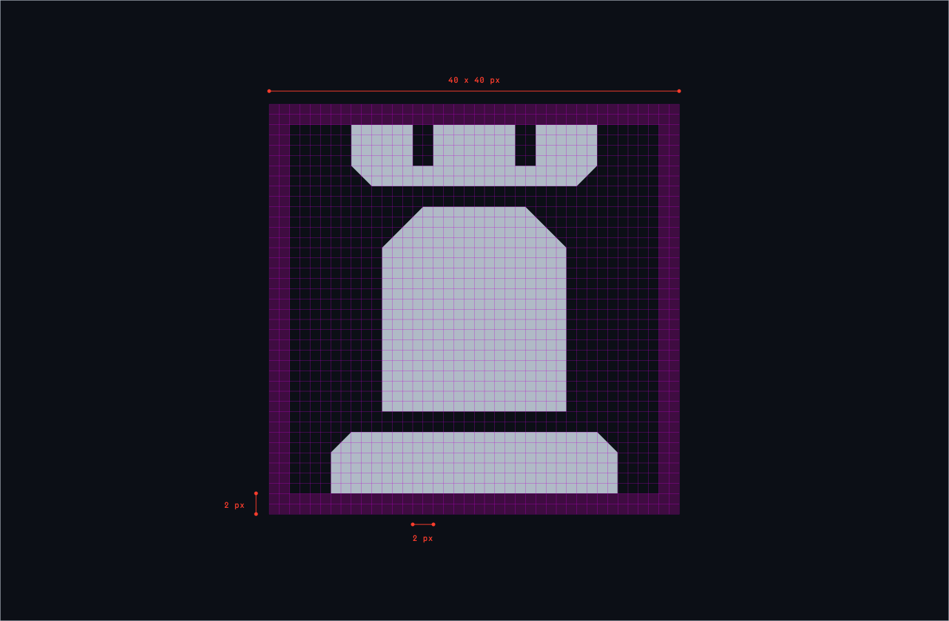
Our Functional icons adhere to a 40x40 grid, allowing for a 2px clearspace. Each icon maintains solidity, with components separated by a 2px space for clarity.
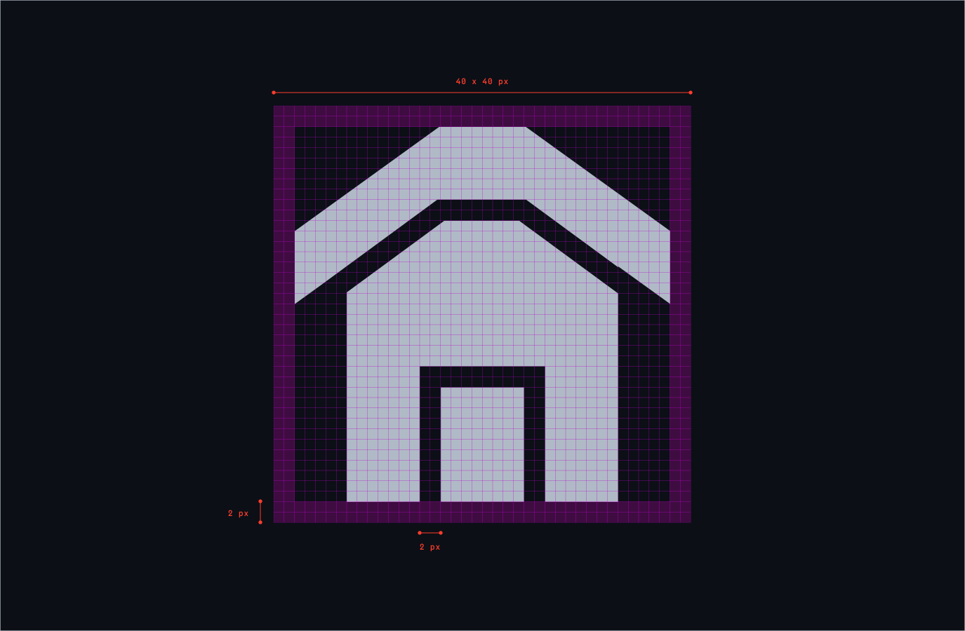
Ensure consistency and legibility in our Functional icon set by adhering to this guidance during creation.

Ensure shapes that are circular do not have angles or notches.
Most terminals should be straight and not cut.
An angle or cut should be present somewhere in the icon.
We can use gaps and space between elements, this should be set to 2px.
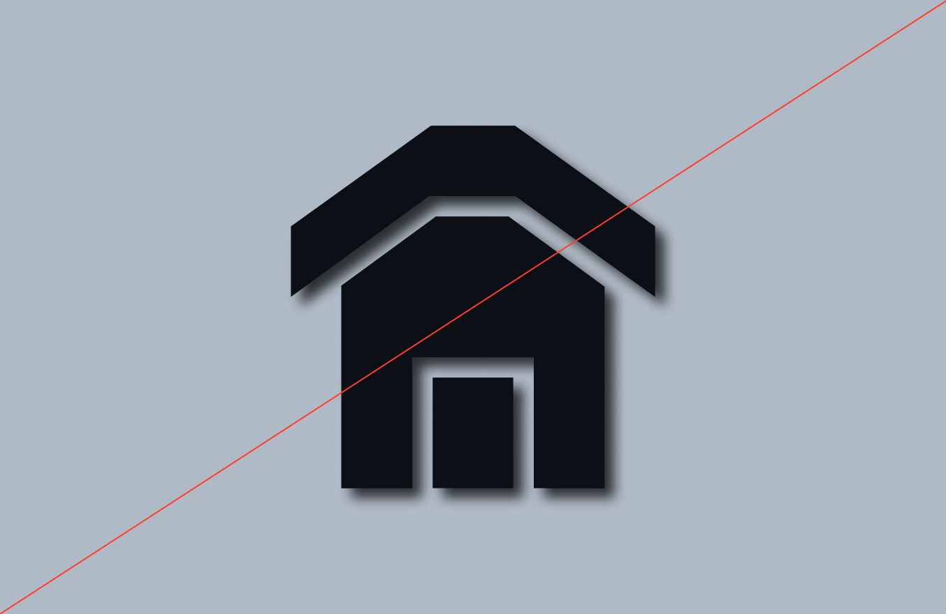
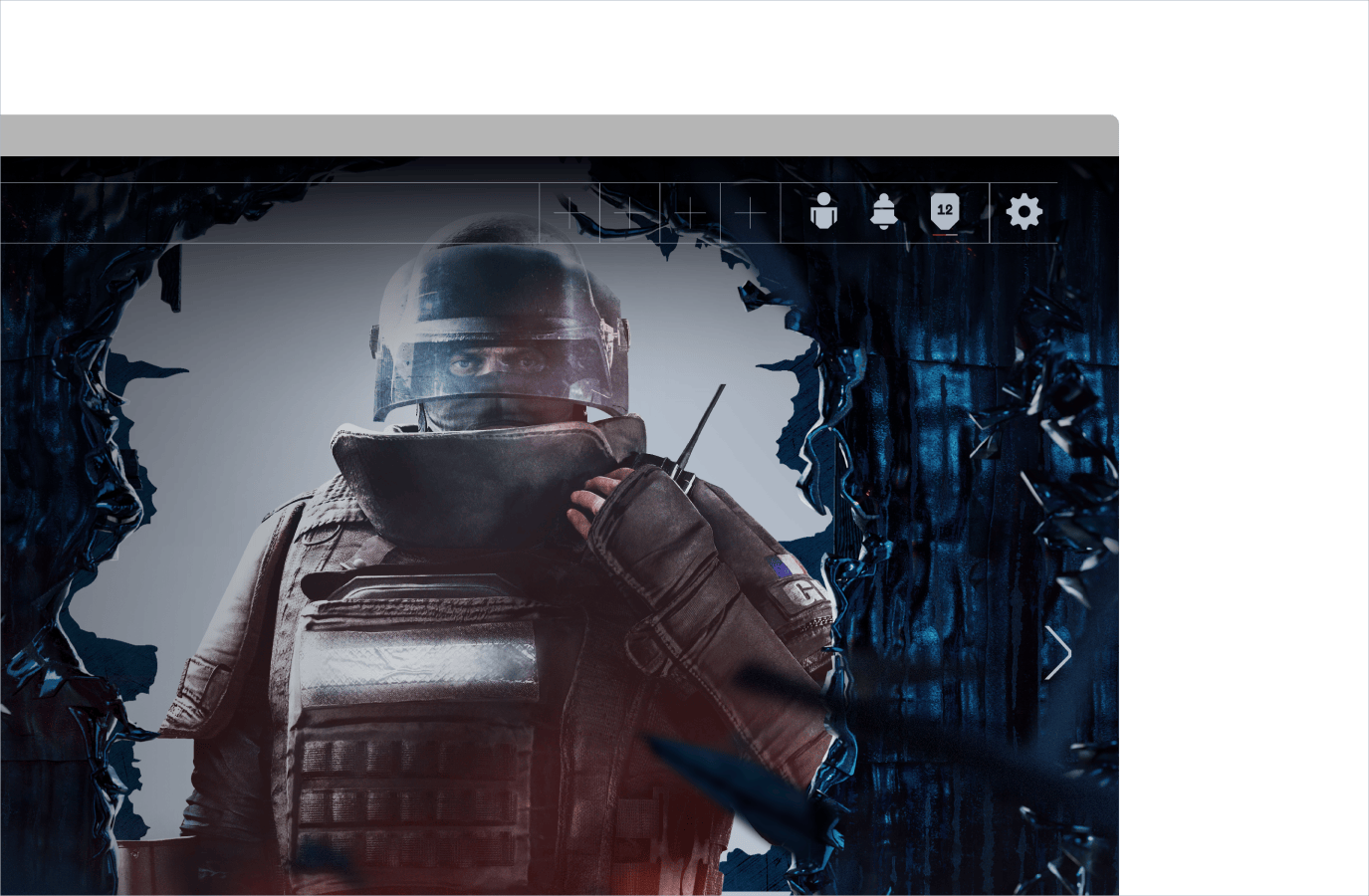
Explore this example showcasing our Functional icon style, ideal for both UI elements and illustrative purposes within presentations.
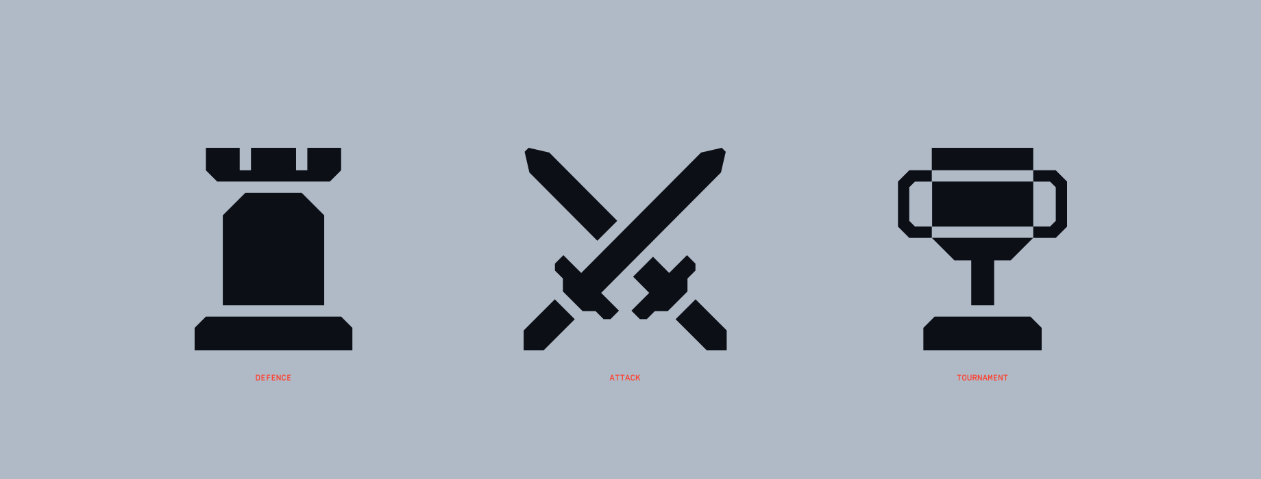
Our Pictogram icons feature intricate details and refined designs compared to our Functional set. These icons are primarily utilised at a larger scale, effectively illustrating concepts such as attack
and defence within in-game menus. They should always be used at a larger scale than our Functional icons.
Our Functional Icons adhere to a 40x40 grid, allowing for a 2px clearspace. Each icon maintains solidity, with components separated by a 2px space for clarity.
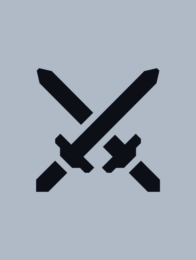
Ensure consistency and legibility in our Pictogram icon set by adhering to this guidance during creation.
The Pictograms should live at a larger scale then our Functional icons.
Pictograms should feature more details and cuts than our functional icons.
Gaps should be set to 2px
Explore this example showcasing our Pictogram Icon style, ideal for in-game menus.
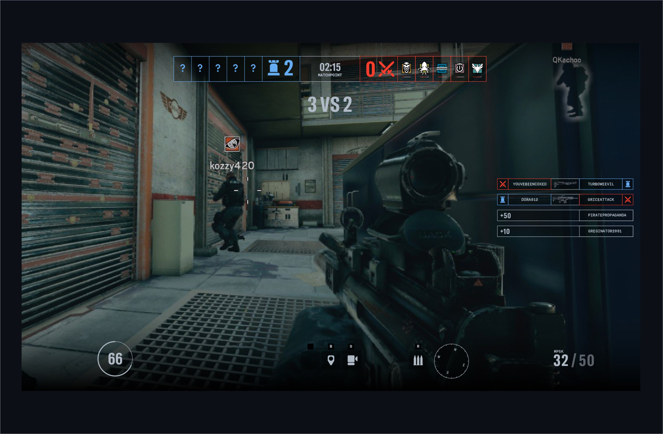
Make sure to follow this guidance to ensure our icons are used correctly in all formats and applications.