03
Our Typographic system embodies a bold and impactful voice within our visual identity. Our typefaces bring flexibility and variety to all our applications.
In this section we will showcase our typefaces, the system and how to use them.
Please visit our Downloads Centre to access all Typography assets.
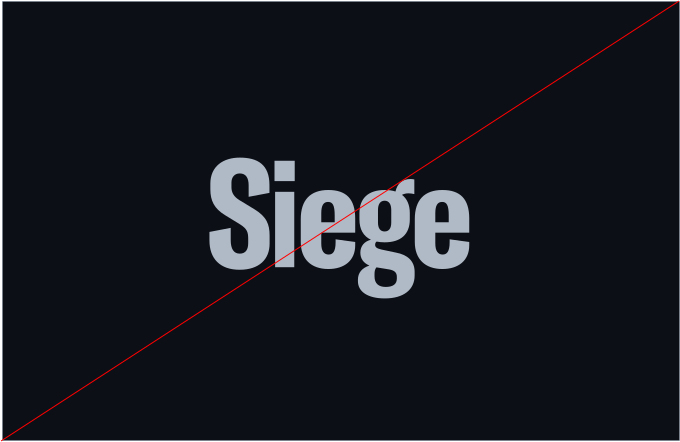
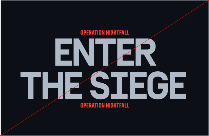
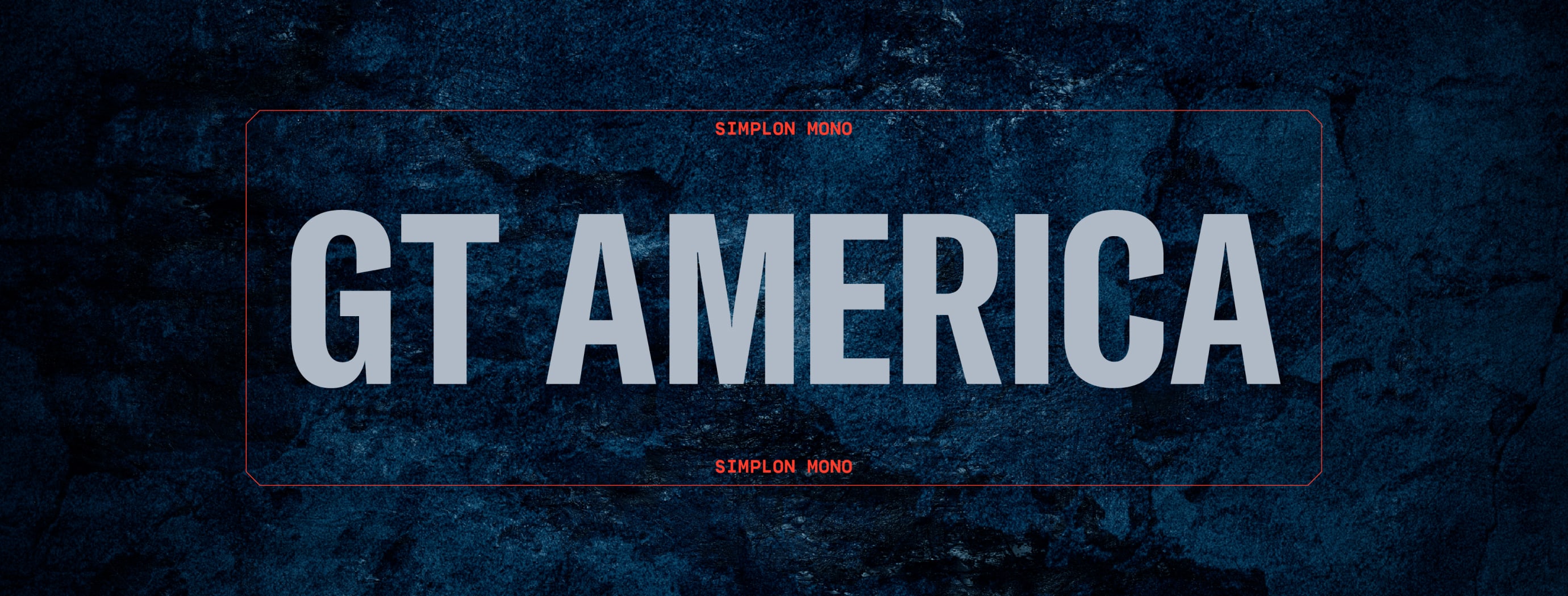
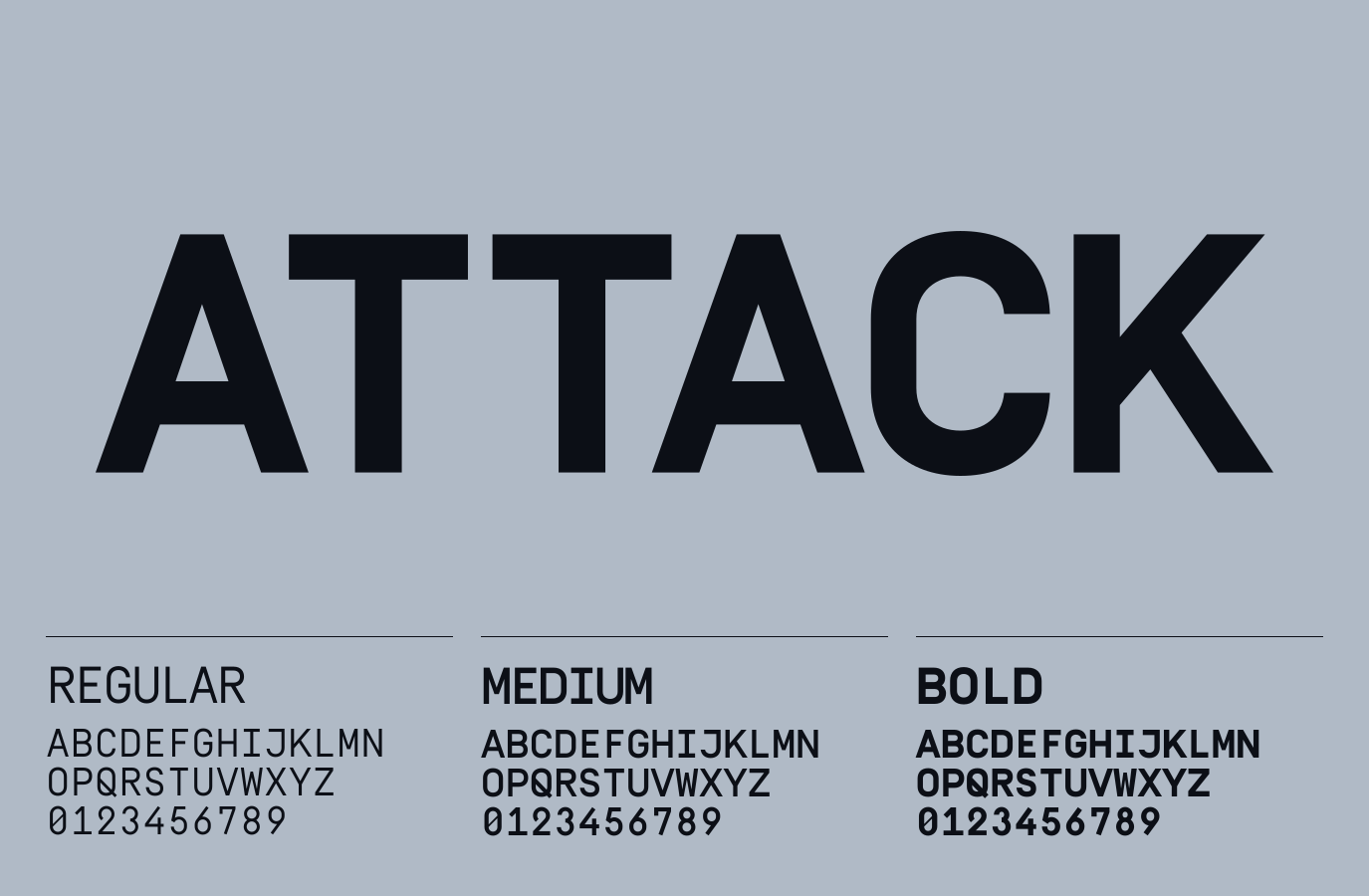
We have two typefaces within our system. GT America Compressed is our headline font which brings impact and structure to our applications. Simplon Mono is our secondary font.
This is used for subheadings and furniture.
Please visit our Downloads Centre to access all font assets.
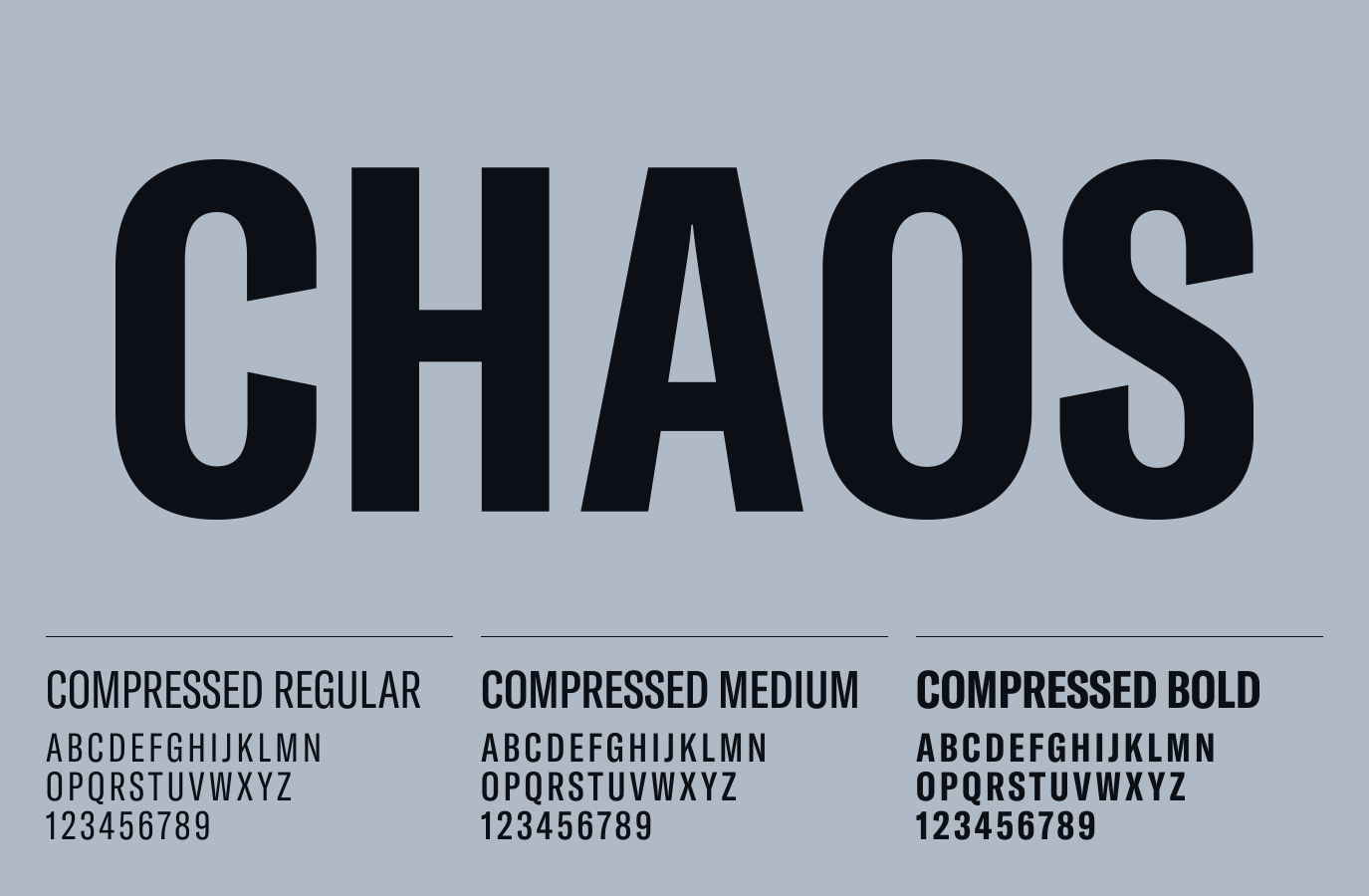
GT America Compressed is the cornerstone of our typographic identity, embodying a bold, impactful, and commanding presence. We use it in three weights to give us flexibility with legibility and allow emphasis where needed.
For a system font alternate please use Roboto Condensed.
Please visit our Downloads Centre to access all font assets.
Simplon Mono, a contemporary monospaced typeface, brings a touch of technical precision to our design language. The font is reserved for subheadings and typographic elements. We use it in three weights to give us flexibility with legibility and emphasis when needed.
For a system font alternate please use IBM Plex Mono.
Please visit our Downloads Centre to access all font assets.
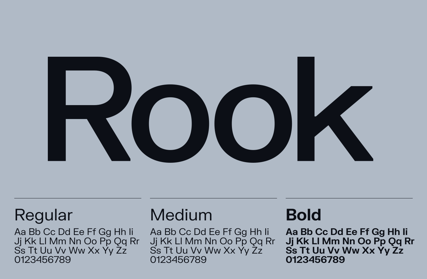
FK Grotesk serves as our supporting typeface and is part of the Rainbow Six Franchise brand, playing a pivotal role in maintaining brand consistency. Reserved exclusively for body copy for Siege, it ensures a cohesive visual language across all brand communications. We use it in three weights to give us flexibility with legibility and emphasis when needed.
For a system font alternate please use Helvetica.
Please visit our Downloads Centre to access all font assets.
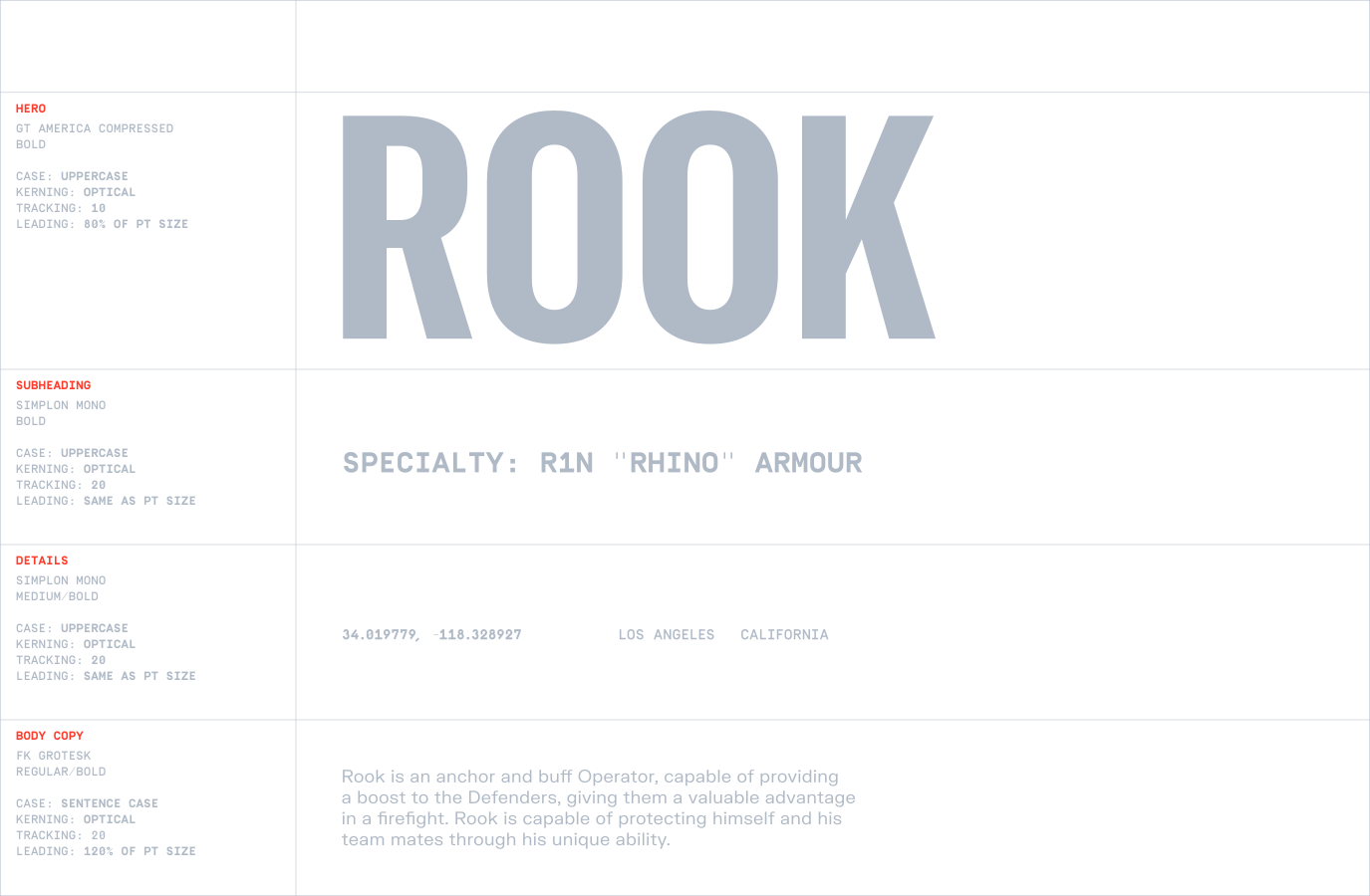
Please follow this guidance for our typographic system, it will ensure consistency across all our digital and print applications.
Please visit our Downloads Centre to access all font assets.
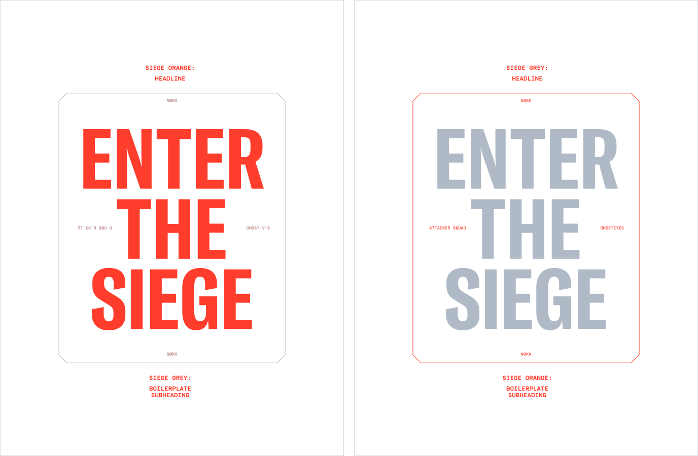
Our typefaces should only sit on the background of Siege Navy and Siege Grey.
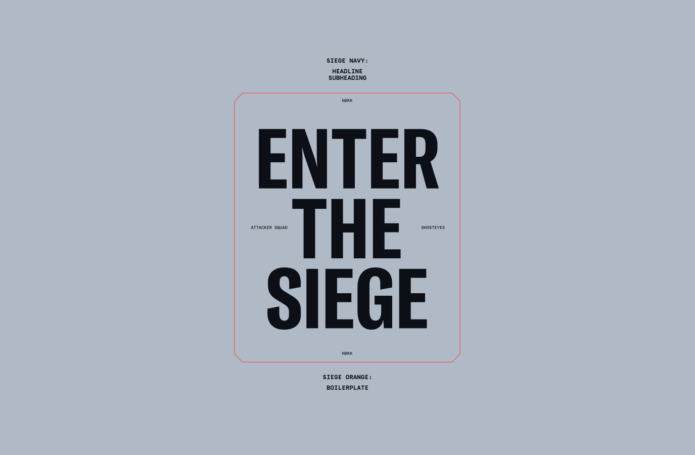
When using Siege Navy as the background, our headline should be in either Siege Orange or Grey whilst the sub-heading is the opposite colour.
When using Siege Grey as the background headlines should always be Siege Navy to ensure legibility.
For more information regarding Boilerplates please refer to the Layout section.
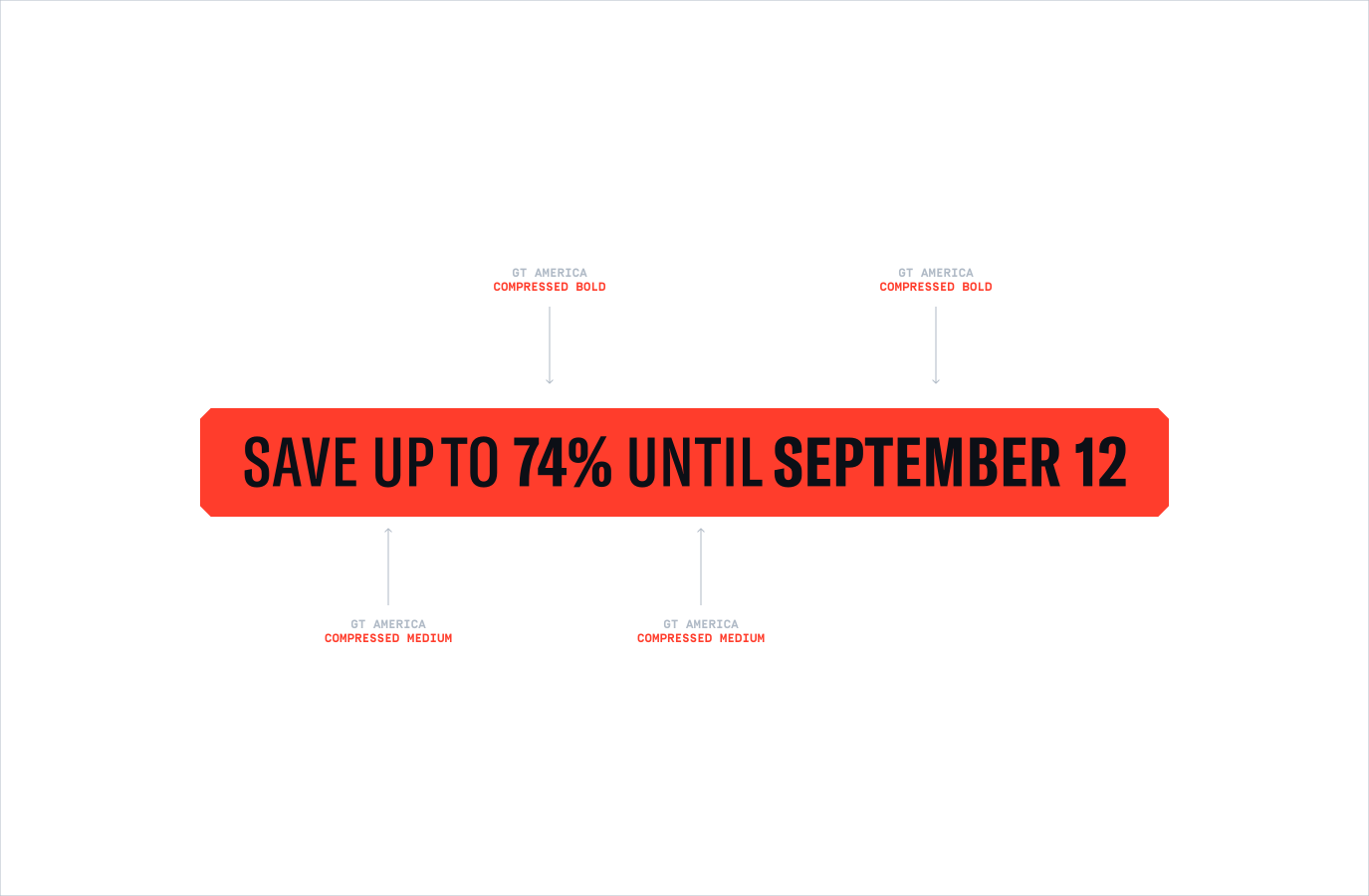
When creating CTAS, we can use a mix of GT America Compressed in Medium and Bold to bring attention to certain details and offers.
Make sure to follow this guidance to ensure our Typography is used correctly in all formats and applications.